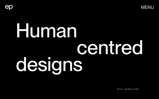
Preview image. Unlock full-res
Academic monograph with confident typography.
Color palette
Page backgrounds, card surfaces, primary text color on dark backgrounds
Primary text, icon fill, background for hero sections
Secondary text, link text, borders for ghost buttons and images
Subtle background for UI elements and alternate section backgrounds, providing a soft contrast
Typography
- Weights
- 300, 400, 500
- Sizes
- 11px, 18px, 27px, 178px
- Line height
- 1, 1.1, 1.3, 1.4
- Letter spacing
- 0.0500em
The primary typeface for headlines, body text, and UI elements. Its large scale and precise letter-spacing contribute to the academic and confident tone.
- Weights
- 400
- Sizes
- 14px, 32px, 38px, 40px
- Line height
- 1, 1.43
- Letter spacing
- 0.0500em
Used for navigation, links, and specific UI elements, it mirrors the primary typeface's characteristics while offering some subtle variations.
- Weights
- 400
- Sizes
- 14px
- Line height
- 1.43
- Fallback
- System Sans-serif
Fallback font, or for small, utility-style text like helper text or captions.
Spacing & shape
Components
Text link using Neue Montreal Variable at 40px, Text Graphite color, with no background and a 1px solid Text Graphite border on hover or active states. This creates a subtle interactive response.
Uses Neue Montreal at 18px / 1.3 line height, Ink Black color, with generous overall padding of 21px or more. This prioritizes readability and emphasizes the content.
Uses Neue Montreal at 178px / 1.0 line height, Canvas White on an Ink Black background, or Ink Black on a Canvas White background. The massive scale and tight line height create a bold, overlapping visual effect.
Small label for directional cues, uses Arial 14px, Text Graphite color, often accompanied by an icon. Emphasizes utility over display.
A very minimalist button style consisting of a 1px solid Text Graphite border and Text Graphite body text (Neue Montreal Variable 14px), with a transparent background. No distinct background color, relying on borders for definition.
Images are typically framed with a 1px solid '#333333' border, giving them a subtle definition against the background.
Guidelines
- Prioritize Neue Montreal for all textual elements unless explicitly specified otherwise, using its full range of weights (300, 400, 500).
- Maintain a bold, high-contrast aesthetic using Ink Black on Canvas White or Canvas White on Ink Black as the primary foreground/background pairs.
- Apply a consistent letter-spacing of 0.0500em for all Neue Montreal and Neue Montreal Variable text to maintain its unique visual signature.
- Utilize 'Text Graphite' (#333333) for all border details, ensuring a unified and subtle visual separation for elements like buttons and images.
- Use generous vertical spacing, typically 85px between major sections, to create an open and uncrowded page layout.
- Employ 'Surface Frost' (#f7f7f7) sparingly as a subtle background for secondary UI elements or to break up white sections without introducing strong color.
- Avoid decorative gradients or shadows; the visual system is flat and direct, relying on high contrast and typography.
- Do not introduce strong accent colors or vivid hues unless for specific visual assets (e.g., product screenshots) that are considered content, not UI.
- Resist the temptation to add rounded corners; elements should predominantly use sharp, 0px radii.
- Do not deviate from the specified letter-spacing of 0.0500em for display and body text, as it's a key brand identifier.
- Avoid dense, information-heavy blocks of text; instead, break content into manageable, well-spaced paragraphs.
About this system
ShowHide
This system projects an academic, almost stark modernity with its high-contrast monochrome palette. The design relies on generous white space and bold typography for impact. Interaction is subtle, using ghost buttons and thin borders rather than heavy fills. The overall atmosphere is discerning and direct, prioritizing content and clarity over decorative flourishes.
Reminiscent of Figma, Linear, Are.na, Dropbox Design.
# Elvina Prasad — Style Reference
> Academic monograph with confident typography.

**Theme:** light

**Site:** https://www.elvinaprasad.com

This system projects an academic, almost stark modernity with its high-contrast monochrome palette. The design relies on generous white space and bold typography for impact. Interaction is subtle, using ghost buttons and thin borders rather than heavy fills. The overall atmosphere is discerning and direct, prioritizing content and clarity over decorative flourishes.

## Tokens — Colors

| Name | Value | Token | Role |
|------|------|------|------|
| Canvas White | `#ffffff` | `--color-canvas-white` | Page backgrounds, card surfaces, primary text color on dark backgrounds |
| Ink Black | `#000000` | `--color-ink-black` | Primary text, icon fill, background for hero sections |
| Text Graphite | `#333333` | `--color-text-graphite` | Secondary text, link text, borders for ghost buttons and images |
| Surface Frost | `#f7f7f7` | `--color-surface-frost` | Subtle background for UI elements and alternate section backgrounds, providing a soft contrast |

## Tokens — Typography

### Neue Montreal
- **Weights:** 300, 400, 500
- **Sizes:** 11px, 18px, 27px, 178px
- **Line height:** 1, 1.1, 1.3, 1.4
- **Letter spacing:** 0.0500em
- **Role:** The primary typeface for headlines, body text, and UI elements. Its large scale and precise letter-spacing contribute to the academic and confident tone.

### Neue Montreal Variable
- **Weights:** 400
- **Sizes:** 14px, 32px, 38px, 40px
- **Line height:** 1, 1.43
- **Letter spacing:** 0.0500em
- **Role:** Used for navigation, links, and specific UI elements, it mirrors the primary typeface's characteristics while offering some subtle variations.

### Arial
- **Substitute:** System Sans-serif
- **Weights:** 400
- **Sizes:** 14px
- **Line height:** 1.43
- **Role:** Fallback font, or for small, utility-style text like helper text or captions.

## Tokens — Type Scale

Golden Ratio (1.618) from 18px base.

| Role | Size | Line height | Letter spacing |
|------|------|------|------|
| caption | 11px | 1.4 | 0.05em |
| body-sm | 14px | 1.43 | 0.05em |
| body | 18px | 1.3 | 0.05em |
| subheading | 27px | 1.1 | 0.05em |
| heading-sm | 32px | 1 | 0.05em |
| heading | 40px | 1 | 0.05em |
| display | 178px | 1 | 0.05em |

## Tokens — Spacing

- **Section gap:** 85px
- **Card padding:** 21px
- **Element gap:** 16px

## Tokens — Radius

- **Default:** 0px

## Components

### Ghost Navigation Link
*Primary navigation element*

Text link using Neue Montreal Variable at 40px, Text Graphite color, with no background and a 1px solid Text Graphite border on hover or active states. This creates a subtle interactive response.

### Body Text Block
*Standard paragraph content*

Uses Neue Montreal at 18px / 1.3 line height, Ink Black color, with generous overall padding of 21px or more. This prioritizes readability and emphasizes the content.

### Hero Headline
*Main page headline*

Uses Neue Montreal at 178px / 1.0 line height, Canvas White on an Ink Black background, or Ink Black on a Canvas White background. The massive scale and tight line height create a bold, overlapping visual effect.

### Scroll Indicator Text
*Directional UI helper*

Small label for directional cues, uses Arial 14px, Text Graphite color, often accompanied by an icon. Emphasizes utility over display.

### Minimal Call to Action Button
*Secondary action button*

A very minimalist button style consisting of a 1px solid Text Graphite border and Text Graphite body text (Neue Montreal Variable 14px), with a transparent background. No distinct background color, relying on borders for definition.

### Image Border
*Framing for visual content*

Images are typically framed with a 1px solid '#333333' border, giving them a subtle definition against the background.

## Guidelines

### Do

- Prioritize Neue Montreal for all textual elements unless explicitly specified otherwise, using its full range of weights (300, 400, 500).
- Maintain a bold, high-contrast aesthetic using Ink Black on Canvas White or Canvas White on Ink Black as the primary foreground/background pairs.
- Apply a consistent letter-spacing of 0.0500em for all Neue Montreal and Neue Montreal Variable text to maintain its unique visual signature.
- Utilize 'Text Graphite' (#333333) for all border details, ensuring a unified and subtle visual separation for elements like buttons and images.
- Use generous vertical spacing, typically 85px between major sections, to create an open and uncrowded page layout.
- Employ 'Surface Frost' (#f7f7f7) sparingly as a subtle background for secondary UI elements or to break up white sections without introducing strong color.

### Don't

- Avoid decorative gradients or shadows; the visual system is flat and direct, relying on high contrast and typography.
- Do not introduce strong accent colors or vivid hues unless for specific visual assets (e.g., product screenshots) that are considered content, not UI.
- Resist the temptation to add rounded corners; elements should predominantly use sharp, 0px radii.
- Do not deviate from the specified letter-spacing of 0.0500em for display and body text, as it's a key brand identifier.
- Avoid dense, information-heavy blocks of text; instead, break content into manageable, well-spaced paragraphs.

## Agent Prompt Guide

Quick Color Reference: text: #000000, background: #ffffff, border: #333333, accent: no distinct accent color, primary action: no distinct CTA color

Example Component Prompts:
1. Create a hero section: Ink Black background. Headline 'Human centred designs' using Neue Montreal 178px weight 400, Canvas White color. Add a 'KEEP SCROLLING' body-sm caption in #ffffff with a simple outlined arrow icon, #ffffff stroke.
2. Design a portfolio item card: Canvas White background. An image with a 1px solid #333333 border. A subheading 'Phare Branding' using Neue Montreal 27px weight 400, Ink Black color, with 21px padding.
3. Implement a ghost navigation button for 'MENU': Neue Montreal Variable 40px weight 400, Ink Black color. No background, 1px solid #333333 border on hover.
More like this
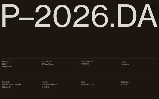









Keep what you find
A free account saves references to boards and can send you a weekly email of picks based on what you save.
To see every result, go Pro.