Preview image. Unlock full-res
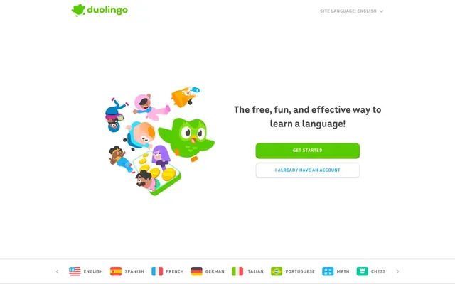
Playful Green Arcade
Color palette
Observed in heading borderColor, heading color, other backgroundColor. Extracted usage does not support a distinct primary control color.
Subtle green accent for backgrounds and decorative borders, creating a gentle contrast with the primary green without overwhelming the eye.
Link text and ghost button borders, providing an alternate vibrant interactive color that stands out from the dominant green.
Specific heading text and borders, adding depth and an alternative vibrant hue for important textual elements.
Specific button text and body text, providing a striking, almost black contrast that hints at an alternative dark mode aesthetic.
Outlined action borders and text, providing a distinct interactive style for secondary actions that align with the brand's green palette.
General text, borders for lists and other elements, providing a strong readable neutral for content.
Decorative SVG fills, ensuring high contrast for illustrative elements.
Page backgrounds, surface colors, and text on darker backgrounds.
Secondary text and navigation elements, providing a softer, muted contrast than Shadowed Pine.
Primary heading text and link text, providing a strong, dark anchor that is slightly less stark than pure black.
Observed in nav borderColor, button borderColor, nav color. Extracted usage does not support a distinct primary control color.
Typography
- Weights
- 500, 700
- Sizes
- 13px, 14px, 15px, 17px, 19px, 32px
- Line height
- 1.15, 1.18, 1.2, 1.21, 1.23, 1.33, 1.4, 1.41, 1.47
- Letter spacing
- 0.053em
- Fallback
- system-ui
The primary typeface for body text, links, buttons, and general UI elements. Its rounded yet clear forms contribute to the friendly and approachable brand personality. Utilized across a wide range of weights and sizes to ensure versatility from captions to subheadings.
- Weights
- 700
- Sizes
- 48px, 64px
- Line height
- 1.2
- Letter spacing
- -0.020em
- Fallback
- serif
Used exclusively for large display headings, this typeface brings a bold, impactful presence. Its distinct character provides a strong visual anchor for key messages on the page.
Spacing & shape
Components
Filled button with `Duolingo Green` background (#58cc02). Text uses `Arctic White` (#ffffff) with `din-round` font, weight 700. `12px` border-radius. Padding of `16px` left/right.
Outlined button with `Outline Green` (#a5ed6e) border and text. Background is transparent. `din-round` font, weight 700. `12px` border-radius. Padding of `16px` left/right.
Transparent background with text and border in `Action Blue` (#1cb0f6). `din-round` font, weight 500. `12px` border-radius. Padding of `16px` left/right.
Transparent background with text and border in `Muted Silver` (#afafaf). `din-round` font, weight 500. No specific border radius.
Text in `Charcoal Text` (#4b4b4b) using `feather` font, weight 700, size 48px or 64px, with letter-spacing -0.020em. Line height 1.2.
Text in `Duolingo Green` (#58cc02) using `feather` font, weight 700, size 48px or 64px, with letter-spacing -0.020em. Line height 1.2.
Text in `Shadowed Pine` (#3c3c3c) using `din-round` font, weight 500, size 14px or 15px, with letter-spacing 0.053em.
Text in `Cloud Gray` (#777777) using `din-round` font, weight 500, size 13px or 14px, with letter-spacing 0.053em.
Text in `Cloud Gray` (#777777) using `din-round` font, weight 500. Minimal padding (e.g., `10px` around), transparent background.
Small elements often using `Duolingo Green` (#58cc02) for background or `Background Green Accent` (#d7ffb8) for borders, with `din-round` text. Features `12px` border-radius.
Guidelines
- Use `Duolingo Green` (#58cc02) for primary interactive elements and key accents to maintain brand recognition.
- Apply `12px` border-radius to all buttons and prominent interactive links for a consistent friendly aesthetic.
- Employ `feather` font with weight 700 and letter-spacing -0.020em for all display-level headings to ensure visual impact.
- Use `Arctic White` (#ffffff) as the primary page background color to allow vibrant brand elements to stand out.
- Ensure generous `elementGap` of `12px` and `sectionGap` of `101px` to create a comfortable, spacious layout.
- Use `outline Green` (#a5ed6e) for secondary actions that need to align with the brand's green while differentiating from the primary filled action.
- Do not use `feather` font for body text or small UI elements; reserve it for large headings only.
- Avoid arbitrary color choices outside the defined palette, especially for interactive elements, to prevent dilution of brand identity.
- Do not use sharp corners on buttons or prominent interactive components; always apply a `12px` border-radius.
- Do not clutter sections; maintain the `12px` element gap and `101px` section gap for comfortable density.
- Avoid using `Action Blue` (#1cb0f6) as a filled button background; it is reserved for outlined buttons and links.
- Do not use `Muted Silver` (#afafaf) for main headings or primary calls to action; reserve it for subtle interactive elements.
About this system
ShowHide
This design system feels like a vibrant, welcoming arcade where learning is a game. The dominant vivid green (#58cc02) and rounded forms, especially the 12px border-radius buttons, create a friendly, approachable atmosphere, softening the otherwise crisp text. Typographic hierarchy is clear with distinct weights and sizes for headings and body, often anchored by a deeper neutral (#4b4b4b and #3c3c3c) that provides stability to the lively greens and blues. A crisp white background allows the saturated brand colors and whimsical illustrations to pop, fostering a sense of fun and engagement.
The page model is primarily full-bleed with content often centered or arranged in logical two-column (text + image) or three-column card grids. The hero section usually features a prominent illustration alongside a large, centered headline and primary action buttons. Sections maintain a consistent vertical rhythm, often alternating between a main content block and smaller, supportive elements. Content is frequently presented with text on one side and an illustrative graphic on the other, creating a dynamic visual flow. The navigation is a sticky top bar, containing the brand logo and language switcher. The layout is spacious with ample clear space around sections and elements.
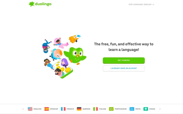
The visual language is characterized by lively, whimsical 2D illustrations with distinct outlines and a vibrant color palette that closely mirrors the brand system's greens, blues, and other playful accents. These illustrations, featuring diverse characters and fantastical elements, are central to explaining concepts and adding a game-like atmosphere. They are typically contained within sections, sometimes overlapping text or elements, and serve mainly to add decorative atmosphere and explain content in a friendly, engaging way. Iconography is filled and colorful, matching the illustration style. The overall density is balanced, with illustrations occupying significant visual space alongside text blocks, creating a visually rich and engaging experience.
Reminiscent of Headspace, Babbel, Khan Academy, Calm.
# Duolingo — Style Reference
> Playful Green Arcade

**Theme:** light

**Site:** https://www.duolingo.com

This design system feels like a vibrant, welcoming arcade where learning is a game. The dominant vivid green (#58cc02) and rounded forms, especially the 12px border-radius buttons, create a friendly, approachable atmosphere, softening the otherwise crisp text. Typographic hierarchy is clear with distinct weights and sizes for headings and body, often anchored by a deeper neutral (#4b4b4b and #3c3c3c) that provides stability to the lively greens and blues. A crisp white background allows the saturated brand colors and whimsical illustrations to pop, fostering a sense of fun and engagement.

## Tokens — Colors

| Name | Value | Token | Role |
|------|------|------|------|
| Duolingo Green | `#58cc02` | `--color-duolingo-green` | Observed in heading borderColor, heading color, other backgroundColor. Extracted usage does not support a distinct primary control color. |
| Background Green Accent | `#d7ffb8` | `--color-background-green-accent` | Subtle green accent for backgrounds and decorative borders, creating a gentle contrast with the primary green without overwhelming the eye. |
| Action Blue | `#1cb0f6` | `--color-action-blue` | Link text and ghost button borders, providing an alternate vibrant interactive color that stands out from the dominant green. |
| Dark Heading Blue | `#042c60` | `--color-dark-heading-blue` | Specific heading text and borders, adding depth and an alternative vibrant hue for important textual elements. |
| Deep Violet Accent | `#000437` | `--color-deep-violet-accent` | Specific button text and body text, providing a striking, almost black contrast that hints at an alternative dark mode aesthetic. |
| Outline Green | `#a5ed6e` | `--color-outline-green` | Outlined action borders and text, providing a distinct interactive style for secondary actions that align with the brand's green palette. |
| Shadowed Pine | `#3c3c3c` | `--color-shadowed-pine` | General text, borders for lists and other elements, providing a strong readable neutral for content. |
| Jet Black | `#000000` | `--color-jet-black` | Decorative SVG fills, ensuring high contrast for illustrative elements. |
| Arctic White | `#ffffff` | `--color-arctic-white` | Page backgrounds, surface colors, and text on darker backgrounds. |
| Cloud Gray | `#777777` | `--color-cloud-gray` | Secondary text and navigation elements, providing a softer, muted contrast than Shadowed Pine. |
| Charcoal Text | `#4b4b4b` | `--color-charcoal-text` | Primary heading text and link text, providing a strong, dark anchor that is slightly less stark than pure black. |
| Muted Silver | `#afafaf` | `--color-muted-silver` | Observed in nav borderColor, button borderColor, nav color. Extracted usage does not support a distinct primary control color. |

## Tokens — Typography

### din-round
- **Substitute:** system-ui
- **Weights:** 500, 700
- **Sizes:** 13px, 14px, 15px, 17px, 19px, 32px
- **Line height:** 1.15, 1.18, 1.2, 1.21, 1.23, 1.33, 1.4, 1.41, 1.47
- **Letter spacing:** 0.053em
- **Role:** The primary typeface for body text, links, buttons, and general UI elements. Its rounded yet clear forms contribute to the friendly and approachable brand personality. Utilized across a wide range of weights and sizes to ensure versatility from captions to subheadings.

### feather
- **Substitute:** serif
- **Weights:** 700
- **Sizes:** 48px, 64px
- **Line height:** 1.2
- **Letter spacing:** -0.020em
- **Role:** Used exclusively for large display headings, this typeface brings a bold, impactful presence. Its distinct character provides a strong visual anchor for key messages on the page.

## Tokens — Type Scale

| Role | Size | Line height | Letter spacing |
|------|------|------|------|
| caption | 13px | 1.47 | 0.053em |
| body | 15px | 1.4 | 0.053em |
| heading-sm | 19px | 1.21 | 0.053em |
| heading | 32px | 1.33 | 0.053em |
| display | 48px | 1.2 | -0.02em |
| display-lg | 64px | 1.2 | -0.02em |

## Tokens — Spacing

- **Section gap:** 101px
- **Card padding:** 16px
- **Element gap:** 12px

## Tokens — Radius

- **Buttons:** 12px
- **links:** 12px

## Layout

The page model is primarily full-bleed with content often centered or arranged in logical two-column (text + image) or three-column card grids. The hero section usually features a prominent illustration alongside a large, centered headline and primary action buttons. Sections maintain a consistent vertical rhythm, often alternating between a main content block and smaller, supportive elements. Content is frequently presented with text on one side and an illustrative graphic on the other, creating a dynamic visual flow. The navigation is a sticky top bar, containing the brand logo and language switcher. The layout is spacious with ample clear space around sections and elements.

## Imagery

The visual language is characterized by lively, whimsical 2D illustrations with distinct outlines and a vibrant color palette that closely mirrors the brand system's greens, blues, and other playful accents. These illustrations, featuring diverse characters and fantastical elements, are central to explaining concepts and adding a game-like atmosphere. They are typically contained within sections, sometimes overlapping text or elements, and serve mainly to add decorative atmosphere and explain content in a friendly, engaging way. Iconography is filled and colorful, matching the illustration style. The overall density is balanced, with illustrations occupying significant visual space alongside text blocks, creating a visually rich and engaging experience.

## Components

### Primary Action Button (Filled)
*Main call to action*

Filled button with `Duolingo Green` background (#58cc02). Text uses `Arctic White` (#ffffff) with `din-round` font, weight 700. `12px` border-radius. Padding of `16px` left/right.

### Secondary Action Button (Outlined)
*Secondary call to action, alternative options*

Outlined button with `Outline Green` (#a5ed6e) border and text. Background is transparent. `din-round` font, weight 700. `12px` border-radius. Padding of `16px` left/right.

### Ghost Button (Neutral)
*Tertiary action, navigation*

Transparent background with text and border in `Action Blue` (#1cb0f6). `din-round` font, weight 500. `12px` border-radius. Padding of `16px` left/right.

### Muted Navigation Button
*Language switcher, secondary navigation*

Transparent background with text and border in `Muted Silver` (#afafaf). `din-round` font, weight 500. No specific border radius.

### Primary Headline
*Page title, main section headings*

Text in `Charcoal Text` (#4b4b4b) using `feather` font, weight 700, size 48px or 64px, with letter-spacing -0.020em. Line height 1.2.

### Accent Headline
*Highlighting key features or sections*

Text in `Duolingo Green` (#58cc02) using `feather` font, weight 700, size 48px or 64px, with letter-spacing -0.020em. Line height 1.2.

### Body Text Standard
*Paragraphs, descriptive content*

Text in `Shadowed Pine` (#3c3c3c) using `din-round` font, weight 500, size 14px or 15px, with letter-spacing 0.053em.

### Muted Body Text
*Secondary descriptions, fine print, meta information*

Text in `Cloud Gray` (#777777) using `din-round` font, weight 500, size 13px or 14px, with letter-spacing 0.053em.

### Navigation Link
*Global navigation items*

Text in `Cloud Gray` (#777777) using `din-round` font, weight 500. Minimal padding (e.g., `10px` around), transparent background.

### Status Indicator
*Small interactive or informational elements*

Small elements often using `Duolingo Green` (#58cc02) for background or `Background Green Accent` (#d7ffb8) for borders, with `din-round` text. Features `12px` border-radius.

## Guidelines

### Do

- Use `Duolingo Green` (#58cc02) for primary interactive elements and key accents to maintain brand recognition.
- Apply `12px` border-radius to all buttons and prominent interactive links for a consistent friendly aesthetic.
- Employ `feather` font with weight 700 and letter-spacing -0.020em for all display-level headings to ensure visual impact.
- Use `Arctic White` (#ffffff) as the primary page background color to allow vibrant brand elements to stand out.
- Ensure generous `elementGap` of `12px` and `sectionGap` of `101px` to create a comfortable, spacious layout.
- Use `outline Green` (#a5ed6e) for secondary actions that need to align with the brand's green while differentiating from the primary filled action.

### Don't

- Do not use `feather` font for body text or small UI elements; reserve it for large headings only.
- Avoid arbitrary color choices outside the defined palette, especially for interactive elements, to prevent dilution of brand identity.
- Do not use sharp corners on buttons or prominent interactive components; always apply a `12px` border-radius.
- Do not clutter sections; maintain the `12px` element gap and `101px` section gap for comfortable density.
- Avoid using `Action Blue` (#1cb0f6) as a filled button background; it is reserved for outlined buttons and links.
- Do not use `Muted Silver` (#afafaf) for main headings or primary calls to action; reserve it for subtle interactive elements.

## Agent Prompt Guide

Quick Color Reference:
text: #4b4b4b
background: #ffffff
border: #3c3c3c
accent: #a5ed6e
primary action: #a5ed6e (outlined action border)

Example Component Prompts:
1. Create an Outlined Primary Action: Transparent background, #a5ed6e border and text, 9999px radius, compact pill padding. Use it for the main CTA instead of a filled button.
2. Create a Secondary Outlined Button: transparent background, `Outline Green` border and text (#a5ed6e), `din-round` weight 700, 12px border-radius, 16px horizontal padding.
3. Create a Main Headline Section: `Arctic White` background. Headline in `Charcoal Text` (#4b4b4b) using `feather` font, weight 700, size 64px, letter-spacing -0.02em. Body text beneath in `Shadowed Pine` (#3c3c3c) using `din-round` font, weight 500, size 15px, letter-spacing 0.053em.
4. Create a Navigation Link: `Cloud Gray` text (#777777), `din-round` font, weight 500, 10px padding, no border or background.
More like this







Keep what you find
A free account saves references to boards and can send you a weekly email of picks based on what you save.
To see every result, go Pro.