Preview image. Unlock full-res
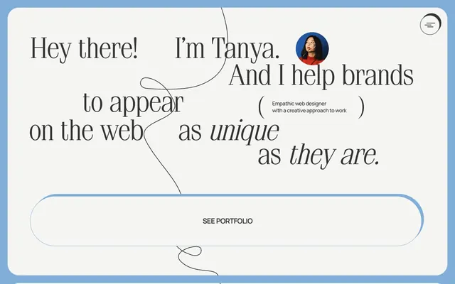
Playful blueprint on textured paper.
Color palette
Outline borders, button backgrounds, input borders, interactive states. This muted blue is the primary accent, providing a calm, professional yet distinct pop of color
Accent borders, occasional decorative elements. A more saturated blue than Sky Blueprint, used for subtle visual differentiation
Link text, decorative accents. This vivid orange creates warmth and draws attention to clickable elements
Page backgrounds, card surfaces, secondary text background. This off-white ensures high contrast with text while providing a warmer, less stark base than pure white
Primary text, strong borders, icons. Used for maximum contrast and emphasis against light backgrounds
Secondary text, input text, subtle borders, some interactive element backgrounds. Provides good readability without the harshness of pure black
Button text (especially on accent colors), some subtle element borders
Typography
- Weights
- 300, 400
- Sizes
- 16px, 18px, 24px, 30px, 46px, 48px, 80px
- Line height
- 1, 1.2, 1.33, 1.35, 1.54, 1.55, 1.56
- Fallback
- Playfair Display
Headlines, expressive display text, and key narrative elements. Its elegant serif form provides a sense of craftsmanship and established authority, especially at larger sizes.
- Weights
- 400, 500, 600
- Sizes
- 12px, 13px, 14px, 16px, 18px
- Line height
- 1.2, 1.29, 1.33, 1.36, 1.38, 1.4, 1.42, 1.43, 1.45, 1.56, 1.57, 1.58
- Letter spacing
- -0.0360em
- Fallback
- Inter
Body text, navigation, and compact UI labels. The consistent, modern sans-serif provides strong readability and a contemporary feel, especially with its slight negative letter-spacing for tightness.
- Weights
- 400
- Sizes
- 16px
- Line height
- 1.2
- Fallback
- Times New Roman
Body text, icon labels, and secondary information on cards. Used sparingly, providing a classic, academic contrast to the primary sans-serif where a more traditional feel is desired.
- Weights
- 450
- Sizes
- 14px
- Line height
- 1.2
- Fallback
- Helvetica Neue
Minor labels and specific UI elements requiring a precise, condensed look.
Spacing & shape
Elevation
Components
Filled with Sky Blueprint (#81aed9), text in Cloud White (#ffffff). Radius is 50px for a soft, pill-like shape. Padding 0px vertical, 15px horizontal.
Canvas White (#f5f5f3) background with Ink Black (#000000) 5px -5px 0px 0px offset shadow. Corner radius of 20px. Internal padding is 48px on all sides.
Background in Sky Blueprint (#81aed9). Radius is 30px. No box shadow. Internal padding is 0px.
Transparent background with a bottom border of Sky Blueprint (#81aed9). Text in Deep Charcoal (#333333). Radius of 30px, with 10px top padding, 20px horizontal padding, and 0px bottom padding. Placeholder text is in Sky Blueprint.
Canvas White (#f5f5f3) background. Radius of 20px or 30px. No box shadow. Padding is 0px.
Ink Black (#000000) lines on a Cloud White (#ffffff) circular background, bordered by Canvas White.
Guidelines
- Use Sky Blueprint (#81aed9) as the primary accent color for all main interactive elements and borders.
- Apply Simeiz font for all heading and display text, prioritizing weights 300 and 400 at larger sizes for an elegant feel.
- Utilize an offset box-shadow of 5px -5px 0px 0px with Deep Charcoal (#333333) for elevated card elements to create a distinctive visual pop.
- Implement a default border-radius of 50px for primary action buttons to achieve a soft, pill-like appearance.
- Maintain a compact visual density, using 10px as a common element gap and 48px for internal card padding for a contained feel.
- Ensure primary text uses Ink Black (#000000) for maximum contrast against Canvas White (#f5f5f3) backgrounds.
- Introduce Sunset Orange (#ff8562) only for critical inline links, creating visual warmth and hierarchy.
- Avoid using multiple chromatic colors; stick primarily to Sky Blueprint as the main brand accent and Sunset Orange specifically for links.
- Do not use heavy, dark backgrounds for sections; maintain Canvas White (#f5f5f3) or Cloud White (#ffffff) as dominant surfaces.
- Refrain from using strong, block-like shadows; the distinctive offset shadow is key to the brand's playful elevation.
- Do not deviate from the established border radii; roundness is a key identifier for buttons (50px), inputs (30px), and cards (20px/30px).
- Avoid excessive spacing between elements or sections; the design favors a 'compact' density, so larger gaps should be deliberate and functional.
- Do not use bold weights for Simeiz font; the brand's heading style relies on the lighter 300 or 400 weights for its restrained elegance.
- Do not apply text decoration (underline) on non-link text to avoid confusion; links are primarily identified by Sunset Orange (#ff8562).
About this system
ShowHide
Dyotanya's visual system evokes a playful, hand-drawn blueprint aesthetic. It combines elegant serif typography with a stark, compact sans-serif, all set against a canvas of near-white. A single muted blue creates soft accents and interactive elements, often appearing as subtle borders. Dynamic, offset shadows add a touch of whimsy and depth to cards and elements, disrupting the otherwise flat surfaces.
The page adopts a max-width contained layout, allowing generous external padding that is bordered by a Sky Blueprint frame. The hero section features large, expressive Simeiz typography, dynamically arranged and sometimes overlapping with subtle graphical elements like the decorative curly line. Further sections alternate between white and muted backgrounds (though not explicitly shown in data, implied by general design contrast). Content is arranged in alternating text-left/image-right or vertical stacks. Card grids are prominent for portfolio items, featuring distinct offset shadows. The layout emphasizes ample whitespace and visual hierarchy, with a clear focus on typography in the hero area and organized content blocks below. Navigation is minimal, featuring a discreet hamburger menu in the top right.
The imagery style is minimalist and strategic, primarily featuring product shots or abstract elements contained within rounded shapes. Photography, where present (like the portrait or client work examples), uses a clean, high-key treatment, often desaturated or monochrome, allowing the colorful UI elements to stand out. Icons are simple, outlined, and monochromatic (Ink Black), complementing the hand-drawn aesthetic. Animated curly lines act as decorative dividers, adding to the 'blueprint' feel. Imagery serves to showcase work or add subtle visual interest rather than being a dominant content driver, maintaining a text-dominant hierarchy.
Reminiscent of Figma, Webflow, Basement Studio, Linear.
# Dyotanya — Style Reference
> Playful blueprint on textured paper.

**Theme:** light

**Site:** https://dyotanya.com/en

Dyotanya's visual system evokes a playful, hand-drawn blueprint aesthetic. It combines elegant serif typography with a stark, compact sans-serif, all set against a canvas of near-white. A single muted blue creates soft accents and interactive elements, often appearing as subtle borders. Dynamic, offset shadows add a touch of whimsy and depth to cards and elements, disrupting the otherwise flat surfaces.

## Tokens — Colors

| Name | Value | Token | Role |
|------|------|------|------|
| Sky Blueprint | `#81aed9` | `--color-sky-blueprint` | Outline borders, button backgrounds, input borders, interactive states. This muted blue is the primary accent, providing a calm, professional yet distinct pop of color |
| Vivid Blue | `#55a1ea` | `--color-vivid-blue` | Accent borders, occasional decorative elements. A more saturated blue than Sky Blueprint, used for subtle visual differentiation |
| Sunset Orange | `#ff8562` | `--color-sunset-orange` | Link text, decorative accents. This vivid orange creates warmth and draws attention to clickable elements |
| Canvas White | `#f5f5f3` | `--color-canvas-white` | Page backgrounds, card surfaces, secondary text background. This off-white ensures high contrast with text while providing a warmer, less stark base than pure white |
| Ink Black | `#000000` | `--color-ink-black` | Primary text, strong borders, icons. Used for maximum contrast and emphasis against light backgrounds |
| Deep Charcoal | `#333333` | `--color-deep-charcoal` | Secondary text, input text, subtle borders, some interactive element backgrounds. Provides good readability without the harshness of pure black |
| Cloud White | `#ffffff` | `--color-cloud-white` | Button text (especially on accent colors), some subtle element borders |

## Tokens — Typography

### Simeiz
- **Substitute:** Playfair Display
- **Weights:** 300, 400
- **Sizes:** 16px, 18px, 24px, 30px, 46px, 48px, 80px
- **Line height:** 1, 1.2, 1.33, 1.35, 1.54, 1.55, 1.56
- **Role:** Headlines, expressive display text, and key narrative elements. Its elegant serif form provides a sense of craftsmanship and established authority, especially at larger sizes.

### Manrope
- **Substitute:** Inter
- **Weights:** 400, 500, 600
- **Sizes:** 12px, 13px, 14px, 16px, 18px
- **Line height:** 1.2, 1.29, 1.33, 1.36, 1.38, 1.4, 1.42, 1.43, 1.45, 1.56, 1.57, 1.58
- **Letter spacing:** -0.0360em
- **Role:** Body text, navigation, and compact UI labels. The consistent, modern sans-serif provides strong readability and a contemporary feel, especially with its slight negative letter-spacing for tightness.

### Times
- **Substitute:** Times New Roman
- **Weights:** 400
- **Sizes:** 16px
- **Line height:** 1.2
- **Role:** Body text, icon labels, and secondary information on cards. Used sparingly, providing a classic, academic contrast to the primary sans-serif where a more traditional feel is desired.

### Suisse Intl
- **Substitute:** Helvetica Neue
- **Weights:** 450
- **Sizes:** 14px
- **Line height:** 1.2
- **Role:** Minor labels and specific UI elements requiring a precise, condensed look.

## Tokens — Type Scale

| Role | Size | Line height | Letter spacing |
|------|------|------|------|
| caption | 12px | 1.4 | — |
| body | 14px | 1.4 | — |
| body-lg | 16px | 1.2 | — |
| subheading | 18px | 1.35 | — |
| heading | 24px | 1.33 | — |
| heading-lg | 30px | 1.54 | — |
| display | 80px | 1 | — |

## Tokens — Spacing

- **Section gap:** 48px
- **Card padding:** 48px
- **Element gap:** 10px

## Tokens — Radius

- **Buttons:** 50px
- **Inputs:** 30px
- **Cards:** 20px
- **tags:** 3000px

## Tokens — Elevation

- **Card:** `rgb(51, 51, 51) 5px -5px 0px 0px`
- **Other elements:** `rgb(51, 51, 51) 4px -4px 0px 0px`

## Layout

The page adopts a max-width contained layout, allowing generous external padding that is bordered by a Sky Blueprint frame. The hero section features large, expressive Simeiz typography, dynamically arranged and sometimes overlapping with subtle graphical elements like the decorative curly line. Further sections alternate between white and muted backgrounds (though not explicitly shown in data, implied by general design contrast). Content is arranged in alternating text-left/image-right or vertical stacks. Card grids are prominent for portfolio items, featuring distinct offset shadows. The layout emphasizes ample whitespace and visual hierarchy, with a clear focus on typography in the hero area and organized content blocks below. Navigation is minimal, featuring a discreet hamburger menu in the top right.

## Imagery

The imagery style is minimalist and strategic, primarily featuring product shots or abstract elements contained within rounded shapes. Photography, where present (like the portrait or client work examples), uses a clean, high-key treatment, often desaturated or monochrome, allowing the colorful UI elements to stand out. Icons are simple, outlined, and monochromatic (Ink Black), complementing the hand-drawn aesthetic. Animated curly lines act as decorative dividers, adding to the 'blueprint' feel. Imagery serves to showcase work or add subtle visual interest rather than being a dominant content driver, maintaining a text-dominant hierarchy.

## Components

### Primary Filled Button
*Call to action.*

Filled with Sky Blueprint (#81aed9), text in Cloud White (#ffffff). Radius is 50px for a soft, pill-like shape. Padding 0px vertical, 15px horizontal.

### Outline Card with Shadow
*Feature cards, portfolio items.*

Canvas White (#f5f5f3) background with Ink Black (#000000) 5px -5px 0px 0px offset shadow. Corner radius of 20px. Internal padding is 48px on all sides.

### Accent Card
*Highlighting specific content.*

Background in Sky Blueprint (#81aed9). Radius is 30px. No box shadow. Internal padding is 0px.

### Round Input Field
*User input.*

Transparent background with a bottom border of Sky Blueprint (#81aed9). Text in Deep Charcoal (#333333). Radius of 30px, with 10px top padding, 20px horizontal padding, and 0px bottom padding. Placeholder text is in Sky Blueprint.

### Thin Border Card
*Secondary content containers, subtle grouping.*

Canvas White (#f5f5f3) background. Radius of 20px or 30px. No box shadow. Padding is 0px.

### Hamburger Menu Icon
*Navigation toggle.*

Ink Black (#000000) lines on a Cloud White (#ffffff) circular background, bordered by Canvas White.

## Guidelines

### Do

- Use Sky Blueprint (#81aed9) as the primary accent color for all main interactive elements and borders.
- Apply Simeiz font for all heading and display text, prioritizing weights 300 and 400 at larger sizes for an elegant feel.
- Utilize an offset box-shadow of 5px -5px 0px 0px with Deep Charcoal (#333333) for elevated card elements to create a distinctive visual pop.
- Implement a default border-radius of 50px for primary action buttons to achieve a soft, pill-like appearance.
- Maintain a compact visual density, using 10px as a common element gap and 48px for internal card padding for a contained feel.
- Ensure primary text uses Ink Black (#000000) for maximum contrast against Canvas White (#f5f5f3) backgrounds.
- Introduce Sunset Orange (#ff8562) only for critical inline links, creating visual warmth and hierarchy.

### Don't

- Avoid using multiple chromatic colors; stick primarily to Sky Blueprint as the main brand accent and Sunset Orange specifically for links.
- Do not use heavy, dark backgrounds for sections; maintain Canvas White (#f5f5f3) or Cloud White (#ffffff) as dominant surfaces.
- Refrain from using strong, block-like shadows; the distinctive offset shadow is key to the brand's playful elevation.
- Do not deviate from the established border radii; roundness is a key identifier for buttons (50px), inputs (30px), and cards (20px/30px).
- Avoid excessive spacing between elements or sections; the design favors a 'compact' density, so larger gaps should be deliberate and functional.
- Do not use bold weights for Simeiz font; the brand's heading style relies on the lighter 300 or 400 weights for its restrained elegance.
- Do not apply text decoration (underline) on non-link text to avoid confusion; links are primarily identified by Sunset Orange (#ff8562).

## Agent Prompt Guide

Quick Color Reference:
text: #000000
background: #f5f5f3
border: #81aed9
accent: #ff8562
primary action: #81aed9 (filled action)

Example Component Prompts:
1. Create a Primary Action Button: #81aed9 background, #000000 text, 9999px radius, compact pill padding. Use this filled treatment for the main CTA.
2. Design a portfolio card: background #f5f5f3, borders 20px radius, shadow #333333 5px -5px 0px 0px, internal padding 48px. Headline text should be Simeiz 24px weight 400, color #000000.
3. Implement an input field: transparent background, bottom border #81aed9, text #333333, radius 30px, horizontal padding 20px, top padding 10px. Placeholder text is Manrope 16px weight 400 in #81aed9.
4. Produce a link: text color #ff8562, font Manrope 16px weight 400. Not underlined.
More like this









Keep what you find
A free account saves references to boards and can send you a weekly email of picks based on what you save.
To see every result, go Pro.