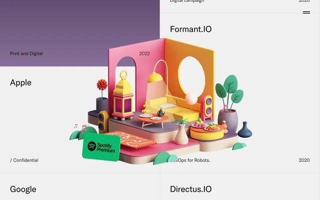
Preview image. Unlock full-res
Gray canvas, vivid art
Color palette
Decorative background gradient, used for specific showcased projects
Dark borders and separators for elevated surfaces and inverted UI. Do not promote it to the primary CTA color
Subtle card and section borders, soft dividers
Card backgrounds, secondary surface areas
Navigation text, high-contrast borders
Typography
- Weights
- 200, 300, 400
- Sizes
- 16px, 21px, 38px
- Line height
- 1, 1.31, 1.32, 2.37
- Fallback
- Inter
The primary typeface for all textual content. Its varied weights are used to establish hierarchy, with lighter weights (200, 300) lending a contemporary, understated feel to headings and an almost monospaced quality to body text at smaller sizes.
Spacing & shape
Components
Ghost button with no background: rgba(0, 0, 0, 0). Uses a 1px #000000 border and no border radius (0px). Padding is 15px top/bottom, 10px left/right. Text color is #000000, font GT America, weight 400.
A monolithic rectangular block with no border radius (0px) and no shadows. Background is #f0f0f0. Internal padding is 45px on all sides. Content includes headings, subheadings, and occasionally date stamps. These cards are the 'canvas' for embedded rich media.
Similar to the standard Project Card but with a transparent background (rgba(0, 0, 0, 0)), allowing underlying visuals to show through. No border radius (0px) and no shadows. Internal padding is 45px on all sides.
Guidelines
- Employ GT America for all typographic elements, prioritizing weights 200-400 for a precise feel.
- Maintain a strict 0px border-radius for all UI elements to uphold the stark, architectural aesthetic.
- Use #000000 for primary text and critical interactive borders.
- Utilize #f0f0f0 for all background surfaces of content blocks and cards.
- Ensure generous padding of 45px within card-like components to frame content effectively.
- Construct layouts with substantial vertical separation, mirroring the ~720px section gaps found between project articles.
- Favor ghost-style interactive elements with stark #000000 borders and transparent backgrounds.
- Avoid using curved borders or any border-radius greater than 0px.
- Do not introduce shadows or elevation effects; maintain a flat, layered appearance.
- Refrain from adding additional accent colors outside of the contextual usage within embedded content; the UI should remain achromatic.
- Do not use subtle variations of gray for text; stick to #000000 for all primary text content.
- Avoid dense or compact layouts; maintain ample whitespace for a gallery-like presentation.
About this system
ShowHide
Petertarka's visual system evokes a gallery of abstract works: a muted, almost achromatic canvas where individual 'art pieces' (product showcases) are presented in their own vibrantly colored, often 3D-rendered, contexts. The UI itself is minimalist, relying on precise typography and stark line borders rather than heavy shadows or complex gradients. The spacious layout creates a sense of gravitas and focuses attention on the central visual content, punctuated by crisp, interactive elements.
The page adheres to a full-bleed grid layout, where content sections (project cards) span the full width of the viewport. There is no central max-width container, giving a sense of expansive space. The hero section is characterized by a prominent visual taking up a large portion of the initial viewport. Sections stack vertically with significant and consistent spacing, presenting a rhythmic, almost modular progression. Content within sections is often implicitly split into visual and textual areas, but the overall structure emphasizes the contained visual artwork. Navigation is minimal, typically a top-right hamburger menu. The layout feels like a vertical gallery, with each 'artwork' given ample room to breathe.
This site prominently features highly stylized, often surreal 3D illustrations and renders as its core content. These visuals are typically contained within the 0px-radius project cards, occupying significant visual space. The imagery is diverse in color and composition, ranging from vibrant, cartoonish scenes to more abstract, textured pieces, with a strong emphasis on clean digital rendering. Product screenshots or photography are minimal, and when present, are integrated seamlessly into the rendered scenes. Icons are minimal, appearing only for UI elements (like the hamburger menu) in a simple, outlined style.
Reminiscent of B&O (Bang & Olufsen), Certain Apple marketing pages, Anagram (design studio), Herman Miller (product pages), Are.na.
# Petertarka — Style Reference
> Gray canvas, vivid art

**Theme:** light

**Site:** https://petertarka.com

Petertarka's visual system evokes a gallery of abstract works: a muted, almost achromatic canvas where individual 'art pieces' (product showcases) are presented in their own vibrantly colored, often 3D-rendered, contexts. The UI itself is minimalist, relying on precise typography and stark line borders rather than heavy shadows or complex gradients. The spacious layout creates a sense of gravitas and focuses attention on the central visual content, punctuated by crisp, interactive elements.

## Tokens — Colors

| Name | Value | Token | Role |
|------|------|------|------|
| Sky Gradient | `#77c1e5` | `--color-sky-gradient` | Decorative background gradient, used for specific showcased projects |
| Phantom Ink | `#000000` | `--color-phantom-ink` | Dark borders and separators for elevated surfaces and inverted UI. Do not promote it to the primary CTA color |
| Fog Bound | `#d8d8d8` | `--color-fog-bound` | Subtle card and section borders, soft dividers |
| Canvas Gray | `#f0f0f0` | `--color-canvas-gray` | Card backgrounds, secondary surface areas |
| Paper White | `#ffffff` | `--color-paper-white` | Navigation text, high-contrast borders |

## Tokens — Typography

### GT America
- **Substitute:** Inter
- **Weights:** 200, 300, 400
- **Sizes:** 16px, 21px, 38px
- **Line height:** 1, 1.31, 1.32, 2.37
- **Role:** The primary typeface for all textual content. Its varied weights are used to establish hierarchy, with lighter weights (200, 300) lending a contemporary, understated feel to headings and an almost monospaced quality to body text at smaller sizes.

## Tokens — Type Scale

| Role | Size | Line height | Letter spacing |
|------|------|------|------|
| caption | 16px | 1.32 | — |
| body-sm | 21px | 1.32 | — |
| body | 38px | 1.3 | — |

## Tokens — Spacing

- **Card padding:** 45px
- **Element gap:** 6px

## Tokens — Radius

- **none:** 0px

## Layout

The page adheres to a full-bleed grid layout, where content sections (project cards) span the full width of the viewport. There is no central max-width container, giving a sense of expansive space. The hero section is characterized by a prominent visual taking up a large portion of the initial viewport. Sections stack vertically with significant and consistent spacing, presenting a rhythmic, almost modular progression. Content within sections is often implicitly split into visual and textual areas, but the overall structure emphasizes the contained visual artwork. Navigation is minimal, typically a top-right hamburger menu. The layout feels like a vertical gallery, with each 'artwork' given ample room to breathe.

## Imagery

This site prominently features highly stylized, often surreal 3D illustrations and renders as its core content. These visuals are typically contained within the 0px-radius project cards, occupying significant visual space. The imagery is diverse in color and composition, ranging from vibrant, cartoonish scenes to more abstract, textured pieces, with a strong emphasis on clean digital rendering. Product screenshots or photography are minimal, and when present, are integrated seamlessly into the rendered scenes. Icons are minimal, appearing only for UI elements (like the hamburger menu) in a simple, outlined style.

## Components

### Main Navigation Button
*Hamburger menu button for main navigation*

Ghost button with no background: rgba(0, 0, 0, 0). Uses a 1px #000000 border and no border radius (0px). Padding is 15px top/bottom, 10px left/right. Text color is #000000, font GT America, weight 400.

### Project Card
*Container for individual project showcases*

A monolithic rectangular block with no border radius (0px) and no shadows. Background is #f0f0f0. Internal padding is 45px on all sides. Content includes headings, subheadings, and occasionally date stamps. These cards are the 'canvas' for embedded rich media.

### Project Card - Transparent
*Alternative container for specific project showcases, overlays visual content*

Similar to the standard Project Card but with a transparent background (rgba(0, 0, 0, 0)), allowing underlying visuals to show through. No border radius (0px) and no shadows. Internal padding is 45px on all sides.

## Guidelines

### Do

- Employ GT America for all typographic elements, prioritizing weights 200-400 for a precise feel.
- Maintain a strict 0px border-radius for all UI elements to uphold the stark, architectural aesthetic.
- Use #000000 for primary text and critical interactive borders.
- Utilize #f0f0f0 for all background surfaces of content blocks and cards.
- Ensure generous padding of 45px within card-like components to frame content effectively.
- Construct layouts with substantial vertical separation, mirroring the ~720px section gaps found between project articles.
- Favor ghost-style interactive elements with stark #000000 borders and transparent backgrounds.

### Don't

- Avoid using curved borders or any border-radius greater than 0px.
- Do not introduce shadows or elevation effects; maintain a flat, layered appearance.
- Refrain from adding additional accent colors outside of the contextual usage within embedded content; the UI should remain achromatic.
- Do not use subtle variations of gray for text; stick to #000000 for all primary text content.
- Avoid dense or compact layouts; maintain ample whitespace for a gallery-like presentation.

## Agent Prompt Guide

Quick Color Reference:
text: #000000
background: #f0f0f0
border: #000000
accent: #77c1e5
primary action: no distinct CTA color

Example Component Prompts:
Create a primary heading for a project: 'Green Mountain Energy' in GT America, weight 300, size 38px, color #000000, line height 1.0.
Create a project card titled 'Formant.IO': Background #f0f0f0, 0px border-radius, 45px padding on all sides. Inside, display a text label '2022' using GT America, weight 400, size 16px, color #000000. Underneath, add the heading 'Formant.IO' using GT America, weight 300, size 38px, color #000000.
Create a navigation button: 'Commercial' text in GT America, weight 400, size 16px, color #000000. The button is ghost style with a background of rgba(0,0,0,0), a 1px solid #000000 border, 0px border-radius, and 15px top/bottom padding with 10px left/right padding.
More like this









Keep what you find
A free account saves references to boards and can send you a weekly email of picks based on what you save.
To see every result, go Pro.