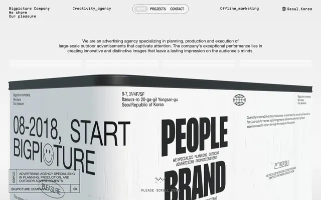
Preview image. Unlock full-res
crumpled paper manifesto
Color palette
Primary text, heading text, critical UI borders, icon fills. The dominant dark element against light surfaces
Primary page background, component backgrounds (e.g., navigation items) for visual separation
Subtle background for card-like elements, secondary surfaces, and borders to create slight depth without hard lines
Muted borders, decorative strokes, and subtle dividing lines, suggesting a lighter impression or an older print
Typography
- Weights
- 400, 500, 700
- Sizes
- 14px, 15px, 16px, 17px, 20px, 75px, 274px
- Line height
- 1, 1.05, 1.06, 1.14, 1.2, 1.29, 1.3, 1.6
- Letter spacing
- -0.0400em for largest sizes (274px), -0.0100em for mid-range (75px), normal for body text
- Fallback
- Arial
Primary brand typeface for headings, body copy, and UI elements. Its neutrality allows the large scale and heavy weights to convey impact. The severe tracking for large sizes adds to the industrial aesthetic.
- Weights
- 400
- Sizes
- 13px, 16px, 17px
- Line height
- 1, 1.2, 2
- Letter spacing
- normal
- Fallback
- Space Mono
Monospace secondary text for metadata, labels, and structured information. Provides a technical, archival contrast to the primary sans-serif.
- Weights
- 400
- Sizes
- 17px, 22px
- Line height
- 1, 1.2
- Letter spacing
- normal
- Fallback
- Inter
Used for navigation and specific structural elements. Its clean, geometric form reinforces the minimalist, functional UI.
- Weights
- 400
- Sizes
- 17px
- Line height
- 1.47
- Letter spacing
- -0.0200em
- Fallback
- Architects Daughter
Highly decorative, handwritten-style accent font used sparingly for unique visual statements or callouts, breaking the rigid typographic structure.
Spacing & shape
Components
Completely transparent background with an Ink Black (or sometimes Faded Ink) 1px solid border and Ink Black text. Radius is 28px, making it a pill shape, with 10px vertical and 40px horizontal padding. The border color is subtle, hinting at interactivity without drawing excessive attention.
A button with a background of Paper White or Aged Paper and Ink Black text. It uses a high border-radius of 40px, giving it a strong pill shape. Borders are 1px solid Ink Black or Faded Ink.
A rectangular container with an Aged Paper background, often bordered by Faded Ink (1px solid). Internal padding varies, typically 10px-40px. Corners have a 20px radius.
A small, solid Ink Black star shape used as a non-textual separator or decorative element, often repeating horizontally to create visual rhythm.
Often uses Helvetica Neue at 274px, weight 700, Ink Black text, with severe negative letter-spacing (-0.0400em). Appears directly on the page background without explicit containers, relying on sheer size for impact.
Guidelines
- Prioritize Helvetica Neue, weight 700, for all major headlines and impactful statements, leveraging dramatic scale (e.g., 274px).
- Use distinct negative letter-spacing for large text: -0.0400em for sizes 75px and above, -0.0100em for sizes around 20px.
- Employ Ink Black (#121212) as the default color for all text, essential borders, and icons, creating high contrast.
- Utilize Paper White (#ffffff) for primary page backgrounds and Aged Paper (#f1f1f1) for secondary surfaces to create subtle layered depth.
- Apply a 20px border-radius to general container elements, 28px for navigation items, and 40px for buttons to maintain a consistent rounded but not overly soft aesthetic.
- Use Faded Ink (#e1e1e1) for subtle borders and background textures, suggesting a softer printed line.
- Implement Ghost Navigation Buttons with a 1px solid border in Ink Black and 28px radius for a lightweight, interactive feel.
- Avoid strong accent colors; the system is deliberately monochromatic with high contrast values.
- Do not introduce heavy shadows or overt elevation effects; rely on subtle background color shifts and borders for layering.
- Refrain from using complex gradients; the aesthetic is flat and print-like.
- Do not combine multiple decorative fonts; Rock Salt is used sparingly for unique callouts, not general elements.
- Avoid dense, clustered layouts; maintain generous spacing with sectionGap at 72px and elementGap at 10px for readability and visual breathing room.
- Do not use generic button styles; ensure buttons follow the 40px radius, ghost or outlined appearance with either Ink Black or Faded Ink borders.
- Avoid illustrative imagery that deviates from product screenshots or stark black-and-white graphics; the focus is on typography and texture.
About this system
ShowHide
This design system operates on a 'digital printing press' aesthetic, characterized by an off-white, textured canvas reminiscent of crumpled paper and heavy, monochromatic typography. Visual hierarchy is established through a dramatic scale of bold sans-serif text, often appearing in large, dense blocks. Components are outlined and minimalist, avoiding strong colors or heavy shadows to maintain a lightweight, ephemeral quality, as if printed or drawn onto the background. The overall feel is raw, industrial, and highly graphic, with an emphasis on typographic expression over illustrative elements.
The page primarily uses a full-bleed layout, allowing large typographic and graphic elements to extend to the viewport edges without a fixed max-width. The hero section often presents massive, centered headlines or graphic elements on a full-viewport textured background. Section rhythm is less about alternating bands and more about strong vertical breaks, often marked by massive text blocks or decorative star elements. Content arrangement frequently features centered stacks for headlines and body text, sometimes alternating with large, full-width 'poster-like' graphic sections. There's no evident grid usage for card-like elements, but rather a more freeform, collage-like composition. Density is spacious for text blocks but highly compact and dense within large typographic 'image' sections. Navigation is a minimal, top-aligned bar with ghost buttons, consistent across the page.
The site heavily relies on typographic imagery rather than traditional photographs or illustrations. When present, images appear to be product screenshots or highly stylized, distorted graphics with a strong black-and-white treatment. They are often large-scale, full-bleed, and integrated into the overall visual texture, mimicking large format posters or printed materials. Icons are minimal, outlined, or solid filled in Ink Black, adhering to a consistent, stark visual vocabulary. The density is image-heavy, but these 'images' are primarily textual or abstract graphic elements, making the site feel text-dominant architecturally, even with large visual space allocations.
Reminiscent of ACNE Studios, Balenciaga, Brutalism.website (selected examples), Studio Dumbar, Moments Agency.
# 큰그림컴퍼니 — Style Reference
> crumpled paper manifesto

**Theme:** light

**Site:** https://www.bpco.kr

This design system operates on a 'digital printing press' aesthetic, characterized by an off-white, textured canvas reminiscent of crumpled paper and heavy, monochromatic typography. Visual hierarchy is established through a dramatic scale of bold sans-serif text, often appearing in large, dense blocks. Components are outlined and minimalist, avoiding strong colors or heavy shadows to maintain a lightweight, ephemeral quality, as if printed or drawn onto the background. The overall feel is raw, industrial, and highly graphic, with an emphasis on typographic expression over illustrative elements.

## Tokens — Colors

| Name | Value | Token | Role |
|------|------|------|------|
| Ink Black | `#121212` | `--color-ink-black` | Primary text, heading text, critical UI borders, icon fills. The dominant dark element against light surfaces |
| Paper White | `#ffffff` | `--color-paper-white` | Primary page background, component backgrounds (e.g., navigation items) for visual separation |
| Aged Paper | `#f1f1f1` | `--color-aged-paper` | Subtle background for card-like elements, secondary surfaces, and borders to create slight depth without hard lines |
| Faded Ink | `#e1e1e1` | `--color-faded-ink` | Muted borders, decorative strokes, and subtle dividing lines, suggesting a lighter impression or an older print |

## Tokens — Typography

### Helvetica Neue
- **Substitute:** Arial
- **Weights:** 400, 500, 700
- **Sizes:** 14px, 15px, 16px, 17px, 20px, 75px, 274px
- **Line height:** 1, 1.05, 1.06, 1.14, 1.2, 1.29, 1.3, 1.6
- **Letter spacing:** -0.0400em for largest sizes (274px), -0.0100em for mid-range (75px), normal for body text
- **Role:** Primary brand typeface for headings, body copy, and UI elements. Its neutrality allows the large scale and heavy weights to convey impact. The severe tracking for large sizes adds to the industrial aesthetic.

### PPSupplyMono
- **Substitute:** Space Mono
- **Weights:** 400
- **Sizes:** 13px, 16px, 17px
- **Line height:** 1, 1.2, 2
- **Letter spacing:** normal
- **Role:** Monospace secondary text for metadata, labels, and structured information. Provides a technical, archival contrast to the primary sans-serif.

### PPSupplySans
- **Substitute:** Inter
- **Weights:** 400
- **Sizes:** 17px, 22px
- **Line height:** 1, 1.2
- **Letter spacing:** normal
- **Role:** Used for navigation and specific structural elements. Its clean, geometric form reinforces the minimalist, functional UI.

### Rock Salt
- **Substitute:** Architects Daughter
- **Weights:** 400
- **Sizes:** 17px
- **Line height:** 1.47
- **Letter spacing:** -0.0200em
- **Role:** Highly decorative, handwritten-style accent font used sparingly for unique visual statements or callouts, breaking the rigid typographic structure.

## Tokens — Type Scale

| Role | Size | Line height | Letter spacing |
|------|------|------|------|
| caption | 13px | 2 | — |
| heading | 20px | 1.2 | -0.2px |
| heading-lg | 75px | 1.05 | -0.75px |
| display | 274px | 1 | -10.96px |

## Tokens — Spacing

- **Section gap:** 72px
- **Card padding:** 10-40px
- **Element gap:** 10px

## Tokens — Radius

- **Default:** 20px
- **button:** 40px
- **image:** 288px
- **navigation:** 28px

## Layout

The page primarily uses a full-bleed layout, allowing large typographic and graphic elements to extend to the viewport edges without a fixed max-width. The hero section often presents massive, centered headlines or graphic elements on a full-viewport textured background. Section rhythm is less about alternating bands and more about strong vertical breaks, often marked by massive text blocks or decorative star elements. Content arrangement frequently features centered stacks for headlines and body text, sometimes alternating with large, full-width 'poster-like' graphic sections. There's no evident grid usage for card-like elements, but rather a more freeform, collage-like composition. Density is spacious for text blocks but highly compact and dense within large typographic 'image' sections. Navigation is a minimal, top-aligned bar with ghost buttons, consistent across the page.

## Imagery

The site heavily relies on typographic imagery rather than traditional photographs or illustrations. When present, images appear to be product screenshots or highly stylized, distorted graphics with a strong black-and-white treatment. They are often large-scale, full-bleed, and integrated into the overall visual texture, mimicking large format posters or printed materials. Icons are minimal, outlined, or solid filled in Ink Black, adhering to a consistent, stark visual vocabulary. The density is image-heavy, but these 'images' are primarily textual or abstract graphic elements, making the site feel text-dominant architecturally, even with large visual space allocations.

## Components

### Ghost Navigation Button
*Top navigation items and secondary actions.*

Completely transparent background with an Ink Black (or sometimes Faded Ink) 1px solid border and Ink Black text. Radius is 28px, making it a pill shape, with 10px vertical and 40px horizontal padding. The border color is subtle, hinting at interactivity without drawing excessive attention.

### Rounded Button
*General purpose buttons and tags.*

A button with a background of Paper White or Aged Paper and Ink Black text. It uses a high border-radius of 40px, giving it a strong pill shape. Borders are 1px solid Ink Black or Faded Ink.

### Text Block Container
*Grouped content sections, text-heavy cards.*

A rectangular container with an Aged Paper background, often bordered by Faded Ink (1px solid). Internal padding varies, typically 10px-40px. Corners have a 20px radius.

### Accent Star
*Decorative divider or visual break.*

A small, solid Ink Black star shape used as a non-textual separator or decorative element, often repeating horizontally to create visual rhythm.

### Hero Text Block
*Large, attention-grabbing typographic display.*

Often uses Helvetica Neue at 274px, weight 700, Ink Black text, with severe negative letter-spacing (-0.0400em). Appears directly on the page background without explicit containers, relying on sheer size for impact.

## Guidelines

### Do

- Prioritize Helvetica Neue, weight 700, for all major headlines and impactful statements, leveraging dramatic scale (e.g., 274px).
- Use distinct negative letter-spacing for large text: -0.0400em for sizes 75px and above, -0.0100em for sizes around 20px.
- Employ Ink Black (#121212) as the default color for all text, essential borders, and icons, creating high contrast.
- Utilize Paper White (#ffffff) for primary page backgrounds and Aged Paper (#f1f1f1) for secondary surfaces to create subtle layered depth.
- Apply a 20px border-radius to general container elements, 28px for navigation items, and 40px for buttons to maintain a consistent rounded but not overly soft aesthetic.
- Use Faded Ink (#e1e1e1) for subtle borders and background textures, suggesting a softer printed line.
- Implement Ghost Navigation Buttons with a 1px solid border in Ink Black and 28px radius for a lightweight, interactive feel.

### Don't

- Avoid strong accent colors; the system is deliberately monochromatic with high contrast values.
- Do not introduce heavy shadows or overt elevation effects; rely on subtle background color shifts and borders for layering.
- Refrain from using complex gradients; the aesthetic is flat and print-like.
- Do not combine multiple decorative fonts; Rock Salt is used sparingly for unique callouts, not general elements.
- Avoid dense, clustered layouts; maintain generous spacing with sectionGap at 72px and elementGap at 10px for readability and visual breathing room.
- Do not use generic button styles; ensure buttons follow the 40px radius, ghost or outlined appearance with either Ink Black or Faded Ink borders.
- Avoid illustrative imagery that deviates from product screenshots or stark black-and-white graphics; the focus is on typography and texture.

## Agent Prompt Guide

Quick Color Reference:
text: #121212
background: #ffffff
border: #121212
accent: no distinct accent color
primary action: no distinct CTA color

Example Component Prompts:
1. Create a Hero Headline: Display text 'BIG PICTURE' in Helvetica Neue, size 274px, weight 700, Ink Black (#121212), line-height 1.0, letter-spacing -10.96px, centered on Paper White (#ffffff) background.
2. Create a Ghost Navigation Button: Text 'PROJECTS' in PPSupplySans, size 17px, weight 400, Ink Black (#121212). 1px solid Ink Black (#121212) border with 28px radius. Padding 10px vertical, 40px horizontal. Background transparent.
3. Create a Content Block: Background Aged Paper (#f1f1f1), 1px solid Faded Ink (#e1e1e1) border, 20px radius. Inside, use Helvetica Neue body text size 15px, weight 400, Ink Black (#121212), line-height 1.6. Padding 40px.
4. Create a Monospace Caption: Text '08-2018, START' in PPSupplyMono, size 13px, weight 400, Ink Black (#121212), line-height 2.0.
More like this









Keep what you find
A free account saves references to boards and can send you a weekly email of picks based on what you save.
To see every result, go Pro.