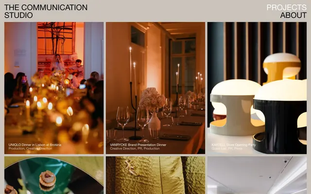
Preview image. Unlock full-res
Gallery Grid on Canvas
Color palette
Page background, primary surface for content sections
Subtle borders for content modules, image frames, and outline for focus states. Its near-white quality provides a delicate visual separation
Primary headings, body text, and icon fills on light surfaces. Do not promote it to the primary CTA color
Muted text for navigation items in the header, and project titles overlaid on dark images, providing visual contrast
Typography
- Weights
- 400
- Sizes
- 15px, 20px, 36px
- Line height
- 0.8, 1, 1.13, 1.15
- Fallback
- Arial
The sole typeface, used across all elements. Its consistent weight (400) reinforces the understated, functional aesthetic. Varying sizes provide hierarchy without introducing visual noise through different weights or fonts.
Spacing & shape
Components
Each card is a borderless container, allowing the image to define its boundaries. Text overlays are used for titles and descriptions. Background is transparent with a 0px border-radius, presenting a clean, unadorned visual.
Text is overlaid directly onto project images. Uses Type Ink (#000000) for general projects, but switches to Text Ghost (#ffffff) when images are dark to maintain legibility. Typography is 15px Helvetica Neue weight 400 with a line height of 1.15.
Guidelines
- Prioritize image content: allow rich photography to dominate the visual space, framing them without heavy UI elements.
- Maintain an achromatic canvas: use Canvas Fog (#dad5cf) for primary backgrounds and Border Ash (#e5e7eb) for subtle structural borders, ensuring photography is the main source of color.
- Uncluttered navigation: implement minimalist navigation with Text Ghost (#ffffff) against dark headers and Type Ink (#000000) against lighter sections.
- Use Helvetica Neue weight 400 for all text: create hierarchy solely through font size (15px, 20px, 36px) and line height, not varying weights.
- Employ square, sharp-edged imagery: all imagery and cards should have a 0px border-radius, emphasizing a gallery-like presentation.
- Structure content in tight, borderless grids for projects: rely on the natural boundaries of images rather than explicit card borders or heavy padding.
- Use Type Ink (#000000) for all main body and heading text for strong contrast against backgrounds.
- Do not introduce strong accent colors: color should primarily come from project photography, not UI elements.
- Avoid decorative shadows or complex elevation: maintain a flat, clean aesthetic with no box shadows for cards or images.
- Do not vary font weights: stick strictly to Helvetica Neue weight 400 as the only text weight to uphold consistency and subtlety.
- Refrain from using heavily padded or bordered components: keep elements visually lightweight and seamless.
- Do not use rounded corners: all visual elements, especially images and content blocks, must retain sharp, 0px corners.
- Avoid excessive whitespace between project grid items: maintain a comfortable 10px element gap for a cohesive gallery feel.
- Do not add any explicit CTA background colors: user interaction is indicated by text color changes and subtle hover effects, not filled buttons.
About this system
ShowHide
The Communication Studio employs a refined, subdued aesthetic reminiscent of gallery curation. Projects are presented as a grid of art pieces, framed with subtle borders and minimal text overlays. The palette is predominantly achromatic, allowing the richly colored photography to take center stage. Typography is clean and functional, supporting the visual content without distraction, creating a calm and contemplative browsing experience centered on visual storytelling.
The page employs a full-width and contained model; while the main content is within a horizontal flow, the header elements are distributed across the full width. The hero section is characterized by a prominent background image that defines the initial visual impact. Content is arranged in a dense, uniform grid of three columns, creating a gallery-like presentation for projects. Sections flow seamlessly with consistent vertical spacing (18px section gap), lacking explicit dividers, allowing images to define the visual rhythm. Navigation is minimal, limited to a sticky header with a few links.
This site predominantly uses high-quality, product-focused, and event photography. Images are presented full-bleed within their grid containers, with crisp, sharp edges (0px border-radius). The photography covers a range of lighting from high-key product shots to moodier event scenes, often with rich, saturated colors that stand out against the achromatic UI. Imagery serves as both atmospheric and explanatory content, showcasing projects and experiences. The visual density is image-heavy, with text serving as minimal overlay or supportive captions.
Reminiscent of A24 (Studio), Moment Factory, The Brand Union (now Superunion), Certain Measures.
# The Communication Studio — Style Reference
> Gallery Grid on Canvas

**Theme:** light

**Site:** https://thecommunicationstudio.pt

The Communication Studio employs a refined, subdued aesthetic reminiscent of gallery curation. Projects are presented as a grid of art pieces, framed with subtle borders and minimal text overlays. The palette is predominantly achromatic, allowing the richly colored photography to take center stage. Typography is clean and functional, supporting the visual content without distraction, creating a calm and contemplative browsing experience centered on visual storytelling.

## Tokens — Colors

| Name | Value | Token | Role |
|------|------|------|------|
| Canvas Fog | `#dad5cf` | `--color-canvas-fog` | Page background, primary surface for content sections |
| Border Ash | `#e5e7eb` | `--color-border-ash` | Subtle borders for content modules, image frames, and outline for focus states. Its near-white quality provides a delicate visual separation |
| Type Ink | `#000000` | `--color-type-ink` | Primary headings, body text, and icon fills on light surfaces. Do not promote it to the primary CTA color |
| Text Ghost | `#ffffff` | `--color-text-ghost` | Muted text for navigation items in the header, and project titles overlaid on dark images, providing visual contrast |

## Tokens — Typography

### Helvetica Neue
- **Substitute:** Arial
- **Weights:** 400
- **Sizes:** 15px, 20px, 36px
- **Line height:** 0.8, 1, 1.13, 1.15
- **Role:** The sole typeface, used across all elements. Its consistent weight (400) reinforces the understated, functional aesthetic. Varying sizes provide hierarchy without introducing visual noise through different weights or fonts.

## Tokens — Type Scale

| Role | Size | Line height | Letter spacing |
|------|------|------|------|
| body | 15px | 1.15 | — |
| heading-sm | 20px | 1.13 | — |
| heading | 36px | 1 | — |

## Tokens — Spacing

- **Card padding:** 0px
- **Element gap:** 10px

## Tokens — Radius

- **Cards:** 0px
- **Images:** 0px

## Layout

The page employs a full-width and contained model; while the main content is within a horizontal flow, the header elements are distributed across the full width. The hero section is characterized by a prominent background image that defines the initial visual impact. Content is arranged in a dense, uniform grid of three columns, creating a gallery-like presentation for projects. Sections flow seamlessly with consistent vertical spacing (18px section gap), lacking explicit dividers, allowing images to define the visual rhythm. Navigation is minimal, limited to a sticky header with a few links.

## Imagery

This site predominantly uses high-quality, product-focused, and event photography. Images are presented full-bleed within their grid containers, with crisp, sharp edges (0px border-radius). The photography covers a range of lighting from high-key product shots to moodier event scenes, often with rich, saturated colors that stand out against the achromatic UI. Imagery serves as both atmospheric and explanatory content, showcasing projects and experiences. The visual density is image-heavy, with text serving as minimal overlay or supportive captions.

## Components

### Project Gallery Card
*Displays individual project entries within a grid.*

Each card is a borderless container, allowing the image to define its boundaries. Text overlays are used for titles and descriptions. Background is transparent with a 0px border-radius, presenting a clean, unadorned visual.

### Image Overlay Text (Project Title)
*Provides context and title for project images.*

Text is overlaid directly onto project images. Uses Type Ink (#000000) for general projects, but switches to Text Ghost (#ffffff) when images are dark to maintain legibility. Typography is 15px Helvetica Neue weight 400 with a line height of 1.15.

## Guidelines

### Do

- Prioritize image content: allow rich photography to dominate the visual space, framing them without heavy UI elements.
- Maintain an achromatic canvas: use Canvas Fog (#dad5cf) for primary backgrounds and Border Ash (#e5e7eb) for subtle structural borders, ensuring photography is the main source of color.
- Uncluttered navigation: implement minimalist navigation with Text Ghost (#ffffff) against dark headers and Type Ink (#000000) against lighter sections.
- Use Helvetica Neue weight 400 for all text: create hierarchy solely through font size (15px, 20px, 36px) and line height, not varying weights.
- Employ square, sharp-edged imagery: all imagery and cards should have a 0px border-radius, emphasizing a gallery-like presentation.
- Structure content in tight, borderless grids for projects: rely on the natural boundaries of images rather than explicit card borders or heavy padding.
- Use Type Ink (#000000) for all main body and heading text for strong contrast against backgrounds.

### Don't

- Do not introduce strong accent colors: color should primarily come from project photography, not UI elements.
- Avoid decorative shadows or complex elevation: maintain a flat, clean aesthetic with no box shadows for cards or images.
- Do not vary font weights: stick strictly to Helvetica Neue weight 400 as the only text weight to uphold consistency and subtlety.
- Refrain from using heavily padded or bordered components: keep elements visually lightweight and seamless.
- Do not use rounded corners: all visual elements, especially images and content blocks, must retain sharp, 0px corners.
- Avoid excessive whitespace between project grid items: maintain a comfortable 10px element gap for a cohesive gallery feel.
- Do not add any explicit CTA background colors: user interaction is indicated by text color changes and subtle hover effects, not filled buttons.

## Agent Prompt Guide

Quick Color Reference:
text: #000000
background: #dad5cf
border: #e5e7eb
accent: no distinct accent color
primary action: no distinct CTA color

Example Component Prompts:
1. Create a top navigation bar: Canvas Fog (#dad5cf) background, 'THE COMMUNICATION STUDIO' as 36px Helvetica Neue weight 400 Type Ink (#000000) on the left, and 'PROJECTS' and 'ABOUT' as 20px Helvetica Neue weight 400 Text Ghost (#ffffff) on the right, floating over a dark background image area.
2. Design a project grid item with an image: Use an image with 0px radius, 0px padding. Overlay 'UNIQLO Dinner in Lisbon at Brotéria' as 15px Helvetica Neue weight 400 Type Ink (#000000) text on the bottom left, followed by 'Production, Creative Direction' as 15px Helvetica Neue weight 400 Type Ink (#000000) text below it. The entire card, including hover, should have a 0px border-radius and no box shadow effect.
3. Create a section describing a project: Canvas Fog (#dad5cf) background, using full-width imagery and a minimal text block. 'Project Name' as 36px Helvetica Neue weight 400 Type Ink (#000000) heading, followed by a short description in 15px Helvetica Neue weight 400 Type Ink (#000000) body text. This section should have 18px `sectionGap` above and below it.
More like this









Keep what you find
A free account saves references to boards and can send you a weekly email of picks based on what you save.
To see every result, go Pro.