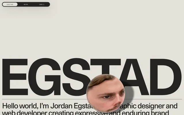
Preview image. Unlock full-res
Color palette
Hairline borders, dividers, input outlines, and card edges on light surfaces. Do not promote it to the primary CTA color
Dark borders and separators for elevated surfaces and inverted UI. Do not promote it to the primary CTA color
Secondary text, subtle borders, high-contrast accents
Typography
- Weights
- 400
- Sizes
- 16px
- Line height
- 1.2
- Letter spacing
- normal
- Fallback
- Times
Muted body text, navigation items, secondary information, adopting a classic feel.
- Weights
- 400
- Sizes
- 12px, 15px, 59px, 399px
- Line height
- 0.97, 1, 1.33, 1.34
- Letter spacing
- -0.055em at 399px, 0.020em at 12px and 15px
Dominant headlines and large display text, creating a strong, almost architectural presence with tight tracking and custom features for distinctive letterforms.
- Weights
- 400
- Sizes
- 12px
- Line height
- 3
- Letter spacing
- 0.100em
Specialized navigation elements and labels, characterized by wide tracking for a technical, spaced-out effect.
Spacing & shape
Components
Solid Inkwell Black background with Canvas Parchment text. Uses 1440px border radius for full rounded ends. Padding of 14px vertical and 30px horizontal, with 1px Deepest Black border.
Transparent background with Inkwell Black text. Uses 1440px border radius for full rounded ends. Padding of 14px vertical and 30px horizontal, with 1px Canvas Parchment border.
Text in Inkwell Black, border in Canvas Parchment. Uses S85 font at 12px, 0.1em letter spacing. Padding of 14px vertical and 16px horizontal. Radius of 1440px for a pill shape.
Uses EG Metaphor font at 399px, weight 400, Inkwell Black color, with -0.055em letter spacing. Underlined with a 4px solid Inkwell Black line.
Times New Roman at 16px, weight 400, Inkwell Black color. Line height 1.2. Margin bottom of 14px between paragraphs.
Guidelines
- Prioritize text as the primary visual element, using large scale and distinct typefaces to convey meaning.
- Maintain high contrast between text (Inkwell Black) and background (Canvas Parchment) for all content.
- Use 1440px border radius consistently for all interactive elements and navigation items to create a 'pill' shape.
- Apply -0.055em letter spacing to display text (EG Metaphor 399px) to enhance its compactness and visual weight.
- Employ the Canvas Parchment background as the dominant canvas, allowing Inkwell Black typography and components to stand out.
- Utilize 4px solid Inkwell Black lines for expressive underlines or dividers, particularly under large headlines.
- Avoid decorative gradients or shadows; the aesthetic relies on flat, high-contrast forms.
- Do not introduce additional color; the palette is strictly monochrome with a warm neutral base.
- Do not vary from the precise letter spacing applied to display and specialized navigation text (S85), as it is integral to their identity.
- Avoid complex layouts or highly nested elements; maintain a clean, open composition.
- Do not use Times New Roman for display elements; reserve it for secondary content where a classic feel is desired.
About this system
ShowHide
Egstad's design system embraces a bold, unadorned aesthetic with stark visual contrasts. A muted, warm off-white background serves as the canvas for heavy, densely tracked sans-serif typography, asserting presence through scale and weight rather than color. Interactive elements use a tactile, almost skeumorphic toggle-like appearance with rounded full-bleed radii, creating a sense of mechanical precision against the otherwise flat plane. The overall impression is one of grounded, deliberate clarity, using minimal color to focus attention on structure and text.
The site employs a max-width contained layout, with content usually centered. The hero section features extremely large, full-width typography ('EGSTAD') which dominates the screen, often overlapping with the circular portrait. Sections maintain a consistent vertical rhythm, primarily defined by the spacing between large text blocks and smaller content groupings. Navigation consists of a static top bar with interactive 'pill' shaped buttons, appearing like a physical tab interface, and a secondary minimalist footer navigation. The overall density is spacious, emphasizing individual elements rather than overwhelming the user with information.
This site features very minimal imagery. When present, it appears as a singular, dominant, circular cropped portrait of a person, positioned in a way that visually interacts with text. There are no other visual elements like photography, illustrations, or product screenshots. The focus is entirely on typography and UI.
Reminiscent of Brutalist Websites, Linear, Stripe, Are.na.
# Egstad — Style Reference
> Type-first Brutalist

**Theme:** light

**Site:** https://egstad.com

Egstad's design system embraces a bold, unadorned aesthetic with stark visual contrasts. A muted, warm off-white background serves as the canvas for heavy, densely tracked sans-serif typography, asserting presence through scale and weight rather than color. Interactive elements use a tactile, almost skeumorphic toggle-like appearance with rounded full-bleed radii, creating a sense of mechanical precision against the otherwise flat plane. The overall impression is one of grounded, deliberate clarity, using minimal color to focus attention on structure and text.

## Tokens — Colors

| Name | Value | Token | Role |
|------|------|------|------|
| Canvas Parchment | `#e2e0d9` | `--color-canvas-parchment` | Hairline borders, dividers, input outlines, and card edges on light surfaces. Do not promote it to the primary CTA color |
| Inkwell Black | `#252422` | `--color-inkwell-black` | Dark borders and separators for elevated surfaces and inverted UI. Do not promote it to the primary CTA color |
| Deepest Black | `#000000` | `--color-deepest-black` | Secondary text, subtle borders, high-contrast accents |

## Tokens — Typography

### Times New Roman
- **Substitute:** Times
- **Weights:** 400
- **Sizes:** 16px
- **Line height:** 1.2
- **Letter spacing:** normal
- **Role:** Muted body text, navigation items, secondary information, adopting a classic feel.

### EG Metaphor
- **Weights:** 400
- **Sizes:** 12px, 15px, 59px, 399px
- **Line height:** 0.97, 1, 1.33, 1.34
- **Letter spacing:** -0.055em at 399px, 0.020em at 12px and 15px
- **Role:** Dominant headlines and large display text, creating a strong, almost architectural presence with tight tracking and custom features for distinctive letterforms.

### S85
- **Weights:** 400
- **Sizes:** 12px
- **Line height:** 3
- **Letter spacing:** 0.100em
- **Role:** Specialized navigation elements and labels, characterized by wide tracking for a technical, spaced-out effect.

## Tokens — Type Scale

| Role | Size | Line height | Letter spacing |
|------|------|------|------|
| caption | 12px | 1.34 | 0.24px |
| body-lg | 16px | 1.2 | — |
| heading | 59px | 1.33 | — |
| display | 399px | 0.97 | -22px |

## Tokens — Spacing

- **Section gap:** 22px
- **Card padding:** 14px
- **Element gap:** 16px

## Tokens — Radius

- **Buttons:** 1440px
- **navigation:** 1440px
- **tabs:** 36px

## Layout

The site employs a max-width contained layout, with content usually centered. The hero section features extremely large, full-width typography ('EGSTAD') which dominates the screen, often overlapping with the circular portrait. Sections maintain a consistent vertical rhythm, primarily defined by the spacing between large text blocks and smaller content groupings. Navigation consists of a static top bar with interactive 'pill' shaped buttons, appearing like a physical tab interface, and a secondary minimalist footer navigation. The overall density is spacious, emphasizing individual elements rather than overwhelming the user with information.

## Imagery

This site features very minimal imagery. When present, it appears as a singular, dominant, circular cropped portrait of a person, positioned in a way that visually interacts with text. There are no other visual elements like photography, illustrations, or product screenshots. The focus is entirely on typography and UI.

## Components

### Navigation Tab Active
*Primary navigation item, active state*

Solid Inkwell Black background with Canvas Parchment text. Uses 1440px border radius for full rounded ends. Padding of 14px vertical and 30px horizontal, with 1px Deepest Black border.

### Navigation Tab Inactive
*Primary navigation item, inactive state*

Transparent background with Inkwell Black text. Uses 1440px border radius for full rounded ends. Padding of 14px vertical and 30px horizontal, with 1px Canvas Parchment border.

### Navigation Link Outlined
*Small, outlined navigation link*

Text in Inkwell Black, border in Canvas Parchment. Uses S85 font at 12px, 0.1em letter spacing. Padding of 14px vertical and 16px horizontal. Radius of 1440px for a pill shape.

### Large Typography Headline
*Main heading text on hero sections*

Uses EG Metaphor font at 399px, weight 400, Inkwell Black color, with -0.055em letter spacing. Underlined with a 4px solid Inkwell Black line.

### Body Text Section
*Paragraphs of body content*

Times New Roman at 16px, weight 400, Inkwell Black color. Line height 1.2. Margin bottom of 14px between paragraphs.

## Guidelines

### Do

- Prioritize text as the primary visual element, using large scale and distinct typefaces to convey meaning.
- Maintain high contrast between text (Inkwell Black) and background (Canvas Parchment) for all content.
- Use 1440px border radius consistently for all interactive elements and navigation items to create a 'pill' shape.
- Apply -0.055em letter spacing to display text (EG Metaphor 399px) to enhance its compactness and visual weight.
- Employ the Canvas Parchment background as the dominant canvas, allowing Inkwell Black typography and components to stand out.
- Utilize 4px solid Inkwell Black lines for expressive underlines or dividers, particularly under large headlines.

### Don't

- Avoid decorative gradients or shadows; the aesthetic relies on flat, high-contrast forms.
- Do not introduce additional color; the palette is strictly monochrome with a warm neutral base.
- Do not vary from the precise letter spacing applied to display and specialized navigation text (S85), as it is integral to their identity.
- Avoid complex layouts or highly nested elements; maintain a clean, open composition.
- Do not use Times New Roman for display elements; reserve it for secondary content where a classic feel is desired.

## Agent Prompt Guide

Quick Color Reference:
text: #252422
background: #e2e0d9
border: #e2e0d9
accent: no distinct accent color
primary action: no distinct CTA color

Example Component Prompts:
1. Create a primary navigation bar: Use a Canvas Parchment background. The active item should be an 'Inkwell Black' background with Canvas Parchment text, 1440px radius, 14px vertical and 30px horizontal padding, with a 1px Deepest Black border. Inactive items should be transparent with Inkwell Black text, 1440px radius, 14px vertical and 30px horizontal padding, and a 1px Canvas Parchment border. Use Times New Roman at 16px for text.
2. Create a main hero headline: Use 'EG Metaphor' font, 399px size, weight 400, Inkwell Black color, -0.055em letter spacing. Include a 4px solid Inkwell Black underscore.
3. Create a secondary information paragraph: Use Times New Roman, 16px size, weight 400, Inkwell Black color, with 1.2 line height. Ensure 14px spacing below the paragraph.
More like this









Keep what you find
A free account saves references to boards and can send you a weekly email of picks based on what you save.
To see every result, go Pro.