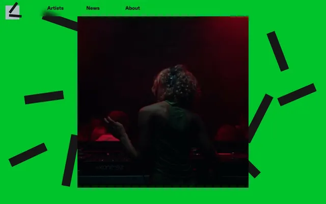
Preview image. Unlock full-res
Acid Green Command Center
Color palette
Primary background for sections and larger UI blocks, lending a bold, almost digital intensity
Red outline accent for tags, dividers, and focused UI edges. Do not promote it to the primary CTA color
Primary text color for headings and body content, as well as thin article borders and selected component backgrounds. Creates high contrast against Screen Green
Subtle background for the footer and occasional softer sections, providing a slight visual break from the high contrast, yet remaining distinctly achromatic
Typography
- Weights
- 100
- Sizes
- 22px, 36px, 38px
- Line height
- 1, 1.05, 1.09, 1.48
- Fallback
- Inter
Used for navigation items, primary headings, and bold link text. Its extremely light weight (100) for a 'Black' nominal weight suggests a deliberate choice for lightness and understated presence despite its strong family name.
- Weights
- 100
- Sizes
- 19px, 38px
- Line height
- 1, 1.26
- Fallback
- Inter
Appears in main hero headings and some emphasized links/footer text. Similar to Diatype-Black, its declared 'Bold' weight at 100 provides a subtle visual distinction without adding heavy typographic density.
- Weights
- 100
- Sizes
- 22px, 24px
- Line height
- 1
- Fallback
- Inter
Body text and less prominent link text. The consistent weight 100 across all Diatype families creates a unified, airy typographic texture.
Spacing & shape
Components
Uses ABCDiatype-Black at 22px, weight 100, and Midnight Charcoal text color. On hover, the text color should shift to Fuchsia Flare with a subtle animation. Padding of 6px left/right.
Each card has a Midnight Charcoal background, with no explicit border or radius. Contains an image (often desaturated) and a heading. Padding is 24px.
Uses ABCDiatype-Black at 38px, weight 100, Midnight Charcoal text. Features dynamic left/right padding of 4px to 12px depending on context, and significant bottom padding of 38-49px.
Uses ABCDiatype-Black at 22px, weight 100, Midnight Charcoal text. Exhibits generous bottom padding of 60px between items.
Features text 'Recent News' in Fuchsia Flare, rotated diagonally. This appears over an offset Midnight Charcoal background element. The entire group often appears with a Midnight Charcoal border of 8px solid.
Guidelines
- Use Screen Green (#00c32b) as the dominant background color for most primary content sections.
- Apply Midnight Charcoal (#161616) for all primary text content to ensure maximum contrast and legibility.
- Reserve Fuchsia Flare (#ff3aad) for interactive elements, hover states, and rotated decorative accents.
- Maintain a default border-radius of 0px for all UI elements to preserve a sharp, angular aesthetic.
- Employ ABCDiatype-Black, -Bold, and -Regular at their designated weight 100 across all typographic roles for a consistent light visual texture.
- Utilize 24px as a common vertical gap between distinct UI elements and sections for a comfortable density.
- Implement the 8px solid Midnight Charcoal border for visual emphasis around key content blocks and callouts.
- Avoid using saturated colors other than Screen Green and Fuchsia Flare; maintain an achromatic base palette.
- Do not introduce rounded corners or border-radius values greater than 0px on any UI elements.
- Refrain from using heavy font weights (e.g., 400 or above) for any text, as the design emphasizes lightness with weight 100.
- Avoid generic drop shadows or elevation; the system relies on high contrast and distinct background colors for layering.
- Do not deviate from the specified padding and margin values; the exact spacing creates the system's intended rhythm.
- Resist using photography or imagery with high saturation; prefer desaturated or monochrome visuals to let UI colors dominate.
- Do not apply Fuchsia Flare (#ff3aad) as a primary background color for large sections, it's intended as an accent.
About this system
ShowHide
Ekipa Agency uses a stark, high-contrast visual system with a primary acid green canvas punctuated by deep charcoal text and bold, rotated accents of vivid fuchsia. The design feels raw and energetic, with imagery often desaturated, allowing the strong chromatic colors and sharp typographic choices to command attention. Thin borders and a near-monochromatic base palette ensure the vibrant highlights feel impactful and intentional.
The page primarily uses a full-bleed layout, with the dominant Screen Green background extending across the viewport. The hero section features a full-width image (often dark and moody) with content overlaid or presented beneath. Content frequently organizes into sections with consistent vertical spacing of around 24px, sometimes interrupted by larger gaps for emphasis. There's a common pattern of article-like blocks with thin borders, sometimes arranged in grids (e.g., 3-column for artist features under a main section title). Text often appears in centered stacks or left-aligned within these blocks. The navigation is a minimal top bar.
The visual language for imagery is characterized by desaturated, often monochrome, photography and abstract graphics. Images typically serve as background elements or content placeholders within cards, maintaining a contained, often cropped presentation without rounded edges. When present, images are secondary to the strong typographic and color identity. Icons are minimal, likely monochromatic if they appear.
Reminiscent of Boiler Room, Resident Advisor, NTS Radio, SoundCloud.
# Ekipa Agency — Style Reference
> Acid Green Command Center

**Theme:** light

**Site:** https://ekipa.agency

Ekipa Agency uses a stark, high-contrast visual system with a primary acid green canvas punctuated by deep charcoal text and bold, rotated accents of vivid fuchsia. The design feels raw and energetic, with imagery often desaturated, allowing the strong chromatic colors and sharp typographic choices to command attention. Thin borders and a near-monochromatic base palette ensure the vibrant highlights feel impactful and intentional.

## Tokens — Colors

| Name | Value | Token | Role |
|------|------|------|------|
| Screen Green | `#00c32b` | `--color-screen-green` | Primary background for sections and larger UI blocks, lending a bold, almost digital intensity |
| Fuchsia Flare | `#ff3aad` | `--color-fuchsia-flare` | Red outline accent for tags, dividers, and focused UI edges. Do not promote it to the primary CTA color |
| Midnight Charcoal | `#161616` | `--color-midnight-charcoal` | Primary text color for headings and body content, as well as thin article borders and selected component backgrounds. Creates high contrast against Screen Green |
| Soft Concrete | `#adbbc3` | `--color-soft-concrete` | Subtle background for the footer and occasional softer sections, providing a slight visual break from the high contrast, yet remaining distinctly achromatic |

## Tokens — Typography

### ABCDiatype-Black
- **Substitute:** Inter
- **Weights:** 100
- **Sizes:** 22px, 36px, 38px
- **Line height:** 1, 1.05, 1.09, 1.48
- **Role:** Used for navigation items, primary headings, and bold link text. Its extremely light weight (100) for a 'Black' nominal weight suggests a deliberate choice for lightness and understated presence despite its strong family name.

### ABCDiatype-Bold
- **Substitute:** Inter
- **Weights:** 100
- **Sizes:** 19px, 38px
- **Line height:** 1, 1.26
- **Role:** Appears in main hero headings and some emphasized links/footer text. Similar to Diatype-Black, its declared 'Bold' weight at 100 provides a subtle visual distinction without adding heavy typographic density.

### ABCDiatype-Regular
- **Substitute:** Inter
- **Weights:** 100
- **Sizes:** 22px, 24px
- **Line height:** 1
- **Role:** Body text and less prominent link text. The consistent weight 100 across all Diatype families creates a unified, airy typographic texture.

## Tokens — Type Scale

Perfect Fourth (1.333) from 38px base.

| Role | Size | Line height | Letter spacing |
|------|------|------|------|
| caption | 22px | 1.09 | — |
| body-sm | 36px | 1.09 | — |
| body | 38px | 1.09 | — |

## Tokens — Spacing

- **Section gap:** 24px
- **Card padding:** 24px
- **Element gap:** 12px

## Tokens — Radius

- **Default:** 0px

## Layout

The page primarily uses a full-bleed layout, with the dominant Screen Green background extending across the viewport. The hero section features a full-width image (often dark and moody) with content overlaid or presented beneath. Content frequently organizes into sections with consistent vertical spacing of around 24px, sometimes interrupted by larger gaps for emphasis. There's a common pattern of article-like blocks with thin borders, sometimes arranged in grids (e.g., 3-column for artist features under a main section title). Text often appears in centered stacks or left-aligned within these blocks. The navigation is a minimal top bar.

## Imagery

The visual language for imagery is characterized by desaturated, often monochrome, photography and abstract graphics. Images typically serve as background elements or content placeholders within cards, maintaining a contained, often cropped presentation without rounded edges. When present, images are secondary to the strong typographic and color identity. Icons are minimal, likely monochromatic if they appear.

## Components

### Primary Navigation Link
*Interactive text link in the header.*

Uses ABCDiatype-Black at 22px, weight 100, and Midnight Charcoal text color. On hover, the text color should shift to Fuchsia Flare with a subtle animation. Padding of 6px left/right.

### Feature Teaser Card
*Displays album or artist features.*

Each card has a Midnight Charcoal background, with no explicit border or radius. Contains an image (often desaturated) and a heading. Padding is 24px.

### Primary Heading
*Main section titles and content blocks.*

Uses ABCDiatype-Black at 38px, weight 100, Midnight Charcoal text. Features dynamic left/right padding of 4px to 12px depending on context, and significant bottom padding of 38-49px.

### Artist List Item
*Single entry in the roster list.*

Uses ABCDiatype-Black at 22px, weight 100, Midnight Charcoal text. Exhibits generous bottom padding of 60px between items.

### Rotated Accent Badge – Recent News
*Decorative and functional accent for callouts.*

Features text 'Recent News' in Fuchsia Flare, rotated diagonally. This appears over an offset Midnight Charcoal background element. The entire group often appears with a Midnight Charcoal border of 8px solid.

## Guidelines

### Do

- Use Screen Green (#00c32b) as the dominant background color for most primary content sections.
- Apply Midnight Charcoal (#161616) for all primary text content to ensure maximum contrast and legibility.
- Reserve Fuchsia Flare (#ff3aad) for interactive elements, hover states, and rotated decorative accents.
- Maintain a default border-radius of 0px for all UI elements to preserve a sharp, angular aesthetic.
- Employ ABCDiatype-Black, -Bold, and -Regular at their designated weight 100 across all typographic roles for a consistent light visual texture.
- Utilize 24px as a common vertical gap between distinct UI elements and sections for a comfortable density.
- Implement the 8px solid Midnight Charcoal border for visual emphasis around key content blocks and callouts.

### Don't

- Avoid using saturated colors other than Screen Green and Fuchsia Flare; maintain an achromatic base palette.
- Do not introduce rounded corners or border-radius values greater than 0px on any UI elements.
- Refrain from using heavy font weights (e.g., 400 or above) for any text, as the design emphasizes lightness with weight 100.
- Avoid generic drop shadows or elevation; the system relies on high contrast and distinct background colors for layering.
- Do not deviate from the specified padding and margin values; the exact spacing creates the system's intended rhythm.
- Resist using photography or imagery with high saturation; prefer desaturated or monochrome visuals to let UI colors dominate.
- Do not apply Fuchsia Flare (#ff3aad) as a primary background color for large sections, it's intended as an accent.

## Agent Prompt Guide

**Quick Color Reference:**
- text: #161616
- background: #00c32b
- border: #161616
- accent: #ff3aad
- primary action: no distinct CTA color

**3-5 Example Component Prompts:**
1. Create a section with a 'Screen Green' background. Headline text 'Our Vision' in ABCDiatype-Black, 38px, weight 100, Midnight Charcoal text, with 38px padding-bottom. Immediately below, add body text in ABCDiatype-Regular, 22px, weight 100, Midnight Charcoal, also left-aligned.
2. Design a feature card: Midnight Charcoal background, no border-radius. Inside, place a desaturated image covering the top half, followed by a heading 'Artist Spotlight' in ABCDiatype-Black, 22px, weight 100, Midnight Charcoal text. Ensure 24px internal padding.
3. Create a footer section: Soft Concrete background. Text '©2025 Ekipa Agency' in ABCDiatype-Regular, 22px, weight 100, Midnight Charcoal text. Provide 60px padding-top and padding-bottom for this section.
4. Design a navigation bar link: 'Artists' in ABCDiatype-Black, 22px, weight 100, Midnight Charcoal text. On hover, the text color should change to Fuchsia Flare (#ff3aad). Include 6px horizontal padding.
5. Implement a rotated accent element: 'Latest Drops' text in Fuchsia Flare (#ff3aad) over a Midnight Charcoal background rectangle, with a Midnight Charcoal 8px solid border around the combined element. The entire element should be rotated by -15 degrees.
More like this







Keep what you find
A free account saves references to boards and can send you a weekly email of picks based on what you save.
To see every result, go Pro.