Preview image. Unlock full-res
Gallery Canvas, Monochromatic Depth
Color palette
Page backgrounds, default text color for inverse elements, borders in navigation
Primary text, borders, button text, and occasional background fills for visual emphasis
Secondary background surfaces and visual blocks
Darker background surfaces, visual blocks
Typography
- Weights
- 400
- Sizes
- 17px, 18px, 20px, 23px, 24px, 48px, 66px, 76px
- Line height
- 0.88, 1, 1.1, 1.15, 1.46, 1.67, 1.7, 1.88
- Fallback
- Space Mono, IBM Plex Mono
All textual content, from navigation to headings, body text, and button labels. Its industrial, geometric quality defines the brand's direct and editorial tone.
Spacing & shape
Components
Transparent background button with Ink Black text, 1px padding top/bottom and 6px padding left/right, no border or radius. Uses NeueMachina 400 for text.
Guidelines
- Prioritize a high-contrast palette of Canvas White backgrounds and Ink Black foregrounds for all primary content.
- Maintain a monochromatic base with occasional inclusion of Stone Gray and Deep Slate as abstract visual blocks or background tints.
- Use NeueMachina 400 for all typography, ensuring consistency across headlines, body, and UI elements.
- Apply 0px border-radius to all interactive and static elements to maintain sharp, unyielding geometric forms.
- Implement motion with `ease` timing functions and durations of 0.5s or 1s for subtle, controlled transitions.
- Treat images as art objects, often with stark compositions resembling photographic prints, integrated as large blocks in the layout.
- Utilize 20px of spacing as a default `margin-bottom` for content blocks and `padding-left`/`padding-right` for container elements.
- Avoid color in the primary UI; reserve any color for embedded imagery or specific artistic elements.
- Do not use rounded corners or any soft shaping on UI components; all elements should adhere to strict 0px radius.
- Refrain from using drop shadows or complex elevation; maintain a flat, two-dimensional aesthetic for all surfaces.
- Do not introduce decorative gradients; preserve the solid, stark color blocks.
- Avoid decorative iconography; the visual language relies on pure text and photographic elements.
- Do not use excessive visual hierarchy through varying font weights; all typography is NeueMachina 400, relying on size and position for emphasis.
- Prevent cluttered layouts; prioritize ample whitespace, with spacing mostly derived from the 20px and 40px tokens.
About this system
ShowHide
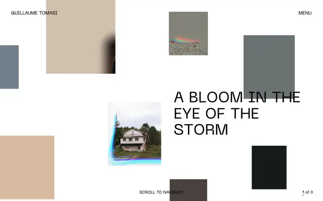
The Guillaume Tomasi design system uses a stark, high-contrast aesthetic characterized by a pure white canvas and dominant black typography. The visual rhythm is established through a seemingly random but controlled placement of large, non-interactive rectangular blocks of varied neutral tones and cropped atmospheric photography. Minimalism in color is paired with a strong, industrial typeface, giving the impression of an art gallery catalogue or editorial spread.
The page structure is full-bleed, adapting to the viewport width without a maximum content constraint. The hero section often features a large, centered headline or an impactful image block. Sections flow seamlessly, using consistent vertical spacing but without alternating background bands. Content arrangement is highly asymmetric, eschewing traditional grids for an artfully scattered composition of text blocks and visual elements, creating dynamic visual tension rather than ordered rhythm. The navigation is a minimalist top bar, likely sticky, with minimal links or a simple 'menu' toggle.
This system primarily uses atmospheric and sometimes abstract photography or image-like monochromatic blocks. Images are treated as embedded art pieces, often cropped tightly within rectangular frames. They are typically product-focused or environmental, presented without rounded corners or complex masking, contributing to the overall starkness. A single style of minimalist, outlined icon may be present, but the system is image-heavy in its content sections rather than text-dominant, with images serving both decorative atmosphere and explicit content.
Reminiscent of A.P.C., The Row, Artsy (editorial sections), Are.na.
# Guillaume Tomasi — Style Reference
> Gallery Canvas, Monochromatic Depth

**Theme:** light

**Site:** https://www.guillaumetomasi.com

The Guillaume Tomasi design system uses a stark, high-contrast aesthetic characterized by a pure white canvas and dominant black typography. The visual rhythm is established through a seemingly random but controlled placement of large, non-interactive rectangular blocks of varied neutral tones and cropped atmospheric photography. Minimalism in color is paired with a strong, industrial typeface, giving the impression of an art gallery catalogue or editorial spread.

## Tokens — Colors

| Name | Value | Token | Role |
|------|------|------|------|
| Canvas White | `#ffffff` | `--color-canvas-white` | Page backgrounds, default text color for inverse elements, borders in navigation |
| Ink Black | `#000000` | `--color-ink-black` | Primary text, borders, button text, and occasional background fills for visual emphasis |
| Stone Gray | `#bfbfbf` | `--color-stone-gray` | Secondary background surfaces and visual blocks |
| Deep Slate | `#212121` | `--color-deep-slate` | Darker background surfaces, visual blocks |

## Tokens — Typography

### NeueMachina
- **Substitute:** Space Mono, IBM Plex Mono
- **Weights:** 400
- **Sizes:** 17px, 18px, 20px, 23px, 24px, 48px, 66px, 76px
- **Line height:** 0.88, 1, 1.1, 1.15, 1.46, 1.67, 1.7, 1.88
- **Role:** All textual content, from navigation to headings, body text, and button labels. Its industrial, geometric quality defines the brand's direct and editorial tone.

## Tokens — Type Scale

| Role | Size | Line height | Letter spacing |
|------|------|------|------|
| caption | 17px | 1.7 | — |
| subheading | 20px | 1.46 | — |
| heading-sm | 23px | 1.15 | — |
| heading-lg | 48px | 1 | — |
| display | 76px | 0.88 | — |

## Tokens — Spacing

- **Section gap:** 40px
- **Card padding:** 20px
- **Element gap:** 20px

## Tokens — Radius

- **none:** 0px

## Layout

The page structure is full-bleed, adapting to the viewport width without a maximum content constraint. The hero section often features a large, centered headline or an impactful image block. Sections flow seamlessly, using consistent vertical spacing but without alternating background bands. Content arrangement is highly asymmetric, eschewing traditional grids for an artfully scattered composition of text blocks and visual elements, creating dynamic visual tension rather than ordered rhythm. The navigation is a minimalist top bar, likely sticky, with minimal links or a simple 'menu' toggle.

## Imagery

This system primarily uses atmospheric and sometimes abstract photography or image-like monochromatic blocks. Images are treated as embedded art pieces, often cropped tightly within rectangular frames. They are typically product-focused or environmental, presented without rounded corners or complex masking, contributing to the overall starkness. A single style of minimalist, outlined icon may be present, but the system is image-heavy in its content sections rather than text-dominant, with images serving both decorative atmosphere and explicit content.

## Components

### Ghost Text Button
*Interactive text link, often used for navigation and system controls.*

Transparent background button with Ink Black text, 1px padding top/bottom and 6px padding left/right, no border or radius. Uses NeueMachina 400 for text.

## Guidelines

### Do

- Prioritize a high-contrast palette of Canvas White backgrounds and Ink Black foregrounds for all primary content.
- Maintain a monochromatic base with occasional inclusion of Stone Gray and Deep Slate as abstract visual blocks or background tints.
- Use NeueMachina 400 for all typography, ensuring consistency across headlines, body, and UI elements.
- Apply 0px border-radius to all interactive and static elements to maintain sharp, unyielding geometric forms.
- Implement motion with `ease` timing functions and durations of 0.5s or 1s for subtle, controlled transitions.
- Treat images as art objects, often with stark compositions resembling photographic prints, integrated as large blocks in the layout.
- Utilize 20px of spacing as a default `margin-bottom` for content blocks and `padding-left`/`padding-right` for container elements.

### Don't

- Avoid color in the primary UI; reserve any color for embedded imagery or specific artistic elements.
- Do not use rounded corners or any soft shaping on UI components; all elements should adhere to strict 0px radius.
- Refrain from using drop shadows or complex elevation; maintain a flat, two-dimensional aesthetic for all surfaces.
- Do not introduce decorative gradients; preserve the solid, stark color blocks.
- Avoid decorative iconography; the visual language relies on pure text and photographic elements.
- Do not use excessive visual hierarchy through varying font weights; all typography is NeueMachina 400, relying on size and position for emphasis.
- Prevent cluttered layouts; prioritize ample whitespace, with spacing mostly derived from the 20px and 40px tokens.

## Agent Prompt Guide

Quick Color Reference:
text: #000000
background: #ffffff
border: #000000
accent: no distinct accent color
primary action: no distinct CTA color

Example Component Prompts:
1. Create a primary navigation item: Ink Black text (NeueMachina 400, 18px), no background, no border, with 1px top/bottom padding and 6px left/right padding.
2. Design a headline section: Ink Black text (NeueMachina 400, 76px, lineHeight 0.88) centered on a Canvas White background. Below it, a subtitle in Ink Black (NeueMachina 400, 24px, lineHeight 1.1) with 20px margin-bottom.
3. Create a descriptive text block: Ink Black text (NeueMachina 400, 18px, lineHeight 1.67) on a Canvas White background, with an elementGap of 20px between paragraphs.
More like this









Keep what you find
A free account saves references to boards and can send you a weekly email of picks based on what you save.
To see every result, go Pro.