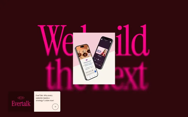
Preview image. Unlock full-res
Burgundy Canvas, Vivid Pink Accents
Color palette
Primary background for dark sections, prominent text, card borders, and primary button text. Conveys gravitas and brand identity
Accent for interactive elements, links, decorative borders, and active states. Provides high-contrast punctuation against dark backgrounds and a playful pop
Muted accent color for light highlights, softer interactive states, and informational text against warm backgrounds
Main page background, content surfaces, subtle overlay for text over imagery
Soft secondary background for content sections and cards, creating a warm, approachable surface. Humanizes the overall dark theme
Subtle background for card elements, offering a slightly cooler variation of the Blush Sand
Secondary text color, subtle borders, and specific background elements. Provides strong contrast when needed
Typography
- Weights
- 400
- Sizes
- 32px, 48px, 128px
- Line height
- 1.1, 1.4
- Letter spacing
- -0.010em
- Fallback
- Playfair Display
Display headlines and hero text. This classic serif, particularly at 128px, provides a bold, artistic, and authoritative statement, contrasting with the geometric sans-serifs.
- Weights
- 400
- Sizes
- 12px, 14px, 18px, 22px
- Line height
- 1.1, 1.2, 1.4
- Letter spacing
- -0.010em
- Fallback
- Inter
Primary body text, longer form content, and call-to-action text. Its geometric sans-serif nature ensures high readability and a clean, modern feel across various sizes.
- Weights
- 300, 400, 500
- Sizes
- 11px, 14px, 16px, 32px
- Line height
- 1.25, 1.4, 1.6
- Letter spacing
- 0.040em, 0.009em, -0.010em, -0.010em
- Fallback
- IBM Plex Mono
Captions, tags, labels, and small UI elements. The monospace characteristic lends a subtle technical and precise aesthetic.
Spacing & shape
Components
Ghost button with 1px Rich Burgundy border, Rich Burgundy text, and full pill radius (9999px). Padding 16px vertical, 32px horizontal. This button style makes actions feel inherent to the content flow rather than a heavy interactive block.
Ghost button with 1px Rich Burgundy border, Rich Burgundy text, and full pill radius (9999px). Padding 18px vertical, 52px horizontal.
Rounded tag with Pale Rose background (#ffdce2), Rich Burgundy text, and full pill radius (9999px). Padding 4px vertical, 12px horizontal. Used for subtle categorization within content blocks.
Card with no background fill and `none` box shadow, 0px border radius. Used for transparently presenting content without visual heavy lifting.
Card with no background fill, 8px border radius. Used for article previews and product features, offering a subtle visual grouping.
Guidelines
- Use Rich Burgundy (#2d070b) as the primary text and section background for gravitas.
- Apply Vivid Pink (#ff0389) exclusively for interactive elements like links, buttons, and active states to guide user attention.
- Set display headlines with Instrument Serif (weight 400) at generous sizes like 48px or 128px for artistic impact with -0.010em letter spacing.
- Utilize Manrope (weight 400) for all body text at 18px with -0.010em letter spacing for clear, modern readability.
- Employ DM Mono at 11-14px for all captions, tags, and meta-information, using its distinct letter spacings (e.g., 0.040em at 11px) for a technical touch.
- Ensure all buttons and small interactive tags have a 9999px border-radius for a distinct pill-shaped appearance.
- Maintain a comfortable density with an element gap of 4px and a card padding of 12px to allow content to breathe.
- Do not use Vivid Pink (#ff0389) as a background for large sections or containers; reserve it for small, functional accents.
- Avoid using drop shadows on cards; the system relies on background color shifts and borders for visual separation.
- Do not vary typography for non-hierarchical emphasis; rely on color accents or DM Mono for distinct information types.
- Do not introduce sharp corners (0px radius) for interactive elements; all buttons and tags must use 9999px radius.
- Do not stack multiple background colors directly adjacent without an intervening content block; use Blush Sand (#fef0e6) and Pale Rose (#ffdce2) for distinct section shifts.
- Avoid using too many font weights; stick to the defined weights for each font family (e.g., Manrope 400, Instrument Serif 400, DM Mono 300, 400, 500).
About this system
ShowHide
Evermade employs a confident, art-inspired visual language that merges stark elegance with playful, vivid accents. The primary palette is a dark, warm burgundy grounded by soft, humanistic neutrals, creating a refined backdrop. Typography features a strong contrast between classic serif display fonts and clean geometric sans-serifs, communicating authority and approachability. Components are lightweight with distinctive full rounded corners, emphasizing an open, modern aesthetic rather than heavy panels or complex shadows.
The page structure employs a mixed full-bleed and contained pattern. Hero sections are typically full-bleed with large, dramatic imagery and centered, oversized typography. Subsequent content sections alternate background colors (White Canvas, Blush Sand, Rich Burgundy) with consistent vertical spacing akin to the sectionGap. Content is arranged in alternating text-left/image-right or centered stacks. Card grids are prominent for displaying articles and insights, suggesting a responsive, column-based layout. Navigation is minimal, likely a top-bar or slide-out, as the focus is on large, expressive content blocks.
Imagery primarily utilizes full-bleed, high-contrast photography or stylized product screenshots often with a desaturated or tinted overlay, creating a dramatic, art-directed atmosphere. These are frequently masked or partially obscured when in the background. Illustrations are minimal and typically flat, serving as decorative elements or supporting icons. Icons themselves are outlined, thin-stroke, and monochrome, often in Ash Black or Vivid Pink, maintaining a lightweight and precise feel. Imagery serves to establish mood and brand identity rather than detailed informational content, often featuring abstract compositions or product-in-use shots.
Reminiscent of Basic Agency, Figma, B&O (Bang & Olufsen).
# Evermade — Style Reference
> Burgundy Canvas, Vivid Pink Accents

**Theme:** light

**Site:** https://evermade.fi

Evermade employs a confident, art-inspired visual language that merges stark elegance with playful, vivid accents. The primary palette is a dark, warm burgundy grounded by soft, humanistic neutrals, creating a refined backdrop. Typography features a strong contrast between classic serif display fonts and clean geometric sans-serifs, communicating authority and approachability. Components are lightweight with distinctive full rounded corners, emphasizing an open, modern aesthetic rather than heavy panels or complex shadows.

## Tokens — Colors

| Name | Value | Token | Role |
|------|------|------|------|
| Rich Burgundy | `#2d070b` | `--color-rich-burgundy` | Primary background for dark sections, prominent text, card borders, and primary button text. Conveys gravitas and brand identity |
| Vivid Pink | `#ff0389` | `--color-vivid-pink` | Accent for interactive elements, links, decorative borders, and active states. Provides high-contrast punctuation against dark backgrounds and a playful pop |
| Hint of Rose | `#ffc7de` | `--color-hint-of-rose` | Muted accent color for light highlights, softer interactive states, and informational text against warm backgrounds |
| White Canvas | `#ffffff` | `--color-white-canvas` | Main page background, content surfaces, subtle overlay for text over imagery |
| Blush Sand | `#fef0e6` | `--color-blush-sand` | Soft secondary background for content sections and cards, creating a warm, approachable surface. Humanizes the overall dark theme |
| Pale Rose | `#ffdce2` | `--color-pale-rose` | Subtle background for card elements, offering a slightly cooler variation of the Blush Sand |
| Ash Black | `#000000` | `--color-ash-black` | Secondary text color, subtle borders, and specific background elements. Provides strong contrast when needed |

## Tokens — Typography

### Instrument Serif
- **Substitute:** Playfair Display
- **Weights:** 400
- **Sizes:** 32px, 48px, 128px
- **Line height:** 1.1, 1.4
- **Letter spacing:** -0.010em
- **Role:** Display headlines and hero text. This classic serif, particularly at 128px, provides a bold, artistic, and authoritative statement, contrasting with the geometric sans-serifs.

### Manrope
- **Substitute:** Inter
- **Weights:** 400
- **Sizes:** 12px, 14px, 18px, 22px
- **Line height:** 1.1, 1.2, 1.4
- **Letter spacing:** -0.010em
- **Role:** Primary body text, longer form content, and call-to-action text. Its geometric sans-serif nature ensures high readability and a clean, modern feel across various sizes.

### DM Mono
- **Substitute:** IBM Plex Mono
- **Weights:** 300, 400, 500
- **Sizes:** 11px, 14px, 16px, 32px
- **Line height:** 1.25, 1.4, 1.6
- **Letter spacing:** 0.040em, 0.009em, -0.010em, -0.010em
- **Role:** Captions, tags, labels, and small UI elements. The monospace characteristic lends a subtle technical and precise aesthetic.

## Tokens — Type Scale

Perfect Fifth (1.5) from 14px base.

| Role | Size | Line height | Letter spacing |
|------|------|------|------|
| caption | 11px | 1.4 | 0.44px |
| body | 14px | 1.4 | 0.13px |
| heading | 18px | 1.2 | -0.18px |
| heading-lg | 22px | 1.1 | -0.22px |
| display-sm | 32px | 1.1 | -0.32px |
| display | 48px | 1.1 | -0.48px |
| display-xl | 128px | 1.1 | -1.28px |

## Tokens — Spacing

- **Section gap:** 178px
- **Card padding:** 12px
- **Element gap:** 4px

## Tokens — Radius

- **Default:** 0px
- **pill:** 9999px
- **soft:** 8px

## Layout

The page structure employs a mixed full-bleed and contained pattern. Hero sections are typically full-bleed with large, dramatic imagery and centered, oversized typography. Subsequent content sections alternate background colors (White Canvas, Blush Sand, Rich Burgundy) with consistent vertical spacing akin to the sectionGap. Content is arranged in alternating text-left/image-right or centered stacks. Card grids are prominent for displaying articles and insights, suggesting a responsive, column-based layout. Navigation is minimal, likely a top-bar or slide-out, as the focus is on large, expressive content blocks.

## Imagery

Imagery primarily utilizes full-bleed, high-contrast photography or stylized product screenshots often with a desaturated or tinted overlay, creating a dramatic, art-directed atmosphere. These are frequently masked or partially obscured when in the background. Illustrations are minimal and typically flat, serving as decorative elements or supporting icons. Icons themselves are outlined, thin-stroke, and monochrome, often in Ash Black or Vivid Pink, maintaining a lightweight and precise feel. Imagery serves to establish mood and brand identity rather than detailed informational content, often featuring abstract compositions or product-in-use shots.

## Components

### Outlined Button Primary
*Primary Call to Action*

Ghost button with 1px Rich Burgundy border, Rich Burgundy text, and full pill radius (9999px). Padding 16px vertical, 32px horizontal. This button style makes actions feel inherent to the content flow rather than a heavy interactive block.

### Outlined Button Secondary
*Secondary Call to Action, larger variant*

Ghost button with 1px Rich Burgundy border, Rich Burgundy text, and full pill radius (9999px). Padding 18px vertical, 52px horizontal.

### Pill Tag
*Categorization and filter tags*

Rounded tag with Pale Rose background (#ffdce2), Rich Burgundy text, and full pill radius (9999px). Padding 4px vertical, 12px horizontal. Used for subtle categorization within content blocks.

### Content Card Default
*Standalone content block*

Card with no background fill and `none` box shadow, 0px border radius. Used for transparently presenting content without visual heavy lifting.

### Content Card with Soft Corners
*Elevated content block for articles/insights*

Card with no background fill, 8px border radius. Used for article previews and product features, offering a subtle visual grouping.

## Guidelines

### Do

- Use Rich Burgundy (#2d070b) as the primary text and section background for gravitas.
- Apply Vivid Pink (#ff0389) exclusively for interactive elements like links, buttons, and active states to guide user attention.
- Set display headlines with Instrument Serif (weight 400) at generous sizes like 48px or 128px for artistic impact with -0.010em letter spacing.
- Utilize Manrope (weight 400) for all body text at 18px with -0.010em letter spacing for clear, modern readability.
- Employ DM Mono at 11-14px for all captions, tags, and meta-information, using its distinct letter spacings (e.g., 0.040em at 11px) for a technical touch.
- Ensure all buttons and small interactive tags have a 9999px border-radius for a distinct pill-shaped appearance.
- Maintain a comfortable density with an element gap of 4px and a card padding of 12px to allow content to breathe.

### Don't

- Do not use Vivid Pink (#ff0389) as a background for large sections or containers; reserve it for small, functional accents.
- Avoid using drop shadows on cards; the system relies on background color shifts and borders for visual separation.
- Do not vary typography for non-hierarchical emphasis; rely on color accents or DM Mono for distinct information types.
- Do not introduce sharp corners (0px radius) for interactive elements; all buttons and tags must use 9999px radius.
- Do not stack multiple background colors directly adjacent without an intervening content block; use Blush Sand (#fef0e6) and Pale Rose (#ffdce2) for distinct section shifts.
- Avoid using too many font weights; stick to the defined weights for each font family (e.g., Manrope 400, Instrument Serif 400, DM Mono 300, 400, 500).

## Agent Prompt Guide

Create an Outlined Primary Action: Transparent background, #ff0389 border and text, 9999px radius, compact pill padding. Use it for the main CTA instead of a filled button.
Example Component Prompts:
Create a hero section: Rich Burgundy (#2d070b) background. Headline 'We build the next' in Instrument Serif 128px weight 400, #ff0389, letter-spacing -1.28px. Centered. Below, a ghost button: 'Let's build the next' with text #ff0389, 1px border #ff0389, 9999px radius, 18px 52px padding.
Create a content card: Pale Rose (#ffdce2) background, 8px radius. Heading 'EverTalk: Why every website needs a strategy?' in Manrope 22px weight 400, #2d070b, letter-spacing -0.22px. Below, a Pill Tag 'STRATEGY' with Pale Rose (#ffdce2) background, Rich Burgundy (#2d070b) text, 9999px radius, 4px 12px padding.
Create a navigation link: 'strategy' in DM Mono 14px weight 400, #2d070b, letter-spacing 0.009em. On hover, text color changes to #ff0389.
More like this









Keep what you find
A free account saves references to boards and can send you a weekly email of picks based on what you save.
To see every result, go Pro.