Preview image. Unlock full-res
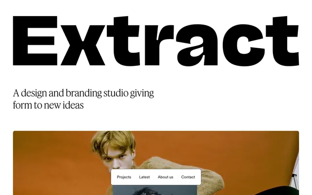
Monochrome Editorial Canvas — grounded in bold typography and rich imagery.
Color palette
Section backgrounds and footer background, providing a subtle, muted color anchor in an otherwise monochrome environment
Neutral form states, badge text, and quiet UI feedback where color should stay understated. Do not promote it to the primary CTA color
Primary text, deep background for cards, input fields, and action buttons, borders for inactive and ghost controls
Typography
- Weights
- 400
- Sizes
- 44px, 104px
- Line height
- 1.25, 1.5
- Fallback
- Anton
Main headings and display text. Its singular, heavy weight demands attention, creating an impactful, almost architectural presence rather than a decorative flourish.
- Weights
- 400, 700
- Sizes
- 18px, 19px, 21px, 34px
- Line height
- 1.25, 1.4, 1.5, 2
- Fallback
- Inter
Body text, navigation, and secondary headings. Its versatility across weights and sizes ensures readability and structured information delivery.
Spacing & shape
Components
Background: Ink Black (#070707), Text: Canvas White (#ffffff), Border: 0px. Border Radius: 4.63636px. Minimal padding on specific sides for unique shape (0px top/right/bottom/left).
Background: Canvas White (#ffffff), Text: Ink Black (#070707), Border: 1px solid Ink Black (#070707). Border Radius: Custom (4.63636px on one side, 0px on others) matching styling of the solid button but with inverted colors.
Background: Ink Black (#070707), Border: none. Border Radius: 9.27273px. Contains large imagery and descriptive text.
Background: Ink Black (#070707), Text: Canvas White (#ffffff), Border: 1px solid Ink Black (#070707). Border Radius: 4.63636px on left, 0px on right. Padding: 9.27273px vertical, 18.5455px horizontal. Placeholder text in Ink Black.
Background: Canvas White (#ffffff), Text: Ink Black (#070707), Border: 1px solid Ink Black (#070707). Border Radius: 0px on left, 4.63636px on right. Padding: 9.27273px vertical, 18.5455px horizontal (inferred matching input).
Guidelines
- Use Feature Deck font (weight 400) for all primary headings (44px, 104px) to establish a strong, impactful visual.
- Maintain a clear monochrome base with Canvas White (#ffffff) for backgrounds and Ink Black (#070707) for text, components, and borders.
- Apply Accent Green (#e7feda) sparingly as a muted background color for distinct sections or footers, never for interactive elements.
- Utilize ABC Diatype (weights 400, 700) for all body text, navigation items, and secondary headings, ensuring readability across various contexts.
- Implement border radii of 9.27273px for cards and images, and 4.63636px for buttons and input fields to maintain a consistent geometric style.
- Employ ghost button styles (Ink Black border, Canvas White background, Ink Black text) for secondary actions or outlined navigation.
- Prioritize natural, rich photography for project showcases, ensuring images are either contained within Ink Black cards or presented against Canvas White backgrounds.
- Avoid using drop shadows or complex gradients; the system relies on flat surfaces and strong contrasts for visual hierarchy.
- Do not introduce additional chromatic colors beyond Accent Green (#e7feda) for UI elements; maintain the strict monochrome and subtle accent palette.
- Do not deviate from the specified font sizes and line heights for Feature Deck and ABC Diatype to preserve the distinct typographic rhythm.
- Do not use Accent Green (#e7feda) for text or primary interactive elements; its role is purely for background segmentation.
- Avoid cluttered layouts; use Element Gap (19px) to provide ample breathing room between elements and Section Gap (59px) between major content blocks.
- Do not apply standard, uniform border radii to all elements; distinguish between card/image radii (9.27273px) and button/input radii (4.63636px).
About this system
ShowHide
Extract's design system channels a confident, editorial aesthetic built on stark black and white contrasts, punctuated by a soft, muted green and rich, natural photography. Typography features bold, custom display fonts for headlines alongside a robust sans-serif for body text, creating a strong sense of visual hierarchy. Components are minimal and grounded in stark geometric shapes, often appearing as ghost outlines or solid blocks, avoiding heavy shadows or intricate decorations to maintain clarity and directness.
The site employs a contained layout with no explicit `pageMaxWidth` detected, suggesting content adapts to available width while maintaining comfortable margins. The hero section features a large, impactful display text centered over a contextual image or flat background. Section rhythm is established through alternating Canvas White and Accent Green backgrounds, creating clear visual breaks. Content is often presented in a two-column layout with imagery accompanying text, or in multi-column card grids for project showcases. Navigation is minimal, often appearing as floating, self-contained interactive components rather than a fixed header.
The site heavily features high-quality, product-focused or editorial photography, often cropped tightly or presented within a clean layout. Images are typically raw, natural, and realistic, avoiding heavy filtering or stylized effects. Photography serves both decorative and explanatory roles, showcasing design projects in context or as standalone artistic elements. Icons, when present, appear to be outlined and monochromatic, complementing the brand's minimalist aesthetic. Imagery occupies significant visual space, often as hero backgrounds or within detailed project grid items.
Reminiscent of Agency for Web, Basement Studio, Griflan.
# Extract — Style Reference
> Monochrome Editorial Canvas — grounded in bold typography and rich imagery.

**Theme:** light

**Site:** https://extract.studio

Extract's design system channels a confident, editorial aesthetic built on stark black and white contrasts, punctuated by a soft, muted green and rich, natural photography. Typography features bold, custom display fonts for headlines alongside a robust sans-serif for body text, creating a strong sense of visual hierarchy. Components are minimal and grounded in stark geometric shapes, often appearing as ghost outlines or solid blocks, avoiding heavy shadows or intricate decorations to maintain clarity and directness.

## Tokens — Colors

| Name | Value | Token | Role |
|------|------|------|------|
| Accent Green | `#e7feda` | `--color-accent-green` | Section backgrounds and footer background, providing a subtle, muted color anchor in an otherwise monochrome environment |
| Canvas White | `#ffffff` | `--color-canvas-white` | Neutral form states, badge text, and quiet UI feedback where color should stay understated. Do not promote it to the primary CTA color |
| Ink Black | `#070707` | `--color-ink-black` | Primary text, deep background for cards, input fields, and action buttons, borders for inactive and ghost controls |

## Tokens — Typography

### Feature Deck
- **Substitute:** Anton
- **Weights:** 400
- **Sizes:** 44px, 104px
- **Line height:** 1.25, 1.5
- **Role:** Main headings and display text. Its singular, heavy weight demands attention, creating an impactful, almost architectural presence rather than a decorative flourish.

### ABC Diatype
- **Substitute:** Inter
- **Weights:** 400, 700
- **Sizes:** 18px, 19px, 21px, 34px
- **Line height:** 1.25, 1.4, 1.5, 2
- **Role:** Body text, navigation, and secondary headings. Its versatility across weights and sizes ensures readability and structured information delivery.

## Tokens — Type Scale

Perfect Fifth (1.5) from 19px base.

| Role | Size | Line height | Letter spacing |
|------|------|------|------|
| subheading | 19px | 1.4 | — |
| heading-sm | 21px | 1.25 | — |
| heading | 34px | 1.25 | — |
| heading-lg | 44px | 1.25 | — |
| display | 104px | 1.5 | — |

## Tokens — Spacing

- **Section gap:** 59px
- **Card padding:** 19px
- **Element gap:** 19px

## Tokens — Radius

- **Buttons:** 4.63636px
- **Inputs:** 4.63636px
- **Cards:** 9.27273px
- **Images:** 9.27273px
- **navigation:** 9.27273px

## Layout

The site employs a contained layout with no explicit `pageMaxWidth` detected, suggesting content adapts to available width while maintaining comfortable margins. The hero section features a large, impactful display text centered over a contextual image or flat background. Section rhythm is established through alternating Canvas White and Accent Green backgrounds, creating clear visual breaks. Content is often presented in a two-column layout with imagery accompanying text, or in multi-column card grids for project showcases. Navigation is minimal, often appearing as floating, self-contained interactive components rather than a fixed header.

## Imagery

The site heavily features high-quality, product-focused or editorial photography, often cropped tightly or presented within a clean layout. Images are typically raw, natural, and realistic, avoiding heavy filtering or stylized effects. Photography serves both decorative and explanatory roles, showcasing design projects in context or as standalone artistic elements. Icons, when present, appear to be outlined and monochromatic, complementing the brand's minimalist aesthetic. Imagery occupies significant visual space, often as hero backgrounds or within detailed project grid items.

## Components

### Solid Navigation Button
*Primary navigation item or active state.*

Background: Ink Black (#070707), Text: Canvas White (#ffffff), Border: 0px. Border Radius: 4.63636px. Minimal padding on specific sides for unique shape (0px top/right/bottom/left).

### Outlined Navigation Button
*Secondary navigation items or inactive states.*

Background: Canvas White (#ffffff), Text: Ink Black (#070707), Border: 1px solid Ink Black (#070707). Border Radius: Custom (4.63636px on one side, 0px on others) matching styling of the solid button but with inverted colors.

### Project Card
*Container for individual project showcases.*

Background: Ink Black (#070707), Border: none. Border Radius: 9.27273px. Contains large imagery and descriptive text.

### Newsletter Input Field
*Email subscription input.*

Background: Ink Black (#070707), Text: Canvas White (#ffffff), Border: 1px solid Ink Black (#070707). Border Radius: 4.63636px on left, 0px on right. Padding: 9.27273px vertical, 18.5455px horizontal. Placeholder text in Ink Black.

### Newsletter Submit Button
*Call to action for newsletter subscription.*

Background: Canvas White (#ffffff), Text: Ink Black (#070707), Border: 1px solid Ink Black (#070707). Border Radius: 0px on left, 4.63636px on right. Padding: 9.27273px vertical, 18.5455px horizontal (inferred matching input).

## Guidelines

### Do

- Use Feature Deck font (weight 400) for all primary headings (44px, 104px) to establish a strong, impactful visual.
- Maintain a clear monochrome base with Canvas White (#ffffff) for backgrounds and Ink Black (#070707) for text, components, and borders.
- Apply Accent Green (#e7feda) sparingly as a muted background color for distinct sections or footers, never for interactive elements.
- Utilize ABC Diatype (weights 400, 700) for all body text, navigation items, and secondary headings, ensuring readability across various contexts.
- Implement border radii of 9.27273px for cards and images, and 4.63636px for buttons and input fields to maintain a consistent geometric style.
- Employ ghost button styles (Ink Black border, Canvas White background, Ink Black text) for secondary actions or outlined navigation.
- Prioritize natural, rich photography for project showcases, ensuring images are either contained within Ink Black cards or presented against Canvas White backgrounds.

### Don't

- Avoid using drop shadows or complex gradients; the system relies on flat surfaces and strong contrasts for visual hierarchy.
- Do not introduce additional chromatic colors beyond Accent Green (#e7feda) for UI elements; maintain the strict monochrome and subtle accent palette.
- Do not deviate from the specified font sizes and line heights for Feature Deck and ABC Diatype to preserve the distinct typographic rhythm.
- Do not use Accent Green (#e7feda) for text or primary interactive elements; its role is purely for background segmentation.
- Avoid cluttered layouts; use Element Gap (19px) to provide ample breathing room between elements and Section Gap (59px) between major content blocks.
- Do not apply standard, uniform border radii to all elements; distinguish between card/image radii (9.27273px) and button/input radii (4.63636px).

## Agent Prompt Guide

### Quick Color Reference
- text: #070707
- background: #ffffff
- border: #070707
- accent: #e7feda
- primary action: no distinct CTA color

### 3-5 Example Component Prompts
1. Create a hero section: Canvas White background. Headline 'A design and branding studio giving form to new ideas' using Feature Deck weight 400 at 104px, Ink Black text. Subtext 'We help brands communicate effectively' using ABC Diatype weight 400 at 21px, Ink Black text.
2. Design a project card: Ink Black (#070707) background, 9.27273px border-radius, 19px padding. Inside, an image with 9.27273px border-radius, followed by a heading 'Project Title' in ABC Diatype weight 700 at 21px, Canvas White text. Underneath, body text 'Short project description' in ABC Diatype weight 400 at 18px, Canvas White text.
3. Build a newsletter signup section: Accent Green (#e7feda) background. Heading 'Join our newsletter' in Feature Deck weight 400 at 44px, Ink Black text. An input field with Ink Black (#070707) background, Canvas White (#ffffff) text, 1px solid Ink Black border, 4.63636px left radius. Next to it, a submit button with Canvas White (#ffffff) background, Ink Black (#070707) text, 1px solid Ink Black border, 4.63636px right radius.
4. Produce a Ghost Navigation Button: Canvas White (#ffffff) background, 1px solid Ink Black (#070707) border, ABC Diatype weight 700 at 18px, Ink Black (#070707) text, 4.63636px border-radius.
More like this









Keep what you find
A free account saves references to boards and can send you a weekly email of picks based on what you save.
To see every result, go Pro.