Preview image. Unlock full-res
Editorial blueprint on stark white
Color palette
Primary text, navigation links, borders, image outlines
Page backgrounds, card surfaces
Spacing & shape
Components
Black text on a white background, typically 10px line-height 1.4, with a 20px bottom margin. These blocks are often framed by a 1px solid #010101 border on all sides or just top/bottom.
Black text, likely uppercase, positioned horizontally at the top of the page. No underlines or background fills on hover, relying solely on text for interaction state.
Images are presented without any border-radius, often with a 1px solid #010101 border on certain edges, aligning with text content. They are stacked vertically with minimal spacing.
Guidelines
- Maintain a strict achromatic palette, using only #010101 for text and borders, and #FFFFFF for backgrounds.
- Utilize a 1px solid #010101 border to define and separate content sections and elements.
- Prioritize text as the primary means of conveying information and hierarchy, avoiding expressive imagery or decorative graphics.
- Implement a base element gap of 8px for vertical rhythm between related items.
- Keep all corners sharp (0px border-radius) across all interface elements.
- Ensure generous top and bottom padding around content, especially headings, to provide visual breathing room.
- Place navigation discreetly at the top or bottom edges of the viewport, using only text (e.g., 'ABOUT', '0', '4').
- Do not introduce any color beyond black and white into the interface.
- Avoid using rounded corners for any UI element; all shapes must be angular and sharp.
- Do not use elevation or shadows; maintain a completely flat visual plane.
- Do not use gradients for backgrounds or any graphical elements.
- Do not center-align blocks of body text; left-alignment is preferred for content areas.
- Avoid large hero sections with prominent imagery; content should start near the top of the viewport with minimal visual fanfare.
- Do not use custom icons or illustrations; rely on typography and simple layout to communicate.
About this system
ShowHide
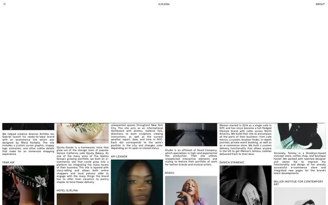
Studio Otto's visual system evokes a raw, editorial blueprint aesthetic. Dominated by stark black-on-white, the design emphasizes content through rigid grid structures and minimal visual embellishment. Thin borders define content blocks, and the absence of decorative color or rounded corners creates a severe, almost academic clarity. Typography acts as the primary visual hierarchy, with no supporting graphical elements to soften the angular presentation.
The page adheres to a maximal-width, full-bleed model, with content spanning the entire viewport width. The hero section is essentially absent, replaced by a simple header with navigation elements and a date. Content is arranged in a staggered, multi-column grid, featuring alternating text-left/image-right or image-left/text-right patterns. Vertical rhythm is established through consistent spacing between content blocks and the use of thin horizontal dividers. Navigation is minimal, consisting of small text links pinned to the top corners of the page.
Imagery primarily consists of photography, presented in tight crops within a rigid grid. Images are treated as raw content blocks, with full sharp edges and no masking. They serve a functional role as portfolio showcases, and are high-key with natural color saturation, with no specific filters or treatments applied. Visual density is moderate, with images typically paired closely with descriptive text blocks. Icons are not a present feature, reinforcing the typographic focus.
Reminiscent of Are.na, New York Times (Archive Section), Dropbox Design Site, Some early web 1.0 sites.
# Studio Otto — Style Reference
> Editorial blueprint on stark white

**Theme:** light

**Site:** https://studio-otto.com

Studio Otto's visual system evokes a raw, editorial blueprint aesthetic. Dominated by stark black-on-white, the design emphasizes content through rigid grid structures and minimal visual embellishment. Thin borders define content blocks, and the absence of decorative color or rounded corners creates a severe, almost academic clarity. Typography acts as the primary visual hierarchy, with no supporting graphical elements to soften the angular presentation.

## Tokens — Colors

| Name | Value | Token | Role |
|------|------|------|------|
| Midnight Ink | `#010101` | `--color-midnight-ink` | Primary text, navigation links, borders, image outlines |
| Canvas White | `#FFFFFF` | `--color-canvas-white` | Page backgrounds, card surfaces |

## Tokens — Spacing

- **Section gap:** 40px
- **Card padding:** 20px
- **Element gap:** 8px

## Tokens — Radius

- **all:** 0px

## Layout

The page adheres to a maximal-width, full-bleed model, with content spanning the entire viewport width. The hero section is essentially absent, replaced by a simple header with navigation elements and a date. Content is arranged in a staggered, multi-column grid, featuring alternating text-left/image-right or image-left/text-right patterns. Vertical rhythm is established through consistent spacing between content blocks and the use of thin horizontal dividers. Navigation is minimal, consisting of small text links pinned to the top corners of the page.

## Imagery

Imagery primarily consists of photography, presented in tight crops within a rigid grid. Images are treated as raw content blocks, with full sharp edges and no masking. They serve a functional role as portfolio showcases, and are high-key with natural color saturation, with no specific filters or treatments applied. Visual density is moderate, with images typically paired closely with descriptive text blocks. Icons are not a present feature, reinforcing the typographic focus.

## Components

### Editorial Text Block
*Content display*

Black text on a white background, typically 10px line-height 1.4, with a 20px bottom margin. These blocks are often framed by a 1px solid #010101 border on all sides or just top/bottom.

### Navigation Link
*Global navigation*

Black text, likely uppercase, positioned horizontally at the top of the page. No underlines or background fills on hover, relying solely on text for interaction state.

### Image Card
*Portfolio showcase*

Images are presented without any border-radius, often with a 1px solid #010101 border on certain edges, aligning with text content. They are stacked vertically with minimal spacing.

## Guidelines

### Do

- Maintain a strict achromatic palette, using only #010101 for text and borders, and #FFFFFF for backgrounds.
- Utilize a 1px solid #010101 border to define and separate content sections and elements.
- Prioritize text as the primary means of conveying information and hierarchy, avoiding expressive imagery or decorative graphics.
- Implement a base element gap of 8px for vertical rhythm between related items.
- Keep all corners sharp (0px border-radius) across all interface elements.
- Ensure generous top and bottom padding around content, especially headings, to provide visual breathing room.
- Place navigation discreetly at the top or bottom edges of the viewport, using only text (e.g., 'ABOUT', '0', '4').

### Don't

- Do not introduce any color beyond black and white into the interface.
- Avoid using rounded corners for any UI element; all shapes must be angular and sharp.
- Do not use elevation or shadows; maintain a completely flat visual plane.
- Do not use gradients for backgrounds or any graphical elements.
- Do not center-align blocks of body text; left-alignment is preferred for content areas.
- Avoid large hero sections with prominent imagery; content should start near the top of the viewport with minimal visual fanfare.
- Do not use custom icons or illustrations; rely on typography and simple layout to communicate.

## Agent Prompt Guide

Quick Color Reference:
text: #010101
background: #FFFFFF
border: #010101
accent: no distinct accent color
primary action: no distinct CTA color

Example Component Prompts:
1. Create a content block: #FFFFFF background, with a 1px solid #010101 border on all sides. Use black text at 10px line-height 1.4, with 20px bottom margin for body copy.
2. Create a navigation element: Display 'ABOUT' in black #010101 text, uppercase, at the top right of the page. No underline or hover state changes beyond text color.
3. Create an image card: Display a full-width image with sharp 0px corners, bordered by a 1px solid #010101 line at any edge that meets another content block. Immediately below, add black text caption.
More like this









Keep what you find
A free account saves references to boards and can send you a weekly email of picks based on what you save.
To see every result, go Pro.