Preview image. Unlock full-res
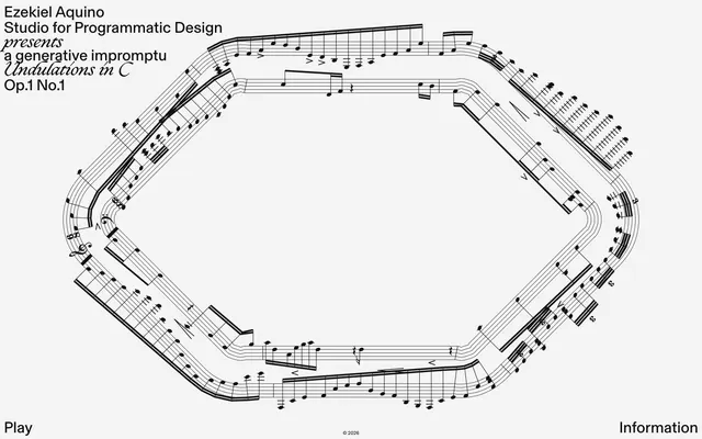
Monochromatic Score Sheet — text as structure, notation as art, on a silent white canvas.
Color palette
Primary text for headings and body, accent for structural borders in the generative graphic. The stark black creates a formal contrast against the light background
Dominant background color for the overall page, providing a clean, expansive, and subtle off-white paper-like base
Hairline borders, dividers, input outlines, and card edges on light surfaces. Do not promote it to the primary CTA color
Typography
- Weights
- 400
- Sizes
- 10px, 32px
- Line height
- 1
- Letter spacing
- normal
- Fallback
- Inter
Body text for descriptions and navigation. Its clean, contemporary lines ground the system with a subtle technical feel. Used widely for general interface elements.
- Weights
- 400
- Sizes
- 32px
- Line height
- 1
- Letter spacing
- normal
- Fallback
- Helvetica Neue
Primary headings and artistic titles requiring a modern, clean, and understated presence. Shares the same size as the italicized serif for visual harmony.
- Weights
- 400
- Sizes
- 32px
- Line height
- 0.92
- Letter spacing
- normal
- Fallback
- Playfair Display Italic
Italicized heading for key artistic statements, offering an elegant, classical touch. The tight line height hints at a carefully crafted composition.
- Weights
- 400
- Sizes
- 13px
- Line height
- 1.2
- Letter spacing
- normal
- Fallback
- Arial
Small functional text, potentially for discreet UI elements or copyright notices. Its commonality provides a neutral, almost invisible anchor.
Spacing & shape
Components
Text color: #ffffff, Background: rgba(0, 0, 0, 0), Border: none, Padding: 0px, Border Radius: 0px.
Guidelines
- Prioritize a monochrome palette using Note Black (#000000) for primary text and Canvas White (#f4f4f4) for backgrounds.
- Use Ghost White (#ffffff) for subtle interactive text elements.
- Employ Basel Grotesk for most functional text and Neue Haas Unica W01 Regular for main headings, maintaining a consistent 32px size for prominent titles.
- Introduce Ogg Regular Italic specifically for artistic or 'presents' statements, emphasizing its elegant italicized form with a tight 0.92 line height.
- Maintain a sense of generous negative space; do not crowd elements.
- Apply hard-edged, 0px border radius for all interactive elements and containers.
- Ensure all interactive buttons are styled as ghost buttons with no background or border, using Ghost White (#ffffff) for text against the Canvas White background for a minimalist interaction point.
- Avoid the use of any bright or saturated colors; the system is strictly achromatic.
- Do not add shadows, gradients, or heavy borders to any UI elements.
- Refrain from using varied padding or rounded corners on buttons or cards; maintain a crisp, flat aesthetic.
- Do not introduce decorative elements that distract from the typography or the central generative graphic.
- Do not use generic system fonts for prominent headings or artistic text; rely on the specific font choices (Basel Grotesk, Neue Haas Unica, Ogg Italic) to convey brand identity.
- Avoid dense UIs; prioritize clear separation and ample whitespace between content blocks.
- Do not use a default button style with a solid background; all interactive elements should appear as text links.
About this system
ShowHide
Ezekiel Aquino's design system evokes an academic, minimalist aesthetic, reminiscent of a printed score on paper. The core visual identity is built on high-contrast monochrome with extensive negative space, making typography the primary visual element. The interplay of classic serif and modern sans-serif fonts, coupled with an almost entirely achromatic palette, creates a refined and intellectual atmosphere. Visual interest is primarily driven by artful arrangement of text and the graphic use of musical notation, rather than decorative UI elements or vibrant color.
Reminiscent of Are.na, The Browser Company (Arc), Brutalist Websites, Erik Spiekermann's personal site.
# Ezekiel Aquino — Style Reference
> Monochromatic Score Sheet — text as structure, notation as art, on a silent white canvas.

**Theme:** light

**Site:** https://ezekielaquino.com

Ezekiel Aquino's design system evokes an academic, minimalist aesthetic, reminiscent of a printed score on paper. The core visual identity is built on high-contrast monochrome with extensive negative space, making typography the primary visual element. The interplay of classic serif and modern sans-serif fonts, coupled with an almost entirely achromatic palette, creates a refined and intellectual atmosphere. Visual interest is primarily driven by artful arrangement of text and the graphic use of musical notation, rather than decorative UI elements or vibrant color.

## Tokens — Colors

| Name | Value | Token | Role |
|------|------|------|------|
| Note Black | `#000000` | `--color-note-black` | Primary text for headings and body, accent for structural borders in the generative graphic. The stark black creates a formal contrast against the light background |
| Canvas White | `#f4f4f4` | `--color-canvas-white` | Dominant background color for the overall page, providing a clean, expansive, and subtle off-white paper-like base |
| Ghost White | `#ffffff` | `--color-ghost-white` | Hairline borders, dividers, input outlines, and card edges on light surfaces. Do not promote it to the primary CTA color |

## Tokens — Typography

### Basel Grotesk
- **Substitute:** Inter
- **Weights:** 400
- **Sizes:** 10px, 32px
- **Line height:** 1
- **Letter spacing:** normal
- **Role:** Body text for descriptions and navigation. Its clean, contemporary lines ground the system with a subtle technical feel. Used widely for general interface elements.

### Neue Haas Unica W01 Regular
- **Substitute:** Helvetica Neue
- **Weights:** 400
- **Sizes:** 32px
- **Line height:** 1
- **Letter spacing:** normal
- **Role:** Primary headings and artistic titles requiring a modern, clean, and understated presence. Shares the same size as the italicized serif for visual harmony.

### Ogg Regular Italic
- **Substitute:** Playfair Display Italic
- **Weights:** 400
- **Sizes:** 32px
- **Line height:** 0.92
- **Letter spacing:** normal
- **Role:** Italicized heading for key artistic statements, offering an elegant, classical touch. The tight line height hints at a carefully crafted composition.

### Arial
- **Substitute:** Arial
- **Weights:** 400
- **Sizes:** 13px
- **Line height:** 1.2
- **Letter spacing:** normal
- **Role:** Small functional text, potentially for discreet UI elements or copyright notices. Its commonality provides a neutral, almost invisible anchor.

## Tokens — Spacing

- **Section gap:** 64px
- **Card padding:** 0px
- **Element gap:** 16px

## Tokens — Radius

- **Buttons:** 0px

## Components

### Ghost Navigation Button
*Primary interactive element for navigation. It's a visually subtle, text-only button with no background or border, relying on text color for subtle visibility.*

Text color: #ffffff, Background: rgba(0, 0, 0, 0), Border: none, Padding: 0px, Border Radius: 0px.

## Guidelines

### Do

- Prioritize a monochrome palette using Note Black (#000000) for primary text and Canvas White (#f4f4f4) for backgrounds.
- Use Ghost White (#ffffff) for subtle interactive text elements.
- Employ Basel Grotesk for most functional text and Neue Haas Unica W01 Regular for main headings, maintaining a consistent 32px size for prominent titles.
- Introduce Ogg Regular Italic specifically for artistic or 'presents' statements, emphasizing its elegant italicized form with a tight 0.92 line height.
- Maintain a sense of generous negative space; do not crowd elements.
- Apply hard-edged, 0px border radius for all interactive elements and containers.
- Ensure all interactive buttons are styled as ghost buttons with no background or border, using Ghost White (#ffffff) for text against the Canvas White background for a minimalist interaction point.

### Don't

- Avoid the use of any bright or saturated colors; the system is strictly achromatic.
- Do not add shadows, gradients, or heavy borders to any UI elements.
- Refrain from using varied padding or rounded corners on buttons or cards; maintain a crisp, flat aesthetic.
- Do not introduce decorative elements that distract from the typography or the central generative graphic.
- Do not use generic system fonts for prominent headings or artistic text; rely on the specific font choices (Basel Grotesk, Neue Haas Unica, Ogg Italic) to convey brand identity.
- Avoid dense UIs; prioritize clear separation and ample whitespace between content blocks.
- Do not use a default button style with a solid background; all interactive elements should appear as text links.

## Agent Prompt Guide

Quick Color Reference:
text: #000000
background: #f4f4f4
border: #000000
accent: #000000
primary action: no distinct CTA color

Example Component Prompts:
1. Create a primary page heading section using 'Neue Haas Unica W01 Regular' at 32px and '#000000' text color, with one line italicized using 'Ogg Regular Italic' at 32px and '#000000' text color, lh 0.92, all left-aligned.
2. Design a subtle navigation link using 'Basel Grotesk' at 10px, '#ffffff' text color, and 0px border-radius, positioned in the bottom-left corner of the viewport.
3. Create a copyright notice using 'Arial' at 13px, '#000000' text color, centered at the bottom of the page.
More like this









Keep what you find
A free account saves references to boards and can send you a weekly email of picks based on what you save.
To see every result, go Pro.