Preview image. Unlock full-res
Warm Scandi elegance
Color palette
Primary text, prominent headings, critical icon details, dark borders — establishes authority and contrast
Primary action backgrounds, interactive elements, subtle accent washes — a soft, inviting blue that feels approachable
Subtle background accents, decorative elements, hero section backgrounds — a very light, cool-tinted neutral
Green action color for filled buttons, selected navigation states, and focused conversion moments
Interactive link text, secondary link borders, subtle visual highlights — a vivid, functional blue
Page background, foundational light surface
Base surface for cards, input fields, prominent UI elements, subtle borders
Secondary surface for card backgrounds and subtle section separators
Strong secondary text, bold borders, accent details
Heading text, primary icons, outline borders, strong contrast elements
Hairline separators and subtle borders
Muted body text, secondary text, placeholder text, border accents
Badge borders, subtle dividers
Detailed body text, secondary informational text, supporting link states
Input field borders, lightest gray for background tints
Typography
- Weights
- 300, 400, 500, 700
- Sizes
- 9px, 10px, 11px, 12px, 13px, 14px, 15px, 16px, 18px
- Line height
- 1, 1.25, 1.29, 1.33, 1.38, 1.5, 1.54, 1.6, 1.63, 2.14
- Letter spacing
- 0.010em (9px), 0.011em (10px), 0.012em (11-12px), 0.013em (13-14px), 0.015em (15-16px), 0.018em (18px)
- Fallback
- system-ui, sans-serif
UI elements, body copy, captions, buttons, and detailed content. Its consistent tracking ensures clarity across various compact applications.
- Weights
- 300, 400, 500
- Sizes
- 18px, 22px, 24px, 28px, 32px, 40px, 60px
- Line height
- 1, 1.25, 1.5
- Letter spacing
- -0.010em (60px), 0.004em (40px), 0.005em (32px), 0.006em (28px), 0.007em (24px), 0.009em (18-22px)
- Fallback
- Georgia, serif
Headlines and prominent display text. Its distinct character and tighter letter-spacing at larger sizes give it a sophisticated, editorial presence.
- Weights
- 300
- Sizes
- 18px
- Line height
- 1
Font Awesome 5 Pro — detected in extracted data but not described by AI
Spacing & shape
Elevation
Components
Background: Sky Dust (#b0c7fa), Text: Midnight Ink (#030e28), Border Radius: 4px, Padding: 10px vertical, 15px horizontal. Uses Moderat font.
Background: transparent, Text: Midnight Ink (#030e28), Border: 1px solid Midnight Ink (#030e28), Border Radius: 4px, Padding: variable. Uses Moderat font.
Background: transparent or Sky Dust (#b0c7fa) on hover, Text: Midnight Ink (#030e28), Border Radius: 9999px (full capsule), Padding: variable. Uses Moderat font.
Background: Cloud Gray (#f7f7f7), Border Radius: 2px, No box shadow, Padding: 16px. Imagery fills the top portion, text below.
Background: transparent, Border Radius: 2px, No box shadow, Padding: 16px. Often used for testimonial blocks or simple image containers.
Background: White Linen (#ffffff), Border: 1px solid Quartz Dust (#b7b7b9), Border Radius: 0px, Padding: 0px vertical, 12px horizontal. Text: Midnight Ink (#030e28).
Background: Spring Bud (#c9fd5b), Text: Deep Graphite (#232323), Border Radius: 0px, Padding: small, inline with content. Uses Moderat font.
Guidelines
- Use Midnight Ink (#030e28) for all primary text and critical UI outlines to maintain brand identity.
- Apply Sky Dust (#b0c7fa) for primary call-to-action button backgrounds, ensuring a consistent interactive feel.
- Maintain a default border radius of 2px for cards and containers, and 4px for interactive buttons.
- Utilize Moderat for all UI elements and body text, with precise letter-spacing as per type scale for optimal legibility.
- Employ Gelica for headlines and display text, prioritizing its distinct character and larger sizes for impactful messaging.
- Structure layouts using a 1200px max-width content container, centered on the page for visual stability.
- Ensure section gaps are consistently 64px to create comfortable breathing room between content blocks.
- Avoid using multiple chromatic colors for primary actions; reserve Sky Dust (#b0c7fa) for this role.
- Do not introduce sharp corners or excessively large radii; adhere to the established 2px and 4px radii.
- Refrain from heavy shadows or strong elevation; opt for minimal, subtle elevation when necessary.
- Do not deviate from the defined letter-spacing values for Moderat and Gelica fonts; precise tracking is critical.
- Avoid using purely black (#000000) for body text; reserve it for headings and high-contrast icons.
- Do not use gradients unless explicitly defined; the system relies on solid colors for clear, understated design.
- Avoid dense, text-heavy sections without image support; integrate product visuals or illustrations frequently.
About this system
ShowHide
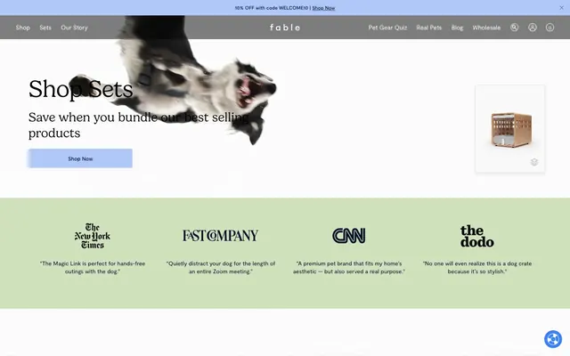
Fable crafts a comforting, refined aesthetic for pet products. It blends warm, inviting neutrals with a singular, muted blue accent that signals interactivity without harshness. Typography is precise and legible, complementing detailed product imagery and subtle illustrative elements. The system emphasizes soft surfaces and rounded edges, creating a gentle, approachable feel for a premium brand.
The site employs a primarily contained layout, utilizing a central 'pageMaxWidth' of 1200px. Sections often alternate between full-width background bands (like the green testimonial section) and content constrained within the max-width. The hero section frequently combines a large, dynamic hero image (often full-bleed or near full-bleed) with a prominent headline and primary call-to-action. Content arrangement features a strong vertical rhythm with consistent section gaps of 64px. Product listings use a responsive grid, typically 3 columns. Navigation is a sticky top bar with clear links and utility icons.
The visual language blends detailed product photography with light, whimsical line-art illustrations. Product shots are typically tight crops, often presented on pure white or light gray backgrounds, emphasizing the object itself. Lifestyle photography, when present, maintains a clean, natural light aesthetic. Illustrations are sparse, organic, monochrome line drawings — often depicting interactions between owners and pets, serving as decorative and explanatory content, adding a touch of playful warmth. Icons are outlined, simple, and functional, primarily monochrome or using accent colors. The overall density is balanced, allowing imagery to break up text-heavy sections and add visual interest.
Reminiscent of Our Place, Brooklinen, Allbirds, Native Deodorant.
# Fable — Style Reference
> Warm Scandi elegance

**Theme:** light

**Site:** https://fablepets.com

Fable crafts a comforting, refined aesthetic for pet products. It blends warm, inviting neutrals with a singular, muted blue accent that signals interactivity without harshness. Typography is precise and legible, complementing detailed product imagery and subtle illustrative elements. The system emphasizes soft surfaces and rounded edges, creating a gentle, approachable feel for a premium brand.

## Tokens — Colors

| Name | Value | Token | Role |
|------|------|------|------|
| Midnight Ink | `#030e28` | `--color-midnight-ink` | Primary text, prominent headings, critical icon details, dark borders — establishes authority and contrast |
| Sky Dust | `#b0c7fa` | `--color-sky-dust` | Primary action backgrounds, interactive elements, subtle accent washes — a soft, inviting blue that feels approachable |
| Mist Bloom | `#dbddff` | `--color-mist-bloom` | Subtle background accents, decorative elements, hero section backgrounds — a very light, cool-tinted neutral |
| Spring Bud | `#c9fd5b` | `--color-spring-bud` | Green action color for filled buttons, selected navigation states, and focused conversion moments |
| Ocean Glimmer | `#2563ed` | `--color-ocean-glimmer` | Interactive link text, secondary link borders, subtle visual highlights — a vivid, functional blue |
| Canvas | `#faf8f5` | `--color-canvas` | Page background, foundational light surface |
| White Linen | `#ffffff` | `--color-white-linen` | Base surface for cards, input fields, prominent UI elements, subtle borders |
| Cloud Gray | `#f7f7f7` | `--color-cloud-gray` | Secondary surface for card backgrounds and subtle section separators |
| Deep Graphite | `#232323` | `--color-deep-graphite` | Strong secondary text, bold borders, accent details |
| Pitch Black | `#000000` | `--color-pitch-black` | Heading text, primary icons, outline borders, strong contrast elements |
| Light Grille | `#eeeeee` | `--color-light-grille` | Hairline separators and subtle borders |
| Shadow Fog | `#7c7f85` | `--color-shadow-fog` | Muted body text, secondary text, placeholder text, border accents |
| Stone Slate | `#dbdddf` | `--color-stone-slate` | Badge borders, subtle dividers |
| Cool Ash | `#515357` | `--color-cool-ash` | Detailed body text, secondary informational text, supporting link states |
| Quartz Dust | `#b7b7b9` | `--color-quartz-dust` | Input field borders, lightest gray for background tints |

## Tokens — Typography

### Moderat
- **Substitute:** system-ui, sans-serif
- **Weights:** 300, 400, 500, 700
- **Sizes:** 9px, 10px, 11px, 12px, 13px, 14px, 15px, 16px, 18px
- **Line height:** 1, 1.25, 1.29, 1.33, 1.38, 1.5, 1.54, 1.6, 1.63, 2.14
- **Letter spacing:** 0.010em (9px), 0.011em (10px), 0.012em (11-12px), 0.013em (13-14px), 0.015em (15-16px), 0.018em (18px)
- **Role:** UI elements, body copy, captions, buttons, and detailed content. Its consistent tracking ensures clarity across various compact applications.

### Gelica
- **Substitute:** Georgia, serif
- **Weights:** 300, 400, 500
- **Sizes:** 18px, 22px, 24px, 28px, 32px, 40px, 60px
- **Line height:** 1, 1.25, 1.5
- **Letter spacing:** -0.010em (60px), 0.004em (40px), 0.005em (32px), 0.006em (28px), 0.007em (24px), 0.009em (18-22px)
- **Role:** Headlines and prominent display text. Its distinct character and tighter letter-spacing at larger sizes give it a sophisticated, editorial presence.

### Font Awesome 5 Pro
- **Weights:** 300
- **Sizes:** 18px
- **Line height:** 1
- **Role:** Font Awesome 5 Pro — detected in extracted data but not described by AI

## Tokens — Type Scale

Golden Ratio (1.618) from 14px base.

| Role | Size | Line height | Letter spacing |
|------|------|------|------|
| body | 14px | 1.5 | 0.18px |
| subheading | 18px | 1.5 | 0.16px |
| heading | 28px | 1.25 | 0.17px |
| display | 60px | 1 | -0.6px |

## Tokens — Spacing

- **Max width:** 1200px
- **Section gap:** 64px
- **Card padding:** 16px
- **Element gap:** 16px

## Tokens — Radius

- **Default:** 2px
- **Buttons:** 4px
- **pills:** 9999px

## Tokens — Elevation

- **Button/Card:** `rgba(0, 0, 0, 0.04) 0px 4px 8px 0px, rgba(0, 0, 0, 0.06) 0px 0px 2px 0px, rgba(0, 0, 0, 0.04) 0px 0px 1px 0px`

## Layout

The site employs a primarily contained layout, utilizing a central 'pageMaxWidth' of 1200px. Sections often alternate between full-width background bands (like the green testimonial section) and content constrained within the max-width. The hero section frequently combines a large, dynamic hero image (often full-bleed or near full-bleed) with a prominent headline and primary call-to-action. Content arrangement features a strong vertical rhythm with consistent section gaps of 64px. Product listings use a responsive grid, typically 3 columns. Navigation is a sticky top bar with clear links and utility icons.

## Imagery

The visual language blends detailed product photography with light, whimsical line-art illustrations. Product shots are typically tight crops, often presented on pure white or light gray backgrounds, emphasizing the object itself. Lifestyle photography, when present, maintains a clean, natural light aesthetic. Illustrations are sparse, organic, monochrome line drawings — often depicting interactions between owners and pets, serving as decorative and explanatory content, adding a touch of playful warmth. Icons are outlined, simple, and functional, primarily monochrome or using accent colors. The overall density is balanced, allowing imagery to break up text-heavy sections and add visual interest.

## Components

### Primary Filled Button
*Key calls to action*

Background: Sky Dust (#b0c7fa), Text: Midnight Ink (#030e28), Border Radius: 4px, Padding: 10px vertical, 15px horizontal. Uses Moderat font.

### Ghost Button
*Secondary actions, navigation links*

Background: transparent, Text: Midnight Ink (#030e28), Border: 1px solid Midnight Ink (#030e28), Border Radius: 4px, Padding: variable. Uses Moderat font.

### Pill Button
*Tertiary filters or tags*

Background: transparent or Sky Dust (#b0c7fa) on hover, Text: Midnight Ink (#030e28), Border Radius: 9999px (full capsule), Padding: variable. Uses Moderat font.

### Product Card
*Displaying individual products*

Background: Cloud Gray (#f7f7f7), Border Radius: 2px, No box shadow, Padding: 16px. Imagery fills the top portion, text below.

### Minimal Card
*Content grouping without strong visual emphasis*

Background: transparent, Border Radius: 2px, No box shadow, Padding: 16px. Often used for testimonial blocks or simple image containers.

### Input Field
*User data entry*

Background: White Linen (#ffffff), Border: 1px solid Quartz Dust (#b7b7b9), Border Radius: 0px, Padding: 0px vertical, 12px horizontal. Text: Midnight Ink (#030e28).

### Best Seller Badge
*Highlighting popular products*

Background: Spring Bud (#c9fd5b), Text: Deep Graphite (#232323), Border Radius: 0px, Padding: small, inline with content. Uses Moderat font.

## Guidelines

### Do

- Use Midnight Ink (#030e28) for all primary text and critical UI outlines to maintain brand identity.
- Apply Sky Dust (#b0c7fa) for primary call-to-action button backgrounds, ensuring a consistent interactive feel.
- Maintain a default border radius of 2px for cards and containers, and 4px for interactive buttons.
- Utilize Moderat for all UI elements and body text, with precise letter-spacing as per type scale for optimal legibility.
- Employ Gelica for headlines and display text, prioritizing its distinct character and larger sizes for impactful messaging.
- Structure layouts using a 1200px max-width content container, centered on the page for visual stability.
- Ensure section gaps are consistently 64px to create comfortable breathing room between content blocks.

### Don't

- Avoid using multiple chromatic colors for primary actions; reserve Sky Dust (#b0c7fa) for this role.
- Do not introduce sharp corners or excessively large radii; adhere to the established 2px and 4px radii.
- Refrain from heavy shadows or strong elevation; opt for minimal, subtle elevation when necessary.
- Do not deviate from the defined letter-spacing values for Moderat and Gelica fonts; precise tracking is critical.
- Avoid using purely black (#000000) for body text; reserve it for headings and high-contrast icons.
- Do not use gradients unless explicitly defined; the system relies on solid colors for clear, understated design.
- Avoid dense, text-heavy sections without image support; integrate product visuals or illustrations frequently.

## Agent Prompt Guide

**Quick Color Reference:**
text: #030e28
background: #faf8f5
border: #dbdddf
accent: #b0c7fa
primary action: #b0c7fa (filled action)

**Example Component Prompts:**
1. Create a Primary Action Button: #b0c7fa background, #000000 text, 9999px radius, compact pill padding. Use this filled treatment for the main CTA.
2. Design a `Product Card` for 'The Puffin™ Game' with an image, title, and a 'Best Seller Badge'.
3. Implement a `Ghost Button` for 'See Details' next to product information.
4. Produce an `Input Field` for an email address, labeled 'Your Email'.
5. Generate a section header using Gelica font, weight 400, size 40px, letter-spacing 0.16px, color #000000, with body text below it using Moderat font, weight 400, size 14px, letter-spacing 0.18px, color #030e28.
More like this








Keep what you find
A free account saves references to boards and can send you a weekly email of picks based on what you save.
To see every result, go Pro.