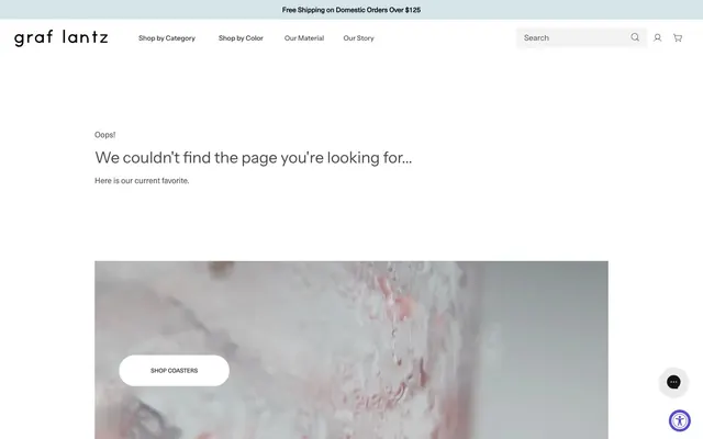
Preview image. Unlock full-res
White canvas, sharp monochrome details.
Color palette
Primary Call To Action backgrounds, active interactive elements — a vivid punctuation mark that guides user interaction
Page backgrounds, elevated card surfaces, primary content areas
Primary text, prominent links, footer text. Provides strong contrast against white backgrounds
General body text, default input text, secondary button text, and navigational links. This forms the most common text color
Input backgrounds, secondary button backgrounds, subtle dividers, and light strokes
Strong borders, specific icon fills, and high-emphasis text snippets, often used for structural outlines
Helper text, less important links, and soft borders, offering a tertiary level of visual hierarchy
Typography
- Weights
- 400, 500, 900
- Sizes
- 12px, 14px, 16px
- Line height
- 1, 1.2, 1.4, 1.5
- Letter spacing
- normal
- Fallback
- Helvetica Neue
Primary typeface for most text content including body, links, navigation, and footer text. Its precise forms contribute to the system's clean, structured feel.
- Weights
- 400, 500
- Sizes
- 14px, 16px, 32px
- Line height
- 1.2
- Letter spacing
- normal
- Fallback
- Inter
Used for headings and input fields, providing clear, readable titles that maintain the overall modern aesthetic.
- Weights
- 400
- Sizes
- 16px, 35px
- Line height
- 1
- Letter spacing
- normal
- Fallback
- System UI
A distinct display font used sparingly for high-impact buttons or decorative headings, injecting a unique personality.
- Weights
- 400
- Sizes
- 16px
- Line height
- 1.2
Source Sans Pro — detected in extracted data but not described by AI
Spacing & shape
Components
Filled button with 'Violet Action' background (#574cd5), 'Graphite Text' (#474747), and a 100% border radius creating a pill shape. Text is medium weight (500) Instrument Sans at 16px.
Input field with 'Subtle Gray' background (#eeeeee), 'Graphite Text' (#474747) for text, no border radius (0px). Padding is 9px vertical and 16px horizontal. Uses Instrument Sans.
Ghost button with 'Subtle Gray' background (#eeeeee), 'Graphite Text' (#474747) for text, and no border radius (0px). Padded 0px vertical and 15px horizontal. Uses NeueHaasUnicaW1G.
Text link using NeueHaasUnicaW1G, size 16px, 'Graphite Text' (#474747). Active/focus states likely involve border or color changes.
Button with 'Canvas White' background (#ffffff), 'Graphite Text' (#474747), and a 50px border radius, typically containing uppercase text. Example: 'SHOP COASTERS'.
Guidelines
- Use 'Canvas White' (#ffffff) as the default background for all primary page sections and elevated component surfaces.
- Apply 'Graphite Text' (#474747) for most body text, links, and form field content to ensure consistent readability.
- Reserve 'Violet Action' (#574cd5) exclusively for primary interactive elements, such as filled call-to-action buttons, to maintain its impact.
- Form input fields should utilize 'Subtle Gray' (#eeeeee) backgrounds and maintain a 0px border radius for a sharp, neutral appearance.
- Headlines should primarily use Instrument Sans font with variable weights and sizes (e.g., 32px), with careful attention to line height 1.2 to 1.0.
- Maintain a default padding of 15px for cards and primary element spacing, with sections separated by 50px of vertical space.
- Employ a 0px border radius for most container elements and buttons to preserve the sharp, modern aesthetic, except for specific pill-shaped elements that use 50px.
- Do not introduce new vibrant colors outside of 'Violet Action' (#574cd5) for interactive elements; color should remain predominantly monochromatic.
- Avoid arbitrary uses of 'Deepest Gray' (#000000) for text; reserve it for structural borders or specific high-contrast icon details.
- Do not vary border radius extensively; stick to 0px for most elements and 50px for specific pill-like shapes.
- Refrain from using lightweight fonts for primary headings. Instrument Sans at weights 400 or 500 should be used for clarity.
- Do not apply shadows or heavy elevation styles; the system relies on flat surfaces and high color contrast for hierarchy.
- Avoid using multiple font families for body text; NeueHaasUnicaW1G should be the standard for general content.
- Do not deviate from the established spacing units of 4px increments, particularly for element gaps (15px) and section gaps (50px).
About this system
ShowHide
Graf Lantz embodies a clean, material-focused aesthetic with a high-contrast monochromatic palette grounded in deep grays and precise typography. Surfaces are predominantly white, providing a crisp canvas for content, while subtle off-white tones introduce minimal depth. A single, vivid violet accent is reserved for primary interactive elements, providing a focused point of action against the otherwise subdued interface. Components are lightweight with strong outlines and sharp corners generally, though some interactive elements feature a playful, overtly rounded form.
The page structure favors a max-width contained layout, likely centered, rather than full-bleed. The hero section is characterized by a prominent visual (like a background image with text overlay) and a focused call to action. Section rhythm appears to be consistent with ample vertical spacing. Content arrangement frequently uses stacked elements with clear headings and accompanying text. Navigation is a simple top bar with text links, likely sticky or prominent. The density is on the comfortable side, prioritizing readability and visual breathing room over information packing.
This system primarily uses product photography, often close-cropped to showcase material texture and detail. Imagery is presented within contained sections, with a tendency toward raw edges over masking. The photography appears brightly lit, focusing on the product itself with minimal background context. Icons are minimal, likely outlined, and contribute to the functional UI rather than serving as decorative elements. The overall density of imagery is balanced, with imagery serving both explanatory and atmospheric roles, breaking up text-dominant sections.
Reminiscent of Everlane, Aesop, Figma, Made by Google (Store).
# Graf Lantz — Style Reference
> White canvas, sharp monochrome details.

**Theme:** light

**Site:** https://glob.land

Graf Lantz embodies a clean, material-focused aesthetic with a high-contrast monochromatic palette grounded in deep grays and precise typography. Surfaces are predominantly white, providing a crisp canvas for content, while subtle off-white tones introduce minimal depth. A single, vivid violet accent is reserved for primary interactive elements, providing a focused point of action against the otherwise subdued interface. Components are lightweight with strong outlines and sharp corners generally, though some interactive elements feature a playful, overtly rounded form.

## Tokens — Colors

| Name | Value | Token | Role |
|------|------|------|------|
| Violet Action | `#574cd5` | `--color-violet-action` | Primary Call To Action backgrounds, active interactive elements — a vivid punctuation mark that guides user interaction |
| Canvas White | `#ffffff` | `--color-canvas-white` | Page backgrounds, elevated card surfaces, primary content areas |
| Text Black | `#212121` | `--color-text-black` | Primary text, prominent links, footer text. Provides strong contrast against white backgrounds |
| Graphite Text | `#474747` | `--color-graphite-text` | General body text, default input text, secondary button text, and navigational links. This forms the most common text color |
| Subtle Gray | `#eeeeee` | `--color-subtle-gray` | Input backgrounds, secondary button backgrounds, subtle dividers, and light strokes |
| Deepest Gray | `#000000` | `--color-deepest-gray` | Strong borders, specific icon fills, and high-emphasis text snippets, often used for structural outlines |
| Muted Silver | `#7b7b7b` | `--color-muted-silver` | Helper text, less important links, and soft borders, offering a tertiary level of visual hierarchy |

## Tokens — Typography

### NeueHaasUnicaW1G
- **Substitute:** Helvetica Neue
- **Weights:** 400, 500, 900
- **Sizes:** 12px, 14px, 16px
- **Line height:** 1, 1.2, 1.4, 1.5
- **Letter spacing:** normal
- **Role:** Primary typeface for most text content including body, links, navigation, and footer text. Its precise forms contribute to the system's clean, structured feel.

### Instrument Sans
- **Substitute:** Inter
- **Weights:** 400, 500
- **Sizes:** 14px, 16px, 32px
- **Line height:** 1.2
- **Letter spacing:** normal
- **Role:** Used for headings and input fields, providing clear, readable titles that maintain the overall modern aesthetic.

### accessibly
- **Substitute:** System UI
- **Weights:** 400
- **Sizes:** 16px, 35px
- **Line height:** 1
- **Letter spacing:** normal
- **Role:** A distinct display font used sparingly for high-impact buttons or decorative headings, injecting a unique personality.

### Source Sans Pro
- **Weights:** 400
- **Sizes:** 16px
- **Line height:** 1.2
- **Role:** Source Sans Pro — detected in extracted data but not described by AI

## Tokens — Type Scale

Perfect Fourth (1.333) from 16px base.

| Role | Size | Line height | Letter spacing |
|------|------|------|------|
| caption | 12px | 1.4 | — |
| body-sm | 14px | 1.4 | — |
| body | 16px | 1.5 | — |
| heading | 32px | 1.2 | — |
| display | 35px | 1 | — |

## Tokens — Spacing

- **Section gap:** 50px
- **Card padding:** 15px
- **Element gap:** 15px

## Tokens — Radius

- **Buttons:** 0px
- **Inputs:** 0px
- **elements:** 0px
- **pill:** 50px

## Layout

The page structure favors a max-width contained layout, likely centered, rather than full-bleed. The hero section is characterized by a prominent visual (like a background image with text overlay) and a focused call to action. Section rhythm appears to be consistent with ample vertical spacing. Content arrangement frequently uses stacked elements with clear headings and accompanying text. Navigation is a simple top bar with text links, likely sticky or prominent. The density is on the comfortable side, prioritizing readability and visual breathing room over information packing.

## Imagery

This system primarily uses product photography, often close-cropped to showcase material texture and detail. Imagery is presented within contained sections, with a tendency toward raw edges over masking. The photography appears brightly lit, focusing on the product itself with minimal background context. Icons are minimal, likely outlined, and contribute to the functional UI rather than serving as decorative elements. The overall density of imagery is balanced, with imagery serving both explanatory and atmospheric roles, breaking up text-dominant sections.

## Components

### Primary Action Button
*Main interactive button*

Filled button with 'Violet Action' background (#574cd5), 'Graphite Text' (#474747), and a 100% border radius creating a pill shape. Text is medium weight (500) Instrument Sans at 16px.

### Search Input Field
*User input for search queries*

Input field with 'Subtle Gray' background (#eeeeee), 'Graphite Text' (#474747) for text, no border radius (0px). Padding is 9px vertical and 16px horizontal. Uses Instrument Sans.

### Secondary Ghost Button
*Secondary action or navigational button*

Ghost button with 'Subtle Gray' background (#eeeeee), 'Graphite Text' (#474747) for text, and no border radius (0px). Padded 0px vertical and 15px horizontal. Uses NeueHaasUnicaW1G.

### Header Navigation Link
*Top-level navigation items*

Text link using NeueHaasUnicaW1G, size 16px, 'Graphite Text' (#474747). Active/focus states likely involve border or color changes.

### Pill Button
*Small, high-contrast action or tag.*

Button with 'Canvas White' background (#ffffff), 'Graphite Text' (#474747), and a 50px border radius, typically containing uppercase text. Example: 'SHOP COASTERS'.

## Guidelines

### Do

- Use 'Canvas White' (#ffffff) as the default background for all primary page sections and elevated component surfaces.
- Apply 'Graphite Text' (#474747) for most body text, links, and form field content to ensure consistent readability.
- Reserve 'Violet Action' (#574cd5) exclusively for primary interactive elements, such as filled call-to-action buttons, to maintain its impact.
- Form input fields should utilize 'Subtle Gray' (#eeeeee) backgrounds and maintain a 0px border radius for a sharp, neutral appearance.
- Headlines should primarily use Instrument Sans font with variable weights and sizes (e.g., 32px), with careful attention to line height 1.2 to 1.0.
- Maintain a default padding of 15px for cards and primary element spacing, with sections separated by 50px of vertical space.
- Employ a 0px border radius for most container elements and buttons to preserve the sharp, modern aesthetic, except for specific pill-shaped elements that use 50px.

### Don't

- Do not introduce new vibrant colors outside of 'Violet Action' (#574cd5) for interactive elements; color should remain predominantly monochromatic.
- Avoid arbitrary uses of 'Deepest Gray' (#000000) for text; reserve it for structural borders or specific high-contrast icon details.
- Do not vary border radius extensively; stick to 0px for most elements and 50px for specific pill-like shapes.
- Refrain from using lightweight fonts for primary headings. Instrument Sans at weights 400 or 500 should be used for clarity.
- Do not apply shadows or heavy elevation styles; the system relies on flat surfaces and high color contrast for hierarchy.
- Avoid using multiple font families for body text; NeueHaasUnicaW1G should be the standard for general content.
- Do not deviate from the established spacing units of 4px increments, particularly for element gaps (15px) and section gaps (50px).

## Agent Prompt Guide

Quick Color Reference:
text: #474747
background: #ffffff
border: #000000
accent: #574cd5
primary action: #574cd5 (filled action)

Example Component Prompts:
Create a Primary Action Button: #574cd5 background, #7b7b7b text, 9999px radius, compact pill padding. Use this filled treatment for the main CTA.
Create a sub-heading: Instrument Sans 32px 500, 'Graphite Text' (#474747), lineHeight 1.2.
More like this








Keep what you find
A free account saves references to boards and can send you a weekly email of picks based on what you save.
To see every result, go Pro.