Preview image. Unlock full-res
Earthy radiance with vibrant pops
Color palette
Primary action buttons, prominent alerts — a deep, energetic red that commands attention
Decorative accents in illustrations and brand elements
Decorative botanical fills and accent elements
Decorative botanical fills and accent elements
Blue decorative accent for icons, marks, and small graphic details. Do not promote it to the primary CTA color
Primary text, headings, strong borders, and solid icon fills
Page background, light card surfaces, and ghost button backgrounds — creates a warm, soft base
Elevated card backgrounds, product surfaces, and crisp text on dark backgrounds
Muted text, placeholder text, and subtle outlined button borders
Very subtle elevation shadows, providing depth without harshness
Typography
- Weights
- 400
- Sizes
- 14px, 16px, 20px, 24px, 56px
- Line height
- 1, 1.14, 1.2, 1.33, 1.38, 1.4, 1.6
- Letter spacing
- 0.0420em
- Fallback
- Montserrat
Body copy, navigation links, and standard button text — friendly and highly readable.
- Weights
- 400
- Sizes
- 20px, 24px, 48px, 56px, 72px
- Line height
- 0.86, 0.89, 1, 1.17, 1.2
- Letter spacing
- -0.0230em at 72px, -0.0210em at 56px, -0.0200em at 48px
- Fallback
- Merriweather
Headings and display text — strong and characterful due to its extra-bold nature, balancing legibility with a distinctive presence.
- Sizes
- 14px, 16px, 20px
- Line height
- 1, 1.38, 1.4, 1.43
- Letter spacing
- 0.0100em
- Fallback
- Montserrat SemiBold
Sub-headings, emphasized body text, and call-out text — provides visual weight for hierarchy.
- Sizes
- 16px
- Line height
- 1.5
- Letter spacing
- normal
- Fallback
- Montserrat Bold
Specific button text where a slightly bolder appearance is desired.
Spacing & shape
Elevation
Components
Background: Maharaja Red (#f9423a), Text: Snow Drift (#ffffff), Border Radius: 24px, Padding: 0px top/bottom, 56px left/right. Emphasized for high conversions.
Background: Midnight Ink (#000000), Text: Snow Drift (#ffffff), Border Radius: 24px, Padding: 0px top/bottom, 45px left/right. Provides a strong alternative to the primary red.
Background: Paper Bark (#fff5ec), Text: Midnight Ink (#000000), Border: 1px solid Midnight Ink (#000000), Border Radius: 24px, Padding: 0px top/bottom, 22px left/right. Offers a softer interaction without distracting from content.
Background: Transparent, Text: Midnight Ink (#000000), Border: 1px solid Midnight Ink (#000000) for bottom-border effect, Border Radius: 0px, Padding: 0px top/bottom, 0px left/right; 8px bottom. Used for discreet interactions.
Background: Snow Drift (#ffffff), Text: Midnight Ink (#000000), Border Radius: 0px, Shadow: rgba(0, 0, 0, 0.25) 0px 4px 20px 0px. Used to draw immediate attention, as with the region selector.
Background: Transparent, Text: Midnight Ink (#000000), Border Radius: 0px, Padding: 0px. Used for subtle labeling.
Guidelines
- Prioritize Paper Bark (#fff5ec) as the default page background to establish warmth and softness.
- Use Maharaja Red (#f9423a) exclusively for primary action buttons and critical alerts to ensure maximum impact.
- Apply a 24px border-radius to all buttons, cards, and badges to maintain a consistent friendly aesthetic.
- Pair Quincy CF (ExtraBold) for headlines with Sofia Pro for body text to create clear typographic hierarchy and brand identity.
- Ensure ample spacing, using a consistent 22px `elementGap` for horizontal and vertical separation of inline elements, and a 30px `sectionGap` between major content blocks.
- Elevate critical UI elements like modals and pop-ups with `box-shadow: rgba(0, 0, 0, 0.25) 0px 4px 20px 0px` for clear visual focus.
- Reinforce the natural aesthetic with botanical SVG icons using Ocean Deep Blue (#002e5d) and Sunburst Yellow (#ffd100) as fill colors.
- Do not introduce severe dark backgrounds or stark white elements except for highly elevated surfaces, to avoid disrupting the warm, natural theme.
- Avoid using multiple colors for primary calls to action; Maharaja Red (#f9423a) is the singular choice for this function.
- Do not apply sharp, angular corners to interactive components, as this contradicts the established soft, rounded aesthetic.
- Refrain from dense, compact layouts; maintain the comfortable spacing values (22px `elementGap`, 30px `sectionGap`) to give content breathing room.
- Do not use generic system fonts when Sofia Pro and Quincy CF are available, as they are crucial for brand recognition.
- Avoid excessive use of shadows; reserve `box-shadow: rgba(0, 0, 0, 0.25) 0px 4px 20px 0px` for truly elevated or focused content only.
- Do not dilute the brand's chromatic elements (Maharaja Red, Tiger Orange, Sunburst Yellow, Ocean Deep Blue) with overly desaturated variants or competing hues.
About this system
ShowHide
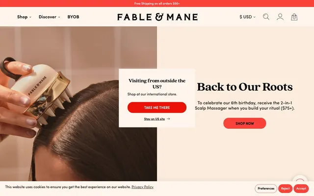
Fable & Mane evokes a spirited, naturalistic brand with a gentle, earthy canvas and flashes of energetic color. The visual system prioritizes warmth and comfort, achieved through rounded forms, soft background tones, and legible but characterful typography. Components feel approachable, often outlined or ghosted, reserving vibrant reds for clear calls to action that pop against muted surroundings. The overall effect is a clean, product-focused presentation softened by organic accents.
The page maintains a `1760px` max-width centered container, providing a spacious feel. The hero section often features a split layout: compelling lifestyle photography on one side and a prominent headline in Quincy CF (`56px`, `Midnight Ink`) with a direct call to action button (Primary Action Button in Maharaja Red) on the other, all against the warm Paper Bark background. Content sections follow a consistent vertical rhythm with a `30px` `sectionGap`, often alternating between single-column and multi-column arrangements. Product listings are presented in a responsive grid, with each product item including a clear `Add to Bag` ghost button. Navigation is a sticky top bar with prominent brand logo and essential links.
The site predominantly uses high-quality photography, often depicting tight crops of product usage (e.g., scalp massages, hair application) with minimal lifestyle context. Product photography features bottles cleanly presented, sometimes with a subtle highlight or blurred background. Illustrations are used for decorative elements, such as the prominent tiger head logo and small circular badges indicating product benefits (Vegan, Silicone-Free). These illustrations are flat, outlined, and directly integrate brand colors. Icons are minimalist and outlined, typically in Midnight Ink (#000000) for navigation and functional elements. Imagery serves a dual role: product showcase and aspirational demonstration of usage, with decorative elements reinforcing brand values. The density is image-heavy in product grids and hero sections, but balanced with structured typography.
Reminiscent of Glossier, Olaplex, Byredo, Drunk Elephant.
# Fable & Mane — Style Reference
> Earthy radiance with vibrant pops

**Theme:** light

**Site:** https://fableandmane.com

Fable & Mane evokes a spirited, naturalistic brand with a gentle, earthy canvas and flashes of energetic color. The visual system prioritizes warmth and comfort, achieved through rounded forms, soft background tones, and legible but characterful typography. Components feel approachable, often outlined or ghosted, reserving vibrant reds for clear calls to action that pop against muted surroundings. The overall effect is a clean, product-focused presentation softened by organic accents.

## Tokens — Colors

| Name | Value | Token | Role |
|------|------|------|------|
| Maharaja Red | `#f9423a` | `--color-maharaja-red` | Primary action buttons, prominent alerts — a deep, energetic red that commands attention |
| Tiger Orange | `#f69f82` | `--color-tiger-orange` | Decorative accents in illustrations and brand elements |
| Sunburst Yellow | `#ffd100` | `--color-sunburst-yellow` | Decorative botanical fills and accent elements |
| Ocean Deep Blue | `#002e5d` | `--color-ocean-deep-blue` | Decorative botanical fills and accent elements |
| Sky Blue | `#007aff` | `--color-sky-blue` | Blue decorative accent for icons, marks, and small graphic details. Do not promote it to the primary CTA color |
| Midnight Ink | `#000000` | `--color-midnight-ink` | Primary text, headings, strong borders, and solid icon fills |
| Paper Bark | `#fff5ec` | `--color-paper-bark` | Page background, light card surfaces, and ghost button backgrounds — creates a warm, soft base |
| Snow Drift | `#ffffff` | `--color-snow-drift` | Elevated card backgrounds, product surfaces, and crisp text on dark backgrounds |
| Smoky Quartz | `#1a243d` | `--color-smoky-quartz` | Muted text, placeholder text, and subtle outlined button borders |
| Pale Ash | `#bfb8b1` | `--color-pale-ash` | Very subtle elevation shadows, providing depth without harshness |

## Tokens — Typography

### Sofia Pro
- **Substitute:** Montserrat
- **Weights:** 400
- **Sizes:** 14px, 16px, 20px, 24px, 56px
- **Line height:** 1, 1.14, 1.2, 1.33, 1.38, 1.4, 1.6
- **Letter spacing:** 0.0420em
- **Role:** Body copy, navigation links, and standard button text — friendly and highly readable.

### Quincy CF
- **Substitute:** Merriweather
- **Weights:** 400
- **Sizes:** 20px, 24px, 48px, 56px, 72px
- **Line height:** 0.86, 0.89, 1, 1.17, 1.2
- **Letter spacing:** -0.0230em at 72px, -0.0210em at 56px, -0.0200em at 48px
- **Role:** Headings and display text — strong and characterful due to its extra-bold nature, balancing legibility with a distinctive presence.

### Sofia Pro
- **Substitute:** Montserrat SemiBold
- **Sizes:** 14px, 16px, 20px
- **Line height:** 1, 1.38, 1.4, 1.43
- **Letter spacing:** 0.0100em
- **Role:** Sub-headings, emphasized body text, and call-out text — provides visual weight for hierarchy.

### Sofia Pro
- **Substitute:** Montserrat Bold
- **Sizes:** 16px
- **Line height:** 1.5
- **Letter spacing:** normal
- **Role:** Specific button text where a slightly bolder appearance is desired.

## Tokens — Type Scale

Perfect Fourth (1.333) from 16px base.

| Role | Size | Line height | Letter spacing |
|------|------|------|------|
| body-sm | 14px | 1.4 | 0.042em |
| body | 16px | 1.4 | 0.042em |
| subheading | 20px | 1.4 | 0.01em |
| heading | 24px | 1.2 | -0.02em |
| heading-lg | 48px | 1 | -0.021em |
| display | 56px | 1 | -0.023em |

## Tokens — Spacing

- **Max width:** 1760px
- **Section gap:** 30px
- **Card padding:** 22px
- **Element gap:** 22px

## Tokens — Radius

- **Buttons:** 24px
- **Cards:** 24px
- **badges:** 24px

## Tokens — Elevation

- **Marketing Card:** `rgba(0, 0, 0, 0.25) 0px 4px 20px 0px`

## Layout

The page maintains a `1760px` max-width centered container, providing a spacious feel. The hero section often features a split layout: compelling lifestyle photography on one side and a prominent headline in Quincy CF (`56px`, `Midnight Ink`) with a direct call to action button (Primary Action Button in Maharaja Red) on the other, all against the warm Paper Bark background. Content sections follow a consistent vertical rhythm with a `30px` `sectionGap`, often alternating between single-column and multi-column arrangements. Product listings are presented in a responsive grid, with each product item including a clear `Add to Bag` ghost button. Navigation is a sticky top bar with prominent brand logo and essential links.

## Imagery

The site predominantly uses high-quality photography, often depicting tight crops of product usage (e.g., scalp massages, hair application) with minimal lifestyle context. Product photography features bottles cleanly presented, sometimes with a subtle highlight or blurred background. Illustrations are used for decorative elements, such as the prominent tiger head logo and small circular badges indicating product benefits (Vegan, Silicone-Free). These illustrations are flat, outlined, and directly integrate brand colors. Icons are minimalist and outlined, typically in Midnight Ink (#000000) for navigation and functional elements. Imagery serves a dual role: product showcase and aspirational demonstration of usage, with decorative elements reinforcing brand values. The density is image-heavy in product grids and hero sections, but balanced with structured typography.

## Components

### Primary Action Button
*Filled button for main calls to action*

Background: Maharaja Red (#f9423a), Text: Snow Drift (#ffffff), Border Radius: 24px, Padding: 0px top/bottom, 56px left/right. Emphasized for high conversions.

### Secondary Action Button
*Filled button for alternative actions*

Background: Midnight Ink (#000000), Text: Snow Drift (#ffffff), Border Radius: 24px, Padding: 0px top/bottom, 45px left/right. Provides a strong alternative to the primary red.

### Ghost Button
*Outline button for less prominent actions, often within product listings*

Background: Paper Bark (#fff5ec), Text: Midnight Ink (#000000), Border: 1px solid Midnight Ink (#000000), Border Radius: 24px, Padding: 0px top/bottom, 22px left/right. Offers a softer interaction without distracting from content.

### Text Link Button
*Minimal button style for navigation or secondary actions, usually inline*

Background: Transparent, Text: Midnight Ink (#000000), Border: 1px solid Midnight Ink (#000000) for bottom-border effect, Border Radius: 0px, Padding: 0px top/bottom, 0px left/right; 8px bottom. Used for discreet interactions.

### Elevated Marketing Card
*Informational pop-up or modal card for announcements*

Background: Snow Drift (#ffffff), Text: Midnight Ink (#000000), Border Radius: 0px, Shadow: rgba(0, 0, 0, 0.25) 0px 4px 20px 0px. Used to draw immediate attention, as with the region selector.

### Feature Badge
*Small, informative labels for product features*

Background: Transparent, Text: Midnight Ink (#000000), Border Radius: 0px, Padding: 0px. Used for subtle labeling.

## Guidelines

### Do

- Prioritize Paper Bark (#fff5ec) as the default page background to establish warmth and softness.
- Use Maharaja Red (#f9423a) exclusively for primary action buttons and critical alerts to ensure maximum impact.
- Apply a 24px border-radius to all buttons, cards, and badges to maintain a consistent friendly aesthetic.
- Pair Quincy CF (ExtraBold) for headlines with Sofia Pro for body text to create clear typographic hierarchy and brand identity.
- Ensure ample spacing, using a consistent 22px `elementGap` for horizontal and vertical separation of inline elements, and a 30px `sectionGap` between major content blocks.
- Elevate critical UI elements like modals and pop-ups with `box-shadow: rgba(0, 0, 0, 0.25) 0px 4px 20px 0px` for clear visual focus.
- Reinforce the natural aesthetic with botanical SVG icons using Ocean Deep Blue (#002e5d) and Sunburst Yellow (#ffd100) as fill colors.

### Don't

- Do not introduce severe dark backgrounds or stark white elements except for highly elevated surfaces, to avoid disrupting the warm, natural theme.
- Avoid using multiple colors for primary calls to action; Maharaja Red (#f9423a) is the singular choice for this function.
- Do not apply sharp, angular corners to interactive components, as this contradicts the established soft, rounded aesthetic.
- Refrain from dense, compact layouts; maintain the comfortable spacing values (22px `elementGap`, 30px `sectionGap`) to give content breathing room.
- Do not use generic system fonts when Sofia Pro and Quincy CF are available, as they are crucial for brand recognition.
- Avoid excessive use of shadows; reserve `box-shadow: rgba(0, 0, 0, 0.25) 0px 4px 20px 0px` for truly elevated or focused content only.
- Do not dilute the brand's chromatic elements (Maharaja Red, Tiger Orange, Sunburst Yellow, Ocean Deep Blue) with overly desaturated variants or competing hues.

## Agent Prompt Guide

Quick Color Reference:
text: #000000
background: #fff5ec
border: #000000
accent: #f9423a
primary action: #f9423a (filled action)

Example Component Prompts:
1. Create a Primary Action Button: #f9423a background, #000000 text, 9999px radius, compact pill padding. Use this filled treatment for the main CTA.
2. Design a product card: `Snow Drift` background, `24px` border-radius, product name 'HoliRoots™ Hair Oil' in `Sofia Pro` `20px` `400` weight with `Midnight Ink` color. Include a `Ghost Button` 'Add to Bag' at the bottom.
3. Implement an informational pop-up (`Elevated Marketing Card` component) with the headline 'Visiting from outside the US?' in `Quincy CF` `24px` `400` weight, `Midnight Ink` color. Include a `Primary Action Button` 'TAKE ME THERE'.
More like this







Keep what you find
A free account saves references to boards and can send you a weekly email of picks based on what you save.
To see every result, go Pro.