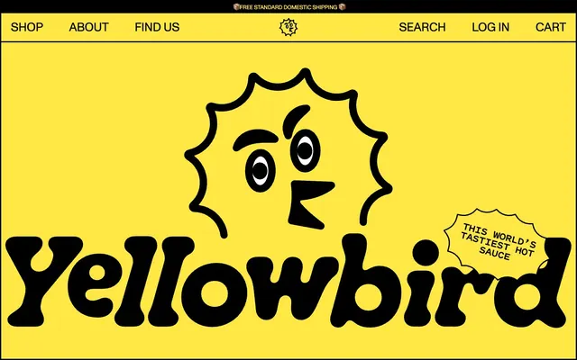
Preview image. Unlock full-res
Bold yellow manifesto
Color palette
Primary background, primary action background, highlight accents in text and icons. This vivid yellow is foundational to the brand's energetic and unmissable presence
Accent border for interactive elements, link rollovers. Used sparingly to denote interactive states against dark backgrounds, providing a jolt of color
Text, borders, icons, secondary action backgrounds. Provides high contrast and defines all structural elements, grounding the vibrant yellow
Internal surface backgrounds for components, icon fills, secondary text on dark backgrounds. Offers a crisp contrast against Yellowbird Yellow and Midnight Black
Card backgrounds, subtle secondary surface areas, offering a softer alternative to pure white while maintaining high contrast with text
Typography
- Weights
- 400
- Sizes
- 14px, 18px, 27px, 30px, 41px, 45px, 61px
- Line height
- 0.78, 0.87, 0.9, 1, 1.1, 1.2, 1.3, 1.67, 2.14
- Letter spacing
- -0.0400em, -0.0300em, -0.0140em, -0.0110em, -0.0070em, -0.0060em
Primary text, navigation, marketing copy, and subheadings. Its strong, geometric character at various sizes, often with tight tracking, conveys a confident and direct brand voice. Substitute: 'Montserrat' or 'Inter' with custom letter-spacing.
- Weights
- 400, 600
- Sizes
- 16px, 18px, 27px
- Line height
- 0.84, 1, 1.2, 1.3, 1.46
- Letter spacing
- -0.0310em, -0.0120em, -0.0110em, 0.0500em
Body copy, captions, supporting text, and small interactive elements. Its slightly more conventional humanist sans-serif shape balances the rigidity of Monument Grotesk, improving readability for longer form content. Substitute: 'Open Sans' or 'Lato'.
- Weights
- 400, 700
- Sizes
- 91px
- Line height
- 1.05
- Letter spacing
- -0.0280em
Distinctive display headlines, especially for brand hero sections or major statements. Its rounded, heavy forms give a playful yet authoritative impression, creating strong visual anchors. Substitute: 'Bebas Neue' or 'Impact' for a similar bold presence, though the curved aspects would be lost.
Spacing & shape
Components
Text link, outlined with a 1px black border. `ABC Monument Grotesk` at 18px / 1.0lh, `Midnight Black` text. No padding, but the bounding box expands on hover. The border defines the clickable area without filling it.
Filled button with `Yellowbird Yellow` background and `Midnight Black` text. Uses `ABC Monument Grotesk` 400 at sizes 16px/1.3lh or 18px/1.3lh. Features a 6px border-radius and 6px padding on all sides, creating a compact, direct appearance.
Essentially a text button with `Midnight Black` text, `ABC Monument Grotesk` 400, usually 14-18px. Minimal padding on smaller contexts (e.g. 0-6px), but can have larger padding of 20px on all sides when functioning as block elements. This component offers interaction without visual weight, relying on text and occasional borders.
A ghost button with a thick (3px) `Midnight Black` border, `Yellowbird Yellow` background with `Midnight Black` text. `ABC Monument Grotesk` 400, 27px font size. Features an irregular, organic-like 30px border-radius, giving it a playful, hand-drawn aesthetic. Padding of 20px on all sides.
Features a `Warm Paper` (#fbfaf2) background with a large `36px` border-radius. Primarily a content container; padding is implicit from how elements within are spaced but can be 20px. Borders are typically defined by inner content rather than the card itself.
A `Yellowbird Yellow` (#ffe845) background with a `30px` border-radius, providing a soft, friendly container for text. Features 20px padding on all sides, creating a clear visual break and focus for the content.
Transparent background (`rgba(0,0,0,0)`) with `Midnight Black` text and a defined `Midnight Black` border. Features 15px vertical padding and 32px right padding, but no left padding, hinting at internal icon placement. 0px border-radius makes it sharp and direct.
Guidelines
- Always use 'Yellowbird Yellow' (#ffe845) as the dominant background color for full-bleed sections, establishing brand identity immediately.
- Define all interactive area boundaries and critical visual separations with a 3px 'Midnight Black' (#000000) solid border.
- Prioritize `Gooper` at 91px for monumental headlines and `ABC Monument Grotesk` 400 for all navigation, headings (27-61px), and marketing copy, reserving `Pitch Sans` for body text.
- Implement tight letter-spacing for headlines and display text, specifically using negative tracking values like -0.0400em at 61px and -0.0280em at 91px.
- Apply `30px` or `36px` border-radius to cards and larger content blocks to soften the chunky design, contrasting with `0px` radius on text inputs and some button variants for directness.
- Utilize 'Midnight Black' (#000000) for all primary text and secondary button backgrounds, ensuring high contrast against the bright yellow and white surfaces.
- Use 20px as a recurring padding unit for cards, buttons, and larger content blocks to create generous internal space.
- Avoid using gradients or drop shadows for elevation; rely on thick borders and color blocking to define dimensional relationships.
- Do not introduce subtle gray tones or desaturated colors outside of 'Warm Paper' (#fbfaf2); the palette is designed for high-contrast chromaticity.
- Never use type weights below 400 for any text; the system relies on bold, confident typography.
- Do not use white as a background for primary buttons or large content sections unless it is an internal element within a larger yellow or black block.
- Avoid using 'Electric Blue' (#007aff) for anything other than specific interactive accents or link highlights, never as a primary background or text color.
- Do not use letter-spacing values approaching normal (0em) for headings or large text; the system explicitly uses compressed tracking to maintain its distinctive look.
- Do not place text directly on top of visually noisy product imagery; always ensure content has a solid color background for legibility and to maintain the brand's graphic quality.
About this system
ShowHide
Yellowbird® utilizes a high-contrast, playful aesthetic, rooted in an energetic yellow canvas and bold black typography. The system leans into strong visual boundaries with thick black outlines and defined shapes, avoiding subtle gradients or shadows. Typography, featuring custom display fonts, is a primary expressive element, varying dramatically in size and tracking to create a dynamic hierarchy. Components are chunky and direct, maintaining the brand's unapologetic visual presence through stark color blocking and distinct border treatments.
The page uses a full-bleed structure that largely contains content within a central, implicit max-width rather than a strict container. The hero section establishes a clear brand identity with a large, centered headline (`Gooper`, 91px) and vibrant 'Yellowbird Yellow' background, featuring the brand's signature outlined illustration. Section rhythm is highly consistent, dominated by large blocks of 'Yellowbird Yellow' with occasional 'Warm Paper' (#fbfaf2) cards, and thick 3px 'Midnight Black' borders visually separating content blocks. Content is arranged in alternating text-heavy and visual-heavy sections, often centered stacks or a 3-column card grid for features. The overall density is spacious with generous padding and ample vertical separation between sections, reinforcing the bold and direct visual communication. A sticky top navigation offers shop, about, and find us links, along with search, login, and cart actions.
The imagery aesthetic is bold and graphic, primarily featuring product photography against a pure white background, isolating the product as the hero. Illustrations are organic, thick-outlined, and often incorporate the brand's 'sun' character, providing a playful and energetic visual counterpart to the product. Icons are filled with 'Midnight Black' (#000000) and have a thick, confident stroke weight. Visuals serve to showcase the product, add brand personality, and explain content, maintaining an image-text balance where visuals occupy significant space but never overlap or bleed into text content.
Reminiscent of Oatly, Liquid Death, Chobani (some campaigns), Mailchimp (old branding).
# Yellowbird® — Style Reference
> Bold yellow manifesto

**Theme:** light

**Site:** https://www.yellowbirdfoods.com

Yellowbird® utilizes a high-contrast, playful aesthetic, rooted in an energetic yellow canvas and bold black typography. The system leans into strong visual boundaries with thick black outlines and defined shapes, avoiding subtle gradients or shadows. Typography, featuring custom display fonts, is a primary expressive element, varying dramatically in size and tracking to create a dynamic hierarchy. Components are chunky and direct, maintaining the brand's unapologetic visual presence through stark color blocking and distinct border treatments.

## Tokens — Colors

| Name | Value | Token | Role |
|------|------|------|------|
| Yellowbird Yellow | `#ffe845` | `--color-yellowbird-yellow` | Primary background, primary action background, highlight accents in text and icons. This vivid yellow is foundational to the brand's energetic and unmissable presence |
| Electric Blue | `#007aff` | `--color-electric-blue` | Accent border for interactive elements, link rollovers. Used sparingly to denote interactive states against dark backgrounds, providing a jolt of color |
| Midnight Black | `#000000` | `--color-midnight-black` | Text, borders, icons, secondary action backgrounds. Provides high contrast and defines all structural elements, grounding the vibrant yellow |
| Canvas White | `#ffffff` | `--color-canvas-white` | Internal surface backgrounds for components, icon fills, secondary text on dark backgrounds. Offers a crisp contrast against Yellowbird Yellow and Midnight Black |
| Warm Paper | `#fbfaf2` | `--color-warm-paper` | Card backgrounds, subtle secondary surface areas, offering a softer alternative to pure white while maintaining high contrast with text |

## Tokens — Typography

### ABC Monument Grotesk
- **Weights:** 400
- **Sizes:** 14px, 18px, 27px, 30px, 41px, 45px, 61px
- **Line height:** 0.78, 0.87, 0.9, 1, 1.1, 1.2, 1.3, 1.67, 2.14
- **Letter spacing:** -0.0400em, -0.0300em, -0.0140em, -0.0110em, -0.0070em, -0.0060em
- **Role:** Primary text, navigation, marketing copy, and subheadings. Its strong, geometric character at various sizes, often with tight tracking, conveys a confident and direct brand voice. Substitute: 'Montserrat' or 'Inter' with custom letter-spacing.

### Pitch Sans
- **Weights:** 400, 600
- **Sizes:** 16px, 18px, 27px
- **Line height:** 0.84, 1, 1.2, 1.3, 1.46
- **Letter spacing:** -0.0310em, -0.0120em, -0.0110em, 0.0500em
- **Role:** Body copy, captions, supporting text, and small interactive elements. Its slightly more conventional humanist sans-serif shape balances the rigidity of Monument Grotesk, improving readability for longer form content. Substitute: 'Open Sans' or 'Lato'.

### Gooper
- **Weights:** 400, 700
- **Sizes:** 91px
- **Line height:** 1.05
- **Letter spacing:** -0.0280em
- **Role:** Distinctive display headlines, especially for brand hero sections or major statements. Its rounded, heavy forms give a playful yet authoritative impression, creating strong visual anchors. Substitute: 'Bebas Neue' or 'Impact' for a similar bold presence, though the curved aspects would be lost.

## Tokens — Type Scale

Perfect Fourth (1.333) from 18px base.

| Role | Size | Line height | Letter spacing |
|------|------|------|------|
| caption | 14px | 1.67 | -0.48px |
| body-sm | 16px | 1.46 | -0.496px |
| body | 18px | 1.3 | -0.558px |
| subheading | 27px | 1.2 | -0.378px |
| heading-sm | 30px | 1.1 | -0.33px |
| heading | 41px | 1.2 | -0.287px |
| heading-lg | 61px | 0.78 | -0.244px |
| display | 91px | 1.05 | -0.255px |

## Tokens — Spacing

- **Section gap:** 80px
- **Card padding:** 20px
- **Element gap:** 24px

## Tokens — Radius

- **Default:** 0px
- **Buttons:** 6px
- **Cards:** 30px
- **interactiveElements:** 10px
- **largeCards:** 36px
- **smallButtons:** 14px

## Layout

The page uses a full-bleed structure that largely contains content within a central, implicit max-width rather than a strict container. The hero section establishes a clear brand identity with a large, centered headline (`Gooper`, 91px) and vibrant 'Yellowbird Yellow' background, featuring the brand's signature outlined illustration. Section rhythm is highly consistent, dominated by large blocks of 'Yellowbird Yellow' with occasional 'Warm Paper' (#fbfaf2) cards, and thick 3px 'Midnight Black' borders visually separating content blocks. Content is arranged in alternating text-heavy and visual-heavy sections, often centered stacks or a 3-column card grid for features. The overall density is spacious with generous padding and ample vertical separation between sections, reinforcing the bold and direct visual communication. A sticky top navigation offers shop, about, and find us links, along with search, login, and cart actions.

## Imagery

The imagery aesthetic is bold and graphic, primarily featuring product photography against a pure white background, isolating the product as the hero. Illustrations are organic, thick-outlined, and often incorporate the brand's 'sun' character, providing a playful and energetic visual counterpart to the product. Icons are filled with 'Midnight Black' (#000000) and have a thick, confident stroke weight. Visuals serve to showcase the product, add brand personality, and explain content, maintaining an image-text balance where visuals occupy significant space but never overlap or bleed into text content.

## Components

### Outline Navigation Link
*Global navigation item*

Text link, outlined with a 1px black border. `ABC Monument Grotesk` at 18px / 1.0lh, `Midnight Black` text. No padding, but the bounding box expands on hover. The border defines the clickable area without filling it.

### Primary Call to Action Button
*Emphasized action*

Filled button with `Yellowbird Yellow` background and `Midnight Black` text. Uses `ABC Monument Grotesk` 400 at sizes 16px/1.3lh or 18px/1.3lh. Features a 6px border-radius and 6px padding on all sides, creating a compact, direct appearance.

### Ghost Call to Action Button
*Secondary action or link*

Essentially a text button with `Midnight Black` text, `ABC Monument Grotesk` 400, usually 14-18px. Minimal padding on smaller contexts (e.g. 0-6px), but can have larger padding of 20px on all sides when functioning as block elements. This component offers interaction without visual weight, relying on text and occasional borders.

### Category Filter Button
*Product filtering or classification*

A ghost button with a thick (3px) `Midnight Black` border, `Yellowbird Yellow` background with `Midnight Black` text. `ABC Monument Grotesk` 400, 27px font size. Features an irregular, organic-like 30px border-radius, giving it a playful, hand-drawn aesthetic. Padding of 20px on all sides.

### Product Card
*Display individual product items*

Features a `Warm Paper` (#fbfaf2) background with a large `36px` border-radius. Primarily a content container; padding is implicit from how elements within are spaced but can be 20px. Borders are typically defined by inner content rather than the card itself.

### Rounded Quote Card
*Highlighting testimonials or key messages*

A `Yellowbird Yellow` (#ffe845) background with a `30px` border-radius, providing a soft, friendly container for text. Features 20px padding on all sides, creating a clear visual break and focus for the content.

### Text Input (Search)
*User text entry field*

Transparent background (`rgba(0,0,0,0)`) with `Midnight Black` text and a defined `Midnight Black` border. Features 15px vertical padding and 32px right padding, but no left padding, hinting at internal icon placement. 0px border-radius makes it sharp and direct.

## Guidelines

### Do

- Always use 'Yellowbird Yellow' (#ffe845) as the dominant background color for full-bleed sections, establishing brand identity immediately.
- Define all interactive area boundaries and critical visual separations with a 3px 'Midnight Black' (#000000) solid border.
- Prioritize `Gooper` at 91px for monumental headlines and `ABC Monument Grotesk` 400 for all navigation, headings (27-61px), and marketing copy, reserving `Pitch Sans` for body text.
- Implement tight letter-spacing for headlines and display text, specifically using negative tracking values like -0.0400em at 61px and -0.0280em at 91px.
- Apply `30px` or `36px` border-radius to cards and larger content blocks to soften the chunky design, contrasting with `0px` radius on text inputs and some button variants for directness.
- Utilize 'Midnight Black' (#000000) for all primary text and secondary button backgrounds, ensuring high contrast against the bright yellow and white surfaces.
- Use 20px as a recurring padding unit for cards, buttons, and larger content blocks to create generous internal space.

### Don't

- Avoid using gradients or drop shadows for elevation; rely on thick borders and color blocking to define dimensional relationships.
- Do not introduce subtle gray tones or desaturated colors outside of 'Warm Paper' (#fbfaf2); the palette is designed for high-contrast chromaticity.
- Never use type weights below 400 for any text; the system relies on bold, confident typography.
- Do not use white as a background for primary buttons or large content sections unless it is an internal element within a larger yellow or black block.
- Avoid using 'Electric Blue' (#007aff) for anything other than specific interactive accents or link highlights, never as a primary background or text color.
- Do not use letter-spacing values approaching normal (0em) for headings or large text; the system explicitly uses compressed tracking to maintain its distinctive look.
- Do not place text directly on top of visually noisy product imagery; always ensure content has a solid color background for legibility and to maintain the brand's graphic quality.

## Agent Prompt Guide

Quick Color Reference:
text: #000000
background: #ffe845
border: #000000
accent: #007aff
primary action: #ffe845 (filled action)

Example Component Prompts:
1. Create a Primary Call to Action button: 'Yellowbird Yellow' (#ffe845) background, 'Midnight Black' (#000000) text. `ABC Monument Grotesk` 400 at 18px, 6px border-radius, and 6px padding.
2. Create a Category Filter Button: 'Yellowbird Yellow' (#ffe845) background, 3px 'Midnight Black' (#000000) border, 'Midnight Black' (#000000) text. `ABC Monument Grotesk` 400 at 27px, 30px border-radius, and 20px padding.
3. Create a Product Card: 'Warm Paper' (#fbfaf2) background, 36px border-radius. No explicit card border. Content inside uses 'Midnight Black' text. Interior elements will manage their own padding.
More like this







Keep what you find
A free account saves references to boards and can send you a weekly email of picks based on what you save.
To see every result, go Pro.