Preview image. Unlock full-res
Sunset Vineyard Aura
Color palette
Primary action buttons – a subtle, desaturated orange that suggests warmth and naturalness for interactive elements
Orange action color for filled buttons, selected navigation states, and focused conversion moments.
Green outline accent for tags, dividers, and focused UI edges.
Blue accent for outlined action borders, linked labels, and lightweight interactive emphasis. Use as a supporting accent, not as a status color
Small, secondary button backgrounds – a vibrant amber used for minor interactive elements
Primary page and footer backgrounds – a warm, light neutral that anchors the palette with an earthy feel
Primary text, borders for cards and navigation, and secondary interactive states – a deep, muted brown-gray that provides strong contrast and an organic feel
Primary heading text and subtle borders – a rich, dark brown, providing high contrast for key informational elements
Elevated card backgrounds, providing a subtle differentiation from the main page background
Typography
- Weights
- 400, 700
- Sizes
- 12px, 15px, 20px, 48px, 64px
- Line height
- 1.2, 1.3, 1.7
- Letter spacing
- 0.0300em
- Fallback
- Playfair Display
Main display font for headlines and prominent text. Its elegant curves bring an artisanal, sophisticated feel, especially at larger sizes like 48px and 64px, retaining its slight tracking across scales.
- Weights
- 400, 700
- Sizes
- 13px, 14px, 16px, 18px, 20px, 24px, 48px
- Line height
- 1.2, 1.3, 1.5, 1.7, 1.8
- Letter spacing
- 0.0300em, 0.0430em, 0.0630em
- Fallback
- Roboto Condensed
Used for body text, navigation items, and secondary headings. Its condensed nature allows for efficient use of space while maintaining readability, with variable tracking at different sizes to prevent text from feeling too dense.
- Weights
- 400
- Sizes
- 20px
- Line height
- 1.5
- Letter spacing
- 0.0300em
- Fallback
- Montserrat
A minimal, geometric sans-serif for specific, isolated text elements, providing a clean, contemporary counterpoint to the more decorative Romie.
Spacing & shape
Components
Background: Warm Clay (#e1c6ab), Text: Electric Blue (#007aff), Padding: 8px top/bottom, 24px left/right. Features sharp, 0px corners.
Background: Terra Cotta (#e3a36e), Text: Deep Earth (#573d21), Padding: 0px top/bottom, 60px left/right. Features sharp, 0px corners.
Transparent background, Text: Vineyard Mauve (#7c664d) or Deep Earth (#573d21), Border: 1px Deep Earth (#573d21) on hover/focus. 50% border radius if circular, otherwise 0px. No explicit padding mentioned, implying content-based sizing.
Background: transparent (rgba(0,0,0,0)), 0px border radius, no box shadow, 0px padding. Image fills the card.
Background: Cloud Cover (#f3f3f3), 0px border radius, no box shadow, 0px padding. Often used without explicit padding around an image.
Guidelines
- Use Desert Sand (#ece0d2) as the primary canvas for all background structures, providing a warm, inviting base.
- Apply Vineyard Mauve (#7c664d) for all standard text elements and hairline borders, creating a cohesive, low-contrast UI.
- Set headlines in Romie font, utilizing its 48px or 64px size with 0.0300em letter spacing for a refined brand presence.
- Design primary call-to-action buttons with a Warm Clay (#e1c6ab) background and Electric Blue (#007aff) text, ensuring they stand out functionally.
- Maintain a comfortable density with element gaps of 10px and card paddings of 17px to allow content to breathe.
- Keep all corners sharp with 0px border-radius across UI components for a grounded, architectural feel.
- Implement the Electric Blue (#007aff) specifically for accessibility features, ensuring high visibility for these vital controls.
- Avoid the use of drop shadows or strong elevation; the design system favors a flat, natural aesthetic.
- Do not introduce highly saturated or cool-toned colors outside of explicit semantic use (like Electric Blue for accessibility), to preserve the warm, earthy palette.
- Refrain from using varied border-radii; adhere strictly to 0px for all elements to maintain visual consistency.
- Do not use generic system fonts in place of Romie, Arial Narrow, or GTStandard-M, as these are critical to the brand’s typographic identity.
- Avoid dense, information-heavy sections; prioritize comfortable spacing and clear focus around imagery and key text.
- Do not assume any semantic color roles for green, red, or blue, unless explicitly stated as an accent or semantic color in the palette; context is critical to usage guidelines.
About this system
ShowHide
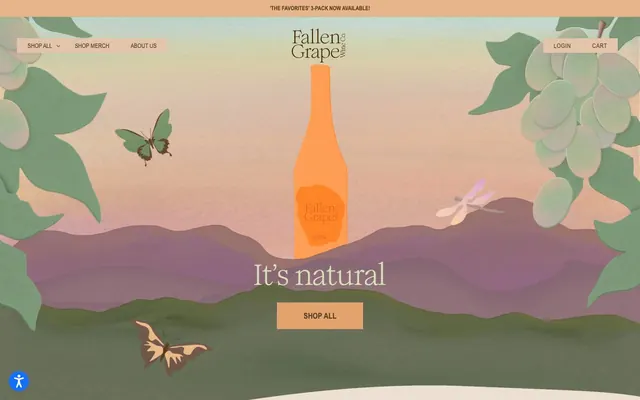
Fallen Grape cultivates a natural, earthy aesthetic, reflecting its product's organic ethos: a warm, muted palette evokes a sunset over a vineyard, complemented by rustic typography. Surfaces are generally flat and unadorned, with a distinct absence of shadows, creating an honest and grounded feel. User interface elements such as buttons and navigation are kept simple, often with a subtle border in a desaturated tone, maintaining an unobtrusive presence that lets the product and imagery shine. The overall atmosphere is serene and authentic, using color and typography to suggest handcrafted quality rather than digital slickness.
The site employs a max-width contained layout generally, but parts of the hero are full-bleed with illustrative background elements that extend to the viewport edges. The hero section features a large, centered illustration with a headline and prominent 'SHOP ALL' button. Below the hero, sections alternate between a primary background and a subtly lighter card background, creating a soft visual rhythm. Content is arranged in centered stacks for textual intros, and multi-column grids (likely 3-column) for product displays. The navigation is a classic sticky top bar, centered for the logo with left-aligned 'Shop All' and right-aligned 'Login' and 'Cart'. The density is comfortable, with ample breathing room between sections and content blocks.
The site uses a mix of artistic, abstract illustrations and high-quality product photography. Illustrations, particularly in the hero section, depict whimsical nature scenes with butterflies, dragonflies, and grapevines, rendered in a muted, painterly style with soft, blended colors. Product photography features wine bottles, merch, and glasses, either in tight crops with soft, natural lighting or in lifestyle contexts with organic elements like leaves. Icons appear to be outlined and minimalist if present, often brand-colored. Imagery serves both decorative atmosphere and direct product showcase, occupying significant visual space in the hero but becoming more contained in product grids.
Reminiscent of Oatly, Seedlip Drinks, Everlane, The Sill.
# Fallen Grape — Style Reference
> Sunset Vineyard Aura

**Theme:** light

**Site:** https://www.fallengrape.com

Fallen Grape cultivates a natural, earthy aesthetic, reflecting its product's organic ethos: a warm, muted palette evokes a sunset over a vineyard, complemented by rustic typography. Surfaces are generally flat and unadorned, with a distinct absence of shadows, creating an honest and grounded feel. User interface elements such as buttons and navigation are kept simple, often with a subtle border in a desaturated tone, maintaining an unobtrusive presence that lets the product and imagery shine. The overall atmosphere is serene and authentic, using color and typography to suggest handcrafted quality rather than digital slickness.

## Tokens — Colors

| Name | Value | Token | Role |
|------|------|------|------|
| Warm Clay | `#e1c6ab` | `--color-warm-clay` | Primary action buttons – a subtle, desaturated orange that suggests warmth and naturalness for interactive elements |
| Terra Cotta | `#e3a36e` | `--color-terra-cotta` | Orange action color for filled buttons, selected navigation states, and focused conversion moments. |
| Pale Sage | `#d8deb7` | `--color-pale-sage` | Green outline accent for tags, dividers, and focused UI edges. |
| Electric Blue | `#007aff` | `--color-electric-blue` | Blue accent for outlined action borders, linked labels, and lightweight interactive emphasis. Use as a supporting accent, not as a status color |
| Sunny Glow | `#efa164` | `--color-sunny-glow` | Small, secondary button backgrounds – a vibrant amber used for minor interactive elements |
| Desert Sand | `#ece0d2` | `--color-desert-sand` | Primary page and footer backgrounds – a warm, light neutral that anchors the palette with an earthy feel |
| Vineyard Mauve | `#7c664d` | `--color-vineyard-mauve` | Primary text, borders for cards and navigation, and secondary interactive states – a deep, muted brown-gray that provides strong contrast and an organic feel |
| Deep Earth | `#573d21` | `--color-deep-earth` | Primary heading text and subtle borders – a rich, dark brown, providing high contrast for key informational elements |
| Cloud Cover | `#f3f3f3` | `--color-cloud-cover` | Elevated card backgrounds, providing a subtle differentiation from the main page background |

## Tokens — Typography

### Romie
- **Substitute:** Playfair Display
- **Weights:** 400, 700
- **Sizes:** 12px, 15px, 20px, 48px, 64px
- **Line height:** 1.2, 1.3, 1.7
- **Letter spacing:** 0.0300em
- **Role:** Main display font for headlines and prominent text. Its elegant curves bring an artisanal, sophisticated feel, especially at larger sizes like 48px and 64px, retaining its slight tracking across scales.

### Arial Narrow
- **Substitute:** Roboto Condensed
- **Weights:** 400, 700
- **Sizes:** 13px, 14px, 16px, 18px, 20px, 24px, 48px
- **Line height:** 1.2, 1.3, 1.5, 1.7, 1.8
- **Letter spacing:** 0.0300em, 0.0430em, 0.0630em
- **Role:** Used for body text, navigation items, and secondary headings. Its condensed nature allows for efficient use of space while maintaining readability, with variable tracking at different sizes to prevent text from feeling too dense.

### GTStandard-M
- **Substitute:** Montserrat
- **Weights:** 400
- **Sizes:** 20px
- **Line height:** 1.5
- **Letter spacing:** 0.0300em
- **Role:** A minimal, geometric sans-serif for specific, isolated text elements, providing a clean, contemporary counterpoint to the more decorative Romie.

## Tokens — Type Scale

Augmented Fourth (1.414) from 15px base.

| Role | Size | Line height | Letter spacing |
|------|------|------|------|
| caption | 12px | 1.7 | — |
| body | 15px | 1.7 | — |
| subheading | 20px | 1.5 | 0.03em |
| heading-sm | 24px | 1.2 | 0.03em |
| heading | 48px | 1.2 | 0.03em |
| display | 64px | 1.2 | 0.03em |

## Tokens — Spacing

- **Section gap:** 36-40px
- **Card padding:** 17px
- **Element gap:** 10px

## Tokens — Radius

- **none:** 0px

## Layout

The site employs a max-width contained layout generally, but parts of the hero are full-bleed with illustrative background elements that extend to the viewport edges. The hero section features a large, centered illustration with a headline and prominent 'SHOP ALL' button. Below the hero, sections alternate between a primary background and a subtly lighter card background, creating a soft visual rhythm. Content is arranged in centered stacks for textual intros, and multi-column grids (likely 3-column) for product displays. The navigation is a classic sticky top bar, centered for the logo with left-aligned 'Shop All' and right-aligned 'Login' and 'Cart'. The density is comfortable, with ample breathing room between sections and content blocks.

## Imagery

The site uses a mix of artistic, abstract illustrations and high-quality product photography. Illustrations, particularly in the hero section, depict whimsical nature scenes with butterflies, dragonflies, and grapevines, rendered in a muted, painterly style with soft, blended colors. Product photography features wine bottles, merch, and glasses, either in tight crops with soft, natural lighting or in lifestyle contexts with organic elements like leaves. Icons appear to be outlined and minimalist if present, often brand-colored. Imagery serves both decorative atmosphere and direct product showcase, occupying significant visual space in the hero but becoming more contained in product grids.

## Components

### Primary Action Button
*Call to action for key interactions*

Background: Warm Clay (#e1c6ab), Text: Electric Blue (#007aff), Padding: 8px top/bottom, 24px left/right. Features sharp, 0px corners.

### Section Callout Button
*Secondary action within content sections*

Background: Terra Cotta (#e3a36e), Text: Deep Earth (#573d21), Padding: 0px top/bottom, 60px left/right. Features sharp, 0px corners.

### Ghost Navigation Button
*Navigation and subtle interactive elements, often with icons*

Transparent background, Text: Vineyard Mauve (#7c664d) or Deep Earth (#573d21), Border: 1px Deep Earth (#573d21) on hover/focus. 50% border radius if circular, otherwise 0px. No explicit padding mentioned, implying content-based sizing.

### Product Card
*Display individual product listings in grids*

Background: transparent (rgba(0,0,0,0)), 0px border radius, no box shadow, 0px padding. Image fills the card.

### Elevated Product Card
*Display featured product listings or interactive cards on the homepage*

Background: Cloud Cover (#f3f3f3), 0px border radius, no box shadow, 0px padding. Often used without explicit padding around an image.

## Guidelines

### Do

- Use Desert Sand (#ece0d2) as the primary canvas for all background structures, providing a warm, inviting base.
- Apply Vineyard Mauve (#7c664d) for all standard text elements and hairline borders, creating a cohesive, low-contrast UI.
- Set headlines in Romie font, utilizing its 48px or 64px size with 0.0300em letter spacing for a refined brand presence.
- Design primary call-to-action buttons with a Warm Clay (#e1c6ab) background and Electric Blue (#007aff) text, ensuring they stand out functionally.
- Maintain a comfortable density with element gaps of 10px and card paddings of 17px to allow content to breathe.
- Keep all corners sharp with 0px border-radius across UI components for a grounded, architectural feel.
- Implement the Electric Blue (#007aff) specifically for accessibility features, ensuring high visibility for these vital controls.

### Don't

- Avoid the use of drop shadows or strong elevation; the design system favors a flat, natural aesthetic.
- Do not introduce highly saturated or cool-toned colors outside of explicit semantic use (like Electric Blue for accessibility), to preserve the warm, earthy palette.
- Refrain from using varied border-radii; adhere strictly to 0px for all elements to maintain visual consistency.
- Do not use generic system fonts in place of Romie, Arial Narrow, or GTStandard-M, as these are critical to the brand’s typographic identity.
- Avoid dense, information-heavy sections; prioritize comfortable spacing and clear focus around imagery and key text.
- Do not assume any semantic color roles for green, red, or blue, unless explicitly stated as an accent or semantic color in the palette; context is critical to usage guidelines.

## Agent Prompt Guide

### Quick Color Reference
- text: #7c664d
- background: #ece0d2
- border: #7c664d
- accent: #e3a36e
- primary action: #e1c6ab (filled action)

### 3-5 Example Component Prompts
- Create a product listing card: Background Cloud Cover (#f3f3f3), 0px border-radius, contains an image and 'Arial Narrow' 18px product title in Deep Earth (#573d21).
- Build a header navigation item: Text 'Vineyard Mauve' (#7c664d), 'Arial Narrow' font 16px, 0.0300em letter-spacing, transparent background, with a 1px 'Vineyard Mauve' (#7c664d) border on hover. Padding is 17px top/bottom.
- Design a primary call-to-action button: Background Warm Clay (#e1c6ab), text Electric Blue (#007aff), 'Arial Narrow' 16px font, 0px border-radius, 8px padding top/bottom and 24px left/right.
- Create a hero section headline: 'Romie' font 64px, Deep Earth (#573d21) text, 0.0300em letter-spacing, centered over a custom illustration on a Desert Sand (#ece0d2) background.
- Construct a 'SHOP ALL' button for a content section: Background Terra Cotta (#e3a36e), text Deep Earth (#573d21), 'Arial Narrow' 16px font, 0px border-radius, 0px padding top/bottom and 60px left/right.
More like this








Keep what you find
A free account saves references to boards and can send you a weekly email of picks based on what you save.
To see every result, go Pro.