Preview image. Unlock full-res
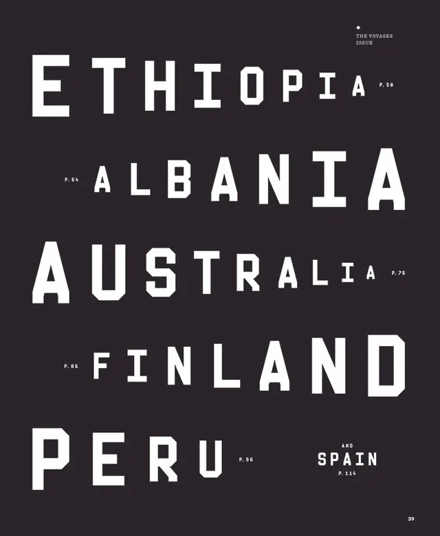
Black canvas, stark white type
Color palette
Page background, primary canvas
Hairline borders, dividers, input outlines, and card edges on light surfaces. Do not promote it to the primary CTA color
Typography
- Weights
- 300
- Sizes
- 14px, 18px
- Line height
- 1.11, 1.43
- Letter spacing
- 0.0560em
- Fallback
- Inter
All text: headlines, body copy, and navigation links. The consistent light weight (300) contributes to the minimalist, high-contrast aesthetic and avoids any visual 'shouting'.
Spacing & shape
Components
Ghost White (#ece5ea) text, Founders Grotesk weight 300, 14px size, 1.43 line height, letter-spacing 0.0560em. Hover state shows a subtle border as its interaction cue. No background or distinct padding.
Guidelines
- Use Pitch Black (#000000) for all page and section backgrounds.
- Apply Ghost White (#ece5ea) for all text elements to maintain high contrast.
- Utilize Founders Grotesk weight 300 for all typography, ensuring a consistent light, airy feel.
- Maintain a letter-spacing of 0.0560em across all text to enhance readability in uppercase contexts.
- Employ 108px as the primary vertical spacing between major sections.
- Keep borders to a minimum; use subtle Ghost White (#ece5ea) outlines for interactive elements only.
- Never use saturated colors; the palette is strictly monochromatic.
- Avoid heavy font weights; the system is defined by its light, airy typography.
- Do not use any shadows or elevation; the design system is entirely flat.
- Refrain from introducing decorative gradients; stick to solid color blocks.
- Do not add extra padding or backgrounds to text links, unless specifically for an interactive border.
- Exclude circular or highly rounded border radii; the implied shape language is sharp and rectilinear.
- Do not break the high-contrast pairing of Ghost White text on a Pitch Black background.
About this system
ShowHide
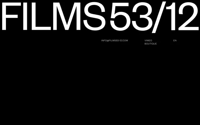
Films 53/12 embraces a stark, monochromatic aesthetic, creating a feeling of artistic minimalism. The design relies heavily on high contrast typography and ample dark negative space, lending an air of seriousness and focused intent. Interactions are subtle, communicated through text highlights rather than bold colorful components. The overall impression is one of restraint and intellectual depth, allowing the content to take precedence within a tightly controlled visual framework.
The page uses a full-bleed black background. The hero features a large, horizontally centered headline. Navigation and secondary information are sparsely placed with large horizontal and vertical gaps. Content is arranged in a minimalist, open fashion, prioritizing ample negative space between each textual element and section. There is no grid system or complex content arrangements; elements appear to be intentionally isolated.
No imagery or graphical elements beyond stark typography and a solid black background. The visual language is pure text and negative space; imagery serves no active role in the design system itself, only as content.
Reminiscent of A24 Films, Studio Fnt, Some.Place.
# Films 53/12 — Style Reference
> Black canvas, stark white type

**Theme:** dark

**Site:** https://www.films53-12.com

Films 53/12 embraces a stark, monochromatic aesthetic, creating a feeling of artistic minimalism. The design relies heavily on high contrast typography and ample dark negative space, lending an air of seriousness and focused intent. Interactions are subtle, communicated through text highlights rather than bold colorful components. The overall impression is one of restraint and intellectual depth, allowing the content to take precedence within a tightly controlled visual framework.

## Tokens — Colors

| Name | Value | Token | Role |
|------|------|------|------|
| Pitch Black | `#000000` | `--color-pitch-black` | Page background, primary canvas |
| Ghost White | `#ece5ea` | `--color-ghost-white` | Hairline borders, dividers, input outlines, and card edges on light surfaces. Do not promote it to the primary CTA color |

## Tokens — Typography

### Founders Grotesk
- **Substitute:** Inter
- **Weights:** 300
- **Sizes:** 14px, 18px
- **Line height:** 1.11, 1.43
- **Letter spacing:** 0.0560em
- **Role:** All text: headlines, body copy, and navigation links. The consistent light weight (300) contributes to the minimalist, high-contrast aesthetic and avoids any visual 'shouting'.

## Tokens — Type Scale

| Role | Size | Line height | Letter spacing |
|------|------|------|------|
| body | 14px | 1.43 | 0.56px |
| heading | 18px | 1.11 | 0.56px |

## Tokens — Spacing

- **Section gap:** 108px

## Layout

The page uses a full-bleed black background. The hero features a large, horizontally centered headline. Navigation and secondary information are sparsely placed with large horizontal and vertical gaps. Content is arranged in a minimalist, open fashion, prioritizing ample negative space between each textual element and section. There is no grid system or complex content arrangements; elements appear to be intentionally isolated.

## Imagery

No imagery or graphical elements beyond stark typography and a solid black background. The visual language is pure text and negative space; imagery serves no active role in the design system itself, only as content.

## Components

### Navigation Link
*Interactive text link*

Ghost White (#ece5ea) text, Founders Grotesk weight 300, 14px size, 1.43 line height, letter-spacing 0.0560em. Hover state shows a subtle border as its interaction cue. No background or distinct padding.

## Guidelines

### Do

- Use Pitch Black (#000000) for all page and section backgrounds.
- Apply Ghost White (#ece5ea) for all text elements to maintain high contrast.
- Utilize Founders Grotesk weight 300 for all typography, ensuring a consistent light, airy feel.
- Maintain a letter-spacing of 0.0560em across all text to enhance readability in uppercase contexts.
- Employ 108px as the primary vertical spacing between major sections.
- Keep borders to a minimum; use subtle Ghost White (#ece5ea) outlines for interactive elements only.

### Don't

- Never use saturated colors; the palette is strictly monochromatic.
- Avoid heavy font weights; the system is defined by its light, airy typography.
- Do not use any shadows or elevation; the design system is entirely flat.
- Refrain from introducing decorative gradients; stick to solid color blocks.
- Do not add extra padding or backgrounds to text links, unless specifically for an interactive border.
- Exclude circular or highly rounded border radii; the implied shape language is sharp and rectilinear.
- Do not break the high-contrast pairing of Ghost White text on a Pitch Black background.

## Agent Prompt Guide

Quick Color Reference:
text: #ece5ea
background: #000000
border: #ece5ea
accent: no distinct accent color
primary action: no distinct CTA color

Example Component Prompts:
1. Create a page header: Pitch Black (#000000) background. Main title in Founders Grotesk weight 300, 56px (derived as the largest visual element), Ghost White (#ece5ea), letter-spacing 0.0560em, centered on the page. Below it, a navigation link 'VIMEO' using Founders Grotesk weight 300, 14px, Ghost White (#ece5ea), 0.0560em letter-spacing.
2. Create a footer section: Pitch Black (#000000) background. A single link 'INFO@FILMS53-12.COM' in Founders Grotesk weight 300, 14px, Ghost White (#ece5ea), 0.0560em letter-spacing, centered at the bottom of the page.
3. Create a secondary navigation block: Three text links 'VIMEO', 'BOUTIQUE', 'EN' laid out horizontally with 108px margin between them, each using Founders Grotesk weight 300, 14px, Ghost White (#ece5ea), 0.0560em letter-spacing. On hover, apply a 1px border of Ghost White (#ece5ea).
More like this




Keep what you find
A free account saves references to boards and can send you a weekly email of picks based on what you save.
To see every result, go Pro.