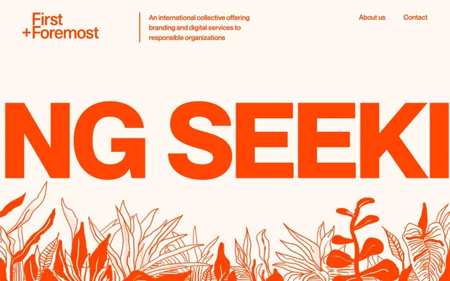
Preview image. Unlock full-res
Warm Orange Canvas
Color palette
Dominant brand color for large background sections, headlines, active links, and filled action buttons. It provides a warm, energetic base that covers significant portions of the viewport
Default text color on Amber Blaze backgrounds, secondary component backgrounds like buttons, and light borders
Primary page background and card surface color, offering a soft, warm neutral canvas for content. This provides a low-contrast readability with dark text while maintaining a warm overall feel
Subtle border color for backgrounds, creating visual separation for sections and illustrations that blend into the Vanilla Cream background
Primary text color and decorative icon fill, offering maximum contrast against light backgrounds
Typography
- Weights
- 100, 400, 700
- Sizes
- 16px, 22px, 26px, 36px, 58px, 80px, 200px
- Line height
- 0.8, 1, 1.2, 1.36, 1.4, 1.45
- Letter spacing
- normal
- Fallback
- Montserrat, system-ui
The primary typeface for all text content, from large, impactful hero headings to body text and navigation. Its clean, geometric sans-serif nature underpins the modern, direct aesthetic. The wide range of weights supports a clear typographic hierarchy.
Spacing & shape
Components
Uses Amber Blaze (#ff4501) as its text color with no underline. Appears in navigation, footers, and other textual contexts. No explicit hover state provided in data.
Transparent background, Amber Blaze (#ff4501) text color, no border, no padding. Font is NeueMontreal, sizes vary, weights can be 400 or 700. Radius is 0px.
Background is Amber Blaze (#ff4501), text color is Arctic Mist (#ffffff). Uses a generous 80px border-radius, creating pill-shaped buttons. Padding is 0px top/bottom and 50px left/right. Font is NeueMontreal (weight 400).
Background is Arctic Mist (#ffffff), text color is Amber Blaze (#ff4501). Uses a generous 80px border-radius, creating pill-shaped buttons. Padding is 0px top/bottom and 50px left/right. Font is NeueMontreal (weight 400).
Background is Arctic Mist (#ffffff), text color is Amber Blaze (#ff4501). Uses a 50% border-radius for a perfect circle. No explicit padding provided in data.
A 5px solid border in Dusty Rose (#ffc2a9) used to delineate content blocks, often horizontally.
Guidelines
- Prioritize Amber Blaze (#ff4501) for significant background sections and primary interactive elements to maintain visual energy.
- Use Vanilla Cream (#ffefe9) as the default background color for content sections for optimal readability and a warm base.
- Employ NeueMontreal at its full display sizes (58, 80, 200px) with appropriate line heights (1.0, 0.8) for impactful headlines.
- Apply 80px border-radius to all filled buttons to achieve a consistent pill-shaped aesthetic.
- Maintain spacious layouts: use 160px for section vertical gaps and 72px for horizontal content margins (left/right).
- Use Obsidian Ink (#000000) for all body text and general UI text against Vanilla Cream (#ffefe9) background.
- Do not introduce additional bold chromatic colors beyond Amber Blaze (#ff4501); rely on its contrast with neutrals.
- Avoid tight spacing: do not use vertical gaps less than 30px between textual elements or less than 50px between sections.
- Do not use subtle variations of orange for text; text links should be Amber Blaze (#ff4501).
- Avoid heavy shadows for elevation; rely on color contrast and subtle borders like Dusty Rose (#ffc2a9) for separation.
- Do not use square buttons; maintain consistency with the 80px border-radius for all primary/secondary actions.
About this system
ShowHide
First + Foremost casts a vibrant, modern tone through the interplay of a single bold orange and off-white neutrals. Typography is large and declarative, often acting as a primary visual element. The layout is spacious with strong rectangular sections, allowing content to breathe and emphasizing the punchy color contrast. Components use soft rounding for buttons against typically sharp-edged backgrounds, creating an approachable yet direct aesthetic.
The page uses a full-bleed layout, where content sections often extend to the edge of the viewport. The hero section features large, bold typography centered over a background that shifts between high-contrast Amber Blaze and soft Vanilla Cream, often integrating line art. Section rhythm is distinctly separated, often employing large vertical gaps (160px) and sometimes featuring a thin Dusty Rose (#ffc2a9) border. Content arrangement frequently uses centered text blocks or large text elements, occasionally paired with small circular imagery. Navigation is a minimalist top bar with text links.
The visual language for imagery is primarily line-art illustrations in a warm tone, used decoratively. When present, images are often full-width or large blocks, sometimes outlined with a subtle border in Dusty Rose (#ffc2a9). Photography for team members is product-focused, small, circular, and isolated against a vibrant Amber Blaze (#ff4501) background. Icons are monochromatic, using Obsidian Ink (#000000) fill. Imagery serves a decorative and atmospheric role, rather than direct product showcase.
Reminiscent of FriendsOfMakers, Built By Buffalo, Made by Many, Brave People.
# Firstandforemost — Style Reference
> Warm Orange Canvas

**Theme:** light

**Site:** https://firstandforemost.co

First + Foremost casts a vibrant, modern tone through the interplay of a single bold orange and off-white neutrals. Typography is large and declarative, often acting as a primary visual element. The layout is spacious with strong rectangular sections, allowing content to breathe and emphasizing the punchy color contrast. Components use soft rounding for buttons against typically sharp-edged backgrounds, creating an approachable yet direct aesthetic.

## Tokens — Colors

| Name | Value | Token | Role |
|------|------|------|------|
| Amber Blaze | `#ff4501` | `--color-amber-blaze` | Dominant brand color for large background sections, headlines, active links, and filled action buttons. It provides a warm, energetic base that covers significant portions of the viewport |
| Arctic Mist | `#ffffff` | `--color-arctic-mist` | Default text color on Amber Blaze backgrounds, secondary component backgrounds like buttons, and light borders |
| Vanilla Cream | `#ffefe9` | `--color-vanilla-cream` | Primary page background and card surface color, offering a soft, warm neutral canvas for content. This provides a low-contrast readability with dark text while maintaining a warm overall feel |
| Dusty Rose | `#ffc2a9` | `--color-dusty-rose` | Subtle border color for backgrounds, creating visual separation for sections and illustrations that blend into the Vanilla Cream background |
| Obsidian Ink | `#000000` | `--color-obsidian-ink` | Primary text color and decorative icon fill, offering maximum contrast against light backgrounds |

## Tokens — Typography

### NeueMontreal
- **Substitute:** Montserrat, system-ui
- **Weights:** 100, 400, 700
- **Sizes:** 16px, 22px, 26px, 36px, 58px, 80px, 200px
- **Line height:** 0.8, 1, 1.2, 1.36, 1.4, 1.45
- **Letter spacing:** normal
- **Role:** The primary typeface for all text content, from large, impactful hero headings to body text and navigation. Its clean, geometric sans-serif nature underpins the modern, direct aesthetic. The wide range of weights supports a clear typographic hierarchy.

## Tokens — Type Scale

Golden Ratio (1.618) from 16px base.

| Role | Size | Line height | Letter spacing |
|------|------|------|------|
| body | 16px | 1.45 | — |
| subheading | 22px | 1.4 | — |
| heading-sm | 26px | 1.36 | — |
| heading | 36px | 1.2 | — |
| heading-lg | 58px | 1 | — |
| display | 200px | 0.8 | — |

## Tokens — Spacing

- **Section gap:** 160px
- **Card padding:** 40-60px
- **Element gap:** 30-50px

## Tokens — Radius

- **Buttons:** 80px

## Layout

The page uses a full-bleed layout, where content sections often extend to the edge of the viewport. The hero section features large, bold typography centered over a background that shifts between high-contrast Amber Blaze and soft Vanilla Cream, often integrating line art. Section rhythm is distinctly separated, often employing large vertical gaps (160px) and sometimes featuring a thin Dusty Rose (#ffc2a9) border. Content arrangement frequently uses centered text blocks or large text elements, occasionally paired with small circular imagery. Navigation is a minimalist top bar with text links.

## Imagery

The visual language for imagery is primarily line-art illustrations in a warm tone, used decoratively. When present, images are often full-width or large blocks, sometimes outlined with a subtle border in Dusty Rose (#ffc2a9). Photography for team members is product-focused, small, circular, and isolated against a vibrant Amber Blaze (#ff4501) background. Icons are monochromatic, using Obsidian Ink (#000000) fill. Imagery serves a decorative and atmospheric role, rather than direct product showcase.

## Components

### Text Link
*Standard inline link for navigation and supplementary information.*

Uses Amber Blaze (#ff4501) as its text color with no underline. Appears in navigation, footers, and other textual contexts. No explicit hover state provided in data.

### Hero Text Button
*Purely text-based button variant, often used for secondary actions or navigation within hero sections.*

Transparent background, Amber Blaze (#ff4501) text color, no border, no padding. Font is NeueMontreal, sizes vary, weights can be 400 or 700. Radius is 0px.

### Filled Primary Button
*High-emphasis call to action for key user behaviors.*

Background is Amber Blaze (#ff4501), text color is Arctic Mist (#ffffff). Uses a generous 80px border-radius, creating pill-shaped buttons. Padding is 0px top/bottom and 50px left/right. Font is NeueMontreal (weight 400).

### Filled Secondary Button
*Alternative filled button for actions of lesser prominence, or when Amber Blaze is the background.*

Background is Arctic Mist (#ffffff), text color is Amber Blaze (#ff4501). Uses a generous 80px border-radius, creating pill-shaped buttons. Padding is 0px top/bottom and 50px left/right. Font is NeueMontreal (weight 400).

### Avatar Button
*Circular button for profile images or icons.*

Background is Arctic Mist (#ffffff), text color is Amber Blaze (#ff4501). Uses a 50% border-radius for a perfect circle. No explicit padding provided in data.

### Section Divider
*Visual separator for content sections.*

A 5px solid border in Dusty Rose (#ffc2a9) used to delineate content blocks, often horizontally.

## Guidelines

### Do

- Prioritize Amber Blaze (#ff4501) for significant background sections and primary interactive elements to maintain visual energy.
- Use Vanilla Cream (#ffefe9) as the default background color for content sections for optimal readability and a warm base.
- Employ NeueMontreal at its full display sizes (58, 80, 200px) with appropriate line heights (1.0, 0.8) for impactful headlines.
- Apply 80px border-radius to all filled buttons to achieve a consistent pill-shaped aesthetic.
- Maintain spacious layouts: use 160px for section vertical gaps and 72px for horizontal content margins (left/right).
- Use Obsidian Ink (#000000) for all body text and general UI text against Vanilla Cream (#ffefe9) background.

### Don't

- Do not introduce additional bold chromatic colors beyond Amber Blaze (#ff4501); rely on its contrast with neutrals.
- Avoid tight spacing: do not use vertical gaps less than 30px between textual elements or less than 50px between sections.
- Do not use subtle variations of orange for text; text links should be Amber Blaze (#ff4501).
- Avoid heavy shadows for elevation; rely on color contrast and subtle borders like Dusty Rose (#ffc2a9) for separation.
- Do not use square buttons; maintain consistency with the 80px border-radius for all primary/secondary actions.

## Agent Prompt Guide

Quick Color Reference:
text: #000000
background: #ffefe9
border: #ffc2a9
accent: #ff4501
primary action: #ff4501 (filled action)

Example Component Prompts:

1. Create a Hero Section: Background is Amber Blaze (#ff4501). Headline 'WE ARE FIRST + FOREMOST' in NeueMontreal weight 700, size 200px, Arctic Mist (#ffffff) text, lineHeight 0.8. Subtext 'An international collective offering...' NeueMontreal weight 400, size 22px, Arctic Mist (#ffffff) text, lineHeight 1.4. Centered alignment.

2. Create a Feature Block: Background is Vanilla Cream (#ffefe9). Heading 'We work on socially responsible projects' in NeueMontreal weight 700, size 58px, Amber Blaze (#ff4501) text, lineHeight 1.0. Body text 'Branding and digital are our forte...' in NeueMontreal weight 400, size 16px, Obsidian Ink (#000000) text, lineHeight 1.45. Center align all text. Section padding 160px top/bottom.

3. Create a Team Card: Background is Amber Blaze (#ff4501). Text 'Our team' in NeueMontreal weight 700, size 36px, Arctic Mist (#ffffff) text, lineHeight 1.2. Below, 'Experts in their field...' in NeueMontreal weight 400, size 22px, Arctic Mist (#ffffff) text, lineHeight 1.4. Include a 'More about us' button using Filled Primary Button style (Amber Blaze background, Arctic Mist text, 80px radius, 0px top/bottom, 50px left/right padding).
More like this









Keep what you find
A free account saves references to boards and can send you a weekly email of picks based on what you save.
To see every result, go Pro.