Preview image. Unlock full-res
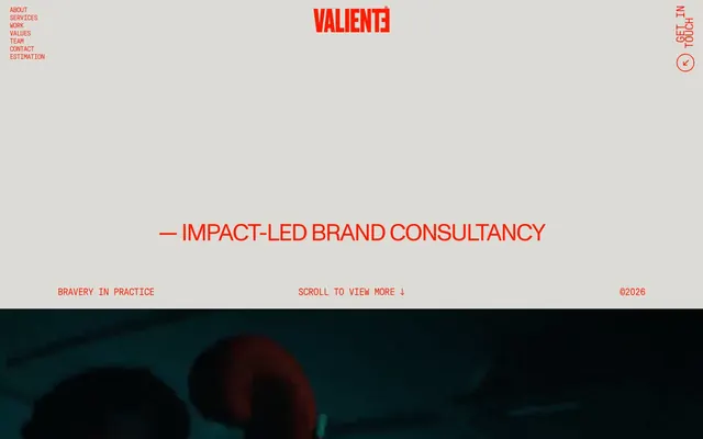
Raw Crimson Statement. The page feels like a manifesto etched in bold red on stark white.
Color palette
Primary brand accent, all interactive elements, key headlines, navigation emphasis, text content where brand intensity is required.
Dominant background color for sections and the overall page.
Primary text color for body copy, subheadings, and some navigation elements. Creates high contrast with Concrete White.
Subtitle text within body copy, occasionally for subtle background variations or section dividers not explicitly shown.
Rare background element, likely an unintentional browser artifact or a very subtle, almost unnoticeable background tint.
Typography
- Weights
- 400
- Sizes
- 12px, 14px, 16px, 18px, 20px, 24px, 48px, 95px, 128px, 190px, 245px
- Line height
- 0.8, 0.82, 1, 1.2
- Letter spacing
- -0.6, -0.56, -0.64, -0.666, -0.6, -0.72, -1.44, -7.125, -4.48, -6.65, -12.25
- Fallback
- Inter
Primary content font for all text from body to display. Its uniform weight contributes to the raw, direct feel. Aggressive negative letter-spacing, particularly at larger sizes, compresses text, making it feel intense and direct.
- Weights
- 400
- Sizes
- 48px
- Line height
- 1
- Letter spacing
- -1.92
- Fallback
- Archivo
Used for specific headlines, likely acting as a complementary display font. Its use at a single size reinforces its stylistic, rather than functional, role. Negative letter-spacing is also used here to maintain the compressed aesthetic.
Spacing & shape
Components
Styled with GT Pressura, weight 400, size 16px, line-height 1.2. Default text color is Charcoal Black (#0a0a0a), with Valiente Crimson (#ff1a00) for active or hover states. No padding or borders, relying on color change for interaction feedback.
Rendered in GT Pressura, weight 400, size 48px, line-height 1, letter-spacing -1.44px (based on -0.0300em). Text color is Valiente Crimson (#ff1a00), commanding immediate attention.
Styled with GT Pressura, weight 400, size 16px, line-height 1.2, letter-spacing -0.64px. Text color is Charcoal Black (#0a0a0a). Content is compact without excessive padding.
Uses GT Pressura, weight 400, size 16px, line-height 1.2, letter-spacing -0.64px. Text color is Charcoal Black (#0a0a0a). Positioned with a minimal margin from other elements.
These cards have no background color, border radius, box shadow, or padding (all 0px). They are essentially text blocks, allowing the content itself to be the primary focus over structural design. Text uses GT Pressura with varying sizes depending on hierarchy.
Guidelines
- Prioritize Valiente Crimson (#ff1a00) for all interactive states and primary branding elements.
- Maintain tight letter-spacing for all text elements, particularly at larger sizes (e.g., -1.44px for 48px text, -12.25px for 245px text), using GT Pressura predominantly.
- Use a pure, flat background of Concrete White (#f5f5f5) for the majority of page sections.
- Ensure headings and key textual statements are rendered in Valiente Crimson (#ff1a00) to maximize brand presence and impact.
- Maintain strict 0px border-radius and box-shadow on all card-like elements, keeping the UI sharp and unadorned.
- Employ Charcoal Black (#0a0a0a) for most body copy to establish clear contrast against the light background.
- Avoid using soft shadows or complex gradients; the aesthetic is flat and direct.
- Do not introduce curved corners or significant border-radii; all elements should maintain sharp 0px corners.
- Refrain from using varied weights or italic styles for GT Pressura; stick to weight 400 for consistency.
- Do not introduce any additional chromatic colors; limit the palette strictly to Valiente Crimson and the neutral shades.
- Avoid excessive whitespace around content blocks; the design prefers compactness and density, especially in text arrangement.
- Do not deviate from the established negative letter-spacing for text, as it is a core characteristic of the brand's typographic identity.
About this system
ShowHide
This design system presents as a raw, almost brutalist exhibition of brand identity. A primary, vivid red against a near-white background commands attention, creating an aggressive, high-energy aesthetic. Typography is dense and tightly kerned, often acting as a visual element itself, reinforcing a sense of purposeful, impactful communication. The design feels like a bold statement rather than a polished interface, prioritizing directness and brand impact.
The page primarily uses a max-width contained layout, likely around 1200-1440px, though a full-bleed video section interrupts this pattern for dramatic effect. The hero section is characterized by a unique staggered typography layout, creating a visual grid rather than a traditional centered headline. Sections are defined by consistent vertical spacing, creating an airy, uncluttered feel despite the dense typography. Content often appears in stacked blocks or implied two-column arrangements (e.g., text block left, implicit visual right), with a strong left alignment. Navigation is a minimalist top-right 'Get in Touch' button and a left-aligned, stacked text menu, both fixed or sticky. The overall rhythm is open and free-flowing, punctuated by bold text blocks.
The site uses a mix of candid, dark-toned photography and abstract typography as visual elements. Photography, when present (like the boxing scene), appears full-bleed or large-scale, often with a moody, desaturated filter that contrasts strongly with the bright, text-centric UI. Imagery is used decoratively to evoke atmosphere rather than to explicitly explain content, relying on its emotional impact. There are also product/people shots with neutral or studio-like backgrounds, often focused on individuals, maintaining a raw, authentic feel without overt styling. Icons are minimal, resembling simple outlined shapes with sharp edges, consistently in Valiente Crimson, providing functional navigation cues while adhering to the bold aesthetic.
Reminiscent of Brave New World, Acme Co., Red Antler.
# VALIENTE BRANDS — Style Reference
> Raw Crimson Statement. The page feels like a manifesto etched in bold red on stark white.

**Theme:** light

**Site:** https://valientebrands.com

This design system presents as a raw, almost brutalist exhibition of brand identity. A primary, vivid red against a near-white background commands attention, creating an aggressive, high-energy aesthetic. Typography is dense and tightly kerned, often acting as a visual element itself, reinforcing a sense of purposeful, impactful communication. The design feels like a bold statement rather than a polished interface, prioritizing directness and brand impact.

## Tokens — Colors

| Name | Value | Token | Role |
|------|------|------|------|
| Valiente Crimson | `#ff1a00` | `--color-valiente-crimson` | Primary brand accent, all interactive elements, key headlines, navigation emphasis, text content where brand intensity is required. |
| Concrete White | `#f5f5f5` | `--color-concrete-white` | Dominant background color for sections and the overall page. |
| Charcoal Black | `#0a0a0a` | `--color-charcoal-black` | Primary text color for body copy, subheadings, and some navigation elements. Creates high contrast with Concrete White. |
| Ash Gray | `#eaeaea` | `--color-ash-gray` | Subtitle text within body copy, occasionally for subtle background variations or section dividers not explicitly shown. |
| Pale Rose | `#e7a196` | `--color-pale-rose` | Rare background element, likely an unintentional browser artifact or a very subtle, almost unnoticeable background tint. |

## Tokens — Typography

### GT Pressura
- **Substitute:** Inter
- **Weights:** 400
- **Sizes:** 12px, 14px, 16px, 18px, 20px, 24px, 48px, 95px, 128px, 190px, 245px
- **Line height:** 0.8, 0.82, 1, 1.2
- **Letter spacing:** -0.6, -0.56, -0.64, -0.666, -0.6, -0.72, -1.44, -7.125, -4.48, -6.65, -12.25
- **Role:** Primary content font for all text from body to display. Its uniform weight contributes to the raw, direct feel. Aggressive negative letter-spacing, particularly at larger sizes, compresses text, making it feel intense and direct.

### Monument Grotesk
- **Substitute:** Archivo
- **Weights:** 400
- **Sizes:** 48px
- **Line height:** 1
- **Letter spacing:** -1.92
- **Role:** Used for specific headlines, likely acting as a complementary display font. Its use at a single size reinforces its stylistic, rather than functional, role. Negative letter-spacing is also used here to maintain the compressed aesthetic.

## Tokens — Type Scale

| Role | Size | Line height | Letter spacing |
|------|------|------|------|
| caption | 12px | 1.2 | -0.6px |
| body | 16px | 1.2 | -0.64px |
| subheading | 24px | 1 | -0.72px |
| heading | 48px | 1 | -1.92px |
| heading-lg | 95px | 0.8 | -7.125px |
| display | 245px | 0.8 | -12.25px |

## Tokens — Spacing

- **Max width:** 1440px
- **Section gap:** 64px
- **Card padding:** 0px
- **Element gap:** 20px

## Tokens — Radius

- **none:** 0px

## Layout

The page primarily uses a max-width contained layout, likely around 1200-1440px, though a full-bleed video section interrupts this pattern for dramatic effect. The hero section is characterized by a unique staggered typography layout, creating a visual grid rather than a traditional centered headline. Sections are defined by consistent vertical spacing, creating an airy, uncluttered feel despite the dense typography. Content often appears in stacked blocks or implied two-column arrangements (e.g., text block left, implicit visual right), with a strong left alignment. Navigation is a minimalist top-right 'Get in Touch' button and a left-aligned, stacked text menu, both fixed or sticky. The overall rhythm is open and free-flowing, punctuated by bold text blocks.

## Imagery

The site uses a mix of candid, dark-toned photography and abstract typography as visual elements. Photography, when present (like the boxing scene), appears full-bleed or large-scale, often with a moody, desaturated filter that contrasts strongly with the bright, text-centric UI. Imagery is used decoratively to evoke atmosphere rather than to explicitly explain content, relying on its emotional impact. There are also product/people shots with neutral or studio-like backgrounds, often focused on individuals, maintaining a raw, authentic feel without overt styling. Icons are minimal, resembling simple outlined shapes with sharp edges, consistently in Valiente Crimson, providing functional navigation cues while adhering to the bold aesthetic.

## Components

### Hero Tagline Bar

### Video Play Button Block

### Services Navigation Menu

### Navigation Link
*Interactive text link in the header and footer navigation.*

Styled with GT Pressura, weight 400, size 16px, line-height 1.2. Default text color is Charcoal Black (#0a0a0a), with Valiente Crimson (#ff1a00) for active or hover states. No padding or borders, relying on color change for interaction feedback.

### Hero Headline
*Main heading for the hero section.*

Rendered in GT Pressura, weight 400, size 48px, line-height 1, letter-spacing -1.44px (based on -0.0300em). Text color is Valiente Crimson (#ff1a00), commanding immediate attention.

### Body Paragraph
*Standard text blocks for descriptive content.*

Styled with GT Pressura, weight 400, size 16px, line-height 1.2, letter-spacing -0.64px. Text color is Charcoal Black (#0a0a0a). Content is compact without excessive padding.

### Footer Copyright
*Legal and copyright information at the bottom of the page.*

Uses GT Pressura, weight 400, size 16px, line-height 1.2, letter-spacing -0.64px. Text color is Charcoal Black (#0a0a0a). Positioned with a minimal margin from other elements.

### Feature Card (Text-only)
*Displays specific features or project details.*

These cards have no background color, border radius, box shadow, or padding (all 0px). They are essentially text blocks, allowing the content itself to be the primary focus over structural design. Text uses GT Pressura with varying sizes depending on hierarchy.

## Guidelines

### Do

- Prioritize Valiente Crimson (#ff1a00) for all interactive states and primary branding elements.
- Maintain tight letter-spacing for all text elements, particularly at larger sizes (e.g., -1.44px for 48px text, -12.25px for 245px text), using GT Pressura predominantly.
- Use a pure, flat background of Concrete White (#f5f5f5) for the majority of page sections.
- Ensure headings and key textual statements are rendered in Valiente Crimson (#ff1a00) to maximize brand presence and impact.
- Maintain strict 0px border-radius and box-shadow on all card-like elements, keeping the UI sharp and unadorned.
- Employ Charcoal Black (#0a0a0a) for most body copy to establish clear contrast against the light background.

### Don't

- Avoid using soft shadows or complex gradients; the aesthetic is flat and direct.
- Do not introduce curved corners or significant border-radii; all elements should maintain sharp 0px corners.
- Refrain from using varied weights or italic styles for GT Pressura; stick to weight 400 for consistency.
- Do not introduce any additional chromatic colors; limit the palette strictly to Valiente Crimson and the neutral shades.
- Avoid excessive whitespace around content blocks; the design prefers compactness and density, especially in text arrangement.
- Do not deviate from the established negative letter-spacing for text, as it is a core characteristic of the brand's typographic identity.

## Agent Prompt Guide

### Quick Color Reference
- Text (Charcoal Black): #0a0a0a
- Background (Concrete White): #f5f5f5
- CTA/Accent (Valiente Crimson): #ff1a00
- Hover/Active (Valiente Crimson): #ff1a00

### 3-5 Example Component Prompts
1.  **Create a hero section:** Concrete White background (#f5f5f5). Headline type '— IMPACT-LED BRAND CONSULTANCY' in Valiente Crimson (#ff1a00), GT Pressura, weight 400, size 48px, line-height 1, letter-spacing -1.44px. Include a subtitle 'BRAVERY IN PRACTICE' below, in Valiente Crimson (#ff1a00), GT Pressura, weight 400, size 16px, line-height 1.2, letter-spacing -0.64px. Both text elements left-aligned within a max-width container, with elementGap 20px between them.
2.  **Generate a navigation link:** Text 'Services' in Charcoal Black (#0a0a0a), GT Pressura, weight 400, size 16px, line-height 1.2, letter-spacing -0.64px. On hover, change text color to Valiente Crimson (#ff1a00). No padding, borders, or background.
3.  **Design a feature text block:** Start with a heading 'WFBCOGLZU' in Valiente Crimson (#ff1a00), GT Pressura, weight 400, size 24px, line-height 1, letter-spacing -0.72px. Followed by body text 'DJCTUVOCITEGUSCB KPYOHBRHIRGIFMNZACXRCYXCTR BXAMHNCS' in Charcoal Black (#0a0a0a), GT Pressura, weight 400, size 16px, line-height 1.2, letter-spacing -0.64px. Both elements left-aligned, with 20px vertical gap between them, on a Concrete White (#f5f5f5) background. The combined block should have 0px padding and 0px borderRadius.
More like this









Keep what you find
A free account saves references to boards and can send you a weekly email of picks based on what you save.
To see every result, go Pro.