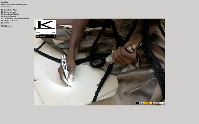
Preview image. Unlock full-res
architectural blueprint on concrete
Color palette
Supporting palette color for small decorative accents when the core palette needs contrast. Do not promote it to the primary CTA color
Page background, primary surface
Card backgrounds, modal surfaces, content blocks, border accents
Primary text, headings, link text for default and hover states. This near-black provides strong contrast against lighter surfaces
Secondary text, descriptive elements, subtle borders for inactive states
Typography
- Weights
- 500
- Sizes
- 13px
- Line height
- 1.2
- Fallback
- Helvetica Neue
Primary text for navigation, links, and detailed information. Its compact nature and medium weight maintain legibility in dense lists.
- Weights
- 500
- Sizes
- 16px
- Line height
- 1.2
- Fallback
- Inter
Descriptive text and body copy in content areas. Its contemporary feel complements the streamlined aesthetic.
Spacing & shape
Components
Uses Neue Haas Unica W 1 G, weight 500, 13px, with Midnight Ink (#18100c) text on Canvas Gray (#d1cfce). Underlined on hover or active state.
Uses Neue Haas Unica W 1 G, weight 500, 13px, Midnight Ink (#18100c) text on Canvas Gray (#d1cfce). Has no explicit background or border, relying on spacing for separation.
Transparent background with a 1px Midnight Ink (#18100c) border. Text is Neue Haas Unica W 1 G, weight 500, 13px, in Midnight Ink (#18100c). No border radius, dimensions are 8px padding vertically/horizontally.
Solid Brand Black (#000000) background with Pure White (#ffffff) text (Neue Haas Unica W 1 G, weight 500, 13px). No border radius. Padding is 16px horizontal and 8px vertical at minimum.
Uses Inter, weight 500, 16px, in Midnight Ink (#18100c) against Canvas Gray (#d1cfce).
Guidelines
- Use Canvas Gray (#d1cfce) as the dominant page background.
- Apply Midnight Ink (#18100c) for all primary text and link text to ensure high contrast.
- Maintain a strict 0px border-radius for all interactive elements and containers, reflecting the sharp, geometric aesthetic.
- Structure all content with a base unit of 8px for element spacing and padding.
- Utilize a 1px solid border in Midnight Ink (#18100c) for 'ghost' button styles to define interactive areas without adding heavy fills.
- Implement Brand Black (#000000) solely for primary action buttons, ensuring they stand out by color and fill.
- Adhere to a compact line height of 1.2 for both Neue Haas Unica W 1 G and Inter fonts, maximizing information density.
- Avoid using border-radius values other than 0px; the system is built on sharp corners.
- Do not introduce highly saturated colors for functional UI elements; color is used sparingly and deliberately.
- Do not use drop shadows or complex elevation; surfaces are flat and defined by color shifts and borders.
- Avoid large, decorative typography features in headlines or section titles; maintain the compact type scale.
- Do not use generic, unbranded text links; always ensure links either use Midnight Ink (#18100c) and are subtly distinguished.
- Do not use images or visual elements that break outside the content frame or use overly organic shapes; maintain a composed, structured layout.
- Avoid varying letter-spacing; all text should use 'normal' letter-spacing except where explicitly defined by the font itself.
About this system
ShowHide
Fiz's visual identity balances stark minimalism with subtle material warmth, drawing heavily on a monochrome palette of near-black text on a muted, almost concrete-like light gray canvas. The design prioritizes readability and directness through compact typography and a deliberate lack of decorative elements. Interaction is framed by crisp, thin strokes and a single contrasting brand accent when an action is taken, focusing attention without visual clutter. The overall effect is one of quiet efficiency and grounded sophistication.
The page exhibits a contained, centered layout, where content is presented within a defined horizontal maximum width, but the background appears to expand fully. The hero section features a prominent, large visual filling a significant portion of the screen, with minimal UI elements overlaid. The overall section rhythm is consistent vertical spacing, often with strong visual separations created by distinct content blocks or imagery. Content is mostly arranged in stacked, centered blocks or text-heavy lists. Navigation is minimal, limited to a simple left-aligned text list and a few compact buttons, emphasizing content over complex site structure.
This site features primarily photography, often presented as large, central visual anchors. The treatment is full-bleed within a contained area, with sharp, unmasked edges, emphasizing the raw, unedited nature of the image. The photography style appears to be product-focused or process-oriented, with high-detail focus and natural lighting. Imagery serves primarily as a decorative atmosphere and content showcase, with a high visual density relative to text in the hero area, establishing a visual gravity.
Reminiscent of Are.na, Studio—Luft, Superside, Actual Source.
# Fiz — Style Reference
> architectural blueprint on concrete

**Theme:** light

**Site:** https://www.davidfiz.com

Fiz's visual identity balances stark minimalism with subtle material warmth, drawing heavily on a monochrome palette of near-black text on a muted, almost concrete-like light gray canvas. The design prioritizes readability and directness through compact typography and a deliberate lack of decorative elements. Interaction is framed by crisp, thin strokes and a single contrasting brand accent when an action is taken, focusing attention without visual clutter. The overall effect is one of quiet efficiency and grounded sophistication.

## Tokens — Colors

| Name | Value | Token | Role |
|------|------|------|------|
| Brand Black | `#000000` | `--color-brand-black` | Supporting palette color for small decorative accents when the core palette needs contrast. Do not promote it to the primary CTA color |
| Canvas Gray | `#d1cfce` | `--color-canvas-gray` | Page background, primary surface |
| Pure White | `#ffffff` | `--color-pure-white` | Card backgrounds, modal surfaces, content blocks, border accents |
| Midnight Ink | `#18100c` | `--color-midnight-ink` | Primary text, headings, link text for default and hover states. This near-black provides strong contrast against lighter surfaces |
| Muted Gray | `#696867` | `--color-muted-gray` | Secondary text, descriptive elements, subtle borders for inactive states |

## Tokens — Typography

### Neue Haas Unica W 1 G
- **Substitute:** Helvetica Neue
- **Weights:** 500
- **Sizes:** 13px
- **Line height:** 1.2
- **Role:** Primary text for navigation, links, and detailed information. Its compact nature and medium weight maintain legibility in dense lists.

### Inter
- **Substitute:** Inter
- **Weights:** 500
- **Sizes:** 16px
- **Line height:** 1.2
- **Role:** Descriptive text and body copy in content areas. Its contemporary feel complements the streamlined aesthetic.

## Tokens — Spacing

- **Section gap:** 48px
- **Card padding:** 8px
- **Element gap:** 8px

## Tokens — Radius

- **Buttons:** 0px
- **Cards:** 0px

## Layout

The page exhibits a contained, centered layout, where content is presented within a defined horizontal maximum width, but the background appears to expand fully. The hero section features a prominent, large visual filling a significant portion of the screen, with minimal UI elements overlaid. The overall section rhythm is consistent vertical spacing, often with strong visual separations created by distinct content blocks or imagery. Content is mostly arranged in stacked, centered blocks or text-heavy lists. Navigation is minimal, limited to a simple left-aligned text list and a few compact buttons, emphasizing content over complex site structure.

## Imagery

This site features primarily photography, often presented as large, central visual anchors. The treatment is full-bleed within a contained area, with sharp, unmasked edges, emphasizing the raw, unedited nature of the image. The photography style appears to be product-focused or process-oriented, with high-detail focus and natural lighting. Imagery serves primarily as a decorative atmosphere and content showcase, with a high visual density relative to text in the hero area, establishing a visual gravity.

## Components

### Primary Navigation Link
*Text link for primary navigation items.*

Uses Neue Haas Unica W 1 G, weight 500, 13px, with Midnight Ink (#18100c) text on Canvas Gray (#d1cfce). Underlined on hover or active state.

### Category Listing Item
*Numbered link items for project categories.*

Uses Neue Haas Unica W 1 G, weight 500, 13px, Midnight Ink (#18100c) text on Canvas Gray (#d1cfce). Has no explicit background or border, relying on spacing for separation.

### Ghost Button
*Secondary interactive elements, such as 'Menu' and 'Visit' buttons.*

Transparent background with a 1px Midnight Ink (#18100c) border. Text is Neue Haas Unica W 1 G, weight 500, 13px, in Midnight Ink (#18100c). No border radius, dimensions are 8px padding vertically/horizontally.

### Filled Action Button
*Primary call to action.*

Solid Brand Black (#000000) background with Pure White (#ffffff) text (Neue Haas Unica W 1 G, weight 500, 13px). No border radius. Padding is 16px horizontal and 8px vertical at minimum.

### Main Logo (text)
*Site identifier, primary brand mark.*

Uses Inter, weight 500, 16px, in Midnight Ink (#18100c) against Canvas Gray (#d1cfce).

## Guidelines

### Do

- Use Canvas Gray (#d1cfce) as the dominant page background.
- Apply Midnight Ink (#18100c) for all primary text and link text to ensure high contrast.
- Maintain a strict 0px border-radius for all interactive elements and containers, reflecting the sharp, geometric aesthetic.
- Structure all content with a base unit of 8px for element spacing and padding.
- Utilize a 1px solid border in Midnight Ink (#18100c) for 'ghost' button styles to define interactive areas without adding heavy fills.
- Implement Brand Black (#000000) solely for primary action buttons, ensuring they stand out by color and fill.
- Adhere to a compact line height of 1.2 for both Neue Haas Unica W 1 G and Inter fonts, maximizing information density.

### Don't

- Avoid using border-radius values other than 0px; the system is built on sharp corners.
- Do not introduce highly saturated colors for functional UI elements; color is used sparingly and deliberately.
- Do not use drop shadows or complex elevation; surfaces are flat and defined by color shifts and borders.
- Avoid large, decorative typography features in headlines or section titles; maintain the compact type scale.
- Do not use generic, unbranded text links; always ensure links either use Midnight Ink (#18100c) and are subtly distinguished.
- Do not use images or visual elements that break outside the content frame or use overly organic shapes; maintain a composed, structured layout.
- Avoid varying letter-spacing; all text should use 'normal' letter-spacing except where explicitly defined by the font itself.

## Agent Prompt Guide

Quick Color Reference:
text: #18100c
background: #d1cfce
border: #18100c
accent: #000000
primary action: no distinct CTA color

Example Component Prompts:
1. Create a project listing: text '01 Kunsthalle Basel' using Neue Haas Unica W 1 G, weight 500, 13px, #18100c. Background #d1cfce. No borders or radius.
2. Create a 'Menu' button: ghost style, 1px #18100c border, #ffffff background, 0px radius. Text 'Menu' using Neue Haas Unica W 1 G, weight 500, 13px, #18100c. Padding 8px.
3. Create a 'Plan your visit' button: #000000 background, #ffffff text (Neue Haas Unica W 1 G, weight 500, 13px), 0px radius. Padding 8px vertical, 16px horizontal.
More like this









Keep what you find
A free account saves references to boards and can send you a weekly email of picks based on what you save.
To see every result, go Pro.