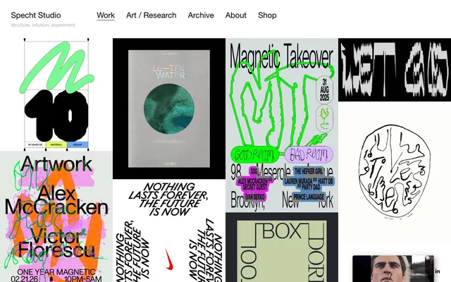
Preview image. Unlock full-res
Gallery Grid Monochrome
Color palette
Dark borders and separators for elevated surfaces and inverted UI. Do not promote it to the primary CTA color
Secondary text, link borders when inactive, image borders and some iconography
Page background, primary surfacing
Typography
- Weights
- 400
- Sizes
- 15px, 16px, 25px
- Line height
- 1, 1.2, 1.4, 1.5
- Letter spacing
- normal
- Fallback
- Arial
All text elements: headings, body copy, navigation, and links. The consistent use of a single font family and weight across all roles creates a unified, no-nonsense typographic voice.
Spacing & shape
Components
Text in Black Ink (#000000) at 15px Helvetica Neue, with a 10px bottom margin. Hover state reveals a subtle border. Padding: 0px 0px 2px 0px.
A square or rectangular content block containing an image, bordered by a 1px solid #666666 line. Text labels below the image are in Midtone Gray (#666666), 16px Helvetica Neue, with a 10px bottom margin. Each item feels like a distinct piece on a gallery wall.
Black Ink (#000000) with a 10px bottom margin, 12px left margin, 13px bottom margin, 24px right/left top padding, 11px top margin, and 10px top margin.
Guidelines
- Prioritize Canvas White (#ffffff) for all background surfaces to maintain a clean, gallery-like aesthetic.
- Use Black Ink (#000000) for all primary text, headings, and active navigation states.
- Frame interactive blocks and images with subtle 1px solid borders using Midtone Gray (#666666) or Black Ink (#000000).
- Apply normal letter-spacing for all Helvetica Neue type, avoiding condensed or expanded tracking.
- Maintain a clear visual hierarchy using spacing; utilize 10px as the default element separation and 67px for section breaks.
- Keep brand accent colors confined to embedded imagery or content rather than UI elements.
- Do not use saturated colors for UI elements; chromaticity should primarily come from background content.
- Avoid heavy shadows or gradients on any UI component; elevation is achieved through framing, not depth effects.
- Do not introduce additional font families or weights beyond Helvetica Neue 400.
- Refrain from large, contrasting background blocks that break the predominantly light theme, except where content specifically dictates.
- Do not introduce complex UI elements or decorative flourishes; maintain a functional, content-focused approach.
About this system
ShowHide
Specht Studio employs a stark, high-contrast visual language reminiscent of a curated gallery wall. The primary interaction is through image-heavy blocks, framed by thin borders and text in a sparse, functional sans-serif. The design emphasizes content arrangement and bold typographic treatments, with color sparsely used and predominantly achromatic for navigation and core information, allowing the rich, varied artwork to provide visual interest and chromatic depth.
Reminiscent of Are.na, OFFICE Magazine, Working Not Working, Sight Unseen.
# Specht Studio — Style Reference
> Gallery Grid Monochrome

**Theme:** light

**Site:** https://stephaniespecht.com

Specht Studio employs a stark, high-contrast visual language reminiscent of a curated gallery wall. The primary interaction is through image-heavy blocks, framed by thin borders and text in a sparse, functional sans-serif. The design emphasizes content arrangement and bold typographic treatments, with color sparsely used and predominantly achromatic for navigation and core information, allowing the rich, varied artwork to provide visual interest and chromatic depth.

## Tokens — Colors

| Name | Value | Token | Role |
|------|------|------|------|
| Black Ink | `#000000` | `--color-black-ink` | Dark borders and separators for elevated surfaces and inverted UI. Do not promote it to the primary CTA color |
| Midtone Gray | `#666666` | `--color-midtone-gray` | Secondary text, link borders when inactive, image borders and some iconography |
| Canvas White | `#ffffff` | `--color-canvas-white` | Page background, primary surfacing |

## Tokens — Typography

### Helvetica Neue
- **Substitute:** Arial
- **Weights:** 400
- **Sizes:** 15px, 16px, 25px
- **Line height:** 1, 1.2, 1.4, 1.5
- **Letter spacing:** normal
- **Role:** All text elements: headings, body copy, navigation, and links. The consistent use of a single font family and weight across all roles creates a unified, no-nonsense typographic voice.

## Tokens — Type Scale

| Role | Size | Line height | Letter spacing |
|------|------|------|------|
| caption | 15px | 1.4 | — |
| body-sm | 16px | 1.4 | — |
| body | 25px | 1.3 | — |

## Tokens — Spacing

- **Section gap:** 67px
- **Card padding:** 24px
- **Element gap:** 10px

## Tokens — Radius

- **Default:** 0px

## Components

### Navigation Link
*Primary site navigation items.*

Text in Black Ink (#000000) at 15px Helvetica Neue, with a 10px bottom margin. Hover state reveals a subtle border. Padding: 0px 0px 2px 0px.

### Image Grid Item
*Display individual portfolio pieces or art.*

A square or rectangular content block containing an image, bordered by a 1px solid #666666 line. Text labels below the image are in Midtone Gray (#666666), 16px Helvetica Neue, with a 10px bottom margin. Each item feels like a distinct piece on a gallery wall.

### Project Title Link
*Headline for individual project entries on the grid.*

Black Ink (#000000) with a 10px bottom margin, 12px left margin, 13px bottom margin, 24px right/left top padding, 11px top margin, and 10px top margin.

## Guidelines

### Do

- Prioritize Canvas White (#ffffff) for all background surfaces to maintain a clean, gallery-like aesthetic.
- Use Black Ink (#000000) for all primary text, headings, and active navigation states.
- Frame interactive blocks and images with subtle 1px solid borders using Midtone Gray (#666666) or Black Ink (#000000).
- Apply normal letter-spacing for all Helvetica Neue type, avoiding condensed or expanded tracking.
- Maintain a clear visual hierarchy using spacing; utilize 10px as the default element separation and 67px for section breaks.
- Keep brand accent colors confined to embedded imagery or content rather than UI elements.

### Don't

- Do not use saturated colors for UI elements; chromaticity should primarily come from background content.
- Avoid heavy shadows or gradients on any UI component; elevation is achieved through framing, not depth effects.
- Do not introduce additional font families or weights beyond Helvetica Neue 400.
- Refrain from large, contrasting background blocks that break the predominantly light theme, except where content specifically dictates.
- Do not introduce complex UI elements or decorative flourishes; maintain a functional, content-focused approach.

## Agent Prompt Guide

Quick Color Reference:
text: #000000
background: #ffffff
border: #000000
accent: no distinct accent color
primary action: no distinct CTA color

Example Component Prompts:
1. Create a primary navigation link: Helvetica Neue 400, 15px, #000000, normal letter-spacing, with a 2px bottom border on hover in Black Ink (#000000).
2. Create an image grid item: A 1px solid border in Midtone Gray (#666666). Below the image, display text in Helvetica Neue 400, 16px, #666666, with a 10px bottom margin.
3. Create a project title heading: Helvetica Neue 400, 25px, #000000, normal letter-spacing, with 10px bottom margin and 24px right/left/top padding, and 11px top margin.
More like this









Keep what you find
A free account saves references to boards and can send you a weekly email of picks based on what you save.
To see every result, go Pro.