Preview image. Unlock full-res
Midnight command center
Color palette
Green outline accent for tags, dividers, and focused UI edges.
Page backgrounds, primary text for inverted states, primary borders, image borders — defines the core dark canvas
Card surfaces, elevated backgrounds, and subtly darker button backgrounds — creates surface hierarchy on the dark canvas
Primary text, headings, input text, ghost button borders, and iconography — high contrast against dark backgrounds
Muted headings, secondary text, and fill for less prominent icons — provides a lower contrast textual element
Muted helper text, secondary borders, and subtle background elements — for granular text and subtle visual separation
Tertiary text, link text, ghost button borders, and decorative elements — lower prominence text and structural lines
Subtle card backgrounds and decorative strokes — adds a slight depth without strong contrast
Helper text and decorative borders — for very light cues against dark backgrounds
Subtle button borders and icon outlines — for minimal distinction on dark surfaces
Typography
- Weights
- 400, 500, 600
- Sizes
- 8px, 11px, 12px, 14px, 15px, 16px, 20px, 22px, 30px, 60px, 80px
- Line height
- 1, 1.1, 1.2, 1.37, 1.4, 1.5
- Letter spacing
- -0.0300em
- Fallback
- Inter
Primary workhorse font for body text, interactive elements, and navigation. Its precise tracking and custom features give a modern, technical precision, feeling both sharp and readable.
- Weights
- 400, 700
- Sizes
- 14px
- Line height
- 1
- Letter spacing
- 0.0290em
- Fallback
- Inter
Used for specific body text elements requiring either lighter or bolder emphasis. Its variable nature allows for nuanced brand expression where needed.
- Weights
- 700
- Sizes
- 22px
- Line height
- 1.15
- Letter spacing
- -0.0300em
- Fallback
- Montserrat
Used for prominent section headings. Its robust weight and tight tracking command attention without being overly loud, providing a confident, clear statement in a dark UI.
- Weights
- 400
- Sizes
- 42px
- Line height
- 1
- Letter spacing
- -0.0240em
- Fallback
- PT Serif Italic
Distinctive display font for hero sections and key marketing headlines. The italic style and unique name suggest a bespoke, artistic touch that counters the functional aesthetic of Geist, conveying creativity.
- Weights
- 400
- Sizes
- 42px
- Line height
- 1.1
- Letter spacing
- -0.0360em
- Fallback
- PT Serif
Companion display font for major headlines, offering a more stable counterpart to the italic version. The extremely tight letter-spacing gives a compressed, impactful feel.
- Weights
- 400
- Sizes
- 12px
- Line height
- 1.2
- Letter spacing
- normal
- Fallback
- system-ui
Fallback and utilitarian text for lists and general UI elements. Ensures basic readability where custom fonts are not critical.
Spacing & shape
Components
backgroundColor: rgba(0, 0, 0, 0), color: Off White (#eeeeee), borderTopColor: Absolute Zero (#000000), borderRadius: 0px, padding: 0px.
backgroundColor: rgba(25, 25, 25, 0.9), color: Off White (#eeeeee), borderTopColor: rgba(255, 255, 255, 0.11), borderRadius: 9999px, padding: 1px 16px 1px 14px.
backgroundColor: rgba(255, 255, 255, 0.1), color: Off White (#eeeeee), borderTopColor: rgba(255, 255, 255, 0.11), borderRadius: 12px, padding: 9px 11px 9px 11px.
backgroundColor: rgba(255, 255, 255, 0.1), color: system default link blue, borderTopColor: system default link blue, borderRadius: 12px, padding: 10px 12px.
backgroundColor: rgba(25, 25, 25, 0.9), borderRadius: 10px, boxShadow: none, padding: 0px.
backgroundColor: rgba(48, 48, 48, 0.9), borderRadius: 24px, boxShadow: none, padding: 0px.
backgroundColor: rgba(0, 0, 0, 0), color: Off White (#eeeeee), borderTopColor: Off White (#eeeeee), borderRadius: 0px, padding: 0px.
backgroundColor: Vivid Green (#71d083), color: Off White (#eeeeee), borderRadius: 9999px, padding: 2px 6px.
Guidelines
- Prioritize Absolute Zero (#000000) for page backgrounds and Deep Charcoal (#191919) for card surfaces to maintain the dominant dark theme.
- Use Off White (#eeeeee) for all primary text, headings, and essential UI elements for readability and high contrast.
- Apply Geist as the primary typeface for body text and interactive elements, leveraging its custom features for precise control like 'blwf', 'cv03', 'cv04', 'cv09', 'cv11'.
- Maintain a compact horizontal padding of 14px for buttons and 10px or 12px for interactive elements to create a dense, functional feel.
- Utilize a 9999px border-radius for all primary buttons and tags to create a distinct pill shape.
- Reserve Vivid Green (#71d083) exclusively for 'New' tags and subtle, functional accents, avoiding overuse to preserve its impact.
- Employ a base unit of 4px for all spacing decisions, creating a compact and consistent element distribution.
- Avoid using bright or overly saturated colors for large surface areas; color should primarily serve as functional highlight or subtle accent.
- Do not introduce heavy box shadows or strong elevation effects; maintain the predominantly flat, dark aesthetic.
- Do not vary line-heights significantly for body text; keep type compact and precise.
- Never use generic sans-serif fonts where Geist is specified; the unique letter-spacing and features of Geist are integral to the brand identity.
- Avoid wide padding on cards or sections, as the design prioritizes a compact, information-dense layout.
- Do not use dark text colors on mid-tone gray backgrounds, as contrast will be insufficient for this dark theme.
- Do not use bold weights indiscriminately; the system mostly relies on lighter or regular weights, with specific heavier weights for structured data or distinct headings.
About this system
ShowHide
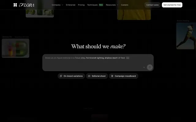
FLORA evokes a midnight command center atmosphere, blending stark functionality with subtle creative flair. It uses a predominantly dark theme with surfaces ranging from pure black to dark charcoal, accented by bright white text and subtle gray borders. Typography plays a central role, leveraging custom fonts with precise letter-spacing to create a crisp, almost whispered authority. Interactive elements are sparse, using ghost button styles and a singular vivid green accent for 'New' tags and hints of activation, maintaining a focus on content over heavy UI.
The page primarily uses a max-width contained layout, likely around 1200px, but features full-bleed dark sections to establish depth. The hero section is a full-width dark canvas with a centered, large headline and prompt input, setting a focused, interactive tone. Section rhythm alternates between full-bleed dark zones and content sections that feature two or three-column card grids. Content is arranged in alternating text-left/visual-right patterns or as tightly packed card grids for features. Vertical spacing between sections is consistent but not overly generous, maintaining density. Navigation consists of a sticky top bar with ghost links, a primary CTA button, and a secondary outlined CTA, all compact.
The visual language is split between abstract generative graphics and tightly composed, often high-contrast product screenshots within dark UI frames. Photography, where present, is primarily product-focused or showcases creative outputs, often framed by the dark UI. Illustrations are minimal, leaning towards highly structured, geometric, or abstract forms that complement the AI theme. Icons are outlined, simple, and monochrome (Off White #eeeeee), emphasizing function over decoration. Images are typically contained within cards with rounded corners or integrated into the dark background, maintaining a high density of visual information.
Reminiscent of Anthropic, RunwayML, Linear, Midjourney.
# FLORA — Style Reference
> Midnight command center

**Theme:** dark

**Site:** https://www.florafauna.ai

FLORA evokes a midnight command center atmosphere, blending stark functionality with subtle creative flair. It uses a predominantly dark theme with surfaces ranging from pure black to dark charcoal, accented by bright white text and subtle gray borders. Typography plays a central role, leveraging custom fonts with precise letter-spacing to create a crisp, almost whispered authority. Interactive elements are sparse, using ghost button styles and a singular vivid green accent for 'New' tags and hints of activation, maintaining a focus on content over heavy UI.

## Tokens — Colors

| Name | Value | Token | Role |
|------|------|------|------|
| Vivid Green | `#71d083` | `--color-vivid-green` | Green outline accent for tags, dividers, and focused UI edges. |
| Absolute Zero | `#000000` | `--color-absolute-zero` | Page backgrounds, primary text for inverted states, primary borders, image borders — defines the core dark canvas |
| Deep Charcoal | `#191919` | `--color-deep-charcoal` | Card surfaces, elevated backgrounds, and subtly darker button backgrounds — creates surface hierarchy on the dark canvas |
| Off White | `#eeeeee` | `--color-off-white` | Primary text, headings, input text, ghost button borders, and iconography — high contrast against dark backgrounds |
| Medium Gray | `#606060` | `--color-medium-gray` | Muted headings, secondary text, and fill for less prominent icons — provides a lower contrast textual element |
| Light Gray | `#b4b4b4` | `--color-light-gray` | Muted helper text, secondary borders, and subtle background elements — for granular text and subtle visual separation |
| Ash Gray | `#7b7b7b` | `--color-ash-gray` | Tertiary text, link text, ghost button borders, and decorative elements — lower prominence text and structural lines |
| Dark Charcoal Outline | `#303030` | `--color-dark-charcoal-outline` | Subtle card backgrounds and decorative strokes — adds a slight depth without strong contrast |
| Soft Gray | `#bfbfbf` | `--color-soft-gray` | Helper text and decorative borders — for very light cues against dark backgrounds |
| Onyx Faint | `#050505` | `--color-onyx-faint` | Subtle button borders and icon outlines — for minimal distinction on dark surfaces |

## Tokens — Typography

### Geist
- **Substitute:** Inter
- **Weights:** 400, 500, 600
- **Sizes:** 8px, 11px, 12px, 14px, 15px, 16px, 20px, 22px, 30px, 60px, 80px
- **Line height:** 1, 1.1, 1.2, 1.37, 1.4, 1.5
- **Letter spacing:** -0.0300em
- **Role:** Primary workhorse font for body text, interactive elements, and navigation. Its precise tracking and custom features give a modern, technical precision, feeling both sharp and readable.

### Geist Variable
- **Substitute:** Inter
- **Weights:** 400, 700
- **Sizes:** 14px
- **Line height:** 1
- **Letter spacing:** 0.0290em
- **Role:** Used for specific body text elements requiring either lighter or bolder emphasis. Its variable nature allows for nuanced brand expression where needed.

### Satoshi
- **Substitute:** Montserrat
- **Weights:** 700
- **Sizes:** 22px
- **Line height:** 1.15
- **Letter spacing:** -0.0300em
- **Role:** Used for prominent section headings. Its robust weight and tight tracking command attention without being overly loud, providing a confident, clear statement in a dark UI.

### Redaction 50 Italic
- **Substitute:** PT Serif Italic
- **Weights:** 400
- **Sizes:** 42px
- **Line height:** 1
- **Letter spacing:** -0.0240em
- **Role:** Distinctive display font for hero sections and key marketing headlines. The italic style and unique name suggest a bespoke, artistic touch that counters the functional aesthetic of Geist, conveying creativity.

### Redaction 10 Regular
- **Substitute:** PT Serif
- **Weights:** 400
- **Sizes:** 42px
- **Line height:** 1.1
- **Letter spacing:** -0.0360em
- **Role:** Companion display font for major headlines, offering a more stable counterpart to the italic version. The extremely tight letter-spacing gives a compressed, impactful feel.

### sans-serif
- **Substitute:** system-ui
- **Weights:** 400
- **Sizes:** 12px
- **Line height:** 1.2
- **Letter spacing:** normal
- **Role:** Fallback and utilitarian text for lists and general UI elements. Ensures basic readability where custom fonts are not critical.

## Tokens — Type Scale

Perfect Fourth (1.333) from 20px base.

| Role | Size | Line height | Letter spacing |
|------|------|------|------|
| heading | 20px | 1.2 | -0.025em |
| heading-lg | 22px | 1.15 | -0.03em |
| display-sm | 30px | 1.2 | -0.03em |
| display | 42px | 1.1 | -0.036em |
| display-lg | 60px | 1.1 | -0.03em |
| display-xl | 80px | 1.1 | -0.03em |

## Tokens — Spacing

- **Max width:** 1200px
- **Section gap:** 48px
- **Card padding:** 24px
- **Element gap:** 4px

## Tokens — Radius

- **Default:** 10px
- **Buttons:** 9999px
- **Cards:** 10px
- **input:** 12px
- **pill:** 999px

## Layout

The page primarily uses a max-width contained layout, likely around 1200px, but features full-bleed dark sections to establish depth. The hero section is a full-width dark canvas with a centered, large headline and prompt input, setting a focused, interactive tone. Section rhythm alternates between full-bleed dark zones and content sections that feature two or three-column card grids. Content is arranged in alternating text-left/visual-right patterns or as tightly packed card grids for features. Vertical spacing between sections is consistent but not overly generous, maintaining density. Navigation consists of a sticky top bar with ghost links, a primary CTA button, and a secondary outlined CTA, all compact.

## Imagery

The visual language is split between abstract generative graphics and tightly composed, often high-contrast product screenshots within dark UI frames. Photography, where present, is primarily product-focused or showcases creative outputs, often framed by the dark UI. Illustrations are minimal, leaning towards highly structured, geometric, or abstract forms that complement the AI theme. Icons are outlined, simple, and monochrome (Off White #eeeeee), emphasizing function over decoration. Images are typically contained within cards with rounded corners or integrated into the dark background, maintaining a high density of visual information.

## Components

### Ghost Navigation Button
*Navigational elements in the header and sub-menus.*

backgroundColor: rgba(0, 0, 0, 0), color: Off White (#eeeeee), borderTopColor: Absolute Zero (#000000), borderRadius: 0px, padding: 0px.

### Outlined Pill Button (Dense)
*Compact secondary actions and filters.*

backgroundColor: rgba(25, 25, 25, 0.9), color: Off White (#eeeeee), borderTopColor: rgba(255, 255, 255, 0.11), borderRadius: 9999px, padding: 1px 16px 1px 14px.

### Outlined Rounded Button (Compact)
*Informational or tertiary actions.*

backgroundColor: rgba(255, 255, 255, 0.1), color: Off White (#eeeeee), borderTopColor: rgba(255, 255, 255, 0.11), borderRadius: 12px, padding: 9px 11px 9px 11px.

### Primary CTA Button
*Main call to action, stand-alone buttons for key interactions.*

backgroundColor: rgba(255, 255, 255, 0.1), color: system default link blue, borderTopColor: system default link blue, borderRadius: 12px, padding: 10px 12px.

### Default Card
*Content containers for features, showcases, or related information.*

backgroundColor: rgba(25, 25, 25, 0.9), borderRadius: 10px, boxShadow: none, padding: 0px.

### Elevated Card
*Specialized cards requiring slightly more visual emphasis, like primary showcase items.*

backgroundColor: rgba(48, 48, 48, 0.9), borderRadius: 24px, boxShadow: none, padding: 0px.

### Text Input (Underlined)
*User input fields that blend into the dark canvas.*

backgroundColor: rgba(0, 0, 0, 0), color: Off White (#eeeeee), borderTopColor: Off White (#eeeeee), borderRadius: 0px, padding: 0px.

### New Tag
*Highlights new features or content.*

backgroundColor: Vivid Green (#71d083), color: Off White (#eeeeee), borderRadius: 9999px, padding: 2px 6px.

## Guidelines

### Do

- Prioritize Absolute Zero (#000000) for page backgrounds and Deep Charcoal (#191919) for card surfaces to maintain the dominant dark theme.
- Use Off White (#eeeeee) for all primary text, headings, and essential UI elements for readability and high contrast.
- Apply Geist as the primary typeface for body text and interactive elements, leveraging its custom features for precise control like 'blwf', 'cv03', 'cv04', 'cv09', 'cv11'.
- Maintain a compact horizontal padding of 14px for buttons and 10px or 12px for interactive elements to create a dense, functional feel.
- Utilize a 9999px border-radius for all primary buttons and tags to create a distinct pill shape.
- Reserve Vivid Green (#71d083) exclusively for 'New' tags and subtle, functional accents, avoiding overuse to preserve its impact.
- Employ a base unit of 4px for all spacing decisions, creating a compact and consistent element distribution.

### Don't

- Avoid using bright or overly saturated colors for large surface areas; color should primarily serve as functional highlight or subtle accent.
- Do not introduce heavy box shadows or strong elevation effects; maintain the predominantly flat, dark aesthetic.
- Do not vary line-heights significantly for body text; keep type compact and precise.
- Never use generic sans-serif fonts where Geist is specified; the unique letter-spacing and features of Geist are integral to the brand identity.
- Avoid wide padding on cards or sections, as the design prioritizes a compact, information-dense layout.
- Do not use dark text colors on mid-tone gray backgrounds, as contrast will be insufficient for this dark theme.
- Do not use bold weights indiscriminately; the system mostly relies on lighter or regular weights, with specific heavier weights for structured data or distinct headings.

## Agent Prompt Guide

**Quick Color Reference**
text: #eeeeee
background: #000000
border: #7b7b7b
accent: #71d083
primary action: #000000 (filled action)

**3-5 Example Component Prompts**
1. Create a hero section with a centered text input: background Absolute Zero (#000000). Headline 'What should we make?' in Redaction 50 Italic, size 42px, color Off White (#eeeeee), letter-spacing -0.024em. Below, a text input field styled as Text Input (Underlined), with color Off White (#eeeeee) and a placeholder text 'Shoot an on-figure editorial...'.
2. Design a feature card displaying '01 Ideate': Background Deep Charcoal (#191919), borderRadius 10px. The number '01' should use Satoshi, size 22px, weight 700, color Off White (#eeeeee). The title 'Ideate' should use Satoshi, size 22px, weight 700, color Off White (#eeeeee), letter-spacing -0.030em. Include a description text in Geist, size 14px, weight 400, color Light Gray (#b4b4b4), on Deep Charcoal background.
3. Create a Primary Action Button: #000000 background, #eeeeee text, 9999px radius, compact pill padding. Use this filled treatment for the main CTA.
4. Create a compact tag: text 'New' in Geist, size 12px, weight 400, color Off White (#eeeeee) on a Vivid Green (#71d083) background, with a borderRadius of 9999px and 2px 6px padding.
More like this








Keep what you find
A free account saves references to boards and can send you a weekly email of picks based on what you save.
To see every result, go Pro.