Preview image. Unlock full-res
monochrome cinematic canvas
Color palette
Highlighting specific content, decorative accents, loading indicators — a singular color for emphasis
Page backgrounds, significant surface areas, text selection background
Subtle background for UI elements, icon fills, card backgrounds where separation from the main canvas is needed
Primary text, prominent headings, link text, borders, iconography
Typography
- Weights
- 400
- Sizes
- 16px
- Line height
- 1
- Fallback
- Inter
Primary headings and core informational text — a robust sans-serif that projects confidence and clarity.
- Weights
- 200
- Sizes
- 16px, 20px
- Line height
- 1, 1.25
- Letter spacing
- -0.0100em
- Fallback
- Lora
Subtle, descriptive text, menu items, and UI labels. Its light weight adds an airy, sophisticated counterpoint to heavier elements.
- Weights
- 400, 700
- Sizes
- 14px, 16px
- Line height
- 0.86, 0.88
- Letter spacing
- -0.0300em
- Fallback
- IBM Plex Mono
Small functional text, legal disclosures, and metadata where extreme compactness and subtle distinction are needed.
- Weights
- 400
- Sizes
- 12px, 14px, 17px, 20px
- Line height
- 0.86, 0.94, 1, 1.25
- Letter spacing
- --0.0100em
- Fallback
- Montserrat Thin
Decorative and thematic text elements, often for unique branding or special callouts. Its distinct character adds a bespoke feel.
Spacing & shape
Components
Text-only button with White Frost text on Midnight Void background. No padding, no radius, making it blend seamlessly into the negative space. On hover, likely a subtle underline or text color change.
White Frost text using TT Firs Neue font 16px, normal letter-spacing. Minimal padding (e.g. 8px vertical, 0px horizontal).
White Frost text on a transparent background, with a minimal White Frost border. No border radius, sharp corners for a utilitarian feel.
Large, bold White Frost text, centrally aligned. Uses TT Firs Neue for maximum impact and legibility against the dark background.
Smaller White Frost text, often centered, using Editorial New font for a more refined, descriptive tone. Accompanied by bracketed thematic phrases also in Editorial New.
Guidelines
- Prioritize text content against Midnight Void (#000000) or Near Black (#101010) backgrounds using White Frost (#ffffff) for readability.
- Use TT Firs Neue consistently for primary headings and clear informational text.
- Employ the light weight of Editorial New (200) for all menu items and subtle UI labels.
- Reserve Power Red (#ff2936) specifically for single-point emphasis or decorative accents; avoid using it for primary interactive elements.
- Maintain a zero border-radius on all UI elements for a sharp, modern aesthetic.
- Ensure generous spacing between content blocks, with section gaps averaging ~47px to prevent visual clutter.
- Do not use saturated colors other than Power Red (#ff2936) anywhere in the primary UI.
- Avoid decorative elements like heavy drop shadows or complex gradients; rely on flat surfaces and high contrast.
- Do not introduce additional font families; restrict typography to TT Firs Neue, Editorial New, Altform, and Wasted Year.
- Avoid rounded corners on any UI component; all borders and edges should be sharp 0px radius.
- Do not use box shadows for elevation; rely on color shifts between Midnight Void and Near Black for subtle depth.
- Do not break the monospace alignment of the footer elements; maintain horizontal consistency.
About this system
ShowHide
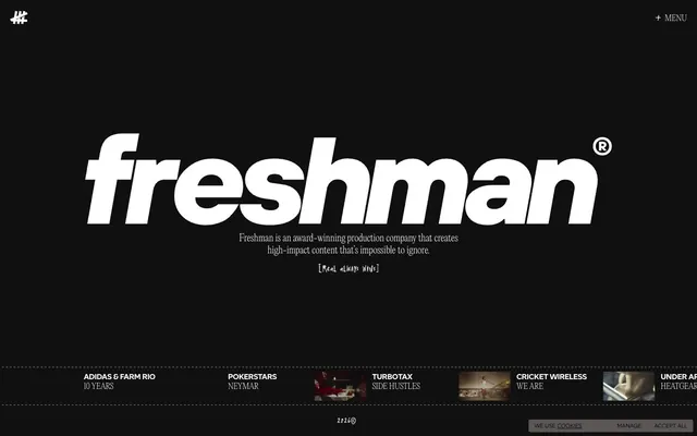
Freshman employs a stark, high-contrast dark theme emphasizing bold typography and minimal UI elements. The design prioritizes content, with a monochromatic canvas broken by sharp, subtle geometric accents and a single vibrant red for impact. Typography is the primary visual communicator, leveraging custom fonts to create a direct and authoritative tone. Components are ghost-like and integrated, giving space to the brand's work.
The page employs a full-bleed dark canvas with content largely centered and contained within implied horizontal bands. The hero section is dominated by an expansive, bold headline and sub-headline, centrally stacked. Below the fold, content appears in a grid-like structure, with horizontally scrolling or paginated blocks (implied by the thumbnails and '2026©' footer). Vertical rhythm is established through significant vertical spacing between sections, leading to a compact density within the content areas. Navigation is minimal, consisting of an 'X' logo and a '+' menu text positioned at the top corners.
This design system uses minimal, tightly cropped video thumbnails and potentially small decorative icons. Imagery serves primarily as content teasers rather than large, atmospheric elements. If photography is used, it should be dark, high-contrast, and focused on product or subject matter, avoiding lifestyle shots. Icons are simple, outlined or filled, and monochrome (White Frost). Image density is low, with text dominating visual space, reinforcing the idea of 'content first' and a clear, direct communication style.
Reminiscent of A24 (film studio), Huge Inc. (agency), Active Theory (creative studio), Basic (design agency).
# Freshman — Style Reference
> monochrome cinematic canvas

**Theme:** dark

**Site:** https://freshman.tv

Freshman employs a stark, high-contrast dark theme emphasizing bold typography and minimal UI elements. The design prioritizes content, with a monochromatic canvas broken by sharp, subtle geometric accents and a single vibrant red for impact. Typography is the primary visual communicator, leveraging custom fonts to create a direct and authoritative tone. Components are ghost-like and integrated, giving space to the brand's work.

## Tokens — Colors

| Name | Value | Token | Role |
|------|------|------|------|
| Power Red | `#ff2936` | `--color-power-red` | Highlighting specific content, decorative accents, loading indicators — a singular color for emphasis |
| Midnight Void | `#000000` | `--color-midnight-void` | Page backgrounds, significant surface areas, text selection background |
| Near Black | `#101010` | `--color-near-black` | Subtle background for UI elements, icon fills, card backgrounds where separation from the main canvas is needed |
| White Frost | `#ffffff` | `--color-white-frost` | Primary text, prominent headings, link text, borders, iconography |

## Tokens — Typography

### TT Firs Neue
- **Substitute:** Inter
- **Weights:** 400
- **Sizes:** 16px
- **Line height:** 1
- **Role:** Primary headings and core informational text — a robust sans-serif that projects confidence and clarity.

### Editorial New
- **Substitute:** Lora
- **Weights:** 200
- **Sizes:** 16px, 20px
- **Line height:** 1, 1.25
- **Letter spacing:** -0.0100em
- **Role:** Subtle, descriptive text, menu items, and UI labels. Its light weight adds an airy, sophisticated counterpoint to heavier elements.

### Altform
- **Substitute:** IBM Plex Mono
- **Weights:** 400, 700
- **Sizes:** 14px, 16px
- **Line height:** 0.86, 0.88
- **Letter spacing:** -0.0300em
- **Role:** Small functional text, legal disclosures, and metadata where extreme compactness and subtle distinction are needed.

### Wasted Year
- **Substitute:** Montserrat Thin
- **Weights:** 400
- **Sizes:** 12px, 14px, 17px, 20px
- **Line height:** 0.86, 0.94, 1, 1.25
- **Letter spacing:** --0.0100em
- **Role:** Decorative and thematic text elements, often for unique branding or special callouts. Its distinct character adds a bespoke feel.

## Tokens — Type Scale

| Role | Size | Line height | Letter spacing |
|------|------|------|------|
| caption | 12px | 0.86 | -0.01em |
| body-sm | 14px | 0.86 | -0.03em |
| heading | 20px | 1 | -0.01em |

## Tokens — Spacing

- **Section gap:** 47px
- **Card padding:** 20px
- **Element gap:** 12px

## Tokens — Radius

- **none:** 0px

## Layout

The page employs a full-bleed dark canvas with content largely centered and contained within implied horizontal bands. The hero section is dominated by an expansive, bold headline and sub-headline, centrally stacked. Below the fold, content appears in a grid-like structure, with horizontally scrolling or paginated blocks (implied by the thumbnails and '2026©' footer). Vertical rhythm is established through significant vertical spacing between sections, leading to a compact density within the content areas. Navigation is minimal, consisting of an 'X' logo and a '+' menu text positioned at the top corners.

## Imagery

This design system uses minimal, tightly cropped video thumbnails and potentially small decorative icons. Imagery serves primarily as content teasers rather than large, atmospheric elements. If photography is used, it should be dark, high-contrast, and focused on product or subject matter, avoiding lifestyle shots. Icons are simple, outlined or filled, and monochrome (White Frost). Image density is low, with text dominating visual space, reinforcing the idea of 'content first' and a clear, direct communication style.

## Components

### Ghost Navigation Button
*Top-level navigation element*

Text-only button with White Frost text on Midnight Void background. No padding, no radius, making it blend seamlessly into the negative space. On hover, likely a subtle underline or text color change.

### Thumbnail Link Title
*Interactive content title within a grid*

White Frost text using TT Firs Neue font 16px, normal letter-spacing. Minimal padding (e.g. 8px vertical, 0px horizontal).

### Footer Cookie Button
*Legal/utility action in the footer*

White Frost text on a transparent background, with a minimal White Frost border. No border radius, sharp corners for a utilitarian feel.

### Main Headline
*Hero section primary statement*

Large, bold White Frost text, centrally aligned. Uses TT Firs Neue for maximum impact and legibility against the dark background.

### Sub-Headline Descriptive Text
*Supporting text for hero sections or key messages*

Smaller White Frost text, often centered, using Editorial New font for a more refined, descriptive tone. Accompanied by bracketed thematic phrases also in Editorial New.

## Guidelines

### Do

- Prioritize text content against Midnight Void (#000000) or Near Black (#101010) backgrounds using White Frost (#ffffff) for readability.
- Use TT Firs Neue consistently for primary headings and clear informational text.
- Employ the light weight of Editorial New (200) for all menu items and subtle UI labels.
- Reserve Power Red (#ff2936) specifically for single-point emphasis or decorative accents; avoid using it for primary interactive elements.
- Maintain a zero border-radius on all UI elements for a sharp, modern aesthetic.
- Ensure generous spacing between content blocks, with section gaps averaging ~47px to prevent visual clutter.

### Don't

- Do not use saturated colors other than Power Red (#ff2936) anywhere in the primary UI.
- Avoid decorative elements like heavy drop shadows or complex gradients; rely on flat surfaces and high contrast.
- Do not introduce additional font families; restrict typography to TT Firs Neue, Editorial New, Altform, and Wasted Year.
- Avoid rounded corners on any UI component; all borders and edges should be sharp 0px radius.
- Do not use box shadows for elevation; rely on color shifts between Midnight Void and Near Black for subtle depth.
- Do not break the monospace alignment of the footer elements; maintain horizontal consistency.

## Agent Prompt Guide

Quick Color Reference:
text: #ffffff
background: #000000
border: #ffffff
accent: #ff2936
primary action: no distinct CTA color

Example Component Prompts:
1. Create a hero section: Midnight Void (#000000) background. Centered main headline 'FRESHMAN' in White Frost (#ffffff), using TT Firs Neue font at a large size. Below it, a centered sub-headline 'Award-winning content' in Editorial New font (weight 200), White Frost text.
2. Create a navigation header: On a Midnight Void (#000000) background, left-aligned logo (simple '#' symbol, White Frost #ffffff). Right-aligned '+ MENU' text in Editorial New font (weight 200), White Frost (#ffffff). No padding or borders.
3. Create a content thumbnail: A horizontally rectangular Near Black (#101010) background. White Frost (#ffffff) text 'ADIDAS & FARM RIO' in TT Firs Neue font (weight 400, 16px). Below it, smaller White Frost (#ffffff) text '10 YEARS' in Altform font (weight 400, 14px), with -0.0300em letter-spacing. Add a 1px White Frost (#ffffff) border along the bottom.
More like this





Keep what you find
A free account saves references to boards and can send you a weekly email of picks based on what you save.
To see every result, go Pro.