Preview image. Unlock full-res
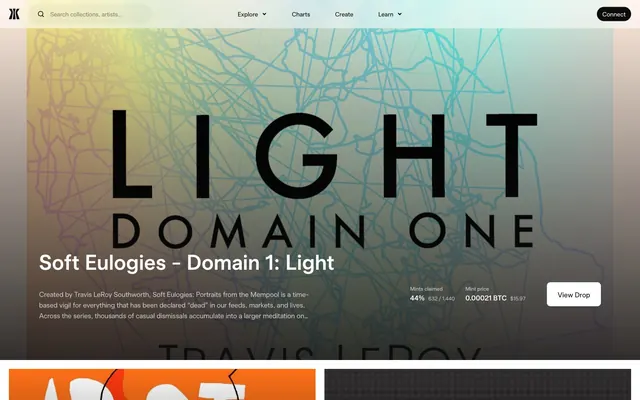
Dark Canvas, Gradient Hues — a digital gallery where art glows against a deep, minimal backdrop.
Color palette
Green decorative accent for icons, marks, and small graphic details. Use as a supporting accent, not as a status color
Supporting palette color for small decorative accents when the core palette needs contrast.
Primary text, surface borders, background for interactive elements, body text, primary icons
Secondary text, subtle borders, inactive states. Lighter neutral for contrasting buttons on dark backgrounds
Elevated card backgrounds, slightly lighter than the primary background to create subtle depth
Muted text, tertiary icons, borders on dark surfaces for lower contrast elements
Primary background for light-themed sections, text on dark interactive elements, card backgrounds in lighter contexts
Slightly darker secondary text, borders, and icons, often used as an accent on light interface elements
Typography
- Weights
- 300, 400, 600
- Sizes
- 12px, 14px, 16px, 18px, 20px, 24px, 32px, 40px, 48px, 72px
- Line height
- 1.15, 1.17, 1.2, 1.25, 1.33, 1.43, 1.5
- Letter spacing
- 0.023em, 0.023em, 0.020em, 0.020em, 0.010em, 0.010em, -0.005em, -0.005em, -0.005em, -0.005em
- Fallback
- Inter
Primary typeface for all headings, body text, and UI elements. Its strong, geometric structure and varied weights establish a confident yet approachable tone. Letter spacing is subtly adjusted to optimize readability across large display sizes and smaller labels.
Spacing & shape
Components
A ghost button with a very high border-radius (999px) for a pill shape, backgroundColor=rgba(0,0,0,0.05), text color #242629, and 0px vertical padding with 12px horizontal padding. Often functions as a filter or category tag.
A minimal, text-only button with no background or padding, color #0c0c0d, and 0px border-radius. Used for navigation and inline calls to action where visual weight should be minimal.
A prominent button with a subtle, translucent white background (rgba(255,255,255,0.1)), text color #efefef, 8px border-radius, and generous 16px vertical by 24px horizontal padding. This button offers high contrast on dark backgrounds.
A ghost button with rgba(0,0,0,0) background, color rgba(0,0,0,0.5), and 0px border-radius, often used for subordinate actions or links that should not distract from primary elements.
A card with backgroundColor=rgba(0,0,0,0.05), 8px border-radius, and 20px padding on all sides. Used for displaying collections or status updates in a uniform, contained block.
A card with rgba(0,0,0,0) background, 0px border-radius, and 32px padding, used for main content display where the background image or gradient provides the visual context.
A card with a very subtle background (rgba(0,0,0,0.02)), 8px border-radius, and no padding, suggesting a tight integration with the surrounding content or acting as a very light divider.
A pill-shaped input field (999px border-radius) with a light, transparent background (rgba(0,0,0,0.03)), #0c0c0d text, and 12px vertical by 48px left / 20px right padding to accommodate an icon.
Guidelines
- Use Midnight Ink (#0c0c0d) for all primary text and important borders to maintain high contrast on dark backgrounds.
- Apply a 999px border-radius to all interactive buttons and inputs, creating a consistent 'pill' visual style.
- Utilize the Aurora Swirl gradient (linear-gradient(...) ending #dc94d5) for hero sections and expressive background areas to inject visual vibrancy.
- Maintain a comfortable rhythm across sections using a 40px `sectionGap` and a base unit of 4px for all element-level spacing.
- On dark surfaces, employ Canvas White (#ffffff) for primary text and Ghostly Gray (#e9e9ec) for secondary text to ensure readability.
- Structure informational blocks with Informational Cards (backgroundColor=rgba(0,0,0,0.05), 8px radius, 20px padding) to create clear content boundaries.
- Use Gamma Sans Display at 72px with -0.36px letter spacing for all prominent display headlines.
- Avoid using highly saturated, single-color backgrounds for main content areas; rely on the subtle neutral surfaces or expressive gradients.
- Do not use sharp 0px radius corners on interactive elements; inputs and buttons must always be pill-shaped with 999px radius.
- Never introduce bold or bright colors as primary background for UI elements, reserving them strictly for artwork, gradients, and subtle accents.
- Do not add additional drop shadows to cards or interactive elements; elevation is primarily achieved through background transparency and color slight shifts.
- Avoid generic system fonts; `Gamma Sans Display` with its specified weights and letter spacing is critical for brand identity.
- Do not use letter-spacing greater than 0.32px on body text sizes; this is an expressive display font and needs controlled tracking.
About this system
ShowHide
Gamma operates with a high-contrast dark theme, emphasizing content through a stark white-on-black typography and subtle achromatic surfaces. Its visual personality is defined by playful gradients and abstract, colorful backgrounds that create a vibrant stage for digital art, contrasting sharply with the otherwise monochrome UI. Interactive elements feature generous curves, while information surfaces maintain sharp edges or a slight radius, creating distinct visual roles against the dark canvas.
The page model is primarily a max-width contained layout, though hero sections often break out to full-bleed. The hero pattern features a full-viewport abstract gradient background with a large, centered headline and text over it, creating a strong visual impact. Section rhythm alternates between full-bleed vibrant graphical sections, subtle dark gray bands, and pure white informational sections, creating varied visual breaks. Content is often arranged in prominent centered stacks for headlines and key information, or in two-column text-left/image-right (or art-right) patterns. Feature grids are common, utilizing 2-column or 3-column layouts for collections. The layout ranges from spacious breathing room in hero and section gaps to more compact information-dense card grids. Navigation consistently employs a sticky top bar with minimal links and a prominent search input.
The site's imagery is characterized by a mix of abstract digital art and product screenshots of NFTs, often displayed within card components. Photography is largely absent. Illustrations are stylized, either geometric-abstract or more organic, in vibrant, often gradient-infused colors that contrast sharply with the dark UI. Icons are simple, outlined, and monochromatic, taking on the surrounding text color. Imagery serves as decorative atmosphere, explanatory content for digital assets, and product showcases, occupying significant visual space to highlight the art itself. There's a deliberate choice for contained display, either within clearly defined cards with subtle radii or as full-bleed backgrounds for hero sections, often blurred or desaturated to allow text to stand out.
Reminiscent of OpenSea, Foundation, SuperRare.
# Gamma — Style Reference
> Dark Canvas, Gradient Hues — a digital gallery where art glows against a deep, minimal backdrop.

**Theme:** dark

**Site:** https://www.gamma.io

Gamma operates with a high-contrast dark theme, emphasizing content through a stark white-on-black typography and subtle achromatic surfaces. Its visual personality is defined by playful gradients and abstract, colorful backgrounds that create a vibrant stage for digital art, contrasting sharply with the otherwise monochrome UI. Interactive elements feature generous curves, while information surfaces maintain sharp edges or a slight radius, creating distinct visual roles against the dark canvas.

## Tokens — Colors

| Name | Value | Token | Role |
|------|------|------|------|
| Verdant Aura | `#069347` | `--color-verdant-aura` | Green decorative accent for icons, marks, and small graphic details. Use as a supporting accent, not as a status color |
| Aurora Swirl | `#e0a6b5` | `--color-aurora-swirl` | Supporting palette color for small decorative accents when the core palette needs contrast. |
| Midnight Ink | `#0c0c0d` | `--color-midnight-ink` | Primary text, surface borders, background for interactive elements, body text, primary icons |
| Ghostly Gray | `#e9e9ec` | `--color-ghostly-gray` | Secondary text, subtle borders, inactive states. Lighter neutral for contrasting buttons on dark backgrounds |
| Carbon Surface | `#1d1d1e` | `--color-carbon-surface` | Elevated card backgrounds, slightly lighter than the primary background to create subtle depth |
| Silver Haze | `#808080` | `--color-silver-haze` | Muted text, tertiary icons, borders on dark surfaces for lower contrast elements |
| Canvas White | `#ffffff` | `--color-canvas-white` | Primary background for light-themed sections, text on dark interactive elements, card backgrounds in lighter contexts |
| Slate Echo | `#242629` | `--color-slate-echo` | Slightly darker secondary text, borders, and icons, often used as an accent on light interface elements |

## Tokens — Typography

### Gamma Sans Display
- **Substitute:** Inter
- **Weights:** 300, 400, 600
- **Sizes:** 12px, 14px, 16px, 18px, 20px, 24px, 32px, 40px, 48px, 72px
- **Line height:** 1.15, 1.17, 1.2, 1.25, 1.33, 1.43, 1.5
- **Letter spacing:** 0.023em, 0.023em, 0.020em, 0.020em, 0.010em, 0.010em, -0.005em, -0.005em, -0.005em, -0.005em
- **Role:** Primary typeface for all headings, body text, and UI elements. Its strong, geometric structure and varied weights establish a confident yet approachable tone. Letter spacing is subtly adjusted to optimize readability across large display sizes and smaller labels.

## Tokens — Type Scale

Perfect Fourth (1.333) from 16px base.

| Role | Size | Line height | Letter spacing |
|------|------|------|------|
| caption | 12px | 1.33 | 0.276px |
| body-sm | 14px | 1.43 | 0.322px |
| body | 16px | 1.5 | 0.32px |
| subheading | 18px | 1.5 | 0.36px |
| heading | 24px | 1.25 | 0.24px |
| heading-lg | 32px | 1.25 | -0.16px |
| display | 72px | 1.15 | -0.36px |

## Tokens — Spacing

- **Section gap:** 40px
- **Card padding:** 20px
- **Element gap:** 4px

## Tokens — Radius

- **Default:** 8px
- **Buttons:** 999px
- **Inputs:** 999px
- **Cards:** 8px
- **round-corners-for-image:** 4px

## Layout

The page model is primarily a max-width contained layout, though hero sections often break out to full-bleed. The hero pattern features a full-viewport abstract gradient background with a large, centered headline and text over it, creating a strong visual impact. Section rhythm alternates between full-bleed vibrant graphical sections, subtle dark gray bands, and pure white informational sections, creating varied visual breaks. Content is often arranged in prominent centered stacks for headlines and key information, or in two-column text-left/image-right (or art-right) patterns. Feature grids are common, utilizing 2-column or 3-column layouts for collections. The layout ranges from spacious breathing room in hero and section gaps to more compact information-dense card grids. Navigation consistently employs a sticky top bar with minimal links and a prominent search input.

## Imagery

The site's imagery is characterized by a mix of abstract digital art and product screenshots of NFTs, often displayed within card components. Photography is largely absent. Illustrations are stylized, either geometric-abstract or more organic, in vibrant, often gradient-infused colors that contrast sharply with the dark UI. Icons are simple, outlined, and monochromatic, taking on the surrounding text color. Imagery serves as decorative atmosphere, explanatory content for digital assets, and product showcases, occupying significant visual space to highlight the art itself. There's a deliberate choice for contained display, either within clearly defined cards with subtle radii or as full-bleed backgrounds for hero sections, often blurred or desaturated to allow text to stand out.

## Components

### Pill Button
*Flexible interface button*

A ghost button with a very high border-radius (999px) for a pill shape, backgroundColor=rgba(0,0,0,0.05), text color #242629, and 0px vertical padding with 12px horizontal padding. Often functions as a filter or category tag.

### Link Button
*Text-based actions*

A minimal, text-only button with no background or padding, color #0c0c0d, and 0px border-radius. Used for navigation and inline calls to action where visual weight should be minimal.

### CTA Button Large
*Primary action within a card or hero*

A prominent button with a subtle, translucent white background (rgba(255,255,255,0.1)), text color #efefef, 8px border-radius, and generous 16px vertical by 24px horizontal padding. This button offers high contrast on dark backgrounds.

### Muted Text Button
*Subtle, secondary actions*

A ghost button with rgba(0,0,0,0) background, color rgba(0,0,0,0.5), and 0px border-radius, often used for subordinate actions or links that should not distract from primary elements.

### Informational Card
*Container for content sections*

A card with backgroundColor=rgba(0,0,0,0.05), 8px border-radius, and 20px padding on all sides. Used for displaying collections or status updates in a uniform, contained block.

### Contextual Detail Card
*Full-bleed detail card*

A card with rgba(0,0,0,0) background, 0px border-radius, and 32px padding, used for main content display where the background image or gradient provides the visual context.

### Subtle Detail Card
*Minimal information display card*

A card with a very subtle background (rgba(0,0,0,0.02)), 8px border-radius, and no padding, suggesting a tight integration with the surrounding content or acting as a very light divider.

### Search Input
*Search and data entry*

A pill-shaped input field (999px border-radius) with a light, transparent background (rgba(0,0,0,0.03)), #0c0c0d text, and 12px vertical by 48px left / 20px right padding to accommodate an icon.

## Guidelines

### Do

- Use Midnight Ink (#0c0c0d) for all primary text and important borders to maintain high contrast on dark backgrounds.
- Apply a 999px border-radius to all interactive buttons and inputs, creating a consistent 'pill' visual style.
- Utilize the Aurora Swirl gradient (linear-gradient(...) ending #dc94d5) for hero sections and expressive background areas to inject visual vibrancy.
- Maintain a comfortable rhythm across sections using a 40px `sectionGap` and a base unit of 4px for all element-level spacing.
- On dark surfaces, employ Canvas White (#ffffff) for primary text and Ghostly Gray (#e9e9ec) for secondary text to ensure readability.
- Structure informational blocks with Informational Cards (backgroundColor=rgba(0,0,0,0.05), 8px radius, 20px padding) to create clear content boundaries.
- Use Gamma Sans Display at 72px with -0.36px letter spacing for all prominent display headlines.

### Don't

- Avoid using highly saturated, single-color backgrounds for main content areas; rely on the subtle neutral surfaces or expressive gradients.
- Do not use sharp 0px radius corners on interactive elements; inputs and buttons must always be pill-shaped with 999px radius.
- Never introduce bold or bright colors as primary background for UI elements, reserving them strictly for artwork, gradients, and subtle accents.
- Do not add additional drop shadows to cards or interactive elements; elevation is primarily achieved through background transparency and color slight shifts.
- Avoid generic system fonts; `Gamma Sans Display` with its specified weights and letter spacing is critical for brand identity.
- Do not use letter-spacing greater than 0.32px on body text sizes; this is an expressive display font and needs controlled tracking.

## Agent Prompt Guide

Quick Color Reference:
text: #0c0c0d
background: #0c0c0d
border: #0c0c0d
accent: #e0a6b5
primary action: #0c0c0d (filled action)

Example Component Prompts:
1. Create a Primary Action Button: #0c0c0d background, #ffffff text, 9999px radius, compact pill padding. Use this filled treatment for the main CTA.
3. Build a search input: Search Input (backgroundColor=rgba(0,0,0,0.03), #0c0c0d text, 999px radius, 12px vertical 48px left / 20px right padding). Prefix the placeholder 'Search collections, artists...' with a search icon.
More like this







Keep what you find
A free account saves references to boards and can send you a weekly email of picks based on what you save.
To see every result, go Pro.