Preview image. Unlock full-res
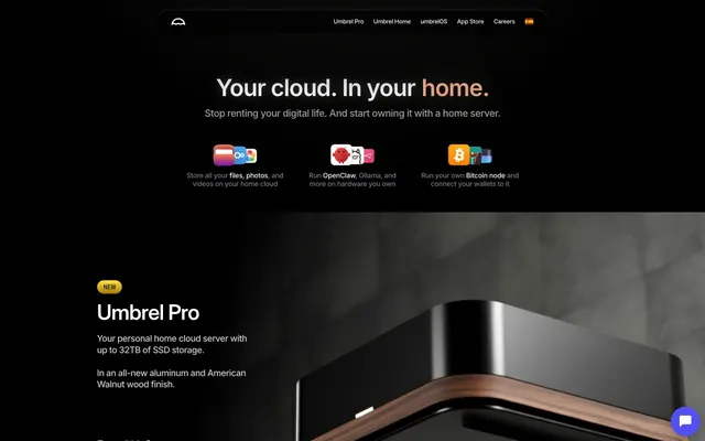
Deep Space Luxury Console. The UI is a console in a dark, high-tech environment, with glowing accents and soft, tactile controls.
Color palette
Primary interactive element background for CTAs, and active states.
Highlight color for headlines and key information, creating a warm contrast.
Decorative background gradient for feature sections, adding depth and dynamic energy.
Decorative background gradient, creating a futuristic, energetic feel.
Decorative background gradient for aggressive or high-impact sections.
Decorative background gradient, suggesting vastness and power.
Accent for illustrations and specific icon fills, adding a vibrant digital touch.
Primary background for pages, text color for light theme elements, accent for borders.
Subtle dark element backgrounds, card surfaces, and shadow bases.
Deepest shadow color for elevated elements, adding subtle separation.
Primary text color on dark backgrounds, icon fills, form input text.
Secondary text, subtle background tones for informational sections.
Tertiary text, subtle borders, inactive states.
Lightest grey for subtle highlights or disabled text.
Placeholder text, minor labels, neutral icon fills.
Used for specific dark text instances, creating very slight depth against other blacks.
Used sparingly for icon accents or success indicators.
Typography
- Weights
- 400, 500, 600, 700
- Sizes
- 12px, 13px, 14px, 16px, 18px, 20px, 23px, 24px, 27px, 32px, 36px, 48px
- Line height
- 1.1, 1.2, 1.24, 1.3, 1.4
- Letter spacing
- -0.03em at 48px, -0.02em at 36px, -0.01em at 14px
- Fallback
- system-ui, sans-serif
Versatile workhorse for all body text, links, buttons, and varied-size headings. Its variable weights and precise letter spacing on larger sizes contribute to a refined textual feel.
- Weights
- 600
- Sizes
- 43px
- Line height
- 1.2
- Letter spacing
- -0.02em
- Fallback
- system-ui, sans-serif
Headline font for primary page titles, its semi-bold weight and tight letter spacing deliver impact and clarity in large display sizes.
- Weights
- 500
- Sizes
- 12px
- Line height
- 1.2
- Fallback
- system-ui, sans-serif
Used for specific compact text elements, often in conjunction with other Inter styles to create subtle visual hierarchy at small sizes.
- Weights
- 500
- Sizes
- 13px
- Line height
- 1.2
- Letter spacing
- -0.01em
- Fallback
- system-ui, sans-serif
Used for compact body text where slight visual distinction from Inter is desired, often for captions or metadata.
- Weights
- 500
- Sizes
- 14px
- Line height
- 1.24
- Letter spacing
- -0.01em
- Fallback
- system-ui, sans-serif
A distinct, more condensed secondary body font for specific information, offering a different texture compared to Inter.
Spacing & shape
Elevation
Components
Background: Violet Impulse (#5351f3), Text: Moonlight Glimmer (#ffffff), Border: none, Radius: 32px or 99px for pills, Padding: 12px vertical, 16px horizontal. Uses Inter 400 at 16px.
Background: transparent (rgba(0,0,0,0)), Text: Moonlight Glimmer (#ffffff), Border: 1px solid Moonlight Glimmer (#ffffff), Radius: 32px, Padding: 12px vertical, 16px horizontal. Uses Inter 400 at 16px.
Background: transparent (rgba(0,0,0,0)), Text: #0000ee (browser default link color for some contexts, but visually #ffffff), Border: none, Radius: 99px, Padding: 8px vertical, 16px horizontal. Uses Inter 400 at 12px.
Background: near-black #191919 or transparent (rgba(0,0,0,0.2)), Border: none, Radius: 24px, Shadow: rgba(0,0,0,0.24) -12px -12px 32px 0px. Text is Moonlight Glimmer (#ffffff).
Background: deep gradients (Deep Web Gradient), Radius: 24px. Contains small icons and body text.
Background: transparent (rgba(235,235,235,0)), Text: Moonlight Glimmer (#ffffff), Border: 1px solid Moonlight Glimmer (#ffffff), Radius: 20px, Padding: 14px vertical, 10px horizontal. Placeholder text uses System Gray (#797985).
Text: Moonlight Glimmer (#ffffff) for primary headlines, with Sunset Ember (#e3a081) for key emphasized words. Uses Inter Display 600 at 43px with -0.02em letter spacing.
Guidelines
- Prioritize Midnight Void (#000000) for all page and primary section backgrounds, ensuring a consistent dark theme.
- Use Moonlight Glimmer (#ffffff) for primary text on dark backgrounds, and Warm Gray (#61635d) or Cool Steel (#cccccc) for secondary or tertiary text hierarchy.
- Apply Violet Impulse (#5351f3) consistently only to primary call-to-action buttons for clear visual guidance.
- Utilize Inter font family for all textual content, leveraging its multiple weights (400, 500, 600, 700) and varying letter spacing to establish clear typographic hierarchy.
- Employ generous padding of 12px vertically and 16px horizontally for all prominent buttons, using a 32px or 99px corner radius to create a soft, approachable pill shape.
- Integrate the brand gradients (e.g., Deep Web Gradient, Plasma Flow Gradient) judiciously as background fills for feature sections or distinct content blocks to add visual dynamism and depth.
- Maintain a clear visual hierarchy by contrasting headline sizes using Inter Display 600 at 43px with tight letter spacing against body text at 16px Inter 400.
- Avoid introducing bright or highly saturated colors outside the defined brand and accent palette; they will detract from the sophisticated dark theme.
- Do not use sharp corners for interactive elements or cards; maintain the established softer aesthetic with radii like 24px, 32px, or 99px.
- Refrain from using more than two distinct gradients close to each other; allow gradients to breathe as distinct background elements for different sections.
- Do not place plain text directly on complex gradient backgrounds without sufficient contrast or a text container; ensure readability at all times.
- Avoid excessive shadow usage on every element; reserve prominent shadows (like rgba(0,0,0,0.24) -12px -12px 32px 0px) for truly elevated elements to indicate interactive depth or importance.
- Do not use generic system fonts when Inter or its customized variants are available; maintaining the specific typographic choices is crucial to brand identity.
- Avoid using small, pixel-based letter spacing adjustments on body copy; reserve negative letter spacing for larger headlines as defined in the type scale.
About this system
ShowHide
Umbrel's design system evokes a sense of deep, sophisticated technology housed within a warm, user-centric environment. The prevailing darkness, created by near-black backgrounds, is punctuated by rich, vibrant gradients that give a feeling of digital depth and energy. Subtle contrasts and varied text weights maintain readability within the dark theme, while rounded corners and soft shadows on elements like buttons and cards introduce approachability to the complex technical offering.
The page primarily uses a full-bleed dark background, creating an expansive, borderless feel. Content is typically centered within a max-width constraint (though not explicitly defined, visually appears around 1200-1400px). The hero section features a large, centered headline over a dark background with subtle product imagery. Section rhythm is marked by significant vertical spacing, often with different gradient backgrounds or distinct product showcases. Content arrangement frequently alternates between large stacked headlines and subtext, followed by a product visual or feature grid. Card grids for features feature 3-column layouts. The navigation is a minimalist top bar, staying hidden on scroll but appearing on interaction, maintaining a clean, uncluttered visual.
The visual language is a blend of product photography and abstract, colored graphics. Product images are tightly cropped, studio-lit, and focus on the hardware itself against dark, often reflective, backgrounds, lending a premium, almost jewelry-like quality. These are typically contained with soft, rounded corners (12px-24px). Abstract graphics, often gradient-filled (like the Deep Web Gradient or Plasma Flow Gradient), serve as decorative backdrops for feature sections, adding depth and energy without specific representational content. Icons are minimal, often line-based or simple filled shapes, using accent colors like Neon Blue (#41bdf5) or Electric Green (#009b00) when not Moonlight Glimmer (#ffffff). The overall role of imagery is to showcase the product with precision, explain concepts abstractly through color, and create an immersive, futuristic atmosphere.
Reminiscent of Apple, Linear, Figma (dark mode), Framework Laptop.
# Umbrel — Style Reference
> Deep Space Luxury Console. The UI is a console in a dark, high-tech environment, with glowing accents and soft, tactile controls.

**Theme:** dark

**Site:** https://umbrel.com

Umbrel's design system evokes a sense of deep, sophisticated technology housed within a warm, user-centric environment. The prevailing darkness, created by near-black backgrounds, is punctuated by rich, vibrant gradients that give a feeling of digital depth and energy. Subtle contrasts and varied text weights maintain readability within the dark theme, while rounded corners and soft shadows on elements like buttons and cards introduce approachability to the complex technical offering.

## Tokens — Colors

| Name | Value | Token | Role |
|------|------|------|------|
| Violet Impulse | `#5351f3` | `--color-violet-impulse` | Primary interactive element background for CTAs, and active states. |
| Sunset Ember | `#e3a081` | `--color-sunset-ember` | Highlight color for headlines and key information, creating a warm contrast. |
| Deep Web Gradient | `#0056ff` | `--color-deep-web-gradient` | Decorative background gradient for feature sections, adding depth and dynamic energy. |
| Plasma Flow Gradient | `#855dff` | `--color-plasma-flow-gradient` | Decorative background gradient, creating a futuristic, energetic feel. |
| Core Melt Gradient | `#591010` | `--color-core-melt-gradient` | Decorative background gradient for aggressive or high-impact sections. |
| Deep Sky Gradient | `#0657a1` | `--color-deep-sky-gradient` | Decorative background gradient, suggesting vastness and power. |
| Neon Blue | `#41bdf5` | `--color-neon-blue` | Accent for illustrations and specific icon fills, adding a vibrant digital touch. |
| Midnight Void | `#000000` | `--color-midnight-void` | Primary background for pages, text color for light theme elements, accent for borders. |
| Obsidian Surface | `#292929` | `--color-obsidian-surface` | Subtle dark element backgrounds, card surfaces, and shadow bases. |
| Onyx Shadow | `#180f03` | `--color-onyx-shadow` | Deepest shadow color for elevated elements, adding subtle separation. |
| Moonlight Glimmer | `#ffffff` | `--color-moonlight-glimmer` | Primary text color on dark backgrounds, icon fills, form input text. |
| Warm Gray | `#61635d` | `--color-warm-gray` | Secondary text, subtle background tones for informational sections. |
| Cool Steel | `#cccccc` | `--color-cool-steel` | Tertiary text, subtle borders, inactive states. |
| Pale Mist | `#e0e0e0` | `--color-pale-mist` | Lightest grey for subtle highlights or disabled text. |
| System Gray | `#797985` | `--color-system-gray` | Placeholder text, minor labels, neutral icon fills. |
| #0a0a0a | `#0a0a0a` | `--color-0a0a0a` | Used for specific dark text instances, creating very slight depth against other blacks. |
| Electric Green | `#009b00` | `--color-electric-green` | Used sparingly for icon accents or success indicators. |

## Tokens — Typography

### Inter
- **Substitute:** system-ui, sans-serif
- **Weights:** 400, 500, 600, 700
- **Sizes:** 12px, 13px, 14px, 16px, 18px, 20px, 23px, 24px, 27px, 32px, 36px, 48px
- **Line height:** 1.1, 1.2, 1.24, 1.3, 1.4
- **Letter spacing:** -0.03em at 48px, -0.02em at 36px, -0.01em at 14px
- **Role:** Versatile workhorse for all body text, links, buttons, and varied-size headings. Its variable weights and precise letter spacing on larger sizes contribute to a refined textual feel.

### Inter Display
- **Substitute:** system-ui, sans-serif
- **Weights:** 600
- **Sizes:** 43px
- **Line height:** 1.2
- **Letter spacing:** -0.02em
- **Role:** Headline font for primary page titles, its semi-bold weight and tight letter spacing deliver impact and clarity in large display sizes.

### Inter Tight
- **Substitute:** system-ui, sans-serif
- **Weights:** 500
- **Sizes:** 12px
- **Line height:** 1.2
- **Role:** Used for specific compact text elements, often in conjunction with other Inter styles to create subtle visual hierarchy at small sizes.

### Manrope
- **Substitute:** system-ui, sans-serif
- **Weights:** 500
- **Sizes:** 13px
- **Line height:** 1.2
- **Letter spacing:** -0.01em
- **Role:** Used for compact body text where slight visual distinction from Inter is desired, often for captions or metadata.

### Roboto Condensed
- **Substitute:** system-ui, sans-serif
- **Weights:** 500
- **Sizes:** 14px
- **Line height:** 1.24
- **Letter spacing:** -0.01em
- **Role:** A distinct, more condensed secondary body font for specific information, offering a different texture compared to Inter.

## Tokens — Spacing

- **Card padding:** 12px

## Tokens — Radius

- **Default:** 16px
- **Buttons:** 32px
- **Inputs:** 20px
- **Cards:** 24px
- **Images:** 12px
- **pills:** 99px

## Tokens — Elevation

- **Card / Elevated Section:** `box-shadow: rgba(0, 0, 0, 0.24) -12px -12px 32px 0px`
- **Product Showcase Shadow:** `box-shadow: rgba(104, 65, 13, 0.23) 0px 10px 20px 0px`

## Layout

The page primarily uses a full-bleed dark background, creating an expansive, borderless feel. Content is typically centered within a max-width constraint (though not explicitly defined, visually appears around 1200-1400px). The hero section features a large, centered headline over a dark background with subtle product imagery. Section rhythm is marked by significant vertical spacing, often with different gradient backgrounds or distinct product showcases. Content arrangement frequently alternates between large stacked headlines and subtext, followed by a product visual or feature grid. Card grids for features feature 3-column layouts. The navigation is a minimalist top bar, staying hidden on scroll but appearing on interaction, maintaining a clean, uncluttered visual.

## Imagery

The visual language is a blend of product photography and abstract, colored graphics. Product images are tightly cropped, studio-lit, and focus on the hardware itself against dark, often reflective, backgrounds, lending a premium, almost jewelry-like quality. These are typically contained with soft, rounded corners (12px-24px). Abstract graphics, often gradient-filled (like the Deep Web Gradient or Plasma Flow Gradient), serve as decorative backdrops for feature sections, adding depth and energy without specific representational content. Icons are minimal, often line-based or simple filled shapes, using accent colors like Neon Blue (#41bdf5) or Electric Green (#009b00) when not Moonlight Glimmer (#ffffff). The overall role of imagery is to showcase the product with precision, explain concepts abstractly through color, and create an immersive, futuristic atmosphere.

## Components

### Product Cards — Umbrel Home & umbrelOS

### Umbrel Pro Hero Banner

### Feature Teaser Cards — App Showcase

### Primary Filled Button
*Main call-to-action button, highlighted against dark backgrounds.*

Background: Violet Impulse (#5351f3), Text: Moonlight Glimmer (#ffffff), Border: none, Radius: 32px or 99px for pills, Padding: 12px vertical, 16px horizontal. Uses Inter 400 at 16px.

### Ghost Button
*Secondary action or navigation element, subtle interaction.*

Background: transparent (rgba(0,0,0,0)), Text: Moonlight Glimmer (#ffffff), Border: 1px solid Moonlight Glimmer (#ffffff), Radius: 32px, Padding: 12px vertical, 16px horizontal. Uses Inter 400 at 16px.

### Navigation Link Button
*Internal navigation or subtle secondary actions within sections.*

Background: transparent (rgba(0,0,0,0)), Text: #0000ee (browser default link color for some contexts, but visually #ffffff), Border: none, Radius: 99px, Padding: 8px vertical, 16px horizontal. Uses Inter 400 at 12px.

### Umbrel Pro Info Card
*Highlights key product features or variants.*

Background: near-black #191919 or transparent (rgba(0,0,0,0.2)), Border: none, Radius: 24px, Shadow: rgba(0,0,0,0.24) -12px -12px 32px 0px. Text is Moonlight Glimmer (#ffffff).

### Feature Teaser Card
*Compact informational blocks, often in grids.*

Background: deep gradients (Deep Web Gradient), Radius: 24px. Contains small icons and body text.

### Input Field
*User entry for forms.*

Background: transparent (rgba(235,235,235,0)), Text: Moonlight Glimmer (#ffffff), Border: 1px solid Moonlight Glimmer (#ffffff), Radius: 20px, Padding: 14px vertical, 10px horizontal. Placeholder text uses System Gray (#797985).

### Headline Banner
*Dominant text for section introductions.*

Text: Moonlight Glimmer (#ffffff) for primary headlines, with Sunset Ember (#e3a081) for key emphasized words. Uses Inter Display 600 at 43px with -0.02em letter spacing.

## Guidelines

### Do

- Prioritize Midnight Void (#000000) for all page and primary section backgrounds, ensuring a consistent dark theme.
- Use Moonlight Glimmer (#ffffff) for primary text on dark backgrounds, and Warm Gray (#61635d) or Cool Steel (#cccccc) for secondary or tertiary text hierarchy.
- Apply Violet Impulse (#5351f3) consistently only to primary call-to-action buttons for clear visual guidance.
- Utilize Inter font family for all textual content, leveraging its multiple weights (400, 500, 600, 700) and varying letter spacing to establish clear typographic hierarchy.
- Employ generous padding of 12px vertically and 16px horizontally for all prominent buttons, using a 32px or 99px corner radius to create a soft, approachable pill shape.
- Integrate the brand gradients (e.g., Deep Web Gradient, Plasma Flow Gradient) judiciously as background fills for feature sections or distinct content blocks to add visual dynamism and depth.
- Maintain a clear visual hierarchy by contrasting headline sizes using Inter Display 600 at 43px with tight letter spacing against body text at 16px Inter 400.

### Don't

- Avoid introducing bright or highly saturated colors outside the defined brand and accent palette; they will detract from the sophisticated dark theme.
- Do not use sharp corners for interactive elements or cards; maintain the established softer aesthetic with radii like 24px, 32px, or 99px.
- Refrain from using more than two distinct gradients close to each other; allow gradients to breathe as distinct background elements for different sections.
- Do not place plain text directly on complex gradient backgrounds without sufficient contrast or a text container; ensure readability at all times.
- Avoid excessive shadow usage on every element; reserve prominent shadows (like rgba(0,0,0,0.24) -12px -12px 32px 0px) for truly elevated elements to indicate interactive depth or importance.
- Do not use generic system fonts when Inter or its customized variants are available; maintaining the specific typographic choices is crucial to brand identity.
- Avoid using small, pixel-based letter spacing adjustments on body copy; reserve negative letter spacing for larger headlines as defined in the type scale.

## Agent Prompt Guide

### Quick Color Reference
- **Text:** #ffffff (Moonlight Glimmer)
- **Background:** #000000 (Midnight Void)
- **CTA:** #5351f3 (Violet Impulse)
- **Border:** #ffffff (Moonlight Glimmer, for ghost buttons/inputs)
- **Accent:** #e3a081 (Sunset Ember)

### 3-5 Example Component Prompts
1. **Create a Primary Call-to-Action Button:** background #5351f3, text #ffffff, border none, radius 32px, padding 12px 16px. Text 'Order Now' using Inter 16px weight 400.
2. **Design a Feature Teaser Card:** background linear-gradient(-26deg, rgba(0, 86, 255, 0.29) 0%, rgb(194, 142, 1) 100%), radius 24px, no border, with an icon (Moonlight Glimmer #ffffff fill) and body text at Inter 14px weight 400, color #ffffff.
3. **Generate a Hero Section Headline:** text 'Your cloud. In your ' using Inter Display 43px weight 600 color #ffffff, followed by 'home.' in Inter Display 43px weight 600 color #e3a081. Letter spacing -0.02em for both. Place this centered over a Midnight Void (#000000) background.
4. **Build an Input Field:** background transparent, border 1px solid #ffffff, radius 20px, padding 14px 10px. Placeholder text 'Enter your email' in System Gray (#797985), actual text in Moonlight Glimmer (#ffffff), using Inter 16px weight 400.
5. **Create a Ghost Navigation Button:** background transparent, text #ffffff, border 1px solid #ffffff, radius 99px, padding 8px 16px. Text 'Explore' using Inter 12px weight 400.
More like this







Keep what you find
A free account saves references to boards and can send you a weekly email of picks based on what you save.
To see every result, go Pro.