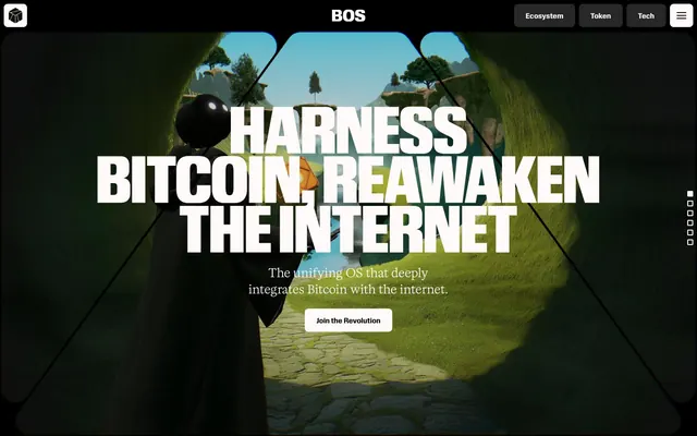
Preview image. Unlock full-res
Dark Command Center
Color palette
Primary text on light surfaces, button text on light backgrounds, primary stroke in dark mode, navigation item borders. Creates stark contrast
Page background, card backgrounds, footer background. The base dark surface that defines the theme
Subtle background for UI elements, slightly elevated from the Digital Canvas
High-contrast neutral action fill for primary buttons on light surfaces.
Primary text, heading text, button text, main border color in dark mode. The dominant contrasting element against dark backgrounds
Secondary text, muted links, subtle borders. Reduces visual weight for less critical information
Typography
- Weights
- 400
- Sizes
- 16px
- Line height
- 1.2
- Fallback
- serif
Body text for longer content blocks, paragraph text, providing a classic counterpoint to the more modern display fonts.
- Weights
- 400
- Sizes
- 12px, 16px, 24px
- Line height
- 1, 1.4, 1.6
- Letter spacing
- 0.0400em, 0.0600em
- Fallback
- monospace
Navigation items, small labels, and utility text. Its monospace nature provides a technical, data-driven feel.
- Weights
- 700, 900
- Sizes
- 14px, 18px, 32px
- Line height
- 0.75, 0.88, 1, 1.1
- Letter spacing
- -0.0100em, 0.0100em, 0.0200em
- Fallback
- sans-serif
Component labels, main body headings, primary links, and button text, offering a strong, clear voice with varying tracking for different sizes.
- Weights
- 900
- Sizes
- 72px, 128px
- Line height
- 0.8
- Letter spacing
- normal
- Fallback
- sans-serif
Dominant display headlines and hero text. Its condensed, bold nature makes a dramatic, architectural statement, leveraging the large sizes for impact.
Spacing & shape
Components
Background: rgba(0, 0, 0, 0), Text: Ghost White (#fffafa), Border: Midnight Truffle (#000000), Radius: 8px, No padding at root level (inherited from parent).
Background: Slate Steel (#272727), Text: Ghost White (#fffafa), Border: Ghost White (#fffafa), Radius: 8px, No padding at root level.
Background: Ghost White (#fffafa), Text: Midnight Truffle (#000000), Border: Midnight Truffle (#000000), Radius: 8px, No padding at root level.
Background: rgba(0, 0, 0, 0), Border: none, Radius: 0px, No padding.
Background: Ghost White (#fffafa), Border: none, Radius: 8px, Padding: 24px.
Background: Digital Canvas (#101010), Border: none, Radius: 16px, No padding.
Background: Digital Canvas (#101010), Border: none, Radius: 100%, No padding.
Background: rgba(0, 0, 0, 0), Text: Ghost White (#fffafa), Border: Ghost White (#fffafa), Radius: 0px, Horizontal padding: 16px.
Font: Kalice, Weight: 400, Color: Ghost White (#fffafa). Often accompanied by a subtle border or minimal background highlight on hover/active.
Guidelines
- Prioritize high contrast between text and background, using Ghost White (#fffafa) on Digital Canvas (#101010) or Midnight Truffle (#000000) on Ghost White for primary content.
- Use Review Condensed (900 weight, 72px or 128px) for all prominent headlines to convey authority and impact.
- Apply 16px border-radius as the default for most container elements like cards and images, with 8px for smaller interactive components like buttons.
- Utilize border-defined elements over solid fills for a lightweight, technical feel. For example, use Ghost Button with rgba(0,0,0,0) background and a Midnight Truffle (#000000) border.
- Maintain a clear vertical rhythm using 64px section gaps and 24px padding within content blocks.
- Employ the Slate Steel (#272727) as a background for secondary interactive components to subtly differentiate them from the main canvas.
- Use Midnight Truffle (#000000) and Ghost White (#fffafa) as the primary colors for borders and strokes to define structural elements.
- Avoid using saturated or vibrant colors outside of specific, functional accents (if introduced later) to maintain the dark, industrial aesthetic.
- Do not deviate from the established font families and weights, especially for display typography, as it compromises the strong visual identity.
- Never introduce soft shadows or excessive elevation; the design leans into flat, distinct surfaces and sharp lines.
- Do not use generic padding values; stick to the 8px base unit and derived increments (16px, 24px, 64px) for consistent rhythm.
- Avoid decorative gradients or complex overlays that would detract from the stark, high-contrast visual language.
- Do not use small, light-weight typography for headings; ensure headings are always bold and impactful, using Review or Review Condensed.
- Do not use rounded corners larger than 16px on cards or main components, with the exception of specific decorative elements like the 48px or 100% radius examples.
About this system
ShowHide
BitcoinOS projects a dark, futuristic command center aesthetic: deep charcoal canvases, stark white typography, and structural borders define its visual identity. Typography is oversized and confident, with a mix of condensed and expanded forms to create a distinct, almost monumental feel. Components are lightweight and often border-defined rather than filled, conveying a sense of precision and advanced technology. The overall impression is one of a high-tech interface, authoritative yet minimal.
The page embraces a full-bleed layout for its hero and main sections, with content often centered within the dark canvas. The hero features a large, centered headline over an immersive abstract background. Section rhythm is primarily defined by consistent vertical spacing (64px) rather than alternating background colors, although subtle variations in dark neutrals exist. Content is frequently arranged in centered stacks or distinct blocks, with visual breaks created by strong typographic statements. Navigation consists of a minimalist sticky header with a hamburger menu for full navigation, and discrete vertical dot navigation along the right edge acting as prominent page anchors.
This design system primarily uses dark, moody abstract 3D renders and illustrative graphics embedded as backgrounds or within masked shapes. These visuals serve an atmospheric and conceptual role rather than directly showcasing products or people. When present, product-type imagery is tightly contained or stylized into geometric shapes. Icons are typically monolinear, white or transparent on dark, with moderate stroke weights. The overall density of imagery is balanced, providing visual interest without overwhelming the stark UI elements, and often creating a tunneling or portal-like effect.
Reminiscent of Alchemy, Protocol Labs, Arbitrum, Filecoin.
# BitcoinOS — Style Reference
> Dark Command Center

**Theme:** dark

**Site:** https://bitcoinos.build

BitcoinOS projects a dark, futuristic command center aesthetic: deep charcoal canvases, stark white typography, and structural borders define its visual identity. Typography is oversized and confident, with a mix of condensed and expanded forms to create a distinct, almost monumental feel. Components are lightweight and often border-defined rather than filled, conveying a sense of precision and advanced technology. The overall impression is one of a high-tech interface, authoritative yet minimal.

## Tokens — Colors

| Name | Value | Token | Role |
|------|------|------|------|
| Midnight Truffle | `#000000` | `--color-midnight-truffle` | Primary text on light surfaces, button text on light backgrounds, primary stroke in dark mode, navigation item borders. Creates stark contrast |
| Digital Canvas | `#101010` | `--color-digital-canvas` | Page background, card backgrounds, footer background. The base dark surface that defines the theme |
| Ash Graphite | `#1a1a1a` | `--color-ash-graphite` | Subtle background for UI elements, slightly elevated from the Digital Canvas |
| Slate Steel | `#272727` | `--color-slate-steel` | High-contrast neutral action fill for primary buttons on light surfaces. |
| Ghost White | `#fffafa` | `--color-ghost-white` | Primary text, heading text, button text, main border color in dark mode. The dominant contrasting element against dark backgrounds |
| Muted Silver | `#bababa` | `--color-muted-silver` | Secondary text, muted links, subtle borders. Reduces visual weight for less critical information |

## Tokens — Typography

### Times
- **Substitute:** serif
- **Weights:** 400
- **Sizes:** 16px
- **Line height:** 1.2
- **Role:** Body text for longer content blocks, paragraph text, providing a classic counterpoint to the more modern display fonts.

### Kalice
- **Substitute:** monospace
- **Weights:** 400
- **Sizes:** 12px, 16px, 24px
- **Line height:** 1, 1.4, 1.6
- **Letter spacing:** 0.0400em, 0.0600em
- **Role:** Navigation items, small labels, and utility text. Its monospace nature provides a technical, data-driven feel.

### Review
- **Substitute:** sans-serif
- **Weights:** 700, 900
- **Sizes:** 14px, 18px, 32px
- **Line height:** 0.75, 0.88, 1, 1.1
- **Letter spacing:** -0.0100em, 0.0100em, 0.0200em
- **Role:** Component labels, main body headings, primary links, and button text, offering a strong, clear voice with varying tracking for different sizes.

### Review Condensed
- **Substitute:** sans-serif
- **Weights:** 900
- **Sizes:** 72px, 128px
- **Line height:** 0.8
- **Letter spacing:** normal
- **Role:** Dominant display headlines and hero text. Its condensed, bold nature makes a dramatic, architectural statement, leveraging the large sizes for impact.

## Tokens — Type Scale

Perfect Fifth (1.5) from 16px base.

| Role | Size | Line height | Letter spacing |
|------|------|------|------|
| caption | 12px | 1 | 0.48px |
| body-sm | 14px | 1.1 | -0.14px |
| body | 16px | 1.2 | — |
| body-lg | 18px | 1.1 | 0.18px |
| heading | 32px | 0.88 | 0.64px |
| display-lg | 72px | 0.8 | — |
| display | 128px | 0.8 | — |

## Tokens — Spacing

- **Section gap:** 64px
- **Card padding:** 24px
- **Element gap:** 8px

## Tokens — Radius

- **Default:** 16px
- **Buttons:** 8px
- **decorative:** 48px
- **links:** 2px
- **smallComponents:** 8px

## Layout

The page embraces a full-bleed layout for its hero and main sections, with content often centered within the dark canvas. The hero features a large, centered headline over an immersive abstract background. Section rhythm is primarily defined by consistent vertical spacing (64px) rather than alternating background colors, although subtle variations in dark neutrals exist. Content is frequently arranged in centered stacks or distinct blocks, with visual breaks created by strong typographic statements. Navigation consists of a minimalist sticky header with a hamburger menu for full navigation, and discrete vertical dot navigation along the right edge acting as prominent page anchors.

## Imagery

This design system primarily uses dark, moody abstract 3D renders and illustrative graphics embedded as backgrounds or within masked shapes. These visuals serve an atmospheric and conceptual role rather than directly showcasing products or people. When present, product-type imagery is tightly contained or stylized into geometric shapes. Icons are typically monolinear, white or transparent on dark, with moderate stroke weights. The overall density of imagery is balanced, providing visual interest without overwhelming the stark UI elements, and often creating a tunneling or portal-like effect.

## Components

### Ghost Button
*Interactive elements with minimal visual footprint.*

Background: rgba(0, 0, 0, 0), Text: Ghost White (#fffafa), Border: Midnight Truffle (#000000), Radius: 8px, No padding at root level (inherited from parent).

### Outlined Button
*Secondary action or navigation items.*

Background: Slate Steel (#272727), Text: Ghost White (#fffafa), Border: Ghost White (#fffafa), Radius: 8px, No padding at root level.

### Filled Primary Button
*Main call to action.*

Background: Ghost White (#fffafa), Text: Midnight Truffle (#000000), Border: Midnight Truffle (#000000), Radius: 8px, No padding at root level.

### Ghost Card
*Structural container for content without visual background.*

Background: rgba(0, 0, 0, 0), Border: none, Radius: 0px, No padding.

### Standard Card
*Content presentation with a clear visual boundary.*

Background: Ghost White (#fffafa), Border: none, Radius: 8px, Padding: 24px.

### Dark Card
*Content container for specific sections requiring a darker contrast.*

Background: Digital Canvas (#101010), Border: none, Radius: 16px, No padding.

### Circular Card
*Decorative or specific content cards with a rounded shape.*

Background: Digital Canvas (#101010), Border: none, Radius: 100%, No padding.

### Text Input
*User input fields.*

Background: rgba(0, 0, 0, 0), Text: Ghost White (#fffafa), Border: Ghost White (#fffafa), Radius: 0px, Horizontal padding: 16px.

### Navigation Bar Item
*Primary navigation links and sections.*

Font: Kalice, Weight: 400, Color: Ghost White (#fffafa). Often accompanied by a subtle border or minimal background highlight on hover/active.

## Guidelines

### Do

- Prioritize high contrast between text and background, using Ghost White (#fffafa) on Digital Canvas (#101010) or Midnight Truffle (#000000) on Ghost White for primary content.
- Use Review Condensed (900 weight, 72px or 128px) for all prominent headlines to convey authority and impact.
- Apply 16px border-radius as the default for most container elements like cards and images, with 8px for smaller interactive components like buttons.
- Utilize border-defined elements over solid fills for a lightweight, technical feel. For example, use Ghost Button with rgba(0,0,0,0) background and a Midnight Truffle (#000000) border.
- Maintain a clear vertical rhythm using 64px section gaps and 24px padding within content blocks.
- Employ the Slate Steel (#272727) as a background for secondary interactive components to subtly differentiate them from the main canvas.
- Use Midnight Truffle (#000000) and Ghost White (#fffafa) as the primary colors for borders and strokes to define structural elements.

### Don't

- Avoid using saturated or vibrant colors outside of specific, functional accents (if introduced later) to maintain the dark, industrial aesthetic.
- Do not deviate from the established font families and weights, especially for display typography, as it compromises the strong visual identity.
- Never introduce soft shadows or excessive elevation; the design leans into flat, distinct surfaces and sharp lines.
- Do not use generic padding values; stick to the 8px base unit and derived increments (16px, 24px, 64px) for consistent rhythm.
- Avoid decorative gradients or complex overlays that would detract from the stark, high-contrast visual language.
- Do not use small, light-weight typography for headings; ensure headings are always bold and impactful, using Review or Review Condensed.
- Do not use rounded corners larger than 16px on cards or main components, with the exception of specific decorative elements like the 48px or 100% radius examples.

## Agent Prompt Guide

Quick Color Reference:
text: #fffafa
background: #101010
border: #fffafa
accent: no distinct accent color
primary action: #fffafa (filled action)

Example Component Prompts:
1. Create a Primary Action Button: #fffafa background, #000000 text, 9999px radius, compact pill padding. Use this filled treatment for the main CTA.
2. Design a Dark Card: background Digital Canvas (#101010), radius 16px. Inside, use Kalice weight 400 at 16px, color Ghost White (#fffafa) for labels, and Review weight 700 at 32px, color Ghost White (#fffafa), letter-spacing 0.64px for a title. Padding 24px inside.
3. Create an Outlined Navigation Item: Background Slate Steel (#272727), text Ghost White (#fffafa), border Ghost White (#fffafa), radius 8px, font Review weight 700 at 14px. No padding at root level; assume parent element handles spacing.
More like this




Keep what you find
A free account saves references to boards and can send you a weekly email of picks based on what you save.
To see every result, go Pro.