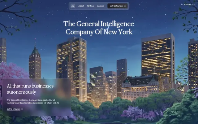
Preview image. Unlock full-res
Architectural Night Sky
Color palette
Dark base for hero sections and occasional accent backgrounds; creates a deep, contemplative atmosphere
Highlight elements, card backgrounds for featured content, and active interface states. Its vivid hue draws attention while maintaining a high-tech feel
Border color for ghost buttons and interactive elements, providing a clear but understated active state
Primary text for headings and bold statements against light backgrounds, emphasizing core information
Main page background, component backgrounds, and primary text on dark elements, maintaining brightness and spaciousness
Subtle alternative background for secondary sections and cards, creating a slight visual separation from the main canvas
Background for input fields and navigation elements, providing a soft contrast
Subtle border for UI elements and dividers, offering minimal distinction
Hairline borders and soft shadows, contributing to a refined, nearly unnoticeable separation of elements
Primary body text and deep contrast accents. Used where legibility against light backgrounds is paramount
Secondary text and less prominent headings, providing contrast below the primary text level
Darker accent for navigation hover states and subtly outlined actions, providing depth on dark surfaces
Placeholder text and subtle icon fills, indicating less active states or auxiliary information
Muted text for helper descriptions and secondary information, reducing visual noise
Lightest neutral used for subtle background variations or very soft dividers
Typography
- Weights
- 400, 500
- Sizes
- 40px, 48px, 54px
- Line height
- 1.1
- Letter spacing
- -0.0200em
Headlines and prominent display text. Its distinct serif creates a sense of gravitas and intellectual authority, often appearing in sizes like 40px and 54px.
- Weights
- 400, 500, 600, 700
- Sizes
- 13px, 15px, 16px, 18px
- Line height
- 1, 1.2, 1.3, 1.4, 1.5
- Letter spacing
- -0.0120em, -0.0100em
Body text, navigation, buttons, and all functional UI labels. This sans-serif provides clarity and modernity, varying in weight from 400 for standard body copy to 700 for more prominent labels, with a subtle negative letter spacing for a compact feel across sizes 13px to 18px.
Spacing & shape
Elevation
Components
Transparent background, text color typically #444141 or #171717, no explicit border, 0px radius. Used for links within text or secondary actions.
Background rgba(255, 255, 255, 0.06), text color #171717, 8px border radius, 5px vertical padding and 12px horizontal padding. Offers a soft, contained interaction.
Background #1f1f29, text color #ffffff. Border #282834, 8px border radius, 7px top, 8px bottom, 16px left, 12px right padding. Used for high-emphasis CTAs.
Ghost background, text color #444141 or #171717, border color #41a1cf or #282834, 4px border radius. Offers a clear but not overly prominent action.
Background #f9faf7 with blur effect, 50.496px border radius, #171717 text. Soft shadow rgba(0, 0, 0, 0.15) 0px 2px 6px 0px. Used in the header, suggesting elegance and lightness.
Background #fefffc, 12px border radius. Soft shadow rgba(0, 0, 0, 0.08) 0px 1px 1px 0px, rgba(0, 0, 0, 0.08) 0px 4px 5px 0px. Used for featured information blocks.
Background rgba(222, 226, 222, 0.16), 24px border radius, no shadow. 16px padding. Used on the hero section for minimal visual intrusion and atmospheric depth.
Background #0081c0, 24px border radius. Complex shadow rgba(0, 0, 0, 0.06) 0px 2px 2px 0px, rgba(0, 0, 0, 0) 0px 6px 6px 0px, rgba(0, 0, 0, 0.04) 0px 0px 0px 5px. Generous padding 128px top, 80px right/bottom/left. Commands attention for key information.
Background #f9faf7, text and border #444141, 0px border radius. Default padding for clarity.
Guidelines
- Prioritize PPMondwest for all display and large headings (40px, 48px, 54px) using weight 400 or 500, with letter-spacing -0.0200em for a refined, compact look.
- Use 'Night Sky' (#1f1f29) as a deep, rich background for hero sections or brand-defining modules, contrasting with light body text and elements.
- Layer surfaces with 'Off White' (#fefffc) and 'Canvas White' (#ffffff) to provide subtle depth and structure on light-themed pages, emphasizing 'Canvas White' for main backgrounds and 'Off White' for slightly recessed elements.
- Apply 'Cofounder Blue' (#0081c0) sparingly as a functional accent color for key cards or active states, reserving its prominence for maximum impact.
- Implement soft, layered shadows for card components (e.g., rgba(0, 0, 0, 0.08) 0px 1px 1px 0px, rgba(0, 0, 0, 0.08) 0px 4px 5px 0px) to give elements a subtle lift without feeling heavy.
- Maintain a comfortable density with an element gap of 8px and card padding of 16px, ensuring sufficient breathing room between UI elements.
- Round corners with care: use 4px for small buttons, 8px for main interactive elements, 12px for cards, and 24px for larger, more prominent cards like the 'Hero Overlay Card', with 50.496px for highly rounded nav items.
- Avoid excessive use of 'Cofounder Blue' (#0081c0) outside of clear accent roles; it should highlight, not dominate, the UI.
- Do not introduce strong, bold colors or gradients other than the defined brand accents; the system relies on a sophisticated achromatic foundation.
- Resist using heavy, opaque backgrounds for layered elements on light pages; instead, favor sublte translucency (rgba(222, 226, 222, 0.16)) for a delicate, modern effect.
- Do not use letter-spacing values tighter than -0.0200em for headings or wider than -0.0100em for body text. Maintain the precise, compact typographic rhythm.
- Refrain from sharp, angular corners for cards and buttons; apply the specified radii (4px, 8px, 12px, 16px, 24px, 50.496px) consistently for a softer, approachable feel.
- Do not deviate from the specified shadow values; the subtle, multi-layered shadows are key to the brand's sophisticated depth without visual clutter.
- Avoid cluttering the layout; aim for comfortable spacing both vertically (32px section gap) and horizontally, letting content breathe rather than stacking elements too closely.
About this system
ShowHide
General Intelligence Company employs a sophisticated aesthetic, blending an evocative, illustrative dark hero with a predominantly minimalist, architectural light UI. Typography is restrained and elegant, utilizing a serif for headlines that conveys gravitas and a clean sans-serif for body text. Surfaces are layered with subtle translucency and soft, multi-layered shadows, creating depth without heaviness. The overall impression is one of calm authority and advanced technology, articulated through precise achromatic forms punctuated by a singular, cool blue accent for interactive elements.
The page structure features an initial full-bleed hero section defined by a dark, illustrative cityscape background with a centered headline. Following this, the layout transitions to a contained, max-width (implied 1200px from content grouping) centered model for content sections. Sections alternate between 'Canvas White' and 'Off White' backgrounds, establishing a clear visual rhythm. Content is arranged predominantly in a two-column text-left/image-right pattern or centered text stacks for emphasis. Feature grids may appear in three-column structures. Navigation is a compact top bar, with sticky behavior, containing minimalist text links and a 'Get Cofounder' button.
The visual language for imagery combines two distinct styles: a highly detailed, illustrative, dark-themed cityscape for the hero section, serving as an atmospheric backdrop, and minimalist, contained product screenshots or abstract graphics for content areas. Photography is absent. Illustrations are organic and atmospheric in the hero, while content area graphics are abstract and geometric, typically featuring outlined shapes and a subdued, near-achromatic palette. Icons are outlined, with a moderate stroke weight, and mostly monochromatic. Imagery acts as both decorative atmosphere in the hero to draw the user in and as explanatory content in product sections, with a balanced density on content-heavy pages.
Reminiscent of Linear, Anthropic (Cloude), Stripe, Intercom.
# General Intelligence Company — Style Reference
> Architectural Night Sky

**Theme:** light

**Site:** https://www.generalintelligencecompany.com

General Intelligence Company employs a sophisticated aesthetic, blending an evocative, illustrative dark hero with a predominantly minimalist, architectural light UI. Typography is restrained and elegant, utilizing a serif for headlines that conveys gravitas and a clean sans-serif for body text. Surfaces are layered with subtle translucency and soft, multi-layered shadows, creating depth without heaviness. The overall impression is one of calm authority and advanced technology, articulated through precise achromatic forms punctuated by a singular, cool blue accent for interactive elements.

## Tokens — Colors

| Name | Value | Token | Role |
|------|------|------|------|
| Night Sky | `#1f1f29` | `--color-night-sky` | Dark base for hero sections and occasional accent backgrounds; creates a deep, contemplative atmosphere |
| Cofounder Blue | `#0081c0` | `--color-cofounder-blue` | Highlight elements, card backgrounds for featured content, and active interface states. Its vivid hue draws attention while maintaining a high-tech feel |
| Action Azure | `#41a1cf` | `--color-action-azure` | Border color for ghost buttons and interactive elements, providing a clear but understated active state |
| Pitch Black | `#000000` | `--color-pitch-black` | Primary text for headings and bold statements against light backgrounds, emphasizing core information |
| Canvas White | `#ffffff` | `--color-canvas-white` | Main page background, component backgrounds, and primary text on dark elements, maintaining brightness and spaciousness |
| Off White | `#fefffc` | `--color-off-white` | Subtle alternative background for secondary sections and cards, creating a slight visual separation from the main canvas |
| Ash Gray | `#f9faf7` | `--color-ash-gray` | Background for input fields and navigation elements, providing a soft contrast |
| Cool Gray | `#eef1ed` | `--color-cool-gray` | Subtle border for UI elements and dividers, offering minimal distinction |
| Steel Gray | `#dee2de` | `--color-steel-gray` | Hairline borders and soft shadows, contributing to a refined, nearly unnoticeable separation of elements |
| Dark Charcoal | `#171717` | `--color-dark-charcoal` | Primary body text and deep contrast accents. Used where legibility against light backgrounds is paramount |
| Charcoal | `#2c2c2c` | `--color-charcoal` | Secondary text and less prominent headings, providing contrast below the primary text level |
| Rich Black | `#282834` | `--color-rich-black` | Darker accent for navigation hover states and subtly outlined actions, providing depth on dark surfaces |
| Slate Gray | `#444141` | `--color-slate-gray` | Placeholder text and subtle icon fills, indicating less active states or auxiliary information |
| Medium Gray | `#646464` | `--color-medium-gray` | Muted text for helper descriptions and secondary information, reducing visual noise |
| Light Gray | `#b4b8b4` | `--color-light-gray` | Lightest neutral used for subtle background variations or very soft dividers |

## Tokens — Typography

### PPMondwest
- **Weights:** 400, 500
- **Sizes:** 40px, 48px, 54px
- **Line height:** 1.1
- **Letter spacing:** -0.0200em
- **Role:** Headlines and prominent display text. Its distinct serif creates a sense of gravitas and intellectual authority, often appearing in sizes like 40px and 54px.

### af
- **Weights:** 400, 500, 600, 700
- **Sizes:** 13px, 15px, 16px, 18px
- **Line height:** 1, 1.2, 1.3, 1.4, 1.5
- **Letter spacing:** -0.0120em, -0.0100em
- **Role:** Body text, navigation, buttons, and all functional UI labels. This sans-serif provides clarity and modernity, varying in weight from 400 for standard body copy to 700 for more prominent labels, with a subtle negative letter spacing for a compact feel across sizes 13px to 18px.

## Tokens — Type Scale

Perfect Fourth (1.333) from 13px base.

| Role | Size | Line height | Letter spacing |
|------|------|------|------|
| caption | 13px | 1.5 | -0.13px |
| button-label | 16px | 1 | -0.19px |
| subheading | 18px | 1.2 | -0.18px |
| heading | 40px | 1.1 | -0.8px |
| heading-lg | 48px | 1.1 | -0.96px |
| display | 54px | 1.1 | -1.08px |

## Tokens — Spacing

- **Section gap:** 32px
- **Card padding:** 16px
- **Element gap:** 8px

## Tokens — Radius

- **Buttons:** 4px
- **cardsLarge:** 24px
- **cardsMedium:** 16px
- **cardsSmall:** 12px
- **nav:** 50.496px
- **navItemsSmall:** 8px
- **none:** 0px

## Tokens — Elevation

- **Nav Items:** `rgba(0, 0, 0, 0.15) 0px 2px 6px 0px`
- **Card:** `rgba(0, 0, 0, 0.08) 0px 1px 1px 0px, rgba(0, 0, 0, 0.08) 0px 4px 5px 0px`
- **Cofounder Featured Card:** `rgba(0, 0, 0, 0.06) 0px 2px 2px 0px, rgba(0, 0, 0, 0) 0px 6px 6px 0px, rgba(0, 0, 0, 0.04) 0px 0px 0px 5px`
- **Input fields and subtle UI elements:** `rgba(0, 0, 0, 0.05) 0px 1px 8px 0px`

## Layout

The page structure features an initial full-bleed hero section defined by a dark, illustrative cityscape background with a centered headline. Following this, the layout transitions to a contained, max-width (implied 1200px from content grouping) centered model for content sections. Sections alternate between 'Canvas White' and 'Off White' backgrounds, establishing a clear visual rhythm. Content is arranged predominantly in a two-column text-left/image-right pattern or centered text stacks for emphasis. Feature grids may appear in three-column structures. Navigation is a compact top bar, with sticky behavior, containing minimalist text links and a 'Get Cofounder' button.

## Imagery

The visual language for imagery combines two distinct styles: a highly detailed, illustrative, dark-themed cityscape for the hero section, serving as an atmospheric backdrop, and minimalist, contained product screenshots or abstract graphics for content areas. Photography is absent. Illustrations are organic and atmospheric in the hero, while content area graphics are abstract and geometric, typically featuring outlined shapes and a subdued, near-achromatic palette. Icons are outlined, with a moderate stroke weight, and mostly monochromatic. Imagery acts as both decorative atmosphere in the hero to draw the user in and as explanatory content in product sections, with a balanced density on content-heavy pages.

## Components

### Ghost Button
*Subtle interactive element*

Transparent background, text color typically #444141 or #171717, no explicit border, 0px radius. Used for links within text or secondary actions.

### Subtle Nav Button
*Navigation item or secondary ghost action*

Background rgba(255, 255, 255, 0.06), text color #171717, 8px border radius, 5px vertical padding and 12px horizontal padding. Offers a soft, contained interaction.

### Solid Dark Button
*Primary action within darker contexts*

Background #1f1f29, text color #ffffff. Border #282834, 8px border radius, 7px top, 8px bottom, 16px left, 12px right padding. Used for high-emphasis CTAs.

### Outlined Action Button
*Interactive button with a defined border*

Ghost background, text color #444141 or #171717, border color #41a1cf or #282834, 4px border radius. Offers a clear but not overly prominent action.

### Blurred Nav Item
*Navigation element with translucent background*

Background #f9faf7 with blur effect, 50.496px border radius, #171717 text. Soft shadow rgba(0, 0, 0, 0.15) 0px 2px 6px 0px. Used in the header, suggesting elegance and lightness.

### Elevated Content Card
*Content container with subtle elevation*

Background #fefffc, 12px border radius. Soft shadow rgba(0, 0, 0, 0.08) 0px 1px 1px 0px, rgba(0, 0, 0, 0.08) 0px 4px 5px 0px. Used for featured information blocks.

### Hero Overlay Card
*Translucent content block over imagery*

Background rgba(222, 226, 222, 0.16), 24px border radius, no shadow. 16px padding. Used on the hero section for minimal visual intrusion and atmospheric depth.

### Cofounder Featured Card
*Prominent, brand-colored feature display*

Background #0081c0, 24px border radius. Complex shadow rgba(0, 0, 0, 0.06) 0px 2px 2px 0px, rgba(0, 0, 0, 0) 0px 6px 6px 0px, rgba(0, 0, 0, 0.04) 0px 0px 0px 5px. Generous padding 128px top, 80px right/bottom/left. Commands attention for key information.

### Ghost Input Field
*Standard user input field*

Background #f9faf7, text and border #444141, 0px border radius. Default padding for clarity.

## Guidelines

### Do

- Prioritize PPMondwest for all display and large headings (40px, 48px, 54px) using weight 400 or 500, with letter-spacing -0.0200em for a refined, compact look.
- Use 'Night Sky' (#1f1f29) as a deep, rich background for hero sections or brand-defining modules, contrasting with light body text and elements.
- Layer surfaces with 'Off White' (#fefffc) and 'Canvas White' (#ffffff) to provide subtle depth and structure on light-themed pages, emphasizing 'Canvas White' for main backgrounds and 'Off White' for slightly recessed elements.
- Apply 'Cofounder Blue' (#0081c0) sparingly as a functional accent color for key cards or active states, reserving its prominence for maximum impact.
- Implement soft, layered shadows for card components (e.g., rgba(0, 0, 0, 0.08) 0px 1px 1px 0px, rgba(0, 0, 0, 0.08) 0px 4px 5px 0px) to give elements a subtle lift without feeling heavy.
- Maintain a comfortable density with an element gap of 8px and card padding of 16px, ensuring sufficient breathing room between UI elements.
- Round corners with care: use 4px for small buttons, 8px for main interactive elements, 12px for cards, and 24px for larger, more prominent cards like the 'Hero Overlay Card', with 50.496px for highly rounded nav items.

### Don't

- Avoid excessive use of 'Cofounder Blue' (#0081c0) outside of clear accent roles; it should highlight, not dominate, the UI.
- Do not introduce strong, bold colors or gradients other than the defined brand accents; the system relies on a sophisticated achromatic foundation.
- Resist using heavy, opaque backgrounds for layered elements on light pages; instead, favor sublte translucency (rgba(222, 226, 222, 0.16)) for a delicate, modern effect.
- Do not use letter-spacing values tighter than -0.0200em for headings or wider than -0.0100em for body text. Maintain the precise, compact typographic rhythm.
- Refrain from sharp, angular corners for cards and buttons; apply the specified radii (4px, 8px, 12px, 16px, 24px, 50.496px) consistently for a softer, approachable feel.
- Do not deviate from the specified shadow values; the subtle, multi-layered shadows are key to the brand's sophisticated depth without visual clutter.
- Avoid cluttering the layout; aim for comfortable spacing both vertically (32px section gap) and horizontally, letting content breathe rather than stacking elements too closely.

## Agent Prompt Guide

Quick Color Reference:
text: #171717
background: #ffffff
border: #dee2de
accent: #0081c0
primary action: #41a1cf (outlined action border)

Example Component Prompts:
1. Create a hero section with a 'Night Sky' background (#1f1f29). Headline (PPMondwest, 54px, weight 400, #ffffff, letter-spacing -1.08px). Subtext (af, 18px, weight 400, #ffffff, line-height 1.2).
2. Create an 'Elevated Content Card': background 'Off White' (#fefffc), 12px border-radius, box-shadow rgba(0, 0, 0, 0.08) 0px 1px 1px 0px, rgba(0, 0, 0, 0.08) 0px 4px 5px 0px, 16px padding. Title (af, 18px, weight 600, #2c2c2c), body text (af, 16px, weight 400, #171717).
3. Create an 'Outlined Action Button': background transparent, border 1px solid 'Action Azure' (#41a1cf), text 'Dark Charcoal' (#171717), 4px border-radius. Text (af, 16px, weight 500, letter-spacing -0.19px), 5px vertical / 12px horizontal padding.
4. Create a 'Blurred Nav Item': background rgba(255, 255, 255, 0.06), 50.496px border-radius, box-shadow rgba(0, 0, 0, 0.15) 0px 2px 6px 0px. Text (af, 15px, weight 400, #171717), 8px padding. Implement a backdrop-filter: blur(9px).
More like this








Keep what you find
A free account saves references to boards and can send you a weekly email of picks based on what you save.
To see every result, go Pro.