Preview image. Unlock full-res
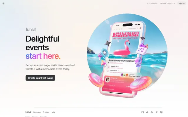
Festival poster behind frosted glass — the UI recedes into gray silence so a technicolor 3D world can explode through the center of the page.
Color palette
Logo accent arc, brand identity mark — the only gradient on the UI chrome, applied exclusively to the wordmark star/logo element
Inline accent text — used on 'start here.' in the hero headline for a single phrase of color against black text
Primary text, headings, nav labels — the near-black is slightly warm, avoiding the coldness of pure #000
Secondary text, icon fills, nav links, muted labels
Tertiary text, borders, stroke on icons
Primary CTA button background — dark against white page so the 3D imagery carries the color load
Page background, button label text
SVG icon fills, highest-contrast overlays
Typography
- Weights
- 400, 500
- Sizes
- 13px, 14px, 16px, 18px, 20px, 64px
- Line height
- 1, 1.5
- Letter spacing
- -0.016em across all sizes (approximately -1.02px at 64px, -0.26px at 16px)
- Fallback
- Inter, SF Pro Display
Single font family for all text across all contexts — the deliberate use of system-ui means the UI feels native and frictionless. Weight 400 at 64px for the headline is anti-convention (most sites push 700+); the size does the work so weight stays quiet. Weight 500 for buttons and nav labels only.
Spacing & shape
Components
Text 'luma' in #131517, accompanied by a superscript star/spark icon rendered with the full Luma Spectrum radial gradient (cyan → violet → pink → orange). The gradient appears ONLY here — it is the singular brand signal on an otherwise achromatic UI.
White background, full-width. Left: logo wordmark. Right: 'Explore Events' link with arrow (Graphite #656768, 14px, weight 400), 'Sign In' button (Graphite text, 14px). Nav labels use #656768 with -0.016em tracking. A live clock display ('3:25 PM EDT') in Ash #a5a6a8 is a distinctive ambient element. Height approximately 52px.
Live local time string in Ash #a5a6a8, 13px weight 400. No background, no border. Sits in the top-right nav as a subtle real-time data point — reinforces the events/scheduling context without visual weight.
Two-color inline headline: 'Delightful events' in Obsidian #131517 at 64px weight 400, then 'start here.' in Flamingo #f31a7c same size/weight. Line-height ~1.03 (66px). Letter-spacing -1.02px. Single font family, weight unchanged — color switch alone creates the accent effect.
16px, weight 400, Graphite #656768, line-height 1.5 (24px). Max-width approximately 320px, left-aligned under the headline. Letter-spacing -0.016em.
13-14px, weight 400, Graphite #656768 at default state. Horizontal row layout. Spacing 8px column-gap between items. No underline at rest. Luma wordmark repeated in footer at 14px weight 500, Obsidian #131517.
Icon-only links (email, font/A, play, X/Twitter, Instagram). SVG fill #656768 Graphite. Size approximately 16px. 8px gap between icons. No hover state visible in static data.
Text link with arrow suffix (↗), 14px weight 400-500, Graphite #656768. 8px border-radius pill treatment. Padding 7px 10px. Sits in top-right nav beside Sign In.
Guidelines
- Use the Luma Spectrum radial gradient exclusively on the logo mark / brand icon — never apply it to buttons, backgrounds, or text elsewhere
- Reserve Flamingo #f31a7c for single accent phrases within otherwise monochromatic headlines — one phrase maximum per heading
- Set display headlines (64px) at weight 400 with letter-spacing -0.016em; resist increasing weight to bold even for hero contexts
- Keep CTA button fill at #333537 (Charcoal) against white backgrounds — let photography and 3D renders provide the chromatic energy
- Use #656768 (Graphite) for all secondary UI text: nav links, subtext, footer labels, icon fills
- Apply 15px border-radius to buttons and interactive cards; use 8px for smaller tags and nav items
- Maintain -0.016em letter-spacing across all type sizes from 13px to 64px — this single value unifies the entire type system
- Never use the Luma Spectrum gradient as a button background, section fill, or text gradient outside the logo mark
- Don't increase headline weight above 400 for emphasis — use Flamingo #f31a7c inline color instead
- Don't add drop shadows or card elevation to the primary UI chrome — the design is intentionally flat to let imagery carry visual depth
- Don't use Flamingo #f31a7c on more than one word cluster per screen — it loses meaning if applied broadly
- Don't use pure #000000 for body text — use Obsidian #131517 which carries slight warmth and reduces harshness against white
- Don't place colored or gradient backgrounds behind the hero text column — white only, so the split layout reads as grounded UI vs expressive imagery
About this system
ShowHide
Luma feels like a summer festival poster designed by a typographer — warm, alive, and unapologetically joyful. The page is nearly achromatic in its UI chrome (near-black #131517 text, mid-gray #656768 secondary, light-gray backgrounds) which makes the explosion of color in the hero 3D render feel earned and deliberate. The signature move is a full-spectrum radial gradient — cyan through violet through pink through orange — used as a single accent arc on the logo mark, transforming a system-font UI into something recognizably branded. Headlines run at 64px weight 400 with -0.016em tracking, relying on size alone rather than weight to command attention — the restraint is the statement. The CTA button is a dark near-black pill (#333537) against white, inverting the typical bright-CTA convention so the colorful hero imagery provides all the visual energy.
Max-width approximately 1200px, centered. Hero is a two-column split: left column contains headline, body copy, and CTA button (left-aligned, approximately 40% width); right column contains the full-bleed circular 3D render (approximately 60% width), extending to the top edge. Navigation is a full-width bar at 52px height, white, with logo-left and utility-links-right pattern. Footer is a single horizontal row with logo + nav links left and social icons right, 24px vertical padding. No alternating section bands visible — the single viewport is hero-only, with footer directly below. Layout is spacious in the left text column (173px left margin from data) and dense in information hierarchy.
The hero is defined by a large 3D render of a smartphone floating above a tropical beach scene, surrounded by playful 3D objects (inflatable rings, flamingo float, calendar emoji, sparkles). The render is fully contained within a circular crop with a sky-blue-to-white radial background. It occupies the right ~60% of the hero split. The treatment is deliberately maximalist and cartoon-tactile — soft lighting, high-saturation product chrome in pink, 3D depth. This 3D hero style is isolated from the rest of the UI, which is pure flat white. Icons in the nav and footer are outlined/stroke-style SVGs at 16px in Graphite #656768 — minimal single-color mono treatment. No photography, no illustration beyond the 3D hero render.
Reminiscent of Eventbrite, Linear, Partiful, Notion, Pitch.
# Luma — Style Reference
> Festival poster behind frosted glass — the UI recedes into gray silence so a technicolor 3D world can explode through the center of the page.

**Theme:** light

**Site:** https://lu.ma

Luma feels like a summer festival poster designed by a typographer — warm, alive, and unapologetically joyful. The page is nearly achromatic in its UI chrome (near-black #131517 text, mid-gray #656768 secondary, light-gray backgrounds) which makes the explosion of color in the hero 3D render feel earned and deliberate. The signature move is a full-spectrum radial gradient — cyan through violet through pink through orange — used as a single accent arc on the logo mark, transforming a system-font UI into something recognizably branded. Headlines run at 64px weight 400 with -0.016em tracking, relying on size alone rather than weight to command attention — the restraint is the statement. The CTA button is a dark near-black pill (#333537) against white, inverting the typical bright-CTA convention so the colorful hero imagery provides all the visual energy.

## Tokens — Colors

| Name | Value | Token | Role |
|------|------|------|------|
| Luma Spectrum | `#099ef1` | `--color-luma-spectrum` | Logo accent arc, brand identity mark — the only gradient on the UI chrome, applied exclusively to the wordmark star/logo element |
| Flamingo | `#f31a7c` | `--color-flamingo` | Inline accent text — used on 'start here.' in the hero headline for a single phrase of color against black text |
| Obsidian | `#131517` | `--color-obsidian` | Primary text, headings, nav labels — the near-black is slightly warm, avoiding the coldness of pure #000 |
| Graphite | `#656768` | `--color-graphite` | Secondary text, icon fills, nav links, muted labels |
| Ash | `#a5a6a8` | `--color-ash` | Tertiary text, borders, stroke on icons |
| Charcoal | `#333537` | `--color-charcoal` | Primary CTA button background — dark against white page so the 3D imagery carries the color load |
| Pure White | `#ffffff` | `--color-pure-white` | Page background, button label text |
| Ink Black | `#000000` | `--color-ink-black` | SVG icon fills, highest-contrast overlays |

## Tokens — Typography

### -apple-system, BlinkMacSystemFont, 'Segoe UI', sans-serif
- **Substitute:** Inter, SF Pro Display
- **Weights:** 400, 500
- **Sizes:** 13px, 14px, 16px, 18px, 20px, 64px
- **Line height:** 1, 1.5
- **Letter spacing:** -0.016em across all sizes (approximately -1.02px at 64px, -0.26px at 16px)
- **Role:** Single font family for all text across all contexts — the deliberate use of system-ui means the UI feels native and frictionless. Weight 400 at 64px for the headline is anti-convention (most sites push 700+); the size does the work so weight stays quiet. Weight 500 for buttons and nav labels only.

## Tokens — Type Scale

Perfect Fifth (1.5) from 16px base.

| Role | Size | Line height | Letter spacing |
|------|------|------|------|
| caption | 13px | 20px | — |
| body | 16px | 24px | -0.26px |
| subheading | 18px | 27px | -0.29px |
| heading-sm | 20px | 24px | -0.32px |
| display | 64px | 66px | -1.02px |

## Tokens — Spacing

- **Max width:** 1200px
- **Section gap:** 32px
- **Card padding:** 16px
- **Element gap:** 8px

## Tokens — Radius

- **Buttons:** 15px
- **Cards:** 15px
- **tags:** 8px

## Layout

Max-width approximately 1200px, centered. Hero is a two-column split: left column contains headline, body copy, and CTA button (left-aligned, approximately 40% width); right column contains the full-bleed circular 3D render (approximately 60% width), extending to the top edge. Navigation is a full-width bar at 52px height, white, with logo-left and utility-links-right pattern. Footer is a single horizontal row with logo + nav links left and social icons right, 24px vertical padding. No alternating section bands visible — the single viewport is hero-only, with footer directly below. Layout is spacious in the left text column (173px left margin from data) and dense in information hierarchy.

## Imagery

The hero is defined by a large 3D render of a smartphone floating above a tropical beach scene, surrounded by playful 3D objects (inflatable rings, flamingo float, calendar emoji, sparkles). The render is fully contained within a circular crop with a sky-blue-to-white radial background. It occupies the right ~60% of the hero split. The treatment is deliberately maximalist and cartoon-tactile — soft lighting, high-saturation product chrome in pink, 3D depth. This 3D hero style is isolated from the rest of the UI, which is pure flat white. Icons in the nav and footer are outlined/stroke-style SVGs at 16px in Graphite #656768 — minimal single-color mono treatment. No photography, no illustration beyond the 3D hero render.

## Components

### Hero Headline + CTA Button

### Event Card

### Footer Navigation Row

### Logo Wordmark
*Brand identity, top-left nav*

Text 'luma' in #131517, accompanied by a superscript star/spark icon rendered with the full Luma Spectrum radial gradient (cyan → violet → pink → orange). The gradient appears ONLY here — it is the singular brand signal on an otherwise achromatic UI.

### Nav Bar
*Primary navigation, sticky top*

White background, full-width. Left: logo wordmark. Right: 'Explore Events' link with arrow (Graphite #656768, 14px, weight 400), 'Sign In' button (Graphite text, 14px). Nav labels use #656768 with -0.016em tracking. A live clock display ('3:25 PM EDT') in Ash #a5a6a8 is a distinctive ambient element. Height approximately 52px.

### Time Display Badge
*Ambient contextual info in nav*

Live local time string in Ash #a5a6a8, 13px weight 400. No background, no border. Sits in the top-right nav as a subtle real-time data point — reinforces the events/scheduling context without visual weight.

### Hero Headline
*Primary value statement*

Two-color inline headline: 'Delightful events' in Obsidian #131517 at 64px weight 400, then 'start here.' in Flamingo #f31a7c same size/weight. Line-height ~1.03 (66px). Letter-spacing -1.02px. Single font family, weight unchanged — color switch alone creates the accent effect.

### Hero Body Text
*Supporting copy below headline*

16px, weight 400, Graphite #656768, line-height 1.5 (24px). Max-width approximately 320px, left-aligned under the headline. Letter-spacing -0.016em.

### Footer Navigation Links
*Footer utility links*

13-14px, weight 400, Graphite #656768 at default state. Horizontal row layout. Spacing 8px column-gap between items. No underline at rest. Luma wordmark repeated in footer at 14px weight 500, Obsidian #131517.

### Footer Social Icons
*Social media links in footer*

Icon-only links (email, font/A, play, X/Twitter, Instagram). SVG fill #656768 Graphite. Size approximately 16px. 8px gap between icons. No hover state visible in static data.

### Explore Events Link
*Secondary nav CTA*

Text link with arrow suffix (↗), 14px weight 400-500, Graphite #656768. 8px border-radius pill treatment. Padding 7px 10px. Sits in top-right nav beside Sign In.

## Guidelines

### Do

- Use the Luma Spectrum radial gradient exclusively on the logo mark / brand icon — never apply it to buttons, backgrounds, or text elsewhere
- Reserve Flamingo #f31a7c for single accent phrases within otherwise monochromatic headlines — one phrase maximum per heading
- Set display headlines (64px) at weight 400 with letter-spacing -0.016em; resist increasing weight to bold even for hero contexts
- Keep CTA button fill at #333537 (Charcoal) against white backgrounds — let photography and 3D renders provide the chromatic energy
- Use #656768 (Graphite) for all secondary UI text: nav links, subtext, footer labels, icon fills
- Apply 15px border-radius to buttons and interactive cards; use 8px for smaller tags and nav items
- Maintain -0.016em letter-spacing across all type sizes from 13px to 64px — this single value unifies the entire type system

### Don't

- Never use the Luma Spectrum gradient as a button background, section fill, or text gradient outside the logo mark
- Don't increase headline weight above 400 for emphasis — use Flamingo #f31a7c inline color instead
- Don't add drop shadows or card elevation to the primary UI chrome — the design is intentionally flat to let imagery carry visual depth
- Don't use Flamingo #f31a7c on more than one word cluster per screen — it loses meaning if applied broadly
- Don't use pure #000000 for body text — use Obsidian #131517 which carries slight warmth and reduces harshness against white
- Don't place colored or gradient backgrounds behind the hero text column — white only, so the split layout reads as grounded UI vs expressive imagery

## Gradient System

One gradient exists in the entire design system: the Luma Spectrum radial-gradient(circle at 0px 0px, #099ef1 0%, #6863f8 18.82%, #d84ffa 32.6%, #f058c5 52.83%, #ff4f90 68.03%, #ff6558 87.66%, #ff891f 100%). It is used in exactly one place: the logo mark spark/star icon in the top-left nav and footer wordmark. Its center-point origin (0px 0px) means it reads as a sweep from cyan at top-left through violet to warm orange at bottom-right. Never tile, animate, or reuse this as a background or text gradient — its power comes entirely from exclusivity.

## Agent Prompt Guide

**Quick Color Reference**
- Text primary: #131517
- Text secondary: #656768
- Text tertiary / borders: #a5a6a8
- Page background: #ffffff
- CTA button fill: #333537
- Accent (inline text): #f31a7c
- Brand gradient: radial from #099ef1 → #6863f8 → #d84ffa → #f058c5 → #ff4f90 → #ff6558 → #ff891f (logo only)

**Example Component Prompts**

1. Hero headline: Two-line headline at 64px -apple-system weight 400, letter-spacing -1.02px, line-height 66px. First two lines in #131517, final phrase ('start here.') in #f31a7c. Left-aligned, max-width 420px.

2. Primary CTA button: Background #333537, text #ffffff, font-size 16px weight 500, letter-spacing -0.26px, padding 12px 18px, border-radius 15px, no shadow, no border.

3. Nav bar: White background, 52px height, full-width. Left: 'luma' text in #131517 14px weight 500 + gradient spark icon. Right: time string in #a5a6a8 13px, 'Explore Events ↗' in #656768 14px, 'Sign In' in #656768 14px. Gaps of 16px between nav items.

4. Footer row: Single horizontal bar, white background, 24px vertical padding. Left cluster: wordmark + 'Discover · Pricing · Help' in #656768 14px, 8px column-gap. Right cluster: 5 SVG social icons in #656768 at 16px, 8px gap.

5. Inline accent text badge: Wrap a single word or short phrase in #f31a7c within an otherwise #131517 headline. Same size, same weight, no background — color alone as the differentiator. Use maximum once per screen.
More like this







Keep what you find
A free account saves references to boards and can send you a weekly email of picks based on what you save.
To see every result, go Pro.