Preview image. Unlock full-res
Shifting Ocean depths
Color palette
Background for hero sections, prominent headers, providing a deep, stable foundation.
Secondary background color for sections, creating a lighter contrast against Deep Ocean while maintaining a cool, consistent tone.
Background for 'verified' badges, signifying trustworthiness and positive affirmation.
Background for 'premium' badges, indicating exclusivity and value.
Hyperlinks and interactive text elements, drawing attention without being overly aggressive.
Primary text color for most content, default button backgrounds, and strong borders.
Iconography, and occasionally as a very dark text or border color for maximum contrast.
Card backgrounds, primary button text, and other elements requiring high contrast against darker backgrounds.
Subtle borders and separators, providing structure without visual heavy-handedness.
Secondary text and less prominent link colors, for information density.
Typography
- Weights
- 400, 440, 500, 600, 700, 800, 850
- Sizes
- 11px, 12px, 14px, 16px, 18px, 20px, 24px, 60px
- Line height
- 0.88, 1, 1.17, 1.22, 1.33, 1.36, 1.38, 1.5, 1.57, 1.7, 1.83
- Letter spacing
- normal
- Fallback
- system-ui, sans-serif
The primary typeface for all textual content, from headings to body text and interactive elements. Its extensive weight range allows for clear typographic hierarchy using only weight, rather than relying on multiple font families.
Spacing & shape
Components
Black background (#111111) with white text (#ffffff), 6px border-radius, 8px vertical padding, 12px horizontal padding. Prominently signals the next step in a process.
White background (#ffffff) with black text (#111111), a subtle border in #767676, 6px border-radius, 8px vertical padding, 12px horizontal padding. A less emphatic, but still clear, interactive element.
Transparent background, black text (#111111), no border, 0px border-radius, with 0px vertical padding and 8px horizontal padding. For inline actions or navigation where no distinct button shape is needed.
White background (#ffffff) with rounded corners (20.8px), featuring internal content like domain name, price, and a primary action button. Padding is '24px'.
Light violet background (#d3c1f7) with black text (#111111), 4px border-radius, 0px vertical padding, 3.5px horizontal padding. Used to highlight premium status or features.
Light teal background (#a6fff8) with black text (#111111), 4px border-radius, 0px vertical padding, 3.5px horizontal padding. Indicates a verified status, reinforcing trust.
Features a black icon (#000000) above a block of text, aligned centrally. These blocks are separated by 32px column-gap when presented in a grid.
Guidelines
- Prioritize Onyx (#111111) for all main text and elements on light backgrounds for optimal contrast against White Smoke (#ffffff) or Sea Mist (#d8efef).
- Use Sea Mist (#d8efef) as a default background for secondary sections to create a gentle contrast with the brand's primary Deep Ocean (#01122c) background.
- Apply 20.8px border-radius to card-like containers, and 6px border-radius specifically for buttons, and 4px for badges.
- Employ the `gdsherpa` typeface for all text elements. Leverage its diverse weight range (400-850) to establish clear hierarchy.
- Maintain a clear visual hierarchy by utilizing Deep Ocean (#01122c) for prominent hero backgrounds and contrasting it with lighter text like White Smoke for readability.
- Use Link Teal (#00a4a6) exclusively for interactive text links and phone numbers to clearly differentiate them from static content.
- Do not introduce new primary background colors; stick to the brand's gradient, Deep Ocean (#01122c), and Sea Mist (#d8efef).
- Avoid using highly saturated colors for large text blocks; reserve them for accents like badges or interactive links.
- Do not deviate from the established border-radius values (20.8px for cards, 6px for buttons, 4px for badges) to maintain visual consistency.
- Refrain from using `gdsherpa` in weights outside of the specified range (400-850) for any content.
- Do not use White Smoke (#ffffff) text on Sea Mist (#d8efef) backgrounds, as the contrast will be insufficient.
- Do not use Link Teal (#00a4a6) for non-interactive text; its purpose is to guide user interaction.
About this system
ShowHide
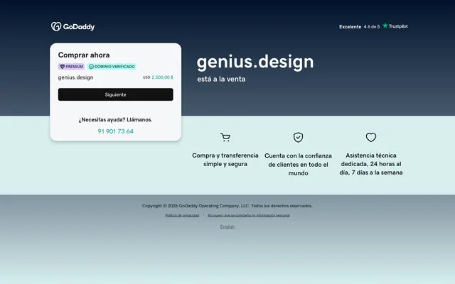
This design system presents a balanced aesthetic, contrasting a deeply saturated, cool background with crisp, achromatic elements. A subtle gradient on the main page background creates depth and shifts from a light, airy teal to a profound navy, grounding the content. Interactive elements and badges introduce small, vibrant accents that pop against the otherwise business-like palette, suggesting a service that is both reliable and user-friendly. The overall impression is one of trustworthiness and clarity.
The page exhibits a mixed-layout model, featuring a full-width header with a dominant dark background, transitioning into a lighter content band. The hero section is characterized by a central, prominent headline paired with a floating card component for key actions. Subsequent sections arrange content in a clear, column-based structure, where feature descriptions are accompanied by subtle icons. Overall, the layout is clean and content-focused, utilizing ample white space for breathability. Page content seems constrained by an implicit max-width, while the background elements extend full-bleed.
The site uses a combination of line-art icons and the brand logo. Icons are monochromatic, primarily black (#000000), offering clear semantic meaning without visual clutter. They are typically contained within the light sections and serve an explanatory role for features. There is a notable absence of photography or complex illustrations, emphasizing a direct, UI-focused presentation.
Reminiscent of Namecheap, Cloudflare, DigitalOcean.
# genius.design — Style Reference
> Shifting Ocean depths

**Theme:** mixed

**Site:** https://genius.design

This design system presents a balanced aesthetic, contrasting a deeply saturated, cool background with crisp, achromatic elements. A subtle gradient on the main page background creates depth and shifts from a light, airy teal to a profound navy, grounding the content. Interactive elements and badges introduce small, vibrant accents that pop against the otherwise business-like palette, suggesting a service that is both reliable and user-friendly. The overall impression is one of trustworthiness and clarity.

## Tokens — Colors

| Name | Value | Token | Role |
|------|------|------|------|
| Deep Ocean | `#01122c` | `--color-deep-ocean` | Background for hero sections, prominent headers, providing a deep, stable foundation. |
| Sea Mist | `#d8efef` | `--color-sea-mist` | Secondary background color for sections, creating a lighter contrast against Deep Ocean while maintaining a cool, consistent tone. |
| Domain Verified Teal | `#a6fff8` | `--color-domain-verified-teal` | Background for 'verified' badges, signifying trustworthiness and positive affirmation. |
| Premium Violet | `#d3c1f7` | `--color-premium-violet` | Background for 'premium' badges, indicating exclusivity and value. |
| Link Teal | `#00a4a6` | `--color-link-teal` | Hyperlinks and interactive text elements, drawing attention without being overly aggressive. |
| Onyx | `#111111` | `--color-onyx` | Primary text color for most content, default button backgrounds, and strong borders. |
| True Black | `#000000` | `--color-true-black` | Iconography, and occasionally as a very dark text or border color for maximum contrast. |
| White Smoke | `#ffffff` | `--color-white-smoke` | Card backgrounds, primary button text, and other elements requiring high contrast against darker backgrounds. |
| Slate Border | `#e4e9ec` | `--color-slate-border` | Subtle borders and separators, providing structure without visual heavy-handedness. |
| Ash Grey | `#444444` | `--color-ash-grey` | Secondary text and less prominent link colors, for information density. |

## Tokens — Typography

### gdsherpa
- **Substitute:** system-ui, sans-serif
- **Weights:** 400, 440, 500, 600, 700, 800, 850
- **Sizes:** 11px, 12px, 14px, 16px, 18px, 20px, 24px, 60px
- **Line height:** 0.88, 1, 1.17, 1.22, 1.33, 1.36, 1.38, 1.5, 1.57, 1.7, 1.83
- **Letter spacing:** normal
- **Role:** The primary typeface for all textual content, from headings to body text and interactive elements. Its extensive weight range allows for clear typographic hierarchy using only weight, rather than relying on multiple font families.

## Tokens — Type Scale

Perfect Fifth (1.5) from 14px base.

| Role | Size | Line height | Letter spacing |
|------|------|------|------|
| caption | 11px | 1.57 | — |
| body | 14px | 1.38 | — |
| heading | 18px | 1.22 | — |
| heading-lg | 24px | 1.17 | — |
| display | 60px | 0.88 | — |

## Tokens — Spacing

- **Section gap:** 30px
- **Card padding:** 24px
- **Element gap:** 8px

## Tokens — Radius

- **Buttons:** 6px
- **Cards:** 20.8px
- **badges:** 4px

## Layout

The page exhibits a mixed-layout model, featuring a full-width header with a dominant dark background, transitioning into a lighter content band. The hero section is characterized by a central, prominent headline paired with a floating card component for key actions. Subsequent sections arrange content in a clear, column-based structure, where feature descriptions are accompanied by subtle icons. Overall, the layout is clean and content-focused, utilizing ample white space for breathability. Page content seems constrained by an implicit max-width, while the background elements extend full-bleed.

## Imagery

The site uses a combination of line-art icons and the brand logo. Icons are monochromatic, primarily black (#000000), offering clear semantic meaning without visual clutter. They are typically contained within the light sections and serve an explanatory role for features. There is a notable absence of photography or complex illustrations, emphasizing a direct, UI-focused presentation.

## Components

### Verification Card

### Feature Icon Blocks

### Badge Collection

### Primary Action Button
*Call to action*

Black background (#111111) with white text (#ffffff), 6px border-radius, 8px vertical padding, 12px horizontal padding. Prominently signals the next step in a process.

### Secondary Outline Button
*Secondary action*

White background (#ffffff) with black text (#111111), a subtle border in #767676, 6px border-radius, 8px vertical padding, 12px horizontal padding. A less emphatic, but still clear, interactive element.

### Text Link Button
*Navigation, minor action*

Transparent background, black text (#111111), no border, 0px border-radius, with 0px vertical padding and 8px horizontal padding. For inline actions or navigation where no distinct button shape is needed.

### Verification Card
*Information display with action*

White background (#ffffff) with rounded corners (20.8px), featuring internal content like domain name, price, and a primary action button. Padding is '24px'.

### Premium Badge
*Feature indicator*

Light violet background (#d3c1f7) with black text (#111111), 4px border-radius, 0px vertical padding, 3.5px horizontal padding. Used to highlight premium status or features.

### Verified Badge
*Status indicator*

Light teal background (#a6fff8) with black text (#111111), 4px border-radius, 0px vertical padding, 3.5px horizontal padding. Indicates a verified status, reinforcing trust.

### Info Card Icon Block
*Feature explanation*

Features a black icon (#000000) above a block of text, aligned centrally. These blocks are separated by 32px column-gap when presented in a grid.

## Guidelines

### Do

- Prioritize Onyx (#111111) for all main text and elements on light backgrounds for optimal contrast against White Smoke (#ffffff) or Sea Mist (#d8efef).
- Use Sea Mist (#d8efef) as a default background for secondary sections to create a gentle contrast with the brand's primary Deep Ocean (#01122c) background.
- Apply 20.8px border-radius to card-like containers, and 6px border-radius specifically for buttons, and 4px for badges.
- Employ the `gdsherpa` typeface for all text elements. Leverage its diverse weight range (400-850) to establish clear hierarchy.
- Maintain a clear visual hierarchy by utilizing Deep Ocean (#01122c) for prominent hero backgrounds and contrasting it with lighter text like White Smoke for readability.
- Use Link Teal (#00a4a6) exclusively for interactive text links and phone numbers to clearly differentiate them from static content.

### Don't

- Do not introduce new primary background colors; stick to the brand's gradient, Deep Ocean (#01122c), and Sea Mist (#d8efef).
- Avoid using highly saturated colors for large text blocks; reserve them for accents like badges or interactive links.
- Do not deviate from the established border-radius values (20.8px for cards, 6px for buttons, 4px for badges) to maintain visual consistency.
- Refrain from using `gdsherpa` in weights outside of the specified range (400-850) for any content.
- Do not use White Smoke (#ffffff) text on Sea Mist (#d8efef) backgrounds, as the contrast will be insufficient.
- Do not use Link Teal (#00a4a6) for non-interactive text; its purpose is to guide user interaction.

## Agent Prompt Guide

### Quick Color Reference
- Text: #111111
- Background: #d8efef
- CTA Button: #111111
- Accent Link: #00a4a6
- Card Background: #ffffff

### Example Component Prompts
1. Create a hero section: background linear-gradient(0deg, #d8efef, #687c8a 40%, #01122c). Centered headline 'genius.design' at 60px gdsherpa weight 850, #ffffff. Subtext 'está a la venta' at 20px gdsherpa weight 400, #ffffff. Position a 'Verification Card' over the gradient, slightly overlapping between the dark and light sections.
2. Create a 'Verification Card': White background (#ffffff) with 20.8px border-radius, inner padding of 24px. Title 'Comprar ahora' at 18px gdsherpa weight 600, #111111. Include a 'Premium Badge' and 'Verified Badge' for 'genius.design'. Inside, display 'USD 2,500.00 $' at 16px gdsherpa weight 400, #111111. End with a 'Primary Action Button' labeled 'Siguiente'.
3. Create a 'Primary Action Button': Background #111111, text #ffffff, 6px border-radius, 8px vertical padding, 12px horizontal padding. Text 'Siguiente' at 14px gdsherpa weight 500, normal letter-spacing.
4. Design a 'Feature Icon Block': Center a shopping cart icon (SVG fill #000000). Below the icon, add a heading 'Compra y transferencia' at 16px gdsherpa weight 600, #111111, followed by a body 'simple y segura' at 14px gdsherpa weight 400, #111111. Ensure there is 8px vertical element gap between the icon and the text.
More like this










Keep what you find
A free account saves references to boards and can send you a weekly email of picks based on what you save.
To see every result, go Pro.