
Preview image. Unlock full-res
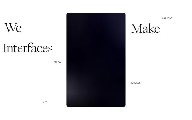
Gallery brochure on textured paper. A pristine, off-white matte surface serves as the canvas, with sharp, meticulously placed charcoal text drawing the eye to curated content.
Color palette
Primary background for pages and main content areas, creating a soft, warm paper-like base.
Dominant text color for headings, body, links, and icons, providing strong contrast against the Greige Canvas.
Used for specific interactive elements and brand identifiers, offering the absolute highest contrast point.
Subtle border and divider lines, providing a faint structural element without jarring contrast.
Typography
- Weights
- 400
- Sizes
- 10px, 22px, 33px, 44px, 67px, 111px
- Line height
- 1, 1.02, 1.1
- Letter spacing
- -0.01
- Fallback
- Inter
The sole typeface, used across all elements from navigation and body text to large display headings. Its consistent weight and precise letter-spacing underscore the system's commitment to visual clarity and understated modernism.
Spacing & shape
Components
Text in Charcoal Text (#0c0c0c) at 10px, weight 400. No background, no padding or border, blending seamlessly into the layout.
PP Neue Montreal, 44px, weight 400, line-height 1.1, Charcoal Text (#0c0c0c), letter-spacing -0.01em. Maintains visual hierarchy with a significant but not overwhelming size.
PP Neue Montreal, 22px, weight 400, line-height 1.1, Charcoal Text (#0c0c0c), letter-spacing -0.01em. Provides very comfortable readability with ample size.
Text in Deepest Ink (#000000), 22px, weight 400. No explicit padding or background, differentiated by color alone. This is often used for 'More Work' or 'About' links.
PP Neue Montreal, 33px, weight 400, line-height 1.1, Charcoal Text (#0c0c0c), letter-spacing -0.01em. Each item functions as a large, readable link.
PP Neue Montreal, 22px, weight 400, line-height 1.1, Charcoal Text (#0c0c0c) but changes to Deepest Ink (#000000) on hover. It is not underlined.
Guidelines
- Use Greige Canvas (#f9f7f4) as the default background for all pages and primary content sections.
- Apply Charcoal Text (#0c0c0c) for all primary text content at PP Neue Montreal weight 400, ensuring high contrast and clarity.
- Maintain a letter-spacing of -0.01em for all PP Neue Montreal typography to retain a tight, precise aesthetic.
- Implement 0px radius across all elements, including buttons and interactive components, for a sharp, angular visual.
- Use Pale Stone Divider (#e3e1dd) for subtle horizontal separators or faint borders where visual distinction is needed without strong emphasis.
- Structure layout with generous vertical spacing, using 50px as a common section separator for comfortable content segmentation.
- Prioritize scale and singular weight (400) of PP Neue Montreal to establish visual hierarchy, rather than multiple weights or colors.
- Do not introduce additional font families; PP Neue Montreal is the only allowed typeface.
- Avoid using box-shadows or gradients; the design relies on flat planes and stark contrast for depth.
- Do not apply rounded corners to any component; maintain the consistent 0px radius for all elements.
- Refrain from using overly saturated or chromatic colors; the palette is strictly neutral with very subtle warm undertones.
- Do not add unnecessary padding or borders to interactive elements like navigation links; keep them minimal and text-based.
- Avoid decorative elements or iconography that deviates from the monochromatic and precise aesthetic.
- Do not vary font weights; all text, including headings, should be PP Neue Montreal 400.
About this system
ShowHide
This design system evokes a sense of quiet authority and refined minimalism, akin to an exclusive gallery brochure. The predominant use of an off-white background with stark, near-black typography creates a high-contrast, yet soft, visual experience. Subtle variations in text sizes and minimal interactive elements guide the eye without visual clutter, emphasizing content discernment over flashy engagements. The aesthetic is built on precision, restraint, and an almost tactile purity, making every element feel deliberately placed.
The site employs a contained layout model, centered, with a flexible maximum width that maintains generous side margins. The hero section features a large, left-aligned headline centered vertically, commanding immediate attention. The overall section rhythm is relatively flat, using consistent vertical spacing (around 50px) to separate content blocks, without alternating background patterns or strong visual dividers. Content arrangement primarily involves vertical stacking, with notable client lists appearing as aligned columns of text. There is no evident grid for cards, but image and text blocks are positioned for visual balance. The density is spacious, leaving ample 'white space' around elements. Navigation is a minimal top bar with left-aligned brand name and right-aligned 'Studio' link, adhering to the stark, minimalist aesthetic.
The site's visual language is characterized by product photography that is meticulously staged and often features high-key lighting. Products are typically presented in clean, isolated contexts, showcasing material and form without lifestyle clutter. Photography serves an explanatory and showcase role, where the object itself is the focus, often with a subtle, brand-aligned color background or a pure white backdrop. There are no illustrations or abstract graphics; all visuals are rooted in tangible product representation. Images are generally contained within defined areas, not full-bleed, and maintain the sharp, unrounded edge aesthetic of the overall design. Density is moderate, with images acting as visual punctuation to text blocks.
Reminiscent of Akin Gump, Certain Measures, Büro Uebele, Studio Fnt.
# Twocreate — Style Reference
> Gallery brochure on textured paper. A pristine, off-white matte surface serves as the canvas, with sharp, meticulously placed charcoal text drawing the eye to curated content.

**Theme:** light

**Site:** https://twocreate.com

This design system evokes a sense of quiet authority and refined minimalism, akin to an exclusive gallery brochure. The predominant use of an off-white background with stark, near-black typography creates a high-contrast, yet soft, visual experience. Subtle variations in text sizes and minimal interactive elements guide the eye without visual clutter, emphasizing content discernment over flashy engagements. The aesthetic is built on precision, restraint, and an almost tactile purity, making every element feel deliberately placed.

## Tokens — Colors

| Name | Value | Token | Role |
|------|------|------|------|
| Greige Canvas | `#f9f7f4` | `--color-greige-canvas` | Primary background for pages and main content areas, creating a soft, warm paper-like base. |
| Charcoal Text | `#0c0c0c` | `--color-charcoal-text` | Dominant text color for headings, body, links, and icons, providing strong contrast against the Greige Canvas. |
| Deepest Ink | `#000000` | `--color-deepest-ink` | Used for specific interactive elements and brand identifiers, offering the absolute highest contrast point. |
| Pale Stone Divider | `#e3e1dd` | `--color-pale-stone-divider` | Subtle border and divider lines, providing a faint structural element without jarring contrast. |

## Tokens — Typography

### PP Neue Montreal
- **Substitute:** Inter
- **Weights:** 400
- **Sizes:** 10px, 22px, 33px, 44px, 67px, 111px
- **Line height:** 1, 1.02, 1.1
- **Letter spacing:** -0.01
- **Role:** The sole typeface, used across all elements from navigation and body text to large display headings. Its consistent weight and precise letter-spacing underscore the system's commitment to visual clarity and understated modernism.

## Tokens — Spacing

- **Section gap:** 50px
- **Card padding:** 20px
- **Element gap:** 10-20px

## Tokens — Radius

- **all:** 0px

## Layout

The site employs a contained layout model, centered, with a flexible maximum width that maintains generous side margins. The hero section features a large, left-aligned headline centered vertically, commanding immediate attention. The overall section rhythm is relatively flat, using consistent vertical spacing (around 50px) to separate content blocks, without alternating background patterns or strong visual dividers. Content arrangement primarily involves vertical stacking, with notable client lists appearing as aligned columns of text. There is no evident grid for cards, but image and text blocks are positioned for visual balance. The density is spacious, leaving ample 'white space' around elements. Navigation is a minimal top bar with left-aligned brand name and right-aligned 'Studio' link, adhering to the stark, minimalist aesthetic.

## Imagery

The site's visual language is characterized by product photography that is meticulously staged and often features high-key lighting. Products are typically presented in clean, isolated contexts, showcasing material and form without lifestyle clutter. Photography serves an explanatory and showcase role, where the object itself is the focus, often with a subtle, brand-aligned color background or a pure white backdrop. There are no illustrations or abstract graphics; all visuals are rooted in tangible product representation. Images are generally contained within defined areas, not full-bleed, and maintain the sharp, unrounded edge aesthetic of the overall design. Density is moderate, with images acting as visual punctuation to text blocks.

## Components

### Hero Headline Block

### Client List with Image

### Work Project Title Card

### Primary Navigation Link
*Navigational elements in the header and footer.*

Text in Charcoal Text (#0c0c0c) at 10px, weight 400. No background, no padding or border, blending seamlessly into the layout.

### Section Heading
*Subheadings introducing new content sections.*

PP Neue Montreal, 44px, weight 400, line-height 1.1, Charcoal Text (#0c0c0c), letter-spacing -0.01em. Maintains visual hierarchy with a significant but not overwhelming size.

### Body Text
*General content and descriptive text.*

PP Neue Montreal, 22px, weight 400, line-height 1.1, Charcoal Text (#0c0c0c), letter-spacing -0.01em. Provides very comfortable readability with ample size.

### Subtle Call-to-Action Link
*Interactive elements that blend with surrounding text.*

Text in Deepest Ink (#000000), 22px, weight 400. No explicit padding or background, differentiated by color alone. This is often used for 'More Work' or 'About' links.

### Client List Item
*Items in client lists or similar enumerations.*

PP Neue Montreal, 33px, weight 400, line-height 1.1, Charcoal Text (#0c0c0c), letter-spacing -0.01em. Each item functions as a large, readable link.

### Inline Text Link
*Links embedded within sentences or short phrases.*

PP Neue Montreal, 22px, weight 400, line-height 1.1, Charcoal Text (#0c0c0c) but changes to Deepest Ink (#000000) on hover. It is not underlined.

## Guidelines

### Do

- Use Greige Canvas (#f9f7f4) as the default background for all pages and primary content sections.
- Apply Charcoal Text (#0c0c0c) for all primary text content at PP Neue Montreal weight 400, ensuring high contrast and clarity.
- Maintain a letter-spacing of -0.01em for all PP Neue Montreal typography to retain a tight, precise aesthetic.
- Implement 0px radius across all elements, including buttons and interactive components, for a sharp, angular visual.
- Use Pale Stone Divider (#e3e1dd) for subtle horizontal separators or faint borders where visual distinction is needed without strong emphasis.
- Structure layout with generous vertical spacing, using 50px as a common section separator for comfortable content segmentation.
- Prioritize scale and singular weight (400) of PP Neue Montreal to establish visual hierarchy, rather than multiple weights or colors.

### Don't

- Do not introduce additional font families; PP Neue Montreal is the only allowed typeface.
- Avoid using box-shadows or gradients; the design relies on flat planes and stark contrast for depth.
- Do not apply rounded corners to any component; maintain the consistent 0px radius for all elements.
- Refrain from using overly saturated or chromatic colors; the palette is strictly neutral with very subtle warm undertones.
- Do not add unnecessary padding or borders to interactive elements like navigation links; keep them minimal and text-based.
- Avoid decorative elements or iconography that deviates from the monochromatic and precise aesthetic.
- Do not vary font weights; all text, including headings, should be PP Neue Montreal 400.

## Agent Prompt Guide

### Quick Color Reference
- Text: #0c0c0c
- Background: #f9f7f4
- Primary Interactive: #000000
- Divider: #e3e1dd

### Example Component Prompts
1. Create a hero section: background #f9f7f4. Headline 'We create products for brands & brands for products' in PP Neue Montreal, 111px, weight 400, line-height 1.0, #0c0c0c, letter-spacing -0.01em.
2. Create a navigation bar: background #f9f7f4. Left item 'TWO CREATE', right item 'STUDIO'. Both in PP Neue Montreal, 10px, weight 400, #0c0c0c, no padding.
3. Create a section heading: 'Selected work' in PP Neue Montreal, 44px, weight 400, line-height 1.1, #0c0c0c, letter-spacing -0.01em. Add 50px top margin.
4. Create a client list item: 'Acqua di Parma' in PP Neue Montreal, 33px, weight 400, line-height 1.1, #0c0c0c, letter-spacing -0.01em. This should behave as a clickable link.
More like this









Keep what you find
A free account saves references to boards and can send you a weekly email of picks based on what you save.
To see every result, go Pro.