Preview image. Unlock full-res
Color palette
Page background — a stark white canvas for extreme content clarity
Primary text, headings, navigational links, subtle borders. Establishes high contrast against the white background, mimicking print on paper
Spacing & shape
Guidelines
- Use 'Midnight Ink' (#000000) for all text elements to maintain high contrast and a print-like aesthetic.
- Maintain a stark white page background ('Canvas', #FFFFFF) for all primary surfaces.
- Employ tight spacing between elements, defaulting to 10px where multiple items are listed horizontally or vertically.
- Prioritize typographic hierarchy and weight changes to denote importance, as no other visual cues like color or elevation are present.
- Keep all borders, if any, at 0px radius, embracing sharp, unrounded forms.
- Minimize UI elements to only essential information; avoid decorative components or complex visual metaphors.
- Do not introduce any saturated or chromatic colors; the system is strictly monochromatic.
- Avoid using shadows or any form of elevation; the design philosophy is flat and unlayered.
- Do not use rounded corners on any UI elements; all shapes should be rectilinear.
- Do not create complex layouts or multi-column grids that introduce visual hierarchy beyond simple text arrangement.
- Do not vary line heights excessively; maintain close-set lines for a compact informational feel.
- Do not add gradients or background imagery; surfaces should remain solid white or black.
About this system
ShowHide
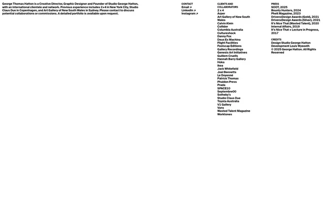
George Hatton's visual system evokes the starkness of an ink-on-paper minimalist print. It's a high-contrast mono-chromatic display, foregrounding content through extreme clarity and absence of distraction. Typography dictates all hierarchy and rhythm on surfaces that mimic a digital canvas, with no visual adornment or complex component structures. Spacing is tight, almost compressed, but maintains legibility through meticulous typographic detail.
The page model is full-bleed, with content contained within left-aligned columns rather than a centered max-width container. There is no distinct hero pattern; the page immediately presents descriptive text. Section rhythm is created by consistent vertical spacing between logically grouped blocks of text, without alternating backgrounds or visual dividers. Content is arranged in left-aligned stacks and multi-column lists where related information (Contact, Clients, Press, Credits) is presented side-by-side. The density is compact but spacious in its use of negative space, allowing focus on individual text blocks. Navigation is minimal, limited to text links within the page structure.
The site uses no explicit imagery, photography, or illustrations. The visual language relies entirely on type and whitespace. Icons are minimal, only present as simple, unadorned arrow pointers for links, rendered in 'Midnight Ink' on a 'Canvas' background. The density is text-dominant, with content presented in clearly defined, separate blocks.
# George Hatton — Style Reference
> Ink on Canvas

**Theme:** light

**Site:** https://georgehatton.com

George Hatton's visual system evokes the starkness of an ink-on-paper minimalist print. It's a high-contrast mono-chromatic display, foregrounding content through extreme clarity and absence of distraction. Typography dictates all hierarchy and rhythm on surfaces that mimic a digital canvas, with no visual adornment or complex component structures. Spacing is tight, almost compressed, but maintains legibility through meticulous typographic detail.

## Tokens — Colors

| Name | Value | Token | Role |
|------|------|------|------|
| Canvas | `#FFFFFF` | `--color-canvas` | Page background — a stark white canvas for extreme content clarity |
| Midnight Ink | `#000000` | `--color-midnight-ink` | Primary text, headings, navigational links, subtle borders. Establishes high contrast against the white background, mimicking print on paper |

## Tokens — Spacing

- **Card padding:** 0px
- **Element gap:** 10px

## Tokens — Radius

- **none:** 0px

## Layout

The page model is full-bleed, with content contained within left-aligned columns rather than a centered max-width container. There is no distinct hero pattern; the page immediately presents descriptive text. Section rhythm is created by consistent vertical spacing between logically grouped blocks of text, without alternating backgrounds or visual dividers. Content is arranged in left-aligned stacks and multi-column lists where related information (Contact, Clients, Press, Credits) is presented side-by-side. The density is compact but spacious in its use of negative space, allowing focus on individual text blocks. Navigation is minimal, limited to text links within the page structure.

## Imagery

The site uses no explicit imagery, photography, or illustrations. The visual language relies entirely on type and whitespace. Icons are minimal, only present as simple, unadorned arrow pointers for links, rendered in 'Midnight Ink' on a 'Canvas' background. The density is text-dominant, with content presented in clearly defined, separate blocks.

## Guidelines

### Do

- Use 'Midnight Ink' (#000000) for all text elements to maintain high contrast and a print-like aesthetic.
- Maintain a stark white page background ('Canvas', #FFFFFF) for all primary surfaces.
- Employ tight spacing between elements, defaulting to 10px where multiple items are listed horizontally or vertically.
- Prioritize typographic hierarchy and weight changes to denote importance, as no other visual cues like color or elevation are present.
- Keep all borders, if any, at 0px radius, embracing sharp, unrounded forms.
- Minimize UI elements to only essential information; avoid decorative components or complex visual metaphors.

### Don't

- Do not introduce any saturated or chromatic colors; the system is strictly monochromatic.
- Avoid using shadows or any form of elevation; the design philosophy is flat and unlayered.
- Do not use rounded corners on any UI elements; all shapes should be rectilinear.
- Do not create complex layouts or multi-column grids that introduce visual hierarchy beyond simple text arrangement.
- Do not vary line heights excessively; maintain close-set lines for a compact informational feel.
- Do not add gradients or background imagery; surfaces should remain solid white or black.

## Agent Prompt Guide

Quick Color Reference:
text: #000000
background: #FFFFFF
border: #000000
accent: no distinct accent color
primary action: no distinct CTA color

Example Component Prompts:
1. Create a descriptive text block: text 'Midnight Ink' on 'Canvas' background, left-aligned, occupying the primary content area.
2. Create a list of links: each link as 'Midnight Ink' text, with a simple right-facing arrow icon beside it, separated by 10px vertical spacing.
3. Create a two-column content section: left column as a 'Midnight Ink' heading followed by a list of 'Midnight Ink' text items, right column mirroring this structure, separated by 10px horizontal gap.
More like this









Keep what you find
A free account saves references to boards and can send you a weekly email of picks based on what you save.
To see every result, go Pro.