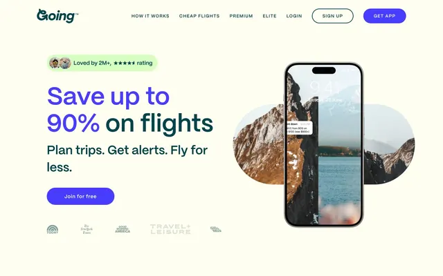
Preview image. Unlock full-res
energetic journey on lime
Color palette
Primary page background, card surfaces, and subtle button accents, evoking a fresh, energetic base
Primary text, navigation links, and outlined button borders – a deep, authoritative voice against the lighter backgrounds
Primary call-to-action buttons, prominent headlines – a vivid, saturated highlight signalling interaction and importance
Decorative color for some headlines and accents, adding a vibrant, almost neon touch
Highly prominent text, borders, and general UI elements requiring maximum contrast
Button backgrounds, form fields, and secondary text, offering a soft, almost off-white contrast
Typography
- Weights
- 400, 475, 600, 700
- Sizes
- 14px, 16px, 18px, 24px, 28px, 40px, 48px, 80px
- Line height
- 1.1, 1.14, 1.15, 1.17, 1.33, 1.4, 1.5
- Letter spacing
- 0.0200em, 0.0600em, 0.1000em
- Fallback
- Inter
The primary typeface for all text content, from body to display headings. Its clean, geometric forms provide a modern and legible foundation, while the varied weights allow for clear hierarchy and emphasis.
Spacing & shape
Elevation
Components
Filled button with 'Action Violet' background (#483cff), 'Paper White' text (#fffef0), and a fully rounded ('pill') corner radius of 900px. Padding is 0px vertical and 32px horizontal. Used for primary CTAs like 'Join for free' and 'Get App'.
Outlined button with 'Teal Ink' border (#004449), 'Paper White' background (#fffef0), and a fully rounded ('pill') corner radius of 900px. Padding is 0px vertical and 32px horizontal. Used for secondary actions like 'Sign Up'.
Filled button with 'Canvas Lime' background (#d7ffc2), 'Teal Ink' text (#004449), and a fully rounded ('pill') corner radius of 900px. Padding is 0px vertical and 32px horizontal. Used for less prominent calls to action or within certain sections.
A card container with 'Canvas Lime' background (#d7ffc2), a 24px border radius, and a subtle shadow: rgba(0, 0, 0, 0.04) 0px 2px 8px 0px. Used for testimonials and feature descriptions.
A decorative badge signaling social proof, using 'Teal Ink' text (#004449) on a transparent background, with no border radius or padding specified directly on the badge element itself, but often embedded within a larger container.
Guidelines
- Prioritize 'Canvas Lime' (#d7ffc2) as the primary background for full sections and content cards to establish the brand's energetic foundation.
- Use 'Action Violet' (#483cff) exclusively for primary call-to-action buttons, ensuring high visual impact and clear user intent.
- Apply a 900px border radius to all interactive buttons and small tags or badges to maintain a soft, approachable, and consistent pill-like shape.
- Set the main body and link text in 'Teal Ink' (#004449) for optimal readability against both 'Canvas Lime' and 'Paper White' backgrounds.
- Maintain a spacious feel by using a section gap of 80px between major content blocks.
- Utilize PP Mori in varying weights (400, 475, 600, 700) to create a clear typographic hierarchy, from subtle body text to bold headlines, adhering to the specified letter-spacing for each size.
- Incorporate a subtle shadow (rgba(0, 0, 0, 0.04) 0px 2px 8px 0px) on 'Content Cards' to provide a gentle lift without heavy visual weight.
- Do not introduce additional background or accent colors that deviate from the established palette of 'Canvas Lime', 'Teal Ink', 'Action Violet', and 'Highlight Green'.
- Avoid sharp corners; all primary UI elements (buttons, cards) should reflect the generous 900px or 24px radii.
- Do not use multiple, heavy shadows or complex gradients unless explicitly defined in the system; stick to the single, subtle card shadow for elevation.
- Refrain from using bold type for conversational body text; reserve higher weights for headings and emphasized elements only.
- Do not deviate from the established 16px element gap and 32px card padding, to maintain the brand's consistent spaciousness.
- Do not use 'Highlight Green' (#0bff80) as a functional UI element; it is reserved for decorative headline accents.
- Avoid primary actions that are not 'Action Violet' filled buttons; secondary actions can be outlined or lime-accented, but the main CTA is distinct.
About this system
ShowHide
Going employs a vibrant and energetic design system, using a warm lime green as an expansive canvas, punctuated by deep teal text and a striking violet accent for primary actions. The aesthetic feels playful yet authoritative, with soft, rounded corners and sparse, subtle card shadows. Typography is confident and direct, maintaining legibility against varied backgrounds. The overall impression is one of approachable dynamism, steering clear of corporate sterility.
Reminiscent of Calm, Headspace, Oura Ring, Credit Karma.
# Going™ — Style Reference
> energetic journey on lime

**Theme:** light

**Site:** https://www.going.com

Going employs a vibrant and energetic design system, using a warm lime green as an expansive canvas, punctuated by deep teal text and a striking violet accent for primary actions. The aesthetic feels playful yet authoritative, with soft, rounded corners and sparse, subtle card shadows. Typography is confident and direct, maintaining legibility against varied backgrounds. The overall impression is one of approachable dynamism, steering clear of corporate sterility.

## Tokens — Colors

| Name | Value | Token | Role |
|------|------|------|------|
| Canvas Lime | `#d7ffc2` | `--color-canvas-lime` | Primary page background, card surfaces, and subtle button accents, evoking a fresh, energetic base |
| Teal Ink | `#004449` | `--color-teal-ink` | Primary text, navigation links, and outlined button borders – a deep, authoritative voice against the lighter backgrounds |
| Action Violet | `#483cff` | `--color-action-violet` | Primary call-to-action buttons, prominent headlines – a vivid, saturated highlight signalling interaction and importance |
| Highlight Green | `#0bff80` | `--color-highlight-green` | Decorative color for some headlines and accents, adding a vibrant, almost neon touch |
| Pitch Black | `#000000` | `--color-pitch-black` | Highly prominent text, borders, and general UI elements requiring maximum contrast |
| Paper White | `#fffef0` | `--color-paper-white` | Button backgrounds, form fields, and secondary text, offering a soft, almost off-white contrast |

## Tokens — Typography

### PP Mori
- **Substitute:** Inter
- **Weights:** 400, 475, 600, 700
- **Sizes:** 14px, 16px, 18px, 24px, 28px, 40px, 48px, 80px
- **Line height:** 1.1, 1.14, 1.15, 1.17, 1.33, 1.4, 1.5
- **Letter spacing:** 0.0200em, 0.0600em, 0.1000em
- **Role:** The primary typeface for all text content, from body to display headings. Its clean, geometric forms provide a modern and legible foundation, while the varied weights allow for clear hierarchy and emphasis.

## Tokens — Type Scale

Perfect Fourth (1.333) from 18px base.

| Role | Size | Line height | Letter spacing |
|------|------|------|------|
| caption | 14px | 1.5 | 0.02em |
| body-sm | 16px | 1.4 | 0.02em |
| body | 18px | 1.33 | 0.02em |
| subheading | 24px | 1.17 | 0.06em |
| heading | 40px | 1.15 | 0.06em |
| heading-lg | 48px | 1.14 | 0.06em |
| display | 80px | 1.1 | 0.1px |

## Tokens — Spacing

- **Section gap:** 80px
- **Card padding:** 32px
- **Element gap:** 16px

## Tokens — Radius

- **General:** 16px
- **Buttons:** 900px
- **Cards:** 24px

## Tokens — Elevation

- **Content Card:** `rgba(0, 0, 0, 0.04) 0px 2px 8px 0px`

## Components

### Primary Action Button
*Call to action*

Filled button with 'Action Violet' background (#483cff), 'Paper White' text (#fffef0), and a fully rounded ('pill') corner radius of 900px. Padding is 0px vertical and 32px horizontal. Used for primary CTAs like 'Join for free' and 'Get App'.

### Outlined Navigation Button
*Secondary action / Navigation*

Outlined button with 'Teal Ink' border (#004449), 'Paper White' background (#fffef0), and a fully rounded ('pill') corner radius of 900px. Padding is 0px vertical and 32px horizontal. Used for secondary actions like 'Sign Up'.

### Lime Accent Button
*Tertiary action / Decorative*

Filled button with 'Canvas Lime' background (#d7ffc2), 'Teal Ink' text (#004449), and a fully rounded ('pill') corner radius of 900px. Padding is 0px vertical and 32px horizontal. Used for less prominent calls to action or within certain sections.

### Content Card
*Content container*

A card container with 'Canvas Lime' background (#d7ffc2), a 24px border radius, and a subtle shadow: rgba(0, 0, 0, 0.04) 0px 2px 8px 0px. Used for testimonials and feature descriptions.

### Rating Badge
*Social proof / Endorsement*

A decorative badge signaling social proof, using 'Teal Ink' text (#004449) on a transparent background, with no border radius or padding specified directly on the badge element itself, but often embedded within a larger container.

## Guidelines

### Do

- Prioritize 'Canvas Lime' (#d7ffc2) as the primary background for full sections and content cards to establish the brand's energetic foundation.
- Use 'Action Violet' (#483cff) exclusively for primary call-to-action buttons, ensuring high visual impact and clear user intent.
- Apply a 900px border radius to all interactive buttons and small tags or badges to maintain a soft, approachable, and consistent pill-like shape.
- Set the main body and link text in 'Teal Ink' (#004449) for optimal readability against both 'Canvas Lime' and 'Paper White' backgrounds.
- Maintain a spacious feel by using a section gap of 80px between major content blocks.
- Utilize PP Mori in varying weights (400, 475, 600, 700) to create a clear typographic hierarchy, from subtle body text to bold headlines, adhering to the specified letter-spacing for each size.
- Incorporate a subtle shadow (rgba(0, 0, 0, 0.04) 0px 2px 8px 0px) on 'Content Cards' to provide a gentle lift without heavy visual weight.

### Don't

- Do not introduce additional background or accent colors that deviate from the established palette of 'Canvas Lime', 'Teal Ink', 'Action Violet', and 'Highlight Green'.
- Avoid sharp corners; all primary UI elements (buttons, cards) should reflect the generous 900px or 24px radii.
- Do not use multiple, heavy shadows or complex gradients unless explicitly defined in the system; stick to the single, subtle card shadow for elevation.
- Refrain from using bold type for conversational body text; reserve higher weights for headings and emphasized elements only.
- Do not deviate from the established 16px element gap and 32px card padding, to maintain the brand's consistent spaciousness.
- Do not use 'Highlight Green' (#0bff80) as a functional UI element; it is reserved for decorative headline accents.
- Avoid primary actions that are not 'Action Violet' filled buttons; secondary actions can be outlined or lime-accented, but the main CTA is distinct.

## Agent Prompt Guide

Quick Color Reference:
text: #004449
background: #d7ffc2
border: #004449
accent: #483cff
primary action: #483cff (filled action)

Example Component Prompts:
1. Create a Primary Action Button: #483cff background, #fffef0 text, 9999px radius, compact pill padding. Use this filled treatment for the main CTA.

2. Design a feature card: 'Canvas Lime' (#d7ffc2) background, 24px border-radius, shadow: rgba(0, 0, 0, 0.04) 0px 2px 8px 0px. Inner padding is 32px. Headline 'Track prices for all of your trips' in PP Mori weight 600 at 24px, color 'Teal Ink' (#004449), line-height 1.17, letter-spacing 0.06em. Body text 'Tell us your trip details—we’ll track prices and alert you when they change.' in PP Mori weight 400 at 16px, color 'Teal Ink' (#004449), line-height 1.4, letter-spacing 0.02em.
More like this







Keep what you find
A free account saves references to boards and can send you a weekly email of picks based on what you save.
To see every result, go Pro.