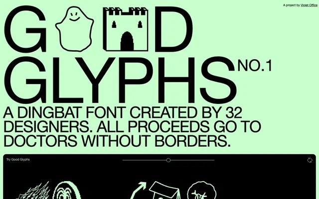
Preview image. Unlock full-res
Neon Playbill on Black Canvas
Color palette
Page background, light surfaces, interactive element highlights, and active text on dark backgrounds
Primary text, deep background for cards and interactive components, borders for all elements, and the base color for all UI controls
Input text and subtle input borders, a slightly lighter variant of Midnight Ink used for specific form fields
Typography
- Weights
- 300, 400
- Sizes
- 13px, 14px, 28px, 288px
- Line height
- 0.8, 1.2, 1.5
- Letter spacing
- -0.0300em
- Fallback
- Arial
Body copy, links, general text, and some headings. The tight letter-spacing gives it a compact, modern feel.
- Weights
- 400
- Sizes
- 288px
- Line height
- 1, 1.2
- Letter spacing
- normal
- Fallback
- System icons (fallback)
Primary display font for decorative glyphs and large, impactful visual statements.
Spacing & shape
Components
Text: Midnight Ink (#000000), Helvetica Neue, 4px padding (top, right, left), 1px (bottom). Border: 1px solid Midnight Ink (#000000). Background: transparent. Border-radius: 10% (for square buttons), 140px (for pill-shaped buttons).
Text: Ghostly Green (#c7ffcd), Helvetica Neue. Background: Midnight Ink (#000000). Padding: 4px (top, right, left), 1px (bottom). Border: 1px solid Midnight Ink (#000000). Border-radius: 10% (for square buttons).
Text: Midnight Ink (#000000), Helvetica Neue. Background: Ghostly Green (#c7ffcd). Border: 1px solid Midnight Ink (#000000). Border-radius: 140px. Padding (implicit): 0px — relies on intrinsic text spacing.
Background: Midnight Ink (#000000). Border-radius: 14px. Padding-bottom: 42px. No box shadow.
Text: Midnight Ink (#000000), Helvetica Neue. Background: transparent. Border: 1px solid Midnight Ink (#000000) on top. Border-radius: 0px. No padding defined by component; relies on content.
Text: Slate Text (#101010), Helvetica Neue. Background: transparent. Border: 1px solid Slate Text (#101010) on top. Border-radius: 0px. No padding defined by component; relies on content.
Guidelines
- Prioritize Midnight Ink (#000000) for all text and UI outlines against Ghostly Green (#c7ffcd) backgrounds for maximum contrast.
- Apply a generous border-radius of 140px for all button shapes that are pill-like, and 14px for cards and container corners.
- Use Helvetica Neue with -0.0300em letter-spacing for all body text and secondary headings to maintain a dense, compact feel.
- Employ the 'good-glyphs' font strictly for large, decorative, glyph-based display elements.
- Use 4px as the foundational unit for small element spacing, such as padding inside buttons.
- Ensure all interactive elements reverse their color scheme upon activation, for example, from Ghostly Green text on Midnight Ink background to Midnight Ink text on Ghostly Green background.
- Utilize 14px for vertical spacing between smaller content blocks or lists, and 84px for large section separation.
- Avoid using gradients or complex box-shadows; maintain a flat, high-contrast aesthetic.
- Do not introduce additional color beyond Ghostly Green, Midnight Ink, and Slate Text, except where specific brand assets necessitate it.
- Do not vary the letter-spacing for Helvetica Neue beyond -0.0300em unless specifically for the 'good-glyphs' display font.
- Avoid complex layouts; favor centered content stacks or simple grid structures.
- Do not use subtle elevation cues like soft shadows; interaction should be indicated through color changes or strong borders.
- Do not use the 'good-glyphs' font for standard body text or headings due to its decorative nature.
- Avoid padding within input elements where default browser styles are visually sufficient; rely on the minimal border emphasis.
About this system
ShowHide
Good Glyphs embraces a stark, high-contrast aesthetic, juxtaposing a vibrant, almost neon green background with severe black text and containers. Typography is a dominant visual element, using an ultra-large, compressed sans-serif for headlines that conveys an irreverent, playful attitude. Interface elements are minimal, relying on strong borders and generous radii, with interactive states signaled primarily through color inversion rather than complex shadows or gradients. The overall atmosphere is punchy, high-energy, and digital-native.
The page primarily uses a full-bleed layout, taking advantage of the large background color. The hero section is characterized by ultra-large, compressed typography layered directly onto the background, followed by a contrasting full-width dark section. Content then alternates between a max-width centered stack for body text and a three-column grid for 'Contributors' cards, maintaining consistent vertical spacing. Navigation is minimal, consisting of a sticky top-right link.
The site primarily uses custom dingbat-style vector illustrations from the 'good-glyphs' font. These are graphic, black-and-white, outline icons with a quirky, playful, and sometimes abstract aesthetic. They are used decoratively within card components, demonstrating the font's content. There are no photographs or complex 3D renders; the visual emphasis is on stylized, flat vector art.
Reminiscent of Fonts In Use, Brutalism.website, The Brand Identity, Supremo.
# Good Glyphs — Style Reference
> Neon Playbill on Black Canvas

**Theme:** light

**Site:** https://goodglyphs.com

Good Glyphs embraces a stark, high-contrast aesthetic, juxtaposing a vibrant, almost neon green background with severe black text and containers. Typography is a dominant visual element, using an ultra-large, compressed sans-serif for headlines that conveys an irreverent, playful attitude. Interface elements are minimal, relying on strong borders and generous radii, with interactive states signaled primarily through color inversion rather than complex shadows or gradients. The overall atmosphere is punchy, high-energy, and digital-native.

## Tokens — Colors

| Name | Value | Token | Role |
|------|------|------|------|
| Ghostly Green | `#c7ffcd` | `--color-ghostly-green` | Page background, light surfaces, interactive element highlights, and active text on dark backgrounds |
| Midnight Ink | `#000000` | `--color-midnight-ink` | Primary text, deep background for cards and interactive components, borders for all elements, and the base color for all UI controls |
| Slate Text | `#101010` | `--color-slate-text` | Input text and subtle input borders, a slightly lighter variant of Midnight Ink used for specific form fields |

## Tokens — Typography

### Helvetica Neue
- **Substitute:** Arial
- **Weights:** 300, 400
- **Sizes:** 13px, 14px, 28px, 288px
- **Line height:** 0.8, 1.2, 1.5
- **Letter spacing:** -0.0300em
- **Role:** Body copy, links, general text, and some headings. The tight letter-spacing gives it a compact, modern feel.

### good-glyphs
- **Substitute:** System icons (fallback)
- **Weights:** 400
- **Sizes:** 288px
- **Line height:** 1, 1.2
- **Letter spacing:** normal
- **Role:** Primary display font for decorative glyphs and large, impactful visual statements.

## Tokens — Type Scale

| Role | Size | Line height | Letter spacing |
|------|------|------|------|
| caption | 13px | 1.5 | -0.39px |
| heading | 28px | 1.2 | -0.84px |
| display | 288px | 0.8 | -8.64px |

## Tokens — Spacing

- **Section gap:** 84px
- **Card padding:** 42px
- **Element gap:** 4px

## Tokens — Radius

- **Buttons:** 140px
- **Cards:** 14px
- **other:** 14px

## Layout

The page primarily uses a full-bleed layout, taking advantage of the large background color. The hero section is characterized by ultra-large, compressed typography layered directly onto the background, followed by a contrasting full-width dark section. Content then alternates between a max-width centered stack for body text and a three-column grid for 'Contributors' cards, maintaining consistent vertical spacing. Navigation is minimal, consisting of a sticky top-right link.

## Imagery

The site primarily uses custom dingbat-style vector illustrations from the 'good-glyphs' font. These are graphic, black-and-white, outline icons with a quirky, playful, and sometimes abstract aesthetic. They are used decoratively within card components, demonstrating the font's content. There are no photographs or complex 3D renders; the visual emphasis is on stylized, flat vector art.

## Components

### Default Button
*Standard interactive element with minimal styling.*

Text: Midnight Ink (#000000), Helvetica Neue, 4px padding (top, right, left), 1px (bottom). Border: 1px solid Midnight Ink (#000000). Background: transparent. Border-radius: 10% (for square buttons), 140px (for pill-shaped buttons).

### Inverted Button
*Action-oriented button with high contrast.*

Text: Ghostly Green (#c7ffcd), Helvetica Neue. Background: Midnight Ink (#000000). Padding: 4px (top, right, left), 1px (bottom). Border: 1px solid Midnight Ink (#000000). Border-radius: 10% (for square buttons).

### Download Button
*Primary call to action.*

Text: Midnight Ink (#000000), Helvetica Neue. Background: Ghostly Green (#c7ffcd). Border: 1px solid Midnight Ink (#000000). Border-radius: 140px. Padding (implicit): 0px — relies on intrinsic text spacing.

### Contributor Card
*Displays individual entries for designers.*

Background: Midnight Ink (#000000). Border-radius: 14px. Padding-bottom: 42px. No box shadow.

### Text Input (Default)
*Basic text input field.*

Text: Midnight Ink (#000000), Helvetica Neue. Background: transparent. Border: 1px solid Midnight Ink (#000000) on top. Border-radius: 0px. No padding defined by component; relies on content.

### Text Input (Active)
*Text input field in a focused or active state.*

Text: Slate Text (#101010), Helvetica Neue. Background: transparent. Border: 1px solid Slate Text (#101010) on top. Border-radius: 0px. No padding defined by component; relies on content.

## Guidelines

### Do

- Prioritize Midnight Ink (#000000) for all text and UI outlines against Ghostly Green (#c7ffcd) backgrounds for maximum contrast.
- Apply a generous border-radius of 140px for all button shapes that are pill-like, and 14px for cards and container corners.
- Use Helvetica Neue with -0.0300em letter-spacing for all body text and secondary headings to maintain a dense, compact feel.
- Employ the 'good-glyphs' font strictly for large, decorative, glyph-based display elements.
- Use 4px as the foundational unit for small element spacing, such as padding inside buttons.
- Ensure all interactive elements reverse their color scheme upon activation, for example, from Ghostly Green text on Midnight Ink background to Midnight Ink text on Ghostly Green background.
- Utilize 14px for vertical spacing between smaller content blocks or lists, and 84px for large section separation.

### Don't

- Avoid using gradients or complex box-shadows; maintain a flat, high-contrast aesthetic.
- Do not introduce additional color beyond Ghostly Green, Midnight Ink, and Slate Text, except where specific brand assets necessitate it.
- Do not vary the letter-spacing for Helvetica Neue beyond -0.0300em unless specifically for the 'good-glyphs' display font.
- Avoid complex layouts; favor centered content stacks or simple grid structures.
- Do not use subtle elevation cues like soft shadows; interaction should be indicated through color changes or strong borders.
- Do not use the 'good-glyphs' font for standard body text or headings due to its decorative nature.
- Avoid padding within input elements where default browser styles are visually sufficient; rely on the minimal border emphasis.

## Agent Prompt Guide

Quick Color Reference:
text: #000000
background: #c7ffcd
border: #000000
accent: #c7ffcd
primary action: #c7ffcd (filled action)

Example Component Prompts:
1. Create a hero section: 'Ghostly Green' background (#c7ffcd). Headline (good-glyphs, weight 400, 288px, lineHeight 0.8, normal letter-spacing, Midnight Ink #000000). Subtitle (Helvetica Neue, weight 400, 28px, lineHeight 1.2, -0.0300em letter-spacing, Midnight Ink #000000).
2. Create a 'Download' button: Background 'Ghostly Green' (#c7ffcd), text 'Midnight Ink' (#000000), 'Helvetica Neue' font, 140px border-radius, 1px solid 'Midnight Ink' border. Text should be 'Donate & Download'.
3. Create a 'Contributor' card: 'Midnight Ink' background (#000000), 14px border-radius, padding-bottom 42px. Inside, place a 'Good Glyphs' icon (good-glyphs font, 288px, Midnight Ink #000000) and Helvetica Neue body text (14px, #c7ffcd, -0.0300em letter-spacing) for designer name.
4. Create a money input field with a label '$$$': Text input (Helvetica Neue, 14px, Slate Text #101010) with transparent background and a 1px solid Slate Text border only on top. Label '$$$' (Helvetica Neue, 14px, Midnight Ink #000000).
More like this









Keep what you find
A free account saves references to boards and can send you a weekly email of picks based on what you save.
To see every result, go Pro.