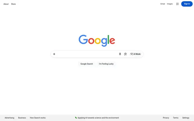
Preview image. Unlock full-res
Portal to infinity. A singular, perfectly centered input field suspended in a vast white void.
Color palette
Primary branded interactive states and active links
Legacy interaction and text-based link states
Primary text, iconography, and high-emphasis borders
Main page background and interface containers
Secondary surface background for nested UI elements
High-contrast input borders and status indicators
Soft dividers and inactive field outlines
Typography
- Weights
- 400
- Sizes
- 14px
- Line height
- 1.2
Roboto — detected in extracted data but not described by AI
- Weights
- 400, 500
- Sizes
- 14px, 16px
- Line height
- 1.2, 1.38, 1.43
- Fallback
- Arial, Helvetica, sans-serif
Body, navigation, and input text; these system fonts provide a predictable, utilitarian reading experience.
- Weights
- 400
- Sizes
- 13px
- Line height
- 1.85
arial — detected in extracted data but not described by AI
- Weights
- 500
- Sizes
- 14px
- Line height
- 1.29
Google Sans Text — detected in extracted data but not described by AI
Spacing & shape
Components
Full-width or centered search bar with 0px radius, 14px top padding. Border #000000, color #1f1f1f. Focus on a flat, non-elevated appearance.
Background #0b57d0 (or transparent for ghost variants), 100px border-radius, 16px padding on left/right for a soft, communicative shape.
14px font size, 400 weight, #1f1f1f color. 4px padding for a compact, non-intrusive footprint.
Guidelines
- Use 100px border-radius for all interactive buttons to maintain the signature pill aesthetic.
- Prioritize #1f1f1f text over pure #000000 for body content to reduce visual fatigue.
- Maintain a maximum of 4px-8px for internal component margins to ensure a compact, responsive feel.
- Use centered layout structures for main utility areas to focus user gaze.
- Ensure all primary actions use the #0b57d0 blue for color-consistency across interaction states.
- Do not use drop shadows; rely on border color shifts (#dadce0) to define containers.
- Do not exceed two weight variants of the primary font (400 and 500) within a single view.
- Do not use saturated brand colors for decorative elements; brand color is for function only.
- Do not use font sizes smaller than 13px.
- Do not use gradients; maintain a flat, monochromatic aesthetic.
About this system
ShowHide
A paradigm of hyper-functional utility where the interface exists solely to disappear, leaving the content in focus. The design utilizes a high-contrast neutral palette anchored by #1f1f1f text on a pure #ffffff canvas, establishing a clinical, high-clarity environment. Signature pill-shaped interactive containers (100px radius) create a sense of singular, precise intent, while the lack of harsh shadows emphasizes a flat, multi-layered information architecture. Visual hierarchy is achieved through monochromatic weight changes and targeted use of 14px and 16px font sizes, creating a system that feels weightless and instantaneous.
Centered, max-width contained layout. Primary focus is a 'hero' central stack in the middle of the viewport. Sections are organized with minimal vertical spacing (36px gaps), creating a 'vertical stream' experience. Navigation is pinned to extreme corners of the viewport.
Usage is strictly limited. Imagery is only employed for functional content representation (icons, logos). Visuals appear in contained, flat formats without shadows or complex masks. Icons are monochrome (#1f1f1f) and low-fidelity to ensure they remain secondary to text-based inputs.
Reminiscent of DuckDuckGo, Bing, Startpage.
# Google — Style Reference
> Portal to infinity. A singular, perfectly centered input field suspended in a vast white void.

**Theme:** light

**Site:** https://google.com

A paradigm of hyper-functional utility where the interface exists solely to disappear, leaving the content in focus. The design utilizes a high-contrast neutral palette anchored by #1f1f1f text on a pure #ffffff canvas, establishing a clinical, high-clarity environment. Signature pill-shaped interactive containers (100px radius) create a sense of singular, precise intent, while the lack of harsh shadows emphasizes a flat, multi-layered information architecture. Visual hierarchy is achieved through monochromatic weight changes and targeted use of 14px and 16px font sizes, creating a system that feels weightless and instantaneous.

## Tokens — Colors

| Name | Value | Token | Role |
|------|------|------|------|
| Classic Blue | `#0b57d0` | `--color-classic-blue` | Primary branded interactive states and active links |
| Link Violet | `#1a0dab` | `--color-link-violet` | Legacy interaction and text-based link states |
| Carbon Text | `#1f1f1f` | `--color-carbon-text` | Primary text, iconography, and high-emphasis borders |
| Canvas White | `#ffffff` | `--color-canvas-white` | Main page background and interface containers |
| Stone Gray | `#f8f9fa` | `--color-stone-gray` | Secondary surface background for nested UI elements |
| Ink Stroke | `#000000` | `--color-ink-stroke` | High-contrast input borders and status indicators |
| Steel Border | `#dadce0` | `--color-steel-border` | Soft dividers and inactive field outlines |

## Tokens — Typography

### Roboto
- **Weights:** 400
- **Sizes:** 14px
- **Line height:** 1.2
- **Role:** Roboto — detected in extracted data but not described by AI

### Google Sans / Roboto
- **Substitute:** Arial, Helvetica, sans-serif
- **Weights:** 400, 500
- **Sizes:** 14px, 16px
- **Line height:** 1.2, 1.38, 1.43
- **Role:** Body, navigation, and input text; these system fonts provide a predictable, utilitarian reading experience.

### arial
- **Weights:** 400
- **Sizes:** 13px
- **Line height:** 1.85
- **Role:** arial — detected in extracted data but not described by AI

### Google Sans Text
- **Weights:** 500
- **Sizes:** 14px
- **Line height:** 1.29
- **Role:** Google Sans Text — detected in extracted data but not described by AI

## Tokens — Type Scale

| Role | Size | Line height | Letter spacing |
|------|------|------|------|
| caption | 13px | 1.85 | — |

## Tokens — Spacing

- **Max width:** 1200px
- **Section gap:** 36px
- **Card padding:** 16px
- **Element gap:** 15px

## Tokens — Radius

- **Buttons:** 100px
- **Cards:** 8px
- **navigation:** 100px

## Layout

Centered, max-width contained layout. Primary focus is a 'hero' central stack in the middle of the viewport. Sections are organized with minimal vertical spacing (36px gaps), creating a 'vertical stream' experience. Navigation is pinned to extreme corners of the viewport.

## Imagery

Usage is strictly limited. Imagery is only employed for functional content representation (icons, logos). Visuals appear in contained, flat formats without shadows or complex masks. Icons are monochrome (#1f1f1f) and low-fidelity to ensure they remain secondary to text-based inputs.

## Components

### Google Search Bar

### Sign In Button + Pill Button Group

### Footer Link Bar

### Main Search Input
*Central user entry point*

Full-width or centered search bar with 0px radius, 14px top padding. Border #000000, color #1f1f1f. Focus on a flat, non-elevated appearance.

### Pill Button
*Primary action button*

Background #0b57d0 (or transparent for ghost variants), 100px border-radius, 16px padding on left/right for a soft, communicative shape.

### Navigation Tab
*Section links*

14px font size, 400 weight, #1f1f1f color. 4px padding for a compact, non-intrusive footprint.

## Guidelines

### Do

- Use 100px border-radius for all interactive buttons to maintain the signature pill aesthetic.
- Prioritize #1f1f1f text over pure #000000 for body content to reduce visual fatigue.
- Maintain a maximum of 4px-8px for internal component margins to ensure a compact, responsive feel.
- Use centered layout structures for main utility areas to focus user gaze.
- Ensure all primary actions use the #0b57d0 blue for color-consistency across interaction states.

### Don't

- Do not use drop shadows; rely on border color shifts (#dadce0) to define containers.
- Do not exceed two weight variants of the primary font (400 and 500) within a single view.
- Do not use saturated brand colors for decorative elements; brand color is for function only.
- Do not use font sizes smaller than 13px.
- Do not use gradients; maintain a flat, monochromatic aesthetic.

## Agent Prompt Guide

Quick Color Reference: Text(#1f1f1f), Background(#ffffff), PrimaryAction(#0b57d0), Border(#dadce0). Example 1: 'Create a search input: 0px border-radius, 1px solid #1f1f1f border, 14px top/bottom padding, #1f1f1f text color.' Example 2: 'Create a rounded button: 100px radius, 16px padding horizontal, background #0b57d0, white text, 14px Google Sans font.'
More like this








Keep what you find
A free account saves references to boards and can send you a weekly email of picks based on what you save.
To see every result, go Pro.