Preview image. Unlock full-res
Deep charcoal, subtle glow
Color palette
Supporting palette color for small decorative accents when the core palette needs contrast.
Outlined button borders, active link text, and highlights. This blue signifies interactive elements
Borders for AI-related components, distinguishing specific features
Blue wash for highlight backgrounds, decorative bands, and soft emphasis behind content. Do not promote it to the primary CTA color
Primary page background, base surface for all content
Slightly lighter surface for secondary components like cards or elevated sections, creating a subtle layer distinction
Background for cards and interactive elements, providing a clear boundary against the darker canvas
Background for neutral filled buttons, offering a muted interactive element
Mid-tone panel surface for subdued dark UI layers and secondary containers. Do not promote it to the primary CTA color
Subtle borders and dividers, providing minimal separation without drawing attention
Main body text, headings, and icon fills, offering high contrast against dark backgrounds
Secondary text, descriptive labels, and inactive states, less prominent than primary text
Typography
- Weights
- 400, 500
- Sizes
- 14px, 16px, 28px
- Line height
- 1.2, 1.29, 1.38, 1.43
- Letter spacing
- 0.0140em
- Fallback
- Roboto, sans-serif
Used for main interactive elements like buttons, prominent body text, and some headings. Its clean aesthetic maintains readability on dark backgrounds.
- Weights
- 500
- Sizes
- 14px
- Line height
- 1.29
- Letter spacing
- normal
- Fallback
- Roboto, sans-serif
Specifically used for navigation items, providing a distinct textual style for top-level interactions.
- Weights
- 400
- Sizes
- 12px, 13px, 14px
- Line height
- 1.2, 1.43, 1.85, 2.15
- Letter spacing
- 0.0140em
- Fallback
- Helvetica Neue, sans-serif
General purpose text for links, secondary information, and small body content. Its system-level availability ensures broad compatibility.
Spacing & shape
Elevation
Components
Transparent background, Primary Text color (#e8e8e8) for text and border. No padding or border-radius specified globally, implies context-specific sizing or minimal inherent styling.
Background Button Gray (#303134), text Primary Text (#e8e8e8), 8px border-radius, 16px horizontal padding.
Transparent background, AI Blue (#99c3ff) text, 9999px border-radius making it a pill shape, no intrinsic padding beyond content.
Transparent background, AI Blue (#99c3ff) for icon fill and border, 50% border-radius for a circular shape, 8px padding.
Transparent background, Primary Text (#e8e8e8) for text and border, no border-radius. Padding of 14px top. Note: the actual search bar has a rounded card container around this.
Background Graphite Card (#22242a), 16px border-radius, soft elevation shadow rgba(0, 0, 0, 0.2) 0px 2px 10px 0px.
Guidelines
- Always use Carbon Canvas (#0e0e11) as the base background for pages and main sections.
- Layer content using Graphite Card (#22242a) for containers and interactive fields, contrasted with Button Gray (#303134) for filled neutral buttons.
- Reserve Google Blue (#99c3ff) for primary interactive outlines and active text links.
- Apply the AI Mode Gradient for any 'AI Mode' components to maintain brand recognition.
- Use Primary Text (#e8e8e8) for all main text elements to ensure high readability on dark backgrounds.
- Maintain a comfortable density with 15px element gaps for most inline content and 20px for section spacing.
- Ensure all buttons use an 8px border-radius, unless specifically intended for a pill shape (9999px).
- Do not introduce light backgrounds; the system is strictly dark mode.
- Avoid excessive use of color; only use accent colors for functional highlights or branded elements.
- Do not deviate from the specified typography families; use Google Sans for prominent text and Arial for utility.
- Do not create new shadow styles; limit elevation to the single defined card shadow.
- Avoid custom border-radii; adhere to the 8px, 16px, 26px, 100px, or 9999px values.
- Do not blend text colors; avoid shades between Primary Text (#e8e8e8) and Muted Text (#9e9e9e) unless defined.
About this system
ShowHide
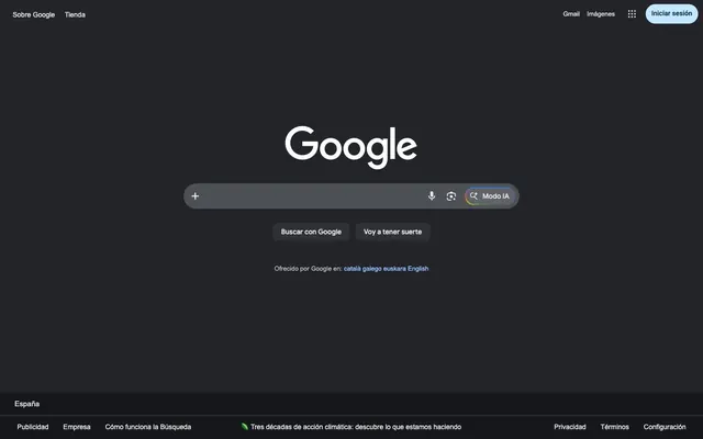
The Google design system is a 'dark mode first' experience with a substantial canvas of deep charcoal and highly subtle surface differentiation. Interaction elements are clearly defined through achromatic outlines and fills, while a carefully restrained use of vibrant, multi-hued gradients and blue accents provides bursts of visual interest for key actions and branding. Typography is generally clean and monochromatic, appearing as crisp white against dark surfaces, relying on weight and size for hierarchy. The overall feel is one of understated functionality and quiet efficiency.
The layout follows a contained, centered model, likely with a flexible max-width, though not explicitly defined. The hero section is dominated by the centered Google logo and search bar, occupying significant vertical space. Below the main search interaction, content appears to be stacked vertically, with consistent vertical spacing between distinct content blocks. The footer is a full-bleed dark strip, providing global navigation and legal information. There's an underlying grid for discrete elements like suggestion buttons, but the overall presentation is text-dominant with functional UI components guiding interaction rather than complex visual arrangements.
This design system uses a minimal visual language for imagery, primarily relying on small, functional icons rather than large graphics or photography. The icons are typically monochrome, matching the Primary Text color (#e8e8e8), creating a sense of clarity and utility. There's a notable exception in the 'Modo IA' button, which features a multi-colored gradient icon as a distinct brand element. Overall, visual density is low, with imagery serving as clear, concise functional indicators rather than decorative elements.
Reminiscent of DuckDuckGo, Bing (Dark Mode), Notion (Dark Mode).
# Google — Style Reference
> Deep charcoal, subtle glow

**Theme:** dark

**Site:** https://manetatoulian.com

The Google design system is a 'dark mode first' experience with a substantial canvas of deep charcoal and highly subtle surface differentiation. Interaction elements are clearly defined through achromatic outlines and fills, while a carefully restrained use of vibrant, multi-hued gradients and blue accents provides bursts of visual interest for key actions and branding. Typography is generally clean and monochromatic, appearing as crisp white against dark surfaces, relying on weight and size for hierarchy. The overall feel is one of understated functionality and quiet efficiency.

## Tokens — Colors

| Name | Value | Token | Role |
|------|------|------|------|
| AI Mode Gradient | `#34a853` | `--color-ai-mode-gradient` | Supporting palette color for small decorative accents when the core palette needs contrast. |
| Google Blue | `#99c3ff` | `--color-google-blue` | Outlined button borders, active link text, and highlights. This blue signifies interactive elements |
| AI Blue | `#a8c7fa` | `--color-ai-blue` | Borders for AI-related components, distinguishing specific features |
| Blue Header Accent | `#c2e7ff` | `--color-blue-header-accent` | Blue wash for highlight backgrounds, decorative bands, and soft emphasis behind content. Do not promote it to the primary CTA color |
| Carbon Canvas | `#0e0e11` | `--color-carbon-canvas` | Primary page background, base surface for all content |
| Steel Surface | `#16171a` | `--color-steel-surface` | Slightly lighter surface for secondary components like cards or elevated sections, creating a subtle layer distinction |
| Graphite Card | `#22242a` | `--color-graphite-card` | Background for cards and interactive elements, providing a clear boundary against the darker canvas |
| Button Gray | `#303134` | `--color-button-gray` | Background for neutral filled buttons, offering a muted interactive element |
| Ghost Outline | `#4d5156` | `--color-ghost-outline` | Mid-tone panel surface for subdued dark UI layers and secondary containers. Do not promote it to the primary CTA color |
| Subtle Ash | `#444746` | `--color-subtle-ash` | Subtle borders and dividers, providing minimal separation without drawing attention |
| Primary Text | `#e8e8e8` | `--color-primary-text` | Main body text, headings, and icon fills, offering high contrast against dark backgrounds |
| Muted Text | `#9e9e9e` | `--color-muted-text` | Secondary text, descriptive labels, and inactive states, less prominent than primary text |

## Tokens — Typography

### Google Sans
- **Substitute:** Roboto, sans-serif
- **Weights:** 400, 500
- **Sizes:** 14px, 16px, 28px
- **Line height:** 1.2, 1.29, 1.38, 1.43
- **Letter spacing:** 0.0140em
- **Role:** Used for main interactive elements like buttons, prominent body text, and some headings. Its clean aesthetic maintains readability on dark backgrounds.

### Google Sans Text
- **Substitute:** Roboto, sans-serif
- **Weights:** 500
- **Sizes:** 14px
- **Line height:** 1.29
- **Letter spacing:** normal
- **Role:** Specifically used for navigation items, providing a distinct textual style for top-level interactions.

### Arial
- **Substitute:** Helvetica Neue, sans-serif
- **Weights:** 400
- **Sizes:** 12px, 13px, 14px
- **Line height:** 1.2, 1.43, 1.85, 2.15
- **Letter spacing:** 0.0140em
- **Role:** General purpose text for links, secondary information, and small body content. Its system-level availability ensures broad compatibility.

## Tokens — Type Scale

Perfect Fifth (1.5) from 12px base.

| Role | Size | Line height | Letter spacing |
|------|------|------|------|
| caption | 12px | 1.43 | 0.014em |
| body-lg | 14px | 1.43 | 0.014em |
| heading | 28px | 1.2 | — |

## Tokens — Spacing

- **Section gap:** 20px
- **Card padding:** 14px
- **Element gap:** 15px

## Tokens — Radius

- **Buttons:** 8px
- **Cards:** 16px
- **pill:** 9999px
- **searchBarInner:** 100px
- **searchBarMain:** 26px

## Tokens — Elevation

- **Card Container:** `rgba(0, 0, 0, 0.2) 0px 2px 10px 0px`

## Layout

The layout follows a contained, centered model, likely with a flexible max-width, though not explicitly defined. The hero section is dominated by the centered Google logo and search bar, occupying significant vertical space. Below the main search interaction, content appears to be stacked vertically, with consistent vertical spacing between distinct content blocks. The footer is a full-bleed dark strip, providing global navigation and legal information. There's an underlying grid for discrete elements like suggestion buttons, but the overall presentation is text-dominant with functional UI components guiding interaction rather than complex visual arrangements.

## Imagery

This design system uses a minimal visual language for imagery, primarily relying on small, functional icons rather than large graphics or photography. The icons are typically monochrome, matching the Primary Text color (#e8e8e8), creating a sense of clarity and utility. There's a notable exception in the 'Modo IA' button, which features a multi-colored gradient icon as a distinct brand element. Overall, visual density is low, with imagery serving as clear, concise functional indicators rather than decorative elements.

## Components

### Neutral Ghost Button
*Standard interactive element for secondary actions.*

Transparent background, Primary Text color (#e8e8e8) for text and border. No padding or border-radius specified globally, implies context-specific sizing or minimal inherent styling.

### Filled Action Button
*Primary or emphasized action. Default subtle fill.*

Background Button Gray (#303134), text Primary Text (#e8e8e8), 8px border-radius, 16px horizontal padding.

### AI Mode Pill Button
*Distinctive button for AI-related features.*

Transparent background, AI Blue (#99c3ff) text, 9999px border-radius making it a pill shape, no intrinsic padding beyond content.

### Circular Icon Button
*Small, interactive element for icons.*

Transparent background, AI Blue (#99c3ff) for icon fill and border, 50% border-radius for a circular shape, 8px padding.

### Search Input Field
*Main interaction point for search queries.*

Transparent background, Primary Text (#e8e8e8) for text and border, no border-radius. Padding of 14px top. Note: the actual search bar has a rounded card container around this.

### Large Search Container Card
*Container for the central search input and related elements.*

Background Graphite Card (#22242a), 16px border-radius, soft elevation shadow rgba(0, 0, 0, 0.2) 0px 2px 10px 0px.

## Guidelines

### Do

- Always use Carbon Canvas (#0e0e11) as the base background for pages and main sections.
- Layer content using Graphite Card (#22242a) for containers and interactive fields, contrasted with Button Gray (#303134) for filled neutral buttons.
- Reserve Google Blue (#99c3ff) for primary interactive outlines and active text links.
- Apply the AI Mode Gradient for any 'AI Mode' components to maintain brand recognition.
- Use Primary Text (#e8e8e8) for all main text elements to ensure high readability on dark backgrounds.
- Maintain a comfortable density with 15px element gaps for most inline content and 20px for section spacing.
- Ensure all buttons use an 8px border-radius, unless specifically intended for a pill shape (9999px).

### Don't

- Do not introduce light backgrounds; the system is strictly dark mode.
- Avoid excessive use of color; only use accent colors for functional highlights or branded elements.
- Do not deviate from the specified typography families; use Google Sans for prominent text and Arial for utility.
- Do not create new shadow styles; limit elevation to the single defined card shadow.
- Avoid custom border-radii; adhere to the 8px, 16px, 26px, 100px, or 9999px values.
- Do not blend text colors; avoid shades between Primary Text (#e8e8e8) and Muted Text (#9e9e9e) unless defined.

## Agent Prompt Guide

Quick Color Reference:
text: #e8e8e8
background: #0e0e11
border: #4d5156
accent: #99c3ff
primary action: #303134 (filled action)

Example Component Prompts:
1. Create a Primary Action Button: #303134 background, #e8e8e8 text, 9999px radius, compact pill padding. Use this filled treatment for the main CTA.
2. Create a filled button: Use a Filled Action Button with Button Gray (#303134) background, Primary Text (#e8e8e8) text, 8px border-radius, and 16px horizontal padding.
3. Create an AI Mode button: Use an AI Mode Pill Button with transparent background, AI Blue (#99c3ff) text, and conic-gradient(rgba(49, 134, 255, 0) 0deg, rgb(52, 168, 83) 43deg, rgb(255, 211, 20) 65deg, rgb(255, 70, 65) 105deg, rgb(49, 134, 255) 144deg, rgb(49, 134, 255) 180deg, rgba(49, 134, 255, 0) 324deg, rgba(49, 134, 255, 0) 360deg) for its gradient branding.
More like this








Keep what you find
A free account saves references to boards and can send you a weekly email of picks based on what you save.
To see every result, go Pro.