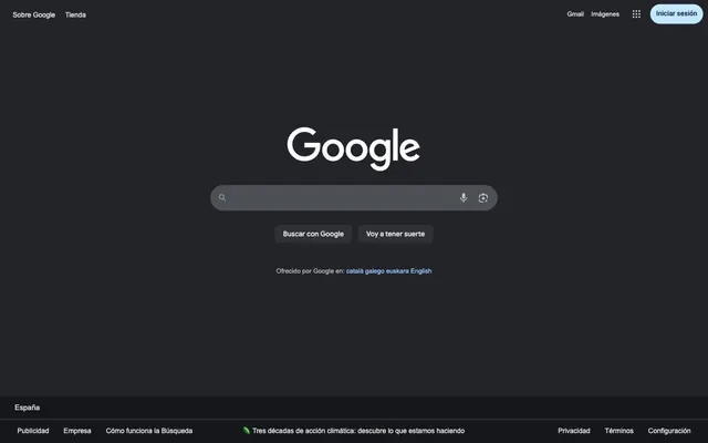
Preview image. Unlock full-res
Midnight terminal, functional luminance.
Color palette
Link text, outlined button borders, key accent elements indicating interactability
Blue wash for highlight backgrounds, decorative bands, and soft emphasis behind content. Do not promote it to the primary CTA color
Page and section backgrounds, base canvas
Button backgrounds, elevated surfaces, search input background
Mid-tone panel surface for subdued dark UI layers and secondary containers. Do not promote it to the primary CTA color
Primary text color for headlines and interface labels, icon fills, prominent borders
Secondary text, muted helper text, inactive icon fills
Mid-level neutral text, decorative fills, subtle borders
Typography
- Weights
- 400
- Sizes
- 13px, 14px, 15px
- Line height
- 1.2, 1.43, 1.85, 2.15
- Fallback
- system-ui
Body copy, navigation links, secondary labels, button text. Provides clear, utilitarian readability.
- Weights
- 400, 500
- Sizes
- 14px, 16px
- Line height
- 1.2, 1.38
- Fallback
- Roboto, Noto Sans
Brand-specific headings, significant interface elements, search input text. Its custom curves lend a distinct, approachable, yet authoritative feel.
- Weights
- 500
- Sizes
- 14px
- Line height
- 1.29
- Fallback
- Roboto, Noto Sans
Navigation items with slightly more emphasis. Complements Google Sans with a friendly, readable clarity for interactive labels.
Spacing & shape
Components
Features a Charcoal Grey (#303134) background with Silver Mist (#e8e8e8) text and a large 26px border-radius, giving it a friendly, prominent presence. Padding for input is 14px left and right, with 0px top/bottom, implying the height is controlled by content.
Uses a Charcoal Grey (#303134) background with Silver Mist (#e8e8e8) text, and 8px border-radius. Padding is 16px horizontal and no vertical padding, suggesting height is set by surrounding elements.
Text in Silver Mist (#e8e8e8) on a transparent background, 8px horizontal padding, 0px vertical padding. Focus/hover states may leverage Digital Blue for border or background.
Features a Digital Blue (#99c3ff) border, transparent background, and Digital Blue (#99c3ff) text for strong visual emphasis. It has a generous 100px border-radius creating a pill shape. 8px padding on all sides, often used for icons or smaller interactive elements.
Utilizes a Sky Highlight (#c2e7ff) background with a prominent border-radius of 100px creating a pill shape. The text color is Carbon Black (#16171a), offering high contrast for visibility, with 8px horizontal padding.
Guidelines
- Prioritize Carbon Black (#16171a) as the default background for all pages and sections to maintain the dark theme.
- Use Silver Mist (#e8e8e8) for primary text and important UI labels to ensure high contrast against dark backgrounds.
- Apply Charcoal Grey (#303134) for interactive component backgrounds, like buttons and input fields.
- Highlight interactive elements and links with Digital Blue (#99c3ff) for text color or borders.
- Ensure all buttons and interactive elements use a border-radius of either 8px for square forms, 26px for inputs, or 100px for pill shapes.
- Incorporate 15px as the standard elementGap for comfortable spacing between UI components.
- Use Arial, 400 weight for most body text and navigation, with sizes 13px, 14px, or 15px.
- Avoid using light backgrounds, as the system is anchored in a dark theme.
- Do not introduce additional saturated colors beyond Digital Blue (#99c3ff) without specific functional justification.
- Do not deviate from the established border-radius values; maintain 8px, 26px, or 100px for consistency.
- Avoid excessive use of shadows or gradients; rely on color and subtle surface changes for hierarchy.
- Do not use generic system fonts for branding elements; Google Sans and Google Sans Text are reserved for specific uses.
- Do not create dense layouts; maintain comfortable spacing with a base unit derived from 4px.
- Do not use generic blue for links if Digital Blue (#99c3ff) is specified for interactive highlights.
About this system
ShowHide
Google's dark-themed search interface embodies a 'midnight terminal' aesthetic, prioritizing clarity and direct interaction. It features a stark dark background, softened by subtle grays for surfaces and interactive elements. Typography is direct and functional, leveraging a system font for most content and custom faces for key brand elements. The design emphasizes clean, rounded forms for interactive components, punctuated by a single, prominent shade of blue that highlights active states and critical links without overwhelming the muted palette. The overall impression is one of efficiency and focused interaction, free from decorative flourishes.
The page structure is full-bleed, with content centered. The hero section features the brand logo and search bar centrally placed against the dark background. Sections generally follow a consistent vertical rhythm, with ample spacing between key interactive elements (elementGap: 15px). The layout avoids complex grid structures, opting instead for stacked, centered components within its contained width. Navigation elements are minimal, appearing in a top bar and a simple footer.
This design system primarily uses UI-driven visuals, with minimal imagery. Icons are monocolor, typically in Silver Mist (#e8e8e8) or Ash Grey (#9aa0a6), with a standard stroke weight, serving a purely functional and indicative role. Any potential photography or illustration would be secondary to the clean dark interface, likely contained, and treated to complement the muted palette rather than stand out vibrantly. The emphasis is on clarity and direct communication through UI elements, not decorative visuals.
Reminiscent of DuckDuckGo, Brave Search, Perplexity AI, Vercel.
# Google — Style Reference
> Midnight terminal, functional luminance.

**Theme:** dark

**Site:** https://orbita.coffee/en

Google's dark-themed search interface embodies a 'midnight terminal' aesthetic, prioritizing clarity and direct interaction. It features a stark dark background, softened by subtle grays for surfaces and interactive elements. Typography is direct and functional, leveraging a system font for most content and custom faces for key brand elements. The design emphasizes clean, rounded forms for interactive components, punctuated by a single, prominent shade of blue that highlights active states and critical links without overwhelming the muted palette. The overall impression is one of efficiency and focused interaction, free from decorative flourishes.

## Tokens — Colors

| Name | Value | Token | Role |
|------|------|------|------|
| Digital Blue | `#99c3ff` | `--color-digital-blue` | Link text, outlined button borders, key accent elements indicating interactability |
| Sky Highlight | `#c2e7ff` | `--color-sky-highlight` | Blue wash for highlight backgrounds, decorative bands, and soft emphasis behind content. Do not promote it to the primary CTA color |
| Carbon Black | `#16171a` | `--color-carbon-black` | Page and section backgrounds, base canvas |
| Charcoal Grey | `#303134` | `--color-charcoal-grey` | Button backgrounds, elevated surfaces, search input background |
| Graphite | `#4d5156` | `--color-graphite` | Mid-tone panel surface for subdued dark UI layers and secondary containers. Do not promote it to the primary CTA color |
| Silver Mist | `#e8e8e8` | `--color-silver-mist` | Primary text color for headlines and interface labels, icon fills, prominent borders |
| Ash Grey | `#9aa0a6` | `--color-ash-grey` | Secondary text, muted helper text, inactive icon fills |
| Cool Steel | `#bfbfbf` | `--color-cool-steel` | Mid-level neutral text, decorative fills, subtle borders |

## Tokens — Typography

### Arial
- **Substitute:** system-ui
- **Weights:** 400
- **Sizes:** 13px, 14px, 15px
- **Line height:** 1.2, 1.43, 1.85, 2.15
- **Role:** Body copy, navigation links, secondary labels, button text. Provides clear, utilitarian readability.

### Google Sans
- **Substitute:** Roboto, Noto Sans
- **Weights:** 400, 500
- **Sizes:** 14px, 16px
- **Line height:** 1.2, 1.38
- **Role:** Brand-specific headings, significant interface elements, search input text. Its custom curves lend a distinct, approachable, yet authoritative feel.

### Google Sans Text
- **Substitute:** Roboto, Noto Sans
- **Weights:** 500
- **Sizes:** 14px
- **Line height:** 1.29
- **Role:** Navigation items with slightly more emphasis. Complements Google Sans with a friendly, readable clarity for interactive labels.

## Tokens — Type Scale

Minor Second (1.067) from 15px base.

| Role | Size | Line height | Letter spacing |
|------|------|------|------|
| caption | 13px | 1.85 | — |
| body-sm | 14px | 1.85 | — |
| body | 15px | 1.85 | — |

## Tokens — Spacing

- **Section gap:** 40px
- **Card padding:** 16px
- **Element gap:** 15px

## Tokens — Radius

- **Buttons:** 8px
- **Inputs:** 26px
- **callToActions:** 100px
- **navItems:** 100px

## Layout

The page structure is full-bleed, with content centered. The hero section features the brand logo and search bar centrally placed against the dark background. Sections generally follow a consistent vertical rhythm, with ample spacing between key interactive elements (elementGap: 15px). The layout avoids complex grid structures, opting instead for stacked, centered components within its contained width. Navigation elements are minimal, appearing in a top bar and a simple footer.

## Imagery

This design system primarily uses UI-driven visuals, with minimal imagery. Icons are monocolor, typically in Silver Mist (#e8e8e8) or Ash Grey (#9aa0a6), with a standard stroke weight, serving a purely functional and indicative role. Any potential photography or illustration would be secondary to the clean dark interface, likely contained, and treated to complement the muted palette rather than stand out vibrantly. The emphasis is on clarity and direct communication through UI elements, not decorative visuals.

## Components

### Search Input Field
*Primary interactive element*

Features a Charcoal Grey (#303134) background with Silver Mist (#e8e8e8) text and a large 26px border-radius, giving it a friendly, prominent presence. Padding for input is 14px left and right, with 0px top/bottom, implying the height is controlled by content.

### Filled Search Button
*Direct action*

Uses a Charcoal Grey (#303134) background with Silver Mist (#e8e8e8) text, and 8px border-radius. Padding is 16px horizontal and no vertical padding, suggesting height is set by surrounding elements.

### Ghost Navigation Link
*Secondary navigation*

Text in Silver Mist (#e8e8e8) on a transparent background, 8px horizontal padding, 0px vertical padding. Focus/hover states may leverage Digital Blue for border or background.

### Accented Outlined Button
*Key interaction cue*

Features a Digital Blue (#99c3ff) border, transparent background, and Digital Blue (#99c3ff) text for strong visual emphasis. It has a generous 100px border-radius creating a pill shape. 8px padding on all sides, often used for icons or smaller interactive elements.

### Sign-In Button
*Authenticated interaction*

Utilizes a Sky Highlight (#c2e7ff) background with a prominent border-radius of 100px creating a pill shape. The text color is Carbon Black (#16171a), offering high contrast for visibility, with 8px horizontal padding.

## Guidelines

### Do

- Prioritize Carbon Black (#16171a) as the default background for all pages and sections to maintain the dark theme.
- Use Silver Mist (#e8e8e8) for primary text and important UI labels to ensure high contrast against dark backgrounds.
- Apply Charcoal Grey (#303134) for interactive component backgrounds, like buttons and input fields.
- Highlight interactive elements and links with Digital Blue (#99c3ff) for text color or borders.
- Ensure all buttons and interactive elements use a border-radius of either 8px for square forms, 26px for inputs, or 100px for pill shapes.
- Incorporate 15px as the standard elementGap for comfortable spacing between UI components.
- Use Arial, 400 weight for most body text and navigation, with sizes 13px, 14px, or 15px.

### Don't

- Avoid using light backgrounds, as the system is anchored in a dark theme.
- Do not introduce additional saturated colors beyond Digital Blue (#99c3ff) without specific functional justification.
- Do not deviate from the established border-radius values; maintain 8px, 26px, or 100px for consistency.
- Avoid excessive use of shadows or gradients; rely on color and subtle surface changes for hierarchy.
- Do not use generic system fonts for branding elements; Google Sans and Google Sans Text are reserved for specific uses.
- Do not create dense layouts; maintain comfortable spacing with a base unit derived from 4px.
- Do not use generic blue for links if Digital Blue (#99c3ff) is specified for interactive highlights.

## Agent Prompt Guide

**Quick Color Reference**
text: #e8e8e8
background: #16171a
border: #e8e8e8
accent: #99c3ff
primary action: #303134 (filled action)

**3-5 Example Component Prompts**
1. Create a primary search input component: Charcoal Grey (#303134) background, with a 26px border-radius, and Silver Mist (#e8e8e8) text using 'Google Sans', 14px, 400 weight. Include a 14px left padding.
2. Design a 'Search' button: Charcoal Grey (#303134) background, Silver Mist (#e8e8e8) text, 8px border-radius, and 16px horizontal padding. Font is 'Google Sans', 14px, 400 weight.
3. Implement a 'Sign In' button: Sky Highlight (#c2e7ff) background, Carbon Black (#16171a) text, 100px border-radius, 8px horizontal padding. Font is 'Google Sans Text', 14px, 500 weight.
4. Show a standard navigation link: Silver Mist (#e8e8e8) text, transparent background, Arial font, 13px, 400 weight, 8px horizontal padding.
More like this








Keep what you find
A free account saves references to boards and can send you a weekly email of picks based on what you save.
To see every result, go Pro.