Preview image. Unlock full-res
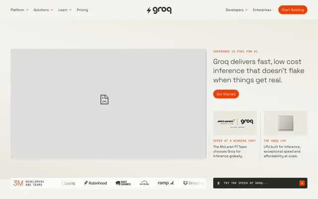
Precision orange glow on matte gray. Like a control panel's critical warning light in a sophisticated machine.
Color palette
Primary call-to-action buttons, active states, key interactive indicators — this vivid orange is the sole brand accent, demanding attention.
Darker shade of Neon Zest, used for hover states or subtle brand accents in darker contexts.
Decorative color for specific content sections, not interactive.
Minor decorative accent, borderline invisible in usage.
Primary text, headline color, dark surface backgrounds.
Page backgrounds, button text, elevated card surfaces.
Light background for sections and UI elements, subtle contrast against Canvas White.
Card backgrounds, slightly darker variant of Warm Mist for deeper partitioning.
Button backgrounds, dark elements, providing strong contrast.
Border colors, subtle dividers.
Secondary text, descriptive elements, lighter contrast against dark backgrounds.
Tertiary text, subtle UI elements, disabled states.
Typography
- Weights
- 300, 400
- Sizes
- 13px, 14px, 15px, 17px, 19px, 21px, 24px, 28px, 32px, 36px, 46px
- Line height
- 0.9, 1, 1.3, 1.4, 1.57
- Letter spacing
- -0.0200em
- Fallback
- system-ui, sans-serif
Primary typeface for all headings, body text, and UI elements. Its slightly condensed forms and negative letter-spacing for larger sizes contribute to a sleek, modern, yet readable presentation.
- Weights
- 400, 500
- Sizes
- 10px, 12px, 14px
- Line height
- 1.17, 1.2, 1.3, 1.4, 1.57
- Letter spacing
- 0.1000em
- Fallback
- monospace
Used for code snippets, technical figures, and any content requiring monospace precision. Its elevated letter-spacing emphasizes its distinct, technical role.
Spacing & shape
Components
Background: Neon Zest (#f43e01), Text: Canvas White (#ffffff), Border: Canvas White (#ffffff). Radius: 1000px (full pill). Padding: 10px vertical, 16px horizontal. This is the prominent interactive element. Text uses Space Grotesk.
Background: transparent (rgba(0,0,0,0)), Text: Obsidian Slate (#2d2f33), Border: Obsidian Slate (#2d2f33). Radius: 1000px. Padding: 0px. Used for subtle navigation or less critical actions. Text uses Space Grotesk.
Background: Deep Pewter (#2a2a25), Text: Warm Mist (#f3f3ee), No border. Radius: 5px. Padding: 12px. Used for footer or less prominent interaction. Text uses Space Grotesk.
Background: transparent (rgba(0,0,0,0)), Text: Obsidian Slate (#2d2f33), No border. Radius: 1000px. Padding: 10px vertical, 16px horizontal, or 0px. Used for top navigation items. Text uses Space Grotesk.
Background: transparent (rgba(0,0,0,0)), No border, No shadow. Radius: 0px. Padding: 0px. Used in the main content area for visual emphasis. Text uses Space Grotesk.
Background: Ash Concrete (#e8e8de), No border, No shadow. Radius: 0px. Padding: 0px. Used for customer quotes. Text uses Space Grotesk.
Guidelines
- Always use Neon Zest (#f43e01) exclusively for primary calls to action or critical indicators to preserve its impact.
- Maintain a clear visual hierarchy by limiting headline weights to Space Grotesk 300 or 400, rather than bolder weights, to align with the understated authority.
- Apply a 1000px border-radius to all primary interactive elements (buttons, navigation pills) for a consistent, modern softness.
- Utilize a base spacing unit of 8px, applying multiples like 4px, 8px, 12px, 16px for comfortable density.
- Use Space Grotesk with -0.0200em letter spacing for headlines to give them an expansive, deliberate feel.
- Employ IBM Plex Mono only for technical content, ensuring its 0.1000em letter spacing clearly distinguishes it from untracked text.
- Never introduce additional vivid color accents; Neon Zest (#f43e01) is the sole saturated brand color.
- Avoid using drop shadows for elevation; rely on background color changes (e.g., Canvas White, Warm Mist, Ash Concrete) for depth.
- Do not vary border radii outside of the established 1000px for buttons, 5px for utility elements, and 0px for informational cards to maintain shape consistency.
- Do not use generic system fonts; always specify Space Grotesk or IBM Plex Mono for brand consistency.
- Avoid arbitrary uses of uppercase; only apply to specific, clearly defined labels or components following established patterns.
About this system
ShowHide
Groq's aesthetic marries industrial-minimalism with high-energy accents. A muted, near-achromatic palette of warm grays and off-whites provides a calm, technical canvas. The single, vivid orange (#F43E01) provides an immediate, focused punch of energy and urgency, appearing exclusively on key interactive elements. Space Grotesk, with its wide letter-spacing only at smaller sizes, creates a modern, spacious feel even at high information density, while IBM Plex Mono anchors technical detail with its fixed-width precision.
The page adheres to a max-width contained model (1440px), where content is centered within a clear canvas. The hero section often adopts a split-layout pattern, with a prominent headline and call-to-action on one side and a product visual or abstract graphic on the other. Section rhythm alternates between light (Canvas White, Warm Mist) and darker (Black, Deep Pewter) backgrounds, creating clear visual breaks and an implicit flow down the page. Content arrangement frequently uses a text-left/image-right alternating pattern. There's also a grid for customer testimonials, appearing in a three-column layout. The overall density is comfortable, with generous section gaps. A sticky header with top-level navigation ensures constant access to key links and a 'Start Building' CTA.
This site prominently features a mixed visual language. Product screenshots are contained and serve an explanatory role. These are often tightly cropped, emphasizing the hardware or specific UI. The brand uses abstract, clean graphics to illustrate concepts, which are geometric and often monochromatic or leverage the subtle neutral palette. There's also some usage of partner logos in a grayscale, badge-like style for social proof. The overall density is balanced, with imagery serving both decorative atmosphere and explanatory content roles, often nestled within text blocks or acting as visual anchors in sections. When present, icons are filled and subtle, blending into the UI rather than standing out.
Reminiscent of Vercel, Netlify, Stripe, Linear.
# Groq — Style Reference
> Precision orange glow on matte gray. Like a control panel's critical warning light in a sophisticated machine.

**Theme:** light

**Site:** https://groq.com

Groq's aesthetic marries industrial-minimalism with high-energy accents. A muted, near-achromatic palette of warm grays and off-whites provides a calm, technical canvas. The single, vivid orange (#F43E01) provides an immediate, focused punch of energy and urgency, appearing exclusively on key interactive elements. Space Grotesk, with its wide letter-spacing only at smaller sizes, creates a modern, spacious feel even at high information density, while IBM Plex Mono anchors technical detail with its fixed-width precision.

## Tokens — Colors

| Name | Value | Token | Role |
|------|------|------|------|
| Neon Zest | `#f43e01` | `--color-neon-zest` | Primary call-to-action buttons, active states, key interactive indicators — this vivid orange is the sole brand accent, demanding attention. |
| Deep Ember | `#c23101` | `--color-deep-ember` | Darker shade of Neon Zest, used for hover states or subtle brand accents in darker contexts. |
| Lavender Haze | `#e09afe` | `--color-lavender-haze` | Decorative color for specific content sections, not interactive. |
| Violet Tint | `#d377fd` | `--color-violet-tint` | Minor decorative accent, borderline invisible in usage. |
| Obsidian Slate | `#2d2f33` | `--color-obsidian-slate` | Primary text, headline color, dark surface backgrounds. |
| Canvas White | `#ffffff` | `--color-canvas-white` | Page backgrounds, button text, elevated card surfaces. |
| Warm Mist | `#f3f3ee` | `--color-warm-mist` | Light background for sections and UI elements, subtle contrast against Canvas White. |
| Ash Concrete | `#e8e8de` | `--color-ash-concrete` | Card backgrounds, slightly darker variant of Warm Mist for deeper partitioning. |
| Deep Pewter | `#2a2a25` | `--color-deep-pewter` | Button backgrounds, dark elements, providing strong contrast. |
| Steel Gray | `#c2c2be` | `--color-steel-gray` | Border colors, subtle dividers. |
| Soft Stone | `#69695d` | `--color-soft-stone` | Secondary text, descriptive elements, lighter contrast against dark backgrounds. |
| Faded Quartz | `#9c9c90` | `--color-faded-quartz` | Tertiary text, subtle UI elements, disabled states. |

## Tokens — Typography

### Space Grotesk
- **Substitute:** system-ui, sans-serif
- **Weights:** 300, 400
- **Sizes:** 13px, 14px, 15px, 17px, 19px, 21px, 24px, 28px, 32px, 36px, 46px
- **Line height:** 0.9, 1, 1.3, 1.4, 1.57
- **Letter spacing:** -0.0200em
- **Role:** Primary typeface for all headings, body text, and UI elements. Its slightly condensed forms and negative letter-spacing for larger sizes contribute to a sleek, modern, yet readable presentation.

### IBM Plex Mono
- **Substitute:** monospace
- **Weights:** 400, 500
- **Sizes:** 10px, 12px, 14px
- **Line height:** 1.17, 1.2, 1.3, 1.4, 1.57
- **Letter spacing:** 0.1000em
- **Role:** Used for code snippets, technical figures, and any content requiring monospace precision. Its elevated letter-spacing emphasizes its distinct, technical role.

## Tokens — Type Scale

Perfect Fourth (1.333) from 10px base.

| Role | Size | Line height | Letter spacing |
|------|------|------|------|
| caption | 10px | 1.57 | 0.1px |
| body-lg | 15px | 1.57 | -0.3px |
| heading-sm | 24px | 1.4 | -0.48px |
| heading | 32px | 1.3 | -0.64px |
| heading-lg | 36px | 1 | -0.72px |
| display | 46px | 0.9 | -0.92px |

## Tokens — Spacing

- **Max width:** 1440px
- **Section gap:** 48-80px
- **Card padding:** 0px
- **Element gap:** 4-16px

## Tokens — Radius

- **Buttons:** 1000px
- **Cards:** 0px
- **forms:** 10px
- **misc:** 5px

## Layout

The page adheres to a max-width contained model (1440px), where content is centered within a clear canvas. The hero section often adopts a split-layout pattern, with a prominent headline and call-to-action on one side and a product visual or abstract graphic on the other. Section rhythm alternates between light (Canvas White, Warm Mist) and darker (Black, Deep Pewter) backgrounds, creating clear visual breaks and an implicit flow down the page. Content arrangement frequently uses a text-left/image-right alternating pattern. There's also a grid for customer testimonials, appearing in a three-column layout. The overall density is comfortable, with generous section gaps. A sticky header with top-level navigation ensures constant access to key links and a 'Start Building' CTA.

## Imagery

This site prominently features a mixed visual language. Product screenshots are contained and serve an explanatory role. These are often tightly cropped, emphasizing the hardware or specific UI. The brand uses abstract, clean graphics to illustrate concepts, which are geometric and often monochromatic or leverage the subtle neutral palette. There's also some usage of partner logos in a grayscale, badge-like style for social proof. The overall density is balanced, with imagery serving both decorative atmosphere and explanatory content roles, often nestled within text blocks or acting as visual anchors in sections. When present, icons are filled and subtle, blending into the UI rather than standing out.

## Components

### Primary CTA Button Group

### Testimonial Card

### Dark Feature Section Block

### Primary Action Button
*Call to action*

Background: Neon Zest (#f43e01), Text: Canvas White (#ffffff), Border: Canvas White (#ffffff). Radius: 1000px (full pill). Padding: 10px vertical, 16px horizontal. This is the prominent interactive element. Text uses Space Grotesk.

### Ghost Button
*Secondary action*

Background: transparent (rgba(0,0,0,0)), Text: Obsidian Slate (#2d2f33), Border: Obsidian Slate (#2d2f33). Radius: 1000px. Padding: 0px. Used for subtle navigation or less critical actions. Text uses Space Grotesk.

### Utility Button
*Tertiary action*

Background: Deep Pewter (#2a2a25), Text: Warm Mist (#f3f3ee), No border. Radius: 5px. Padding: 12px. Used for footer or less prominent interaction. Text uses Space Grotesk.

### Navigation Link
*Header navigation*

Background: transparent (rgba(0,0,0,0)), Text: Obsidian Slate (#2d2f33), No border. Radius: 1000px. Padding: 10px vertical, 16px horizontal, or 0px. Used for top navigation items. Text uses Space Grotesk.

### Hero Card
*Informational block*

Background: transparent (rgba(0,0,0,0)), No border, No shadow. Radius: 0px. Padding: 0px. Used in the main content area for visual emphasis. Text uses Space Grotesk.

### Testimonial Card
*Social proof*

Background: Ash Concrete (#e8e8de), No border, No shadow. Radius: 0px. Padding: 0px. Used for customer quotes. Text uses Space Grotesk.

## Guidelines

### Do

- Always use Neon Zest (#f43e01) exclusively for primary calls to action or critical indicators to preserve its impact.
- Maintain a clear visual hierarchy by limiting headline weights to Space Grotesk 300 or 400, rather than bolder weights, to align with the understated authority.
- Apply a 1000px border-radius to all primary interactive elements (buttons, navigation pills) for a consistent, modern softness.
- Utilize a base spacing unit of 8px, applying multiples like 4px, 8px, 12px, 16px for comfortable density.
- Use Space Grotesk with -0.0200em letter spacing for headlines to give them an expansive, deliberate feel.
- Employ IBM Plex Mono only for technical content, ensuring its 0.1000em letter spacing clearly distinguishes it from untracked text.

### Don't

- Never introduce additional vivid color accents; Neon Zest (#f43e01) is the sole saturated brand color.
- Avoid using drop shadows for elevation; rely on background color changes (e.g., Canvas White, Warm Mist, Ash Concrete) for depth.
- Do not vary border radii outside of the established 1000px for buttons, 5px for utility elements, and 0px for informational cards to maintain shape consistency.
- Do not use generic system fonts; always specify Space Grotesk or IBM Plex Mono for brand consistency.
- Avoid arbitrary uses of uppercase; only apply to specific, clearly defined labels or components following established patterns.

## Agent Prompt Guide

### Quick Color Reference
- Text (primary): #2d2f33
- Background (page): #ffffff
- Background (section): #f3f3ee
- CTA (button): #f43e01
- CTA (text): #ffffff
- Border (subtle): #c2c2be

### 3-5 Example Component Prompts
1. Create a primary hero button: 'Start Building' text with Space Grotesk, 400 weight, 14px size, Canvas White (#ffffff) text color. Background is Neon Zest (#f43e01), border is Canvas White (#ffffff). Corner radius is 1000px, padding 10px vertical and 16px horizontal.
2. Design a section with a Warm Mist (#f3f3ee) background: Use a headline 'To deliver different results, you need a different stack.' with Space Grotesk, 46px size, 0.9 lineHeight, 300 weight, Obsidian Slate (#2d2f33) color, and -0.0200em letter spacing. Below it, add a body paragraph with Space Grotesk, 15px size, 1.57 lineHeight, 400 weight, Soft Stone (#69695d) color.
3. Implement a Testimonial Card: Ash Concrete (#e8e8de) background, 0px border-radius, 0px padding. Inside, use a quote in Space Grotesk, 17px size, 1.57 lineHeight, 400 weight, Obsidian Slate (#2d2f33) color.
4. Generate a technical explanation block: Deep Pewter (#2a2a25) background with Canvas White (#ffffff) as the main text color at 14px (Space Grotesk). Include an inline code snippet using IBM Plex Mono, 12px size, 1.4 lineHeight, 400 weight, Canvas White (#ffffff) color, and 0.1000em letter spacing.
More like this







Keep what you find
A free account saves references to boards and can send you a weekly email of picks based on what you save.
To see every result, go Pro.