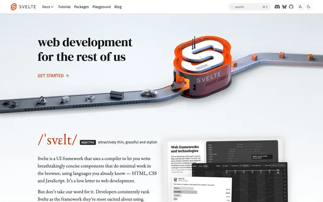
Preview image. Unlock full-res
Crisp editorial elegance
Color palette
Interactive elements, links, and icons – a vivid accent that guides user attention and signifies action.
Primary heading text, commanding a strong presence on light backgrounds.
General body text, default button text, navigation items – providing high contrast without the harshness of pure black.
Subtle text for secondary information, less prominent links, providing hierarchy by reduced contrast.
Subtle background for UI elements like search bars and buttons, creating soft divisions.
Page backgrounds and primary interactive elements, ensuring a bright, expansive canvas.
Typography
- Weights
- 500
- Sizes
- 54px
- Line height
- 1.2
- Fallback
- DM Serif Display
Display headlines; used for prominent hero sections, this 54px text with its precise weight feels like a modern masthead, delivering authority and sophistication.
- Weights
- 400
- Sizes
- 10px, 22px
- Line height
- 1.5
- Fallback
- EB Garamond
Body text for long-form content and some secondary headings. The 22px size for large body blocks combines academic elegance with modern web readability.
- Weights
- 400
- Sizes
- 10px, 12px, 13px, 14px, 16px, 20px
- Line height
- 1, 1.2, 1.5, 1.7
- Fallback
- Fira Sans
UI elements, navigation, and supplementary information. The wider range of sizes from 10px to 20px makes it versatile for system-level text, offering practical clarity against the more decorative serifs.
Spacing & shape
Components
Text in Graphite (#262626) using Fira Sans Regular, with padding of 0px overall. Interacts with a sublte border color on hover or focus.
Background transparent (rgba(0,0,0,0)), text in Graphite (#262626). Border is implicit from surrounding context rather than explicit, with a 4px radius.
Background Snow (#ffffff), text Graphite (#262626), with a border-top-color of Graphite (#262626) and 0px radius. Padding is 0px top/bottom, 10px left/right.
Text in Svelte Orange (#d43008), with no additional styling until hover/focus, where it will likely gain more emphasis.
Guidelines
- Prioritize DM Serif Display 500 for all top-level headlines at 54px size, using Carbon (#141414) for maximum impact.
- Use EB Garamond 400 at 22px for primary body text, paired with a line-height of 1.5 to enhance readability.
- Apply Svelte Orange (#d43008) exclusively for interactive elements, links, and critical accent icons to draw attention to actionable items.
- Maintain a default border-radius of 4px for all buttons and structural containers unless a specific style guide says otherwise.
- Ensure sufficient negative space around major content blocks, with section gaps typically around 100px vertical spacing.
- Keep text colors to Carbon (#141414), Graphite (#262626), and Pewter (#666666) against white or near-white backgrounds for clear visual hierarchy.
- Do not use generic system fonts; EB Garamond, Fira Sans, and DM Serif Display are integral to the brand's typographic identity.
- Avoid excessive use of shadows or busy backgrounds; the design relies on crisp edges and generous white space.
- Do not replace Svelte Orange (#d43008) with other chromatic colors or use it for purely decorative purposes; it's reserved for interaction and emphasis.
- Do not vary border radii arbitrarily; stick to 4px for most elements to maintain visual consistency, with exceptions like the 56px radius for specialized components.
- Do not use pure black (#000000) for body text; instead, opt for Graphite (#262626) or Carbon (#141414) for a softer but still high-contrast look.
- Avoid using a pageMaxWidth; the layout appears to be full-bleed with content centered within flexible containers, allowing for adaptive responsiveness.
About this system
ShowHide
This design system feels like a modern reinterpretation of classic editorial design, balancing gravitas with approachability. The signature move is the pairing of a strong, almost-black headline color (#141414) with an elegant serif font (EB Garamond / DM Serif Display) that commands attention without being overbearing. This is underscored by a clean, spacious layout using ample negative space to highlight key content, with the single vibrant orange (#d43008) serving as a bright, technical accent, reminiscent of a warning light or a 'hot' element in a cool system.
The page follows a full-bleed pattern with content centrally aligned within implied maximum width containers. The hero section is full-width, featuring a prominent, centered headline over a background that combines a soft gradient with the distinctive 3D render. Subsequent sections alternate between centered single-column text blocks and a combination of text and product screenshots, often in a responsive, two-column arrangement. Vertical spacing between sections is generous (100px) creating a spacious rhythm. Navigation is a sticky top bar, providing persistent access to key links.
The visual language mixes functional, abstract 3D product renders with classic product screenshots. The hero features a complex 3D rendering of the 'Svelte' logo integrated into an industrial conveyor belt, symbolizing processing and transformation, rendered with a metallic sheen and an orange glow suggesting activity. This is contrasted with crisp, raw product screenshots of IDEs and code, often presented as contained, sharp-edged rectangles, demonstrating the UI framework in action. Iconography (e.g., search, social media) is minimalist line art, mostly in monochrome black. The overall density of imagery is moderate, used strategically for impact rather than decoration, with product visuals focused on explanatory content.
Reminiscent of Vercel, Next.js, Stripe, Tailwind CSS.
# Svelte — Style Reference
> Crisp editorial elegance

**Theme:** light

**Site:** https://svelte.dev

This design system feels like a modern reinterpretation of classic editorial design, balancing gravitas with approachability. The signature move is the pairing of a strong, almost-black headline color (#141414) with an elegant serif font (EB Garamond / DM Serif Display) that commands attention without being overbearing. This is underscored by a clean, spacious layout using ample negative space to highlight key content, with the single vibrant orange (#d43008) serving as a bright, technical accent, reminiscent of a warning light or a 'hot' element in a cool system.

## Tokens — Colors

| Name | Value | Token | Role |
|------|------|------|------|
| Svelte Orange | `#d43008` | `--color-svelte-orange` | Interactive elements, links, and icons – a vivid accent that guides user attention and signifies action. |
| Carbon | `#141414` | `--color-carbon` | Primary heading text, commanding a strong presence on light backgrounds. |
| Graphite | `#262626` | `--color-graphite` | General body text, default button text, navigation items – providing high contrast without the harshness of pure black. |
| Pewter | `#666666` | `--color-pewter` | Subtle text for secondary information, less prominent links, providing hierarchy by reduced contrast. |
| Ghost White | `#f2f2f2` | `--color-ghost-white` | Subtle background for UI elements like search bars and buttons, creating soft divisions. |
| Snow | `#ffffff` | `--color-snow` | Page backgrounds and primary interactive elements, ensuring a bright, expansive canvas. |

## Tokens — Typography

### DM Serif Display
- **Substitute:** DM Serif Display
- **Weights:** 500
- **Sizes:** 54px
- **Line height:** 1.2
- **Role:** Display headlines; used for prominent hero sections, this 54px text with its precise weight feels like a modern masthead, delivering authority and sophistication.

### EB Garamond
- **Substitute:** EB Garamond
- **Weights:** 400
- **Sizes:** 10px, 22px
- **Line height:** 1.5
- **Role:** Body text for long-form content and some secondary headings. The 22px size for large body blocks combines academic elegance with modern web readability.

### Fira Sans
- **Substitute:** Fira Sans
- **Weights:** 400
- **Sizes:** 10px, 12px, 13px, 14px, 16px, 20px
- **Line height:** 1, 1.2, 1.5, 1.7
- **Role:** UI elements, navigation, and supplementary information. The wider range of sizes from 10px to 20px makes it versatile for system-level text, offering practical clarity against the more decorative serifs.

## Tokens — Spacing

- **Section gap:** 100px
- **Card padding:** 10px
- **Element gap:** 10px

## Tokens — Radius

- **Default:** 4px
- **navItem:** 4px

## Layout

The page follows a full-bleed pattern with content centrally aligned within implied maximum width containers. The hero section is full-width, featuring a prominent, centered headline over a background that combines a soft gradient with the distinctive 3D render. Subsequent sections alternate between centered single-column text blocks and a combination of text and product screenshots, often in a responsive, two-column arrangement. Vertical spacing between sections is generous (100px) creating a spacious rhythm. Navigation is a sticky top bar, providing persistent access to key links.

## Imagery

The visual language mixes functional, abstract 3D product renders with classic product screenshots. The hero features a complex 3D rendering of the 'Svelte' logo integrated into an industrial conveyor belt, symbolizing processing and transformation, rendered with a metallic sheen and an orange glow suggesting activity. This is contrasted with crisp, raw product screenshots of IDEs and code, often presented as contained, sharp-edged rectangles, demonstrating the UI framework in action. Iconography (e.g., search, social media) is minimalist line art, mostly in monochrome black. The overall density of imagery is moderate, used strategically for impact rather than decoration, with product visuals focused on explanatory content.

## Components

### GET STARTED CTA Button

### Search Bar with Keyboard Shortcut

### Companies Social Proof Block

### Primary Navigation Link
*Main navigation item*

Text in Graphite (#262626) using Fira Sans Regular, with padding of 0px overall. Interacts with a sublte border color on hover or focus.

### Default Button
*General interactive button*

Background transparent (rgba(0,0,0,0)), text in Graphite (#262626). Border is implicit from surrounding context rather than explicit, with a 4px radius.

### Minimal Card Button
*Button within a card-like element*

Background Snow (#ffffff), text Graphite (#262626), with a border-top-color of Graphite (#262626) and 0px radius. Padding is 0px top/bottom, 10px left/right.

### Inline Text Link
*Hyperlinks in body copy*

Text in Svelte Orange (#d43008), with no additional styling until hover/focus, where it will likely gain more emphasis.

## Guidelines

### Do

- Prioritize DM Serif Display 500 for all top-level headlines at 54px size, using Carbon (#141414) for maximum impact.
- Use EB Garamond 400 at 22px for primary body text, paired with a line-height of 1.5 to enhance readability.
- Apply Svelte Orange (#d43008) exclusively for interactive elements, links, and critical accent icons to draw attention to actionable items.
- Maintain a default border-radius of 4px for all buttons and structural containers unless a specific style guide says otherwise.
- Ensure sufficient negative space around major content blocks, with section gaps typically around 100px vertical spacing.
- Keep text colors to Carbon (#141414), Graphite (#262626), and Pewter (#666666) against white or near-white backgrounds for clear visual hierarchy.

### Don't

- Do not use generic system fonts; EB Garamond, Fira Sans, and DM Serif Display are integral to the brand's typographic identity.
- Avoid excessive use of shadows or busy backgrounds; the design relies on crisp edges and generous white space.
- Do not replace Svelte Orange (#d43008) with other chromatic colors or use it for purely decorative purposes; it's reserved for interaction and emphasis.
- Do not vary border radii arbitrarily; stick to 4px for most elements to maintain visual consistency, with exceptions like the 56px radius for specialized components.
- Do not use pure black (#000000) for body text; instead, opt for Graphite (#262626) or Carbon (#141414) for a softer but still high-contrast look.
- Avoid using a pageMaxWidth; the layout appears to be full-bleed with content centered within flexible containers, allowing for adaptive responsiveness.

## Agent Prompt Guide

### Quick Color Reference
- Text: #262626 (Graphite)
- Headlines: #141414 (Carbon)
- Background: #FFFFFF (Snow)
- CTA/Accent: #d43008 (Svelte Orange)
- UI Elements Background: #f2f2f2 (Ghost White)

### Example Component Prompts
1. Create a hero section: Snow (#ffffff) background. Headline 'web development for the rest of us' at 54px DM Serif Display 500, Carbon (#141414). Below that, a 'Get Started' link in EB Garamond 400, 22px, Graphite (#262626), with a right arrow icon in Svelte Orange (#d43008).
2. Design a navigation bar link: 'Docs' text in Fira Sans 400, Graphite (#262626), with no specific background color. Add 0px padding all around. The link receives subtle border treatment on hover.
3. Develop a body text block: Paragraphs in EB Garamond 400, 22px, Graphite (#262626), line-height 1.5. Within the paragraph, an inline link 'Marcel Cutts' in Svelte Orange (#d43008).
4. Generate a search input field: Transparent background, #000000 text, 0px border radius, placeholder text in Pewter (#666666) Fira Sans 400. Placeholder text 'search' at 14px.
5. Implement a secondary button: Background Snow (#ffffff), text Graphite (#262626) in Fira Sans 400. Top border is Graphite (#262626), 0px radius. Padding 0px top/bottom, 10px left/right.
More like this







Keep what you find
A free account saves references to boards and can send you a weekly email of picks based on what you save.
To see every result, go Pro.