Preview image. Unlock full-res
Minimalist gallery wall
Color palette
Background for personal imagery
Page backgrounds, card surfaces
Primary text, prominent headings
Dark borders and separators for elevated surfaces and inverted UI. Do not promote it to the primary CTA color
Muted secondary text, subtle dividers, inactive states
Typography
- Weights
- 400, 700
- Sizes
- 12px, 142px
- Line height
- 0.81, 1, 1.17, 1.67
- Letter spacing
- -0.0470em at sizes >= 12px
Primary headings and interactive links. The tight letter spacing for large text creates a condensed, impactful visual.
- Weights
- 400
- Sizes
- 125px
- Line height
- 1.02
- Letter spacing
- normal
Large display headings, specifically for the year range. Its imposing size commands attention in an otherwise subdued layout.
- Weights
- 400
- Sizes
- 16px
- Line height
- 1
- Letter spacing
- normal
- Fallback
- system-ui
All body text and descriptive information, providing clarity and system-level familiarity.
Spacing & shape
Components
Text link using custom_21879, weight 400 for primary text and Pale Ash for secondary descriptor. Underlined with graphite on hover (or current selected item). No padding, using negative letter-spacing for visual density.
Simple text link in Ink Black, using custom_21879 at 12px, weight 400, with tight letter-spacing. Minimal padding around text.
Large text element using custom_49610, 125px for individual years and custom_21879, 142px for the dash, both in Ink Black, normal letter spacing. Forms a prominent visual anchor on the page.
Guidelines
- Prioritize text as the primary vehicle for information and hierarchy, using color only for stark contrast or subtle guidance.
- Maintain a monochromatic palette with Canvas White backgrounds, Ink Black for primary text, and Graphite or Pale Ash for secondary details.
- Use custom_21879 (or suitable substitute) for all interactive text and primary headings, embracing its tight letter-spacing for visual impact.
- Apply 0px border-radius to all elements to reinforce a sharp, unyielding aesthetic.
- Ensure horizontal lines or borders are 1px thick and use Pale Ash for subtle visual separation between list items or sections.
- Keep spacing between elements minimal, often 1px, to create a compact and dense information display.
- Avoid colorful or decorative elements outside of explicit imagery; the interface should remain stark and functional.
- Do not introduce soft shadows or gradients, as the system relies on flat surfaces and hard edges.
- Do not use multiple font families for body text or navigation; stick to the defined typographic system.
- Refrain from generous padding or excessive white space between repeating elements to maintain the compact presentation.
- Do not use bold weights indiscriminately; reserve weight 700 for specific high-emphasis elements identified in `custom_21879` roles.
About this system
ShowHide
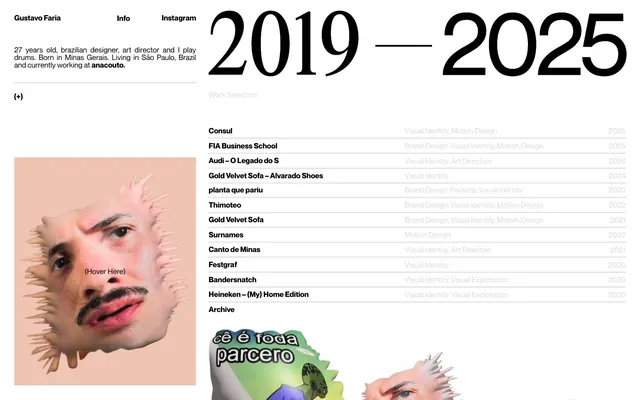
Gustavo Faria's portfolio website presents an austere, high-contrast, text-dominant canvas. Information is structured rigidly with subtle typographic variations to create hierarchy rather than color or extensive spacing. The design emphasizes content clarity and directness through a near-monochromatic palette and a compact layout, punctuated by a single, striking personal image that challenges the otherwise stark presentation.
The page adheres to a predominantly full-bleed model, with a centered content block for the bio and navigation. The hero section features a large, horizontally dominant year range (2019-2025) at the top right, contrasting with the bio on the left. Content is primarily organized into two main columns: a left column for bio text (and a personal image) and a right column for the 'Work Selection' list. The work list items are presented in a compact, vertically stacked format, separated by 1px Pale Ash lines. There is no explicit max-width constraint; content adapts to the viewport. A sticky top navigation containing 'Gustavo Faria', 'Info', and 'Instagram' seems present.
The site primarily uses idiosyncratic, distorted photography of faces, specifically a self-portrait, contained within irregular, organic cutouts. These images are not product showcases but serve as a strong personal brand statement, directly contrasting the minimalist UI. They operate decoratively and as a focal point, occupying a significant visual area and bringing an element of surrealism to the otherwise structured page. Icons are absent, and UI elements are purely textual or geometric.
Reminiscent of Rik Lomas, Julien Van Havere, Studio Fnt, Active Theory.
# GUSTAVO Faria © — Style Reference
> Minimalist gallery wall

**Theme:** light

**Site:** https://gustavo.work

Gustavo Faria's portfolio website presents an austere, high-contrast, text-dominant canvas. Information is structured rigidly with subtle typographic variations to create hierarchy rather than color or extensive spacing. The design emphasizes content clarity and directness through a near-monochromatic palette and a compact layout, punctuated by a single, striking personal image that challenges the otherwise stark presentation.

## Tokens — Colors

| Name | Value | Token | Role |
|------|------|------|------|
| Blush Tone | `#efc4b2` | `--color-blush-tone` | Background for personal imagery |
| Canvas White | `#ffffff` | `--color-canvas-white` | Page backgrounds, card surfaces |
| Ink Black | `#000000` | `--color-ink-black` | Primary text, prominent headings |
| Graphite | `#282828` | `--color-graphite` | Dark borders and separators for elevated surfaces and inverted UI. Do not promote it to the primary CTA color |
| Pale Ash | `#dcdcdc` | `--color-pale-ash` | Muted secondary text, subtle dividers, inactive states |

## Tokens — Typography

### custom_21879
- **Weights:** 400, 700
- **Sizes:** 12px, 142px
- **Line height:** 0.81, 1, 1.17, 1.67
- **Letter spacing:** -0.0470em at sizes >= 12px
- **Role:** Primary headings and interactive links. The tight letter spacing for large text creates a condensed, impactful visual.

### custom_49610
- **Weights:** 400
- **Sizes:** 125px
- **Line height:** 1.02
- **Letter spacing:** normal
- **Role:** Large display headings, specifically for the year range. Its imposing size commands attention in an otherwise subdued layout.

### -apple-system
- **Substitute:** system-ui
- **Weights:** 400
- **Sizes:** 16px
- **Line height:** 1
- **Letter spacing:** normal
- **Role:** All body text and descriptive information, providing clarity and system-level familiarity.

## Tokens — Type Scale

| Role | Size | Line height | Letter spacing |
|------|------|------|------|
| caption | 12px | 1.17 | -0.047em |
| body | 16px | 1 | — |
| heading | 125px | 1.02 | — |
| display | 142px | 0.81 | -0.047em |

## Tokens — Spacing

- **Card padding:** 0px
- **Element gap:** 1px

## Tokens — Radius

- **Default:** 0px

## Layout

The page adheres to a predominantly full-bleed model, with a centered content block for the bio and navigation. The hero section features a large, horizontally dominant year range (2019-2025) at the top right, contrasting with the bio on the left. Content is primarily organized into two main columns: a left column for bio text (and a personal image) and a right column for the 'Work Selection' list. The work list items are presented in a compact, vertically stacked format, separated by 1px Pale Ash lines. There is no explicit max-width constraint; content adapts to the viewport. A sticky top navigation containing 'Gustavo Faria', 'Info', and 'Instagram' seems present.

## Imagery

The site primarily uses idiosyncratic, distorted photography of faces, specifically a self-portrait, contained within irregular, organic cutouts. These images are not product showcases but serve as a strong personal brand statement, directly contrasting the minimalist UI. They operate decoratively and as a focal point, occupying a significant visual area and bringing an element of surrealism to the otherwise structured page. Icons are absent, and UI elements are purely textual or geometric.

## Components

### Work Entry Link
*Interactive list item*

Text link using custom_21879, weight 400 for primary text and Pale Ash for secondary descriptor. Underlined with graphite on hover (or current selected item). No padding, using negative letter-spacing for visual density.

### Navigation Link
*Top-level navigation*

Simple text link in Ink Black, using custom_21879 at 12px, weight 400, with tight letter-spacing. Minimal padding around text.

### Year Range Display
*Large decorative heading*

Large text element using custom_49610, 125px for individual years and custom_21879, 142px for the dash, both in Ink Black, normal letter spacing. Forms a prominent visual anchor on the page.

## Guidelines

### Do

- Prioritize text as the primary vehicle for information and hierarchy, using color only for stark contrast or subtle guidance.
- Maintain a monochromatic palette with Canvas White backgrounds, Ink Black for primary text, and Graphite or Pale Ash for secondary details.
- Use custom_21879 (or suitable substitute) for all interactive text and primary headings, embracing its tight letter-spacing for visual impact.
- Apply 0px border-radius to all elements to reinforce a sharp, unyielding aesthetic.
- Ensure horizontal lines or borders are 1px thick and use Pale Ash for subtle visual separation between list items or sections.
- Keep spacing between elements minimal, often 1px, to create a compact and dense information display.

### Don't

- Avoid colorful or decorative elements outside of explicit imagery; the interface should remain stark and functional.
- Do not introduce soft shadows or gradients, as the system relies on flat surfaces and hard edges.
- Do not use multiple font families for body text or navigation; stick to the defined typographic system.
- Refrain from generous padding or excessive white space between repeating elements to maintain the compact presentation.
- Do not use bold weights indiscriminately; reserve weight 700 for specific high-emphasis elements identified in `custom_21879` roles.

## Agent Prompt Guide

Quick Color Reference:
text: #000000
background: #ffffff
border: #282828
accent: #efc4b2
primary action: no distinct CTA color

Example Component Prompts:
1. Create a top navigation bar: Canvas White background. 'Gustavo Faria', 'Info', 'Instagram' as text links using custom_21879, weight 400, 12px, Ink Black. Minimal 4px padding between items.
2. Design a work list item: 'Consul' as main text using custom_21879, weight 400, Ink Black, 12px. Secondary text 'Visual Identity, Motion Design' uses -apple-system, 16px, Pale Ash. Separated by a 1px Pale Ash border bottom.
3. Create the large year heading '2025': Use custom_49610, 125px, weight 400, Ink Black, normal letter-spacing.
More like this









Keep what you find
A free account saves references to boards and can send you a weekly email of picks based on what you save.
To see every result, go Pro.