Preview image. Unlock full-res
Artistic Jungle Canvas
Color palette
Primary brand color, secondary text against light backgrounds, interactive navigation elements, and decorative strokes in hero sections. Also defines subtle bounding boxes around content
Accent for headings and other decorative elements. Provides a warm, energetic contrast
Decorative accent for headings, links, and icons, adding a subtle, earthy vibrancy
Decorative accent for headings, links, and icons. A bolder, more saturated version of Warm Ginger
Accent for headings, a slightly deeper red than Fiery Red
Decorative accent for links and other interactive elements, providing a cool, modern highlight
Decorative accent for headings, links, and icons, bringing cheerful energy
Background color for headings where a subtle, muted yellow tint is desired
Background for primary call-to-action buttons, signaling a direct interaction point
Background for specific call-to-action buttons, adding variety to calls to action
Background for specific call-to-action buttons, offering a dramatic, deep hue
Background for specific call-to-action buttons, a soft yet distinct accent
Decorative accent for links, similar to Aqua Glow but in a green tone
Decorative accent for links, icons, and headings, a softer orange that complements Warm Ginger
Primary text color, link color, hero background, and general surface borders
Light background for sections, offering a subtle off-white contrast to pure white
Default page background, heading text on dark backgrounds, icon fill, input and button text
Background for headings, providing a very light, cool-toned contrast
Background for headings and sections, a subtle off-white with a warm undertone
Muted text or badge background for secondary information like copyrights
Secondary text color, slightly softer than absolute black
Background for specific neutral ghost buttons
Semantic color for warning badges
Typography
- Weights
- 400, 700
- Sizes
- 13px
- Line height
- 1.2
Arial — detected in extracted data but not described by AI
- Weights
- 400, 700
- Sizes
- 20px, 22px, 32px, 38px, 42px, 54px, 70px, 80px, 88px
- Line height
- 0.95, 0.96, 0.98, 1, 1.1, 1.36
- Letter spacing
- -0.05, -0.042, -0.042, -0.023, -0.021, -0.018, 0.038, 0.02, 0.02
- Fallback
- Playfair Display
Primary display and heading typeface, characterized by its bespoke serif forms. It sets a distinctive, artistic tone, utilizing tight negative letter-spacing for large sizes to create a dense, impactful visual block. For smaller headings, letter spacing becomes positive for clarity.
- Weights
- 400, 600, 700
- Sizes
- 12px, 14px, 16px, 22px, 24px
- Line height
- 1.2, 1.28, 1.36
- Letter spacing
- normal
- Fallback
- Inter
Versatile sans-serif for body text, navigation items, badges, and smaller headings. Provides clarity and readability. The semibold weight at 22px is used for prominent subheadings.
Spacing & shape
Components
Background: rgba(0,0,0,0), Color: rgb(0,0,0), Border: none, Radius: 0px, Padding: 0px.
Background: rgba(0,0,0,0), Color: rgb(0,0,0), Border: none, Radius: 50%, Padding: 0px.
Background: rgba(0, 0, 0, 0.6), Text: Pure White (#ffffff), Border: 1px solid Pure White (#ffffff), Radius: 30px, Padding: 16px 32px 15px 32px.
Background: Illustrator Blue (#2544a0) or other accent colors (Pumpkin Swirl #ff7701, Violet Berry #4b0f4d, Rose Bloom #d98199), Text: Absolute Black (#000000), Border: none, Radius: 0px, Padding: 24px 24px 38px 24px.
Background: rgba(0, 0, 0, 0), Radius: 0px, Shadow: none, Padding: 0px.
Background: rgba(0, 0, 0, 0.1), Text: Pure White (#ffffff), Border: none, Radius: 30px, Padding: 16px 32px 15px 32px.
Background: Warning Yellow (#ffff00), Text: Absolute Black (#000000), Radius: 50%, Padding: 0px.
Background: rgba(0, 0, 0, 0), Text: Midtone Gray (#909090), Radius: 0px, Padding: 0px.
Guidelines
- Use Millik for all primary headings, applying tight negative letter-spacing for visual impact at larger sizes and subtle positive spacing for smaller headings to enhance clarity.
- Utilize Klarheit Grotesk for all body text, navigation elements, and secondary information, prioritizing its legibility and modern feel.
- Accentuate interactive elements and key information with the brand's vibrant accent colors (Fiery Red, Illustrator Blue, Aqua Glow), ensuring they stand out against neutral backgrounds.
- Maintain a comfortable density with consistent elementGap of 20px and sectionGap of 24px to provide breathing room around content.
- Apply a 30px border-radius to all input fields and primary interactive buttons for a consistent soft, approachable shape.
- Employ Absolute Black (#000000) for primary text on light backgrounds and Pure White (#ffffff) for text on dark backgrounds to ensure high contrast.
- Structure pages with Fog Canvas (#f2ebe6) or Cream Canvas (#fef9ee) as base backgrounds for sections, providing soft transitions.
- Avoid using generic blue for links; instead, use brand accent colors like Aqua Glow (#24e3dc) or Emerald Green (#24e34c) when a chromatic link is needed.
- Do not introduce new border radii values beyond 0px, 10px, 30px, and 50% to maintain shape consistency.
- Refrain from adding box shadows to elements unless explicitly defined for a specific component, as the system largely relies on flat surfaces and color contrast.
- Do not use Absolute Black (#000000) as a solid background color for extended sections unless it is the hero with an illustrative overlay.
- Avoid arbitrary changes in letter-spacing for Klarheit Grotesk; it should remain 'normal' unless a specific stylistic reason dictates otherwise.
- Do not use generic button styles; always choose from the defined button variants to ensure consistency in interaction and appearance.
- Do not introduce new typefaces; the system relies exclusively on Millik and Klarheit Grotesk for brand coherence.
About this system
ShowHide
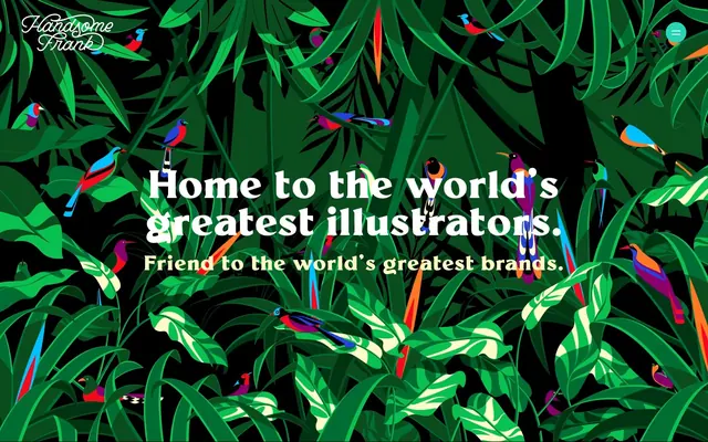
Handsome Frank's visual system evokes a vibrant, artistic jungle, leveraging bold colorful blocks against clean, spacious backgrounds. Typography is a confident mix of a bespoke serif for headlines, featuring tight letter-spacing for impact, and a versatile sans-serif for body text. The overall feel is one of creative energy and precision, using color as an active, functional element rather than mere decoration. Layouts are structured but dynamic, allowing hero illustrations to breathe color into the composition.
The page primarily uses a contained layout with no explicit pageMaxWidth, allowing sections to adapt while text content often aligns within a comfortable reading width. The hero section is a full-bleed, dynamic illustration with centered headline text overlaid. Subsequent sections toggle between clean backgrounds (Fog Canvas, Cream Canvas) to highlight grids of illustration cards. Content arrangement for feature sections includes image-left/text-right or vise-versa implied by the card layouts. A prominent 4-column card grid is used for showcasing illustrators. Vertical rhythm is maintained by consistent section spacing, making the flow comfortable and unhurried. Navigation is a sticky top bar with a hidden menu triggered by a hamburger icon.
The site primarily features vibrant, detailed illustrations as its visual language. These are often full-bleed or large-scale, acting as hero backgrounds or framed within content blocks. The illustrations are diverse in style but consistently rich in color and detail, serving as product showcases and setting an artistic atmosphere. Icons, if present, are minimal and secondary to the main illustrative content. The density is image-heavy, with illustrations taking up significant visual space to emphasize the agency's offerings.
Reminiscent of The Brand Union, Huge Inc., Dribbble, Sagmeister & Walsh, Pentagram.
# Handsome Frank — Style Reference
> Artistic Jungle Canvas

**Theme:** light

**Site:** https://www.handsomefrank.com

Handsome Frank's visual system evokes a vibrant, artistic jungle, leveraging bold colorful blocks against clean, spacious backgrounds. Typography is a confident mix of a bespoke serif for headlines, featuring tight letter-spacing for impact, and a versatile sans-serif for body text. The overall feel is one of creative energy and precision, using color as an active, functional element rather than mere decoration. Layouts are structured but dynamic, allowing hero illustrations to breathe color into the composition.

## Tokens — Colors

| Name | Value | Token | Role |
|------|------|------|------|
| Midnight Ink | `#160572` | `--color-midnight-ink` | Primary brand color, secondary text against light backgrounds, interactive navigation elements, and decorative strokes in hero sections. Also defines subtle bounding boxes around content |
| Fiery Red | `#ea0706` | `--color-fiery-red` | Accent for headings and other decorative elements. Provides a warm, energetic contrast |
| Warm Ginger | `#e29675` | `--color-warm-ginger` | Decorative accent for headings, links, and icons, adding a subtle, earthy vibrancy |
| Terracotta Orange | `#d64e2e` | `--color-terracotta-orange` | Decorative accent for headings, links, and icons. A bolder, more saturated version of Warm Ginger |
| Crimson Edge | `#df1a19` | `--color-crimson-edge` | Accent for headings, a slightly deeper red than Fiery Red |
| Aqua Glow | `#24e3dc` | `--color-aqua-glow` | Decorative accent for links and other interactive elements, providing a cool, modern highlight |
| Sunny Marigold | `#f9e44d` | `--color-sunny-marigold` | Decorative accent for headings, links, and icons, bringing cheerful energy |
| Warm Canvas Yellow | `#fffac2` | `--color-warm-canvas-yellow` | Background color for headings where a subtle, muted yellow tint is desired |
| Illustrator Blue | `#2544a0` | `--color-illustrator-blue` | Background for primary call-to-action buttons, signaling a direct interaction point |
| Pumpkin Swirl | `#ff7701` | `--color-pumpkin-swirl` | Background for specific call-to-action buttons, adding variety to calls to action |
| Violet Berry | `#4b0f4d` | `--color-violet-berry` | Background for specific call-to-action buttons, offering a dramatic, deep hue |
| Rose Bloom | `#d98199` | `--color-rose-bloom` | Background for specific call-to-action buttons, a soft yet distinct accent |
| Emerald Green | `#24e34c` | `--color-emerald-green` | Decorative accent for links, similar to Aqua Glow but in a green tone |
| Melon Hue | `#eea883` | `--color-melon-hue` | Decorative accent for links, icons, and headings, a softer orange that complements Warm Ginger |
| Absolute Black | `#000000` | `--color-absolute-black` | Primary text color, link color, hero background, and general surface borders |
| Fog Canvas | `#f2ebe6` | `--color-fog-canvas` | Light background for sections, offering a subtle off-white contrast to pure white |
| Pure White | `#ffffff` | `--color-pure-white` | Default page background, heading text on dark backgrounds, icon fill, input and button text |
| Sky Haze | `#eef4fb` | `--color-sky-haze` | Background for headings, providing a very light, cool-toned contrast |
| Cream Canvas | `#fef9ee` | `--color-cream-canvas` | Background for headings and sections, a subtle off-white with a warm undertone |
| Midtone Gray | `#909090` | `--color-midtone-gray` | Muted text or badge background for secondary information like copyrights |
| Dark Wolf | `#2c2c2c` | `--color-dark-wolf` | Secondary text color, slightly softer than absolute black |
| Ash Gray | `#636160` | `--color-ash-gray` | Background for specific neutral ghost buttons |
| Warning Yellow | `#ffff00` | `--color-warning-yellow` | Semantic color for warning badges |

## Tokens — Typography

### Arial
- **Weights:** 400, 700
- **Sizes:** 13px
- **Line height:** 1.2
- **Role:** Arial — detected in extracted data but not described by AI

### Millik
- **Substitute:** Playfair Display
- **Weights:** 400, 700
- **Sizes:** 20px, 22px, 32px, 38px, 42px, 54px, 70px, 80px, 88px
- **Line height:** 0.95, 0.96, 0.98, 1, 1.1, 1.36
- **Letter spacing:** -0.05, -0.042, -0.042, -0.023, -0.021, -0.018, 0.038, 0.02, 0.02
- **Role:** Primary display and heading typeface, characterized by its bespoke serif forms. It sets a distinctive, artistic tone, utilizing tight negative letter-spacing for large sizes to create a dense, impactful visual block. For smaller headings, letter spacing becomes positive for clarity.

### Klarheit Grotesk
- **Substitute:** Inter
- **Weights:** 400, 600, 700
- **Sizes:** 12px, 14px, 16px, 22px, 24px
- **Line height:** 1.2, 1.28, 1.36
- **Letter spacing:** normal
- **Role:** Versatile sans-serif for body text, navigation items, badges, and smaller headings. Provides clarity and readability. The semibold weight at 22px is used for prominent subheadings.

## Tokens — Type Scale

Perfect Fourth (1.333) from 16px base.

| Role | Size | Line height | Letter spacing |
|------|------|------|------|
| caption | 12px | 1.2 | — |
| body-sm | 14px | 1.2 | — |
| body | 16px | 1.2 | — |
| subheading | 22px | 1.28 | — |
| heading-sm | 24px | 1.36 | — |
| heading | 32px | 1 | 1.216px |
| heading-lg | 42px | 0.98 | -0.882px |
| display | 88px | 0.95 | -4.4px |

## Tokens — Spacing

- **Section gap:** 24px
- **Card padding:** 24px
- **Element gap:** 20px

## Tokens — Radius

- **Buttons:** 30px
- **Inputs:** 30px
- **bodyElements:** 10px
- **circularElements:** 50%

## Layout

The page primarily uses a contained layout with no explicit pageMaxWidth, allowing sections to adapt while text content often aligns within a comfortable reading width. The hero section is a full-bleed, dynamic illustration with centered headline text overlaid. Subsequent sections toggle between clean backgrounds (Fog Canvas, Cream Canvas) to highlight grids of illustration cards. Content arrangement for feature sections includes image-left/text-right or vise-versa implied by the card layouts. A prominent 4-column card grid is used for showcasing illustrators. Vertical rhythm is maintained by consistent section spacing, making the flow comfortable and unhurried. Navigation is a sticky top bar with a hidden menu triggered by a hamburger icon.

## Imagery

The site primarily features vibrant, detailed illustrations as its visual language. These are often full-bleed or large-scale, acting as hero backgrounds or framed within content blocks. The illustrations are diverse in style but consistently rich in color and detail, serving as product showcases and setting an artistic atmosphere. Icons, if present, are minimal and secondary to the main illustrative content. The density is image-heavy, with illustrations taking up significant visual space to emphasize the agency's offerings.

## Components

### Ghost Button
*Interactive elements that blend into the background, often for discrete actions or navigation.*

Background: rgba(0,0,0,0), Color: rgb(0,0,0), Border: none, Radius: 0px, Padding: 0px.

### Circular Ghost Button
*Small, discreet interactive elements, often used for icon-only actions.*

Background: rgba(0,0,0,0), Color: rgb(0,0,0), Border: none, Radius: 50%, Padding: 0px.

### Pill Accent Button
*Prominent calls to action with rounded edges, standing out against darker backgrounds.*

Background: rgba(0, 0, 0, 0.6), Text: Pure White (#ffffff), Border: 1px solid Pure White (#ffffff), Radius: 30px, Padding: 16px 32px 15px 32px.

### Illustrator Block Button
*Primary action button for navigating to illustrator portfolios, using specific brand colors.*

Background: Illustrator Blue (#2544a0) or other accent colors (Pumpkin Swirl #ff7701, Violet Berry #4b0f4d, Rose Bloom #d98199), Text: Absolute Black (#000000), Border: none, Radius: 0px, Padding: 24px 24px 38px 24px.

### Illustration Card
*Container for showcasing artist work, designed to let the artwork be the focus.*

Background: rgba(0, 0, 0, 0), Radius: 0px, Shadow: none, Padding: 0px.

### Rounded Input Field
*Text input areas with softened corners.*

Background: rgba(0, 0, 0, 0.1), Text: Pure White (#ffffff), Border: none, Radius: 30px, Padding: 16px 32px 15px 32px.

### Warning Dot Badge
*Small, circular indicator for alerts or status.*

Background: Warning Yellow (#ffff00), Text: Absolute Black (#000000), Radius: 50%, Padding: 0px.

### Copyright Notice Badge
*Muted text for legal information.*

Background: rgba(0, 0, 0, 0), Text: Midtone Gray (#909090), Radius: 0px, Padding: 0px.

## Guidelines

### Do

- Use Millik for all primary headings, applying tight negative letter-spacing for visual impact at larger sizes and subtle positive spacing for smaller headings to enhance clarity.
- Utilize Klarheit Grotesk for all body text, navigation elements, and secondary information, prioritizing its legibility and modern feel.
- Accentuate interactive elements and key information with the brand's vibrant accent colors (Fiery Red, Illustrator Blue, Aqua Glow), ensuring they stand out against neutral backgrounds.
- Maintain a comfortable density with consistent elementGap of 20px and sectionGap of 24px to provide breathing room around content.
- Apply a 30px border-radius to all input fields and primary interactive buttons for a consistent soft, approachable shape.
- Employ Absolute Black (#000000) for primary text on light backgrounds and Pure White (#ffffff) for text on dark backgrounds to ensure high contrast.
- Structure pages with Fog Canvas (#f2ebe6) or Cream Canvas (#fef9ee) as base backgrounds for sections, providing soft transitions.

### Don't

- Avoid using generic blue for links; instead, use brand accent colors like Aqua Glow (#24e3dc) or Emerald Green (#24e34c) when a chromatic link is needed.
- Do not introduce new border radii values beyond 0px, 10px, 30px, and 50% to maintain shape consistency.
- Refrain from adding box shadows to elements unless explicitly defined for a specific component, as the system largely relies on flat surfaces and color contrast.
- Do not use Absolute Black (#000000) as a solid background color for extended sections unless it is the hero with an illustrative overlay.
- Avoid arbitrary changes in letter-spacing for Klarheit Grotesk; it should remain 'normal' unless a specific stylistic reason dictates otherwise.
- Do not use generic button styles; always choose from the defined button variants to ensure consistency in interaction and appearance.
- Do not introduce new typefaces; the system relies exclusively on Millik and Klarheit Grotesk for brand coherence.

## Agent Prompt Guide

Quick Color Reference:
text: #000000
background: #ffffff
border: #160572
accent: #160572
primary action: #ff7701 (filled action)

Example Component Prompts:
1. Create a Hero Headline: 'Home to the world’s greatest illustrators.' using Millik regular, size 88px, line-height 0.95, letter-spacing -4.4px, color Pure White (#ffffff), centered on a background of Absolute Black (#000000).
2. Create an Illustrator Block Button: 'Browse Illustrators.' using Illustrator Blue (#2544a0) as background, Absolute Black (#000000) text, Klarheit Grotesk regular, size 24px, no border, 0px radius, padding 24px 24px 38px 24px.
3. Create a Pill Accent Button: 'Subscribe Now' using rgba(0, 0, 0, 0.6) background, Pure White (#ffffff) text, 1px solid Pure White (#ffffff) border, 30px radius, padding 16px 32px 15px 32px.
More like this









Keep what you find
A free account saves references to boards and can send you a weekly email of picks based on what you save.
To see every result, go Pro.