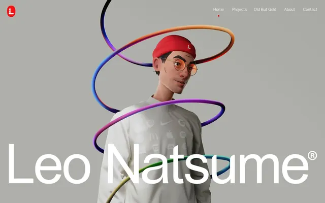
Preview image. Unlock full-res
Gallery Wall Precision
Color palette
Red outline accent for tags, dividers, and focused UI edges. Do not promote it to the primary CTA color
Primary page background, light surface
Secondary background, subtle surface elevations, muted text
Primary text, prominent borders, high-contrast elements
Heading text, important links, secondary borders — slightly softer than pure black but still commanding
Link borders, subtle text
Body text, helper text, subdued borders
Hairline borders for navigational elements, dividers
Typography
- Weights
- 400
- Sizes
- 10px
- Line height
- 1.2
- Fallback
- Arial
Utility text, small labels, and fallback for system elements.
- Weights
- 400
- Sizes
- 12px, 15px, 16px, 18px, 20px, 32px, 45px, 64px
- Line height
- 1.05, 1.2, 1.3, 1.4, 1.6
- Fallback
- Montserrat
Primary headings and body text. Provides a clean, modern geometric feel.
- Weights
- 400
- Sizes
- 12px, 15px, 16px, 18px, 20px, 32px, 45px, 64px
- Line height
- 1.05, 1.2, 1.3, 1.4, 1.6
- Fallback
- Source Sans Pro
Display headings and subheadings, used for impactful statements. Offers an alternative large-scale presence.
- Weights
- 400
- Sizes
- 12px
- Line height
- 1.4
- Fallback
- Helvetica Neue
Specific body text instances, contributing to subtle typographic variation.
- Weights
- 400
- Sizes
- 12px, 70px
- Line height
- 1.4
wfont_b4f017_1511f1af80db4e64b4e84b3f76de255c — detected in extracted data but not described by AI
Spacing & shape
Components
Text only, `Ink Black` on `Canvas White` background, no padding or border. Hover states are implied by text color change or underscore, but not explicitly styled on base.
Uses `wfont_b4f017_e9045633d52f4a2fa031ee07f7d9033d` at `64px` for the main text in `Deep Graphite`, with an `Active Red` accent over 'Let's Create'. No letter-spacing adjustment.
A `1px` high line using `Ink Black` as color, spanning the content width.
A card with `0px` padding, a top-left and top-right `border-radius` of `20px`, and no shadow. The background is transparent `rgba(243, 248, 240, 0)` but implies a base of `Canvas White`.
Uses `wfont_b4f017_e9045633d52f4a2fa031ee07f7d9033d` at `18px`, `Deep Graphite` color. It conveys important information without being a headline.
Uses `Arial` at `10px`, `Muted Silver` color. Often found as metadata or subtle annotations.
Background `Canvas White`, border `1px` solid, color `Ink Black`. `Border-radius` varies for different interaction contexts (e.g. `999px` for pill-shaped email input, `5.56676px` for others).
Guidelines
- Use `Canvas White (#fafafa)` as the dominant background for all pages and most surfaces.
- Emphasize content and hierarchy through `Ink Black (#000000)` for primary text and `Deep Graphite (#1c1d20)` for headings.
- Reserve `Active Red (#f41111)` strictly for brand accents, current state indicators, or impactful focal points, using it sparingly to maximize its effect.
- Implement horizontal dividers as `1px` lines in `Ink Black (#000000)` for clear visual separation.
- Employ a generous `43px` vertical `sectionGap` to maintain a spacious and uncluttered layout between major content blocks.
- Structure interactive elements like navigation items and input fields with thin `1px` borders, using `Light Concrete (#c7c7c7)` or `Ink Black (#000000)` depending on prominence.
- Apply `20px` `border-radius` to the top corners of `Work Showcase Card` elements to create a subtle architectural detail.
- Avoid using drop shadows or heavy elevation styles; rely on color and subtle borders to define surface levels.
- Do not introduce additional vibrant colors beyond `Active Red (#f41111)` to maintain the high-contrast, minimalist palette.
- Refrain from using solid background colors for buttons unless it is a specific, single accent call to action.
- Do not deviate from the specified typeface families; `wfont_b4f017_e9045633d52f4a2fa031ee07f7d9033d` and `wfont_b4f017_1511f1af80db4e64b4e84b3f76de255c` are central to the brand's typographic identity.
- Do not overcrowd sections with dense information; maintain a comfortable `elementGap` of `6px` and focus on singular messages.
- Avoid decorative gradients; surfaces should remain flat and monochromatic.
- Do not use highly textured backgrounds; embrace clean, smooth surfaces characteristic of `Canvas White` and `Surface Cool`.
About this system
ShowHide
The Leo Natsume design system employs a stark, almost monochromatic foundation, punctuated by a single vibrant red accent. Its visual identity relies on precise typography and the interplay of negative space to convey a high-end, minimalist aesthetic. The overall impression is one of restrained confidence, where visual information is carefully curated and presented without clutter. Components are lightweight, often outlined, and subtle surface variations define areas without heavy shadows.
The page primarily uses a full-bleed layout, particularly in the hero section, which features a large, striking visual with centered text. Content sections below often operate within a contained maximum width, centered on the screen. The section rhythm is quite open, defined by a generous `43px` vertical spacing between major blocks and often separated by `1px` `Ink Black` horizontal dividers. Content arrangements alternate between centered single-column text blocks and implicit two-column structures where an image is paired with text. Grid usage is visible in the form of work showcases. The overall density is spacious and clean, prioritizing breathing room. Primary navigation is a simple top bar, with ghost links to pages.
The visual language for imagery is characterized by high-fidelity 3D renders or tightly cropped product screenshots, typically presented against a neutral or white background. Photography appears to be minimal or entirely absent in product showcases. Illustrations are dimensional and often highly customized, featuring organic shapes and vibrant, multi-colored accents (e.g., the coiled lines in the hero section). Icons are minimal, outlined, and monochromatic, used for navigation or social links. Imagery generally holds significant visual weight, often serving as hero elements or key content dividers, and is well-contained within defined areas, not bleeding into the UI. The density of images is moderate; they are used strategically to showcase work rather than as constant decorative elements.
Reminiscent of Figma, Linear, Stripe, Apple (Product Pages).
# Leo Natsume — Style Reference
> Gallery Wall Precision

**Theme:** light

**Site:** https://www.leonatsume.com

The Leo Natsume design system employs a stark, almost monochromatic foundation, punctuated by a single vibrant red accent. Its visual identity relies on precise typography and the interplay of negative space to convey a high-end, minimalist aesthetic. The overall impression is one of restrained confidence, where visual information is carefully curated and presented without clutter. Components are lightweight, often outlined, and subtle surface variations define areas without heavy shadows.

## Tokens — Colors

| Name | Value | Token | Role |
|------|------|------|------|
| Active Red | `#f41111` | `--color-active-red` | Red outline accent for tags, dividers, and focused UI edges. Do not promote it to the primary CTA color |
| Canvas White | `#fafafa` | `--color-canvas-white` | Primary page background, light surface |
| Surface Cool | `#eeeeea` | `--color-surface-cool` | Secondary background, subtle surface elevations, muted text |
| Ink Black | `#000000` | `--color-ink-black` | Primary text, prominent borders, high-contrast elements |
| Deep Graphite | `#1c1d20` | `--color-deep-graphite` | Heading text, important links, secondary borders — slightly softer than pure black but still commanding |
| Medium Gray | `#323232` | `--color-medium-gray` | Link borders, subtle text |
| Muted Silver | `#8b8b8b` | `--color-muted-silver` | Body text, helper text, subdued borders |
| Light Concrete | `#c7c7c7` | `--color-light-concrete` | Hairline borders for navigational elements, dividers |

## Tokens — Typography

### Arial
- **Substitute:** Arial
- **Weights:** 400
- **Sizes:** 10px
- **Line height:** 1.2
- **Role:** Utility text, small labels, and fallback for system elements.

### wfont_b4f017_e9045633d52f4a2fa031ee07f7d9033d
- **Substitute:** Montserrat
- **Weights:** 400
- **Sizes:** 12px, 15px, 16px, 18px, 20px, 32px, 45px, 64px
- **Line height:** 1.05, 1.2, 1.3, 1.4, 1.6
- **Role:** Primary headings and body text. Provides a clean, modern geometric feel.

### wfont_b4f017_1511f1af80db4e64b4e84b3f76de255c
- **Substitute:** Source Sans Pro
- **Weights:** 400
- **Sizes:** 12px, 15px, 16px, 18px, 20px, 32px, 45px, 64px
- **Line height:** 1.05, 1.2, 1.3, 1.4, 1.6
- **Role:** Display headings and subheadings, used for impactful statements. Offers an alternative large-scale presence.

### helvetica-w01-roman
- **Substitute:** Helvetica Neue
- **Weights:** 400
- **Sizes:** 12px
- **Line height:** 1.4
- **Role:** Specific body text instances, contributing to subtle typographic variation.

### wfont_b4f017_1511f1af80db4e64b4e84b3f76de255c
- **Weights:** 400
- **Sizes:** 12px, 70px
- **Line height:** 1.4
- **Role:** wfont_b4f017_1511f1af80db4e64b4e84b3f76de255c — detected in extracted data but not described by AI

## Tokens — Type Scale

Perfect Fifth (1.5) from 10px base.

| Role | Size | Line height | Letter spacing |
|------|------|------|------|
| caption | 10px | 1.2 | — |
| body-lg | 15px | 1.2 | — |
| subheading | 18px | 1.4 | — |
| heading | 32px | 1.05 | — |
| heading-lg | 45px | 1.05 | — |
| display | 70px | 1.4 | — |

## Tokens — Spacing

- **Section gap:** 43px
- **Card padding:** 0px
- **Element gap:** 6px

## Tokens — Radius

- **Default:** 0px
- **card:** 20px
- **cardTop:** 20px 20px 0px 0px
- **largeInteractive:** 5.56676px
- **logo:** 15.0211px
- **pillInteractive:** 999px
- **smallInteractive:** 3px

## Layout

The page primarily uses a full-bleed layout, particularly in the hero section, which features a large, striking visual with centered text. Content sections below often operate within a contained maximum width, centered on the screen. The section rhythm is quite open, defined by a generous `43px` vertical spacing between major blocks and often separated by `1px` `Ink Black` horizontal dividers. Content arrangements alternate between centered single-column text blocks and implicit two-column structures where an image is paired with text. Grid usage is visible in the form of work showcases. The overall density is spacious and clean, prioritizing breathing room. Primary navigation is a simple top bar, with ghost links to pages.

## Imagery

The visual language for imagery is characterized by high-fidelity 3D renders or tightly cropped product screenshots, typically presented against a neutral or white background. Photography appears to be minimal or entirely absent in product showcases. Illustrations are dimensional and often highly customized, featuring organic shapes and vibrant, multi-colored accents (e.g., the coiled lines in the hero section). Icons are minimal, outlined, and monochromatic, used for navigation or social links. Imagery generally holds significant visual weight, often serving as hero elements or key content dividers, and is well-contained within defined areas, not bleeding into the UI. The density of images is moderate; they are used strategically to showcase work rather than as constant decorative elements.

## Components

### Ghost Navigation Link
*Primary navigation item and general interactive text link.*

Text only, `Ink Black` on `Canvas White` background, no padding or border. Hover states are implied by text color change or underscore, but not explicitly styled on base.

### Primary Branded Heading
*Large, eye-catching title for key sections.*

Uses `wfont_b4f017_e9045633d52f4a2fa031ee07f7d9033d` at `64px` for the main text in `Deep Graphite`, with an `Active Red` accent over 'Let's Create'. No letter-spacing adjustment.

### Horizontal Divider
*Visual separation for sections or content blocks.*

A `1px` high line using `Ink Black` as color, spanning the content width.

### Work Showcase Card
*Container for showcasing project images.*

A card with `0px` padding, a top-left and top-right `border-radius` of `20px`, and no shadow. The background is transparent `rgba(243, 248, 240, 0)` but implies a base of `Canvas White`.

### Minimalist Feature Text
*Descriptive text for featured sections.*

Uses `wfont_b4f017_e9045633d52f4a2fa031ee07f7d9033d` at `18px`, `Deep Graphite` color. It conveys important information without being a headline.

### Small Label Text
*Contextual labels or meta-information.*

Uses `Arial` at `10px`, `Muted Silver` color. Often found as metadata or subtle annotations.

### Outlined Input Field
*Standard text input field.*

Background `Canvas White`, border `1px` solid, color `Ink Black`. `Border-radius` varies for different interaction contexts (e.g. `999px` for pill-shaped email input, `5.56676px` for others).

## Guidelines

### Do

- Use `Canvas White (#fafafa)` as the dominant background for all pages and most surfaces.
- Emphasize content and hierarchy through `Ink Black (#000000)` for primary text and `Deep Graphite (#1c1d20)` for headings.
- Reserve `Active Red (#f41111)` strictly for brand accents, current state indicators, or impactful focal points, using it sparingly to maximize its effect.
- Implement horizontal dividers as `1px` lines in `Ink Black (#000000)` for clear visual separation.
- Employ a generous `43px` vertical `sectionGap` to maintain a spacious and uncluttered layout between major content blocks.
- Structure interactive elements like navigation items and input fields with thin `1px` borders, using `Light Concrete (#c7c7c7)` or `Ink Black (#000000)` depending on prominence.
- Apply `20px` `border-radius` to the top corners of `Work Showcase Card` elements to create a subtle architectural detail.

### Don't

- Avoid using drop shadows or heavy elevation styles; rely on color and subtle borders to define surface levels.
- Do not introduce additional vibrant colors beyond `Active Red (#f41111)` to maintain the high-contrast, minimalist palette.
- Refrain from using solid background colors for buttons unless it is a specific, single accent call to action.
- Do not deviate from the specified typeface families; `wfont_b4f017_e9045633d52f4a2fa031ee07f7d9033d` and `wfont_b4f017_1511f1af80db4e64b4e84b3f76de255c` are central to the brand's typographic identity.
- Do not overcrowd sections with dense information; maintain a comfortable `elementGap` of `6px` and focus on singular messages.
- Avoid decorative gradients; surfaces should remain flat and monochromatic.
- Do not use highly textured backgrounds; embrace clean, smooth surfaces characteristic of `Canvas White` and `Surface Cool`.

## Agent Prompt Guide

Quick Color Reference:
text: #000000
background: #fafafa
border: #1c1d20
accent: #f41111
primary action: no distinct CTA color

Example Component Prompts:
1. Create a header: `Canvas White` background. Primary logo (L with red dot) on left. Right side has `Ghost Navigation Link` items: 'Home', 'Projects', 'Old But Gold', 'About', 'Contact' using `Deep Graphite (#1c1d20)` text (`wfont_b4f017_e9045633d52f4a2fa031ee07f7d9033d` at 15px). The 'Home' link should have a small red dot accent from `Active Red (#f41111)` below it.
2. Create a showcase section with the text 'Wired' as a main heading and 'Featuring Luxury brands' as a subheading. The main heading 'Wired' should use `Deep Graphite (#1c1d20)` in `wfont_b4f017_e9045633d52f4a2fa031ee07f7d9033d` at 64px. The subheading 'Featuring Luxury brands' should be `Muted Silver (#8b8b8b)` in `wfont_b4f017_e9045633d52f4a2fa031ee07f7d9033d` at 18px. Separate the header from the content with an `Horizontal Divider`.
3. Design a footer: `Surface Cool (#eeeeea)` background. Left aligned 'leonatsumeart@gmail.com' in `Ink Black (#000000)` `wfont_b4f017_e9045633d52f4a2fa031ee07f7d9033d` at 15px, with a `999px` radius border of `Ink Black (#000000)`. Centered below is 'Located in Porto Alegre, Brazil' `Ink Black (#000000)` `wfont_b4f017_e9045633d52f4a2fa031ee07f7d9033d` at 15px. Right aligned 'SOCIALS' `Muted Silver (#8b8b8b)` `Arial` at 10px, followed by small outlined social media icons in `Deep Graphite (#1c1d20)`.
More like this









Keep what you find
A free account saves references to boards and can send you a weekly email of picks based on what you save.
To see every result, go Pro.