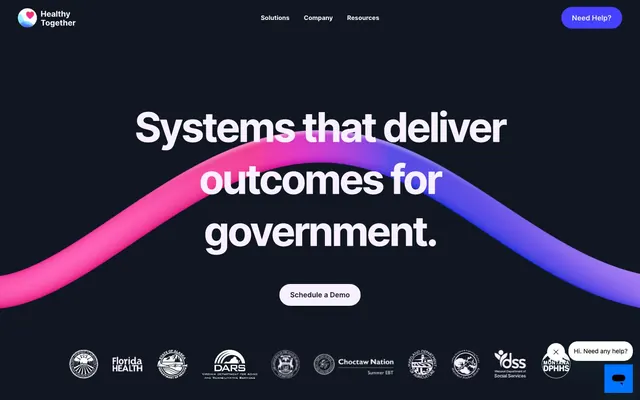
Preview image. Unlock full-res
midnight gradient horizon
Color palette
Primary action buttons, prominent card backgrounds, and a key color in the brand's signature gradient. It signifies interaction and energy; Hero section backgrounds and key decorative visuals. This gradient from vibrant violet to hot pink is a signature brand element
Dark page backgrounds, primary text, navigation elements, subtle borders. This deep gray creates depth and a calm, focused atmosphere
Light page backgrounds, secondary card surfaces, and select large UI sections. It offers a contrasting yet soft backdrop to dark text
Muted background for supporting cards and large content blocks, providing a gentle visual break from starker neutrals
Secondary text, muted headings, and decorative borders. A slightly darker neutral useful for de-emphasizing elements
Card backgrounds, navigation text, and occasional text in dark sections for maximum contrast
Typography
- Weights
- 400, 600, 700
- Sizes
- 14px, 16px, 24px, 36px, 64px, 72px, 92px
- Line height
- 0.88, 0.9, 1, 1.1, 1.15, 1.3, 1.4
- Letter spacing
- -0.05em
- Fallback
- system-ui, sans-serif
The sole typeface for all text content from body paragraphs to display headlines. Its clear, modern sans-serif form maintains legibility across diverse applications, with a notable consistent negative letter-spacing for a sophisticated, tight feel.
Spacing & shape
Elevation
Components
Bold, filled button with Plasma Violet background (#4541fe) and white text, featuring a maximal `16000px` border-radius for a pill shape. Padding is generous at `14px` vertical and `24px` horizontal.
Outline button with Midnight Ink (#101722) text and no background. The `16000px` border-radius creates a pill shape. Padding is `8px` vertical and `8px` horizontal.
Subtle button with Canvas Ice (#f9f0ff) background and Midnight Ink (#101722) text, maintaining the `16000px` pill radius and `14px` vertical, `24px` horizontal padding.
Snow White (#ffffff) background with large `42px` border-radius, giving a generous rounded corner. Internally spaced with `56px` top padding, `32px` horizontal padding, and `64px` bottom padding. No explicit shadow, relies on background contrast.
Features the brand's Plasma Violet (#4541fe) background, with a unique `150% 150% 0% 0%` border-radius, creating a distinct top-rounded shape. Contains a large, soft shadow of the same color, `rgb(69, 65, 254) 40px 0px 576px 160px`.
Utilizes Canvas Ice (#f9f0ff) as its background with an extremely large `1600px` border-radius, appearing as a soft, almost circular shape. Generous internal padding of `96px` vertical and `56px` horizontal.
Guidelines
- Use Inter font family for all text, applying a global letter-spacing of `-0.05em` to maintain a consistently tight, condensed feel.
- Prioritize Plasma Violet (#4541fe) for all primary interactive elements like buttons and key brand highlights.
- Apply `16000px` border-radius for all buttons and small interactive elements to achieve a distinct pill shape.
- Utilize Canvas Ice (#f9f0ff) or Snow White (#ffffff) for card backgrounds and content sections, reserving Midnight Ink (#101722) for entire page backgrounds in dark mode or hero sections.
- Maintain a clear visual hierarchy by using the Radiant Gradient for hero sections and dramatic visual introductions.
- Use `42px` border-radius for standard content cards to ensure a soft and approachable appearance across the system.
- Employ `16px` for `elementGap` horizontally and vertically to create comfortable spacing between UI elements.
- Avoid using harsh, saturated primary colors for large background areas that are not hero sections or prominent feature cards.
- Do not deviate from the Inter font family or its defined letter-spacing; consistency is crucial for brand recognition.
- Never use square or minimally rounded corners for interactive components; all buttons and critical interactive elements should be pill-shaped.
- Do not introduce new shadow styles for elevated elements; stick to the predefined shadow for Gradient Hero Cards or use no shadow.
- Avoid using multiple font sizes for body text; aim for `14px` or `16px` for main content based on context.
- Do not introduce strong, contrasting colors for text that are not Midnight Ink (#101722), Pale Stone (#6c6c7a), or Snow White (#ffffff).
- Avoid generic or standard button shapes; the pill-shaped `16000px` radius is a core identifier.
About this system
ShowHide
Healthy Together employs a cool, dark-mode canvas accented by vibrant, saturated gradients and a subtle, soft light theme for content sections. Typography is grounded in a single, versatile sans-serif family, used confidently across a wide range of sizes and precise tracking. Components feature large, pill-shaped buttons for primary actions and subtly rounded cards, providing a friendly yet professional interface.
The page primarily uses a max-width contained layout, though the hero section breaks this with a full-bleed dark background and a centered headline. Sections alternate between dark (Midnight Ink) and light (Canvas Ice/Snow White) backgrounds, creating a clear visual rhythm. Content is generally arranged in centered stacks for headlines and calls to action, transitioning to 2-column text + image layouts or 3-column card grids for features and testimonials. Vertical spacing between sections is generous and consistent. Navigation is a sticky top bar with a logo, menu links, and a distinctive Plasma Violet pill-shaped 'Need Help?' button.
The imagery style is a mix of abstract 3D renders and subtle iconography. The 3D render, seen in the hero, features organic, flowing shapes in the brand's gradient colors (Plasma Violet to Hot Pink), acting as an atmospheric and decorative element. When present, product imagery consists of tightly cropped screenshots or product surfaces, integrated subtly within cards or sections. Outlined icons with moderate stroke weight are used for functional clarity, typically in Midnight Ink or Pale Stone. The overall density is balanced, with imagery serving both decorative and explanatory roles, often framed by soft card shapes or integrated into background experiences.
Reminiscent of Stripe, Linear, Anthropic, Vercel.
# Healthy Together — Style Reference
> midnight gradient horizon

**Theme:** mixed

**Site:** https://www.healthytogether.co

Healthy Together employs a cool, dark-mode canvas accented by vibrant, saturated gradients and a subtle, soft light theme for content sections. Typography is grounded in a single, versatile sans-serif family, used confidently across a wide range of sizes and precise tracking. Components feature large, pill-shaped buttons for primary actions and subtly rounded cards, providing a friendly yet professional interface.

## Tokens — Colors

| Name | Value | Token | Role |
|------|------|------|------|
| Plasma Violet | `#4541fe` | `--color-plasma-violet` | Primary action buttons, prominent card backgrounds, and a key color in the brand's signature gradient. It signifies interaction and energy; Hero section backgrounds and key decorative visuals. This gradient from vibrant violet to hot pink is a signature brand element |
| Midnight Ink | `#101722` | `--color-midnight-ink` | Dark page backgrounds, primary text, navigation elements, subtle borders. This deep gray creates depth and a calm, focused atmosphere |
| Canvas Ice | `#f9f0ff` | `--color-canvas-ice` | Light page backgrounds, secondary card surfaces, and select large UI sections. It offers a contrasting yet soft backdrop to dark text |
| Soft Lavender | `#d9c6ff` | `--color-soft-lavender` | Muted background for supporting cards and large content blocks, providing a gentle visual break from starker neutrals |
| Pale Stone | `#6c6c7a` | `--color-pale-stone` | Secondary text, muted headings, and decorative borders. A slightly darker neutral useful for de-emphasizing elements |
| Snow White | `#ffffff` | `--color-snow-white` | Card backgrounds, navigation text, and occasional text in dark sections for maximum contrast |

## Tokens — Typography

### Inter
- **Substitute:** system-ui, sans-serif
- **Weights:** 400, 600, 700
- **Sizes:** 14px, 16px, 24px, 36px, 64px, 72px, 92px
- **Line height:** 0.88, 0.9, 1, 1.1, 1.15, 1.3, 1.4
- **Letter spacing:** -0.05em
- **Role:** The sole typeface for all text content from body paragraphs to display headlines. Its clear, modern sans-serif form maintains legibility across diverse applications, with a notable consistent negative letter-spacing for a sophisticated, tight feel.

## Tokens — Type Scale

| Role | Size | Line height | Letter spacing |
|------|------|------|------|
| caption | 14px | 1.4 | -0.05em |
| body | 16px | 1.3 | -0.05em |
| subheading | 24px | 1.15 | -0.05em |
| heading | 36px | 1.1 | -0.05em |
| heading-lg | 64px | 1 | -0.05em |
| display | 92px | 0.88 | -0.05em |

## Tokens — Spacing

- **Section gap:** 56px
- **Card padding:** 24px
- **Element gap:** 16px

## Tokens — Radius

- **Buttons:** 16000px
- **Cards:** 42px
- **badges:** 9999px

## Tokens — Elevation

- **Gradient Hero Card:** `rgb(69, 65, 254) 40px 0px 576px 160px`
- **Other:** `rgba(23, 73, 77, 0.15) 0px 20px 30px 0px`

## Layout

The page primarily uses a max-width contained layout, though the hero section breaks this with a full-bleed dark background and a centered headline. Sections alternate between dark (Midnight Ink) and light (Canvas Ice/Snow White) backgrounds, creating a clear visual rhythm. Content is generally arranged in centered stacks for headlines and calls to action, transitioning to 2-column text + image layouts or 3-column card grids for features and testimonials. Vertical spacing between sections is generous and consistent. Navigation is a sticky top bar with a logo, menu links, and a distinctive Plasma Violet pill-shaped 'Need Help?' button.

## Imagery

The imagery style is a mix of abstract 3D renders and subtle iconography. The 3D render, seen in the hero, features organic, flowing shapes in the brand's gradient colors (Plasma Violet to Hot Pink), acting as an atmospheric and decorative element. When present, product imagery consists of tightly cropped screenshots or product surfaces, integrated subtly within cards or sections. Outlined icons with moderate stroke weight are used for functional clarity, typically in Midnight Ink or Pale Stone. The overall density is balanced, with imagery serving both decorative and explanatory roles, often framed by soft card shapes or integrated into background experiences.

## Components

### Primary Action Button
*Call to action button*

Bold, filled button with Plasma Violet background (#4541fe) and white text, featuring a maximal `16000px` border-radius for a pill shape. Padding is generous at `14px` vertical and `24px` horizontal.

### Ghost Button
*Secondary action or subtle navigation*

Outline button with Midnight Ink (#101722) text and no background. The `16000px` border-radius creates a pill shape. Padding is `8px` vertical and `8px` horizontal.

### Cream Background Button
*Tertiary action or alternative prompt*

Subtle button with Canvas Ice (#f9f0ff) background and Midnight Ink (#101722) text, maintaining the `16000px` pill radius and `14px` vertical, `24px` horizontal padding.

### Standard Content Card
*Information container, testimonial display*

Snow White (#ffffff) background with large `42px` border-radius, giving a generous rounded corner. Internally spaced with `56px` top padding, `32px` horizontal padding, and `64px` bottom padding. No explicit shadow, relies on background contrast.

### Gradient Hero Card
*Prominent feature or call to action*

Features the brand's Plasma Violet (#4541fe) background, with a unique `150% 150% 0% 0%` border-radius, creating a distinct top-rounded shape. Contains a large, soft shadow of the same color, `rgb(69, 65, 254) 40px 0px 576px 160px`.

### Rounded Highlight Card
*Isolated highlight or feature panel*

Utilizes Canvas Ice (#f9f0ff) as its background with an extremely large `1600px` border-radius, appearing as a soft, almost circular shape. Generous internal padding of `96px` vertical and `56px` horizontal.

## Guidelines

### Do

- Use Inter font family for all text, applying a global letter-spacing of `-0.05em` to maintain a consistently tight, condensed feel.
- Prioritize Plasma Violet (#4541fe) for all primary interactive elements like buttons and key brand highlights.
- Apply `16000px` border-radius for all buttons and small interactive elements to achieve a distinct pill shape.
- Utilize Canvas Ice (#f9f0ff) or Snow White (#ffffff) for card backgrounds and content sections, reserving Midnight Ink (#101722) for entire page backgrounds in dark mode or hero sections.
- Maintain a clear visual hierarchy by using the Radiant Gradient for hero sections and dramatic visual introductions.
- Use `42px` border-radius for standard content cards to ensure a soft and approachable appearance across the system.
- Employ `16px` for `elementGap` horizontally and vertically to create comfortable spacing between UI elements.

### Don't

- Avoid using harsh, saturated primary colors for large background areas that are not hero sections or prominent feature cards.
- Do not deviate from the Inter font family or its defined letter-spacing; consistency is crucial for brand recognition.
- Never use square or minimally rounded corners for interactive components; all buttons and critical interactive elements should be pill-shaped.
- Do not introduce new shadow styles for elevated elements; stick to the predefined shadow for Gradient Hero Cards or use no shadow.
- Avoid using multiple font sizes for body text; aim for `14px` or `16px` for main content based on context.
- Do not introduce strong, contrasting colors for text that are not Midnight Ink (#101722), Pale Stone (#6c6c7a), or Snow White (#ffffff).
- Avoid generic or standard button shapes; the pill-shaped `16000px` radius is a core identifier.

## Agent Prompt Guide

Quick Color Reference:
text: #101722
background: #f9f0ff
border: #101722
accent: #4541fe
primary action: #4541fe (filled action)

Example Component Prompts:
1. Create a Primary Action Button: #4541fe background, #f9f0ff text, 9999px radius, compact pill padding. Use this filled treatment for the main CTA.
2. Design a Testimonial Card: Standard Content Card with Snow White (#ffffff) background and 42px radius. Inside, use Pale Stone (#6c6c7a) for paragraph text at 16px Inter weight 400. Include a Ghost Button for interaction.
3. Build a feature section card: Gradient Hero Card with Plasma Violet (#4541fe) background. Headline at 36px Inter weight 700, color Snow White (#ffffff), and letter-spacing -0.05em. Add a Cream Background Button below it.
More like this






Keep what you find
A free account saves references to boards and can send you a weekly email of picks based on what you save.
To see every result, go Pro.