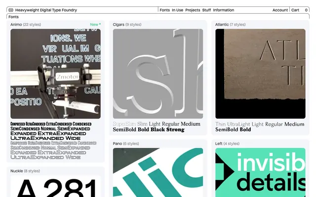
Preview image. Unlock full-res
Type foundry catalog on stark white
Color palette
Green outline accent for tags, dividers, and focused UI edges
Primary text, surface borders, general UI elements, active button background, interactive states — controls the overall dark and authoritative tone
Page backgrounds, card backgrounds, text on dark buttons — provides a clean, expansive base layer
Secondary surface backgrounds, default button backgrounds — adds subtle depth while maintaining achromatic purity
Subtle borders, dividers, decorative fills — a slightly softer black for structural accents
Secondary text, descriptive meta-information, disabled states — offers a softer contrast for less prominent content
Typography
- Weights
- 400, 500
- Sizes
- 14px, 16px
- Line height
- 1, 1.14, 1.25
- Letter spacing
- 0.013em for 14px, 0.014em for 16px
- Fallback
- Inter
Primary body text, navigation items, button labels — its custom design reinforces brand identity without being overly decorative. The slight positive letter-spacing at smaller sizes ensures legibility and a distinct 'digital' feel.
Spacing & shape
Components
Background: Surface Frost (#f3f5fa). Text: Heavy Ink (#222222). Border: 1px solid Heavy Ink (#222222). Radius: 11px. Padding: 12px vertical, 18px horizontal. Font: Nuckle website (400), 16px, line-height 1.25.
Background: Heavy Ink (#222222). Text: Canvas White (#ffffff). Border: 1px solid Canvas White (#ffffff). Radius: 10px. Padding: 7px vertical, 10px horizontal. This button has a slightly smaller radius and padding than the default.
Background: Canvas White (#ffffff). Text: Heavy Ink (#222222). Border: 1px solid Heavy Ink (#222222). Radius: 10px. Padding: 7px vertical, 10px horizontal. This button has a slightly smaller radius and padding than the default.
Background: transparent. No boxShadow. Border radius: 0px. Internal vertical spacing: 4px. Text: Nuckle website, various weights and sizes depending on content. Padding: 0px.
Background: transparent. No boxShadow. Border radius: 11px (likely for a container within the card). Contains a large padding-bottom to enforce aspect ratio. Padding: 0px. Text: Nuckle website, various weights and sizes, often including Accent Green for 'New' tags.
Text: Nuckle website (400 or 500 equivalent, 16px). Color: Heavy Ink (#222222). Hover state not explicitly defined but implied to be visually distinct. Padding: 5px vertical, 8px horizontal, with 2px right padding, and 23px or 166px right margin for spacing.
Guidelines
- Use Heavy Ink (#222222) for all primary text and critical UI borders to maintain high contrast and legibility.
- Apply Surface Frost (#f3f5fa) as a default background for interactive components and secondary surfaces to create subtle visual separation.
- Utilize rounded corners with an 11px radius for cards and default buttons, and 10px for smaller buttons, to provide a consistent, tempered aesthetic.
- Employ the Nuckle website font at 16px with a line height of 1.25 for most body text and navigation, ensuring clear readability.
- Reserve Accent Green (#39d17f) exclusively for 'new' markers or similar functional highlights, keeping chromatic color sparse and impactful.
- Maintain generous element spacing of 12px and card padding of 12px for comfortable information density.
- Structure pages with a clear hierarchy using large custom type for headings and minimal decorative elements.
- Do not introduce additional saturated colors; maintain the high-contrast achromatic base with Accent Green as the sole highlight.
- Avoid heavy drop shadows or intrusive gradients; rely on crisp borders and distinct surface colors for depth.
- Do not use overly dense layouts; leverage comfortable spacing tokens like `elementGap` (12px) to provide visual breathing room.
- Do not deviate from the specified font families; their custom nature is integral to the brand's identity.
- Do not use small, indistinct borders; prioritize strong, dark borders around interactive elements and cards for clarity.
- Avoid generic, full-bleed imagery without clear product context; imagery should be contained and purposeful.
- Do not use animations that distract; keep motion subtle (e.g., opacity, background-color transitions) to enhance interaction without overwhelming.
About this system
ShowHide
Heavyweight Type embraces a stark, high-contrast aesthetic, juxtaposing crisp black text and borders against expansive white and light gray surfaces. Typography is the undisputed hero, presented in large, impactful custom fonts that demand attention without heavy graphic treatments. The system prioritizes functional clarity and precise visual hierarchy, with minimal use of color, reserving a single vivid green as a subtle 'new' flag, making interactions feel deliberate and highly legible.
The page uses a maximum-width contained layout, approximately 1200px wide, with consistent large horizontal margins. The hero section often features a centered headline over a dark background, immediately emphasizing large typography. Content sections below the hero feature a responsive grid of cards, typically 3-4 columns, each showcasing a different font. Vertical section spacing is generous, with a `sectionGap` of 166px separating major content blocks. Navigation is a persistent top bar, horizontally aligned, with a standard set of links, cart, and account. Individual cards maintain their own internal padding and spacing for content. The visual rhythm is driven by the regular grid of cards against a large, uniform background.
Imagery largely consists of black-on-black or inverse graphic representations of typography, creating a high-contrast, artistic, and technical aesthetic. These are often contained within cards, sometimes with rounded corners (11px). When photography is used, it appears to be product-focused, showcasing the type in use in a stark, conceptual manner, rather than lifestyle. Icons are simple, outlined, and mostly monochromatic (Heavy Ink). The overall density is image-heavy in the font showcase sections, but the images serve as abstract examples of the typefaces themselves, rather than decorative elements. There are no full-bleed images, and all visuals are tightly integrated into the card structure.
Reminiscent of Pangram Pangram Foundry, Future Fonts, Grilli Type, Swiss Typefaces.
# Heavyweight — Style Reference
> Type foundry catalog on stark white

**Theme:** light

**Site:** https://heavyweight-type.com

Heavyweight Type embraces a stark, high-contrast aesthetic, juxtaposing crisp black text and borders against expansive white and light gray surfaces. Typography is the undisputed hero, presented in large, impactful custom fonts that demand attention without heavy graphic treatments. The system prioritizes functional clarity and precise visual hierarchy, with minimal use of color, reserving a single vivid green as a subtle 'new' flag, making interactions feel deliberate and highly legible.

## Tokens — Colors

| Name | Value | Token | Role |
|------|------|------|------|
| Accent Green | `#39d17f` | `--color-accent-green` | Green outline accent for tags, dividers, and focused UI edges |
| Heavy Ink | `#222222` | `--color-heavy-ink` | Primary text, surface borders, general UI elements, active button background, interactive states — controls the overall dark and authoritative tone |
| Canvas White | `#ffffff` | `--color-canvas-white` | Page backgrounds, card backgrounds, text on dark buttons — provides a clean, expansive base layer |
| Surface Frost | `#f3f5fa` | `--color-surface-frost` | Secondary surface backgrounds, default button backgrounds — adds subtle depth while maintaining achromatic purity |
| Border Graphite | `#2d2d2d` | `--color-border-graphite` | Subtle borders, dividers, decorative fills — a slightly softer black for structural accents |
| Muted Ash | `#888888` | `--color-muted-ash` | Secondary text, descriptive meta-information, disabled states — offers a softer contrast for less prominent content |

## Tokens — Typography

### Nuckle website
- **Substitute:** Inter
- **Weights:** 400, 500
- **Sizes:** 14px, 16px
- **Line height:** 1, 1.14, 1.25
- **Letter spacing:** 0.013em for 14px, 0.014em for 16px
- **Role:** Primary body text, navigation items, button labels — its custom design reinforces brand identity without being overly decorative. The slight positive letter-spacing at smaller sizes ensures legibility and a distinct 'digital' feel.

## Tokens — Type Scale

| Role | Size | Line height | Letter spacing |
|------|------|------|------|
| body | 14px | 1.14 | 0.18px |
| body-lg | 16px | 1.25 | 0.22px |

## Tokens — Spacing

- **Section gap:** 166px
- **Card padding:** 12px
- **Element gap:** 12px

## Tokens — Radius

- **all:** 11px

## Layout

The page uses a maximum-width contained layout, approximately 1200px wide, with consistent large horizontal margins. The hero section often features a centered headline over a dark background, immediately emphasizing large typography. Content sections below the hero feature a responsive grid of cards, typically 3-4 columns, each showcasing a different font. Vertical section spacing is generous, with a `sectionGap` of 166px separating major content blocks. Navigation is a persistent top bar, horizontally aligned, with a standard set of links, cart, and account. Individual cards maintain their own internal padding and spacing for content. The visual rhythm is driven by the regular grid of cards against a large, uniform background.

## Imagery

Imagery largely consists of black-on-black or inverse graphic representations of typography, creating a high-contrast, artistic, and technical aesthetic. These are often contained within cards, sometimes with rounded corners (11px). When photography is used, it appears to be product-focused, showcasing the type in use in a stark, conceptual manner, rather than lifestyle. Icons are simple, outlined, and mostly monochromatic (Heavy Ink). The overall density is image-heavy in the font showcase sections, but the images serve as abstract examples of the typefaces themselves, rather than decorative elements. There are no full-bleed images, and all visuals are tightly integrated into the card structure.

## Components

### Default Button
*Standard interactive element for general actions.*

Background: Surface Frost (#f3f5fa). Text: Heavy Ink (#222222). Border: 1px solid Heavy Ink (#222222). Radius: 11px. Padding: 12px vertical, 18px horizontal. Font: Nuckle website (400), 16px, line-height 1.25.

### Primary Dark Button
*Emphasized action, often a confirmation or acceptance.*

Background: Heavy Ink (#222222). Text: Canvas White (#ffffff). Border: 1px solid Canvas White (#ffffff). Radius: 10px. Padding: 7px vertical, 10px horizontal. This button has a slightly smaller radius and padding than the default.

### Outlined Light Button
*Alternative action, often used in conjunction with a primary dark button.*

Background: Canvas White (#ffffff). Text: Heavy Ink (#222222). Border: 1px solid Heavy Ink (#222222). Radius: 10px. Padding: 7px vertical, 10px horizontal. This button has a slightly smaller radius and padding than the default.

### Font Showcase Card (Minimal)
*Displays font examples with minimal visual chrome.*

Background: transparent. No boxShadow. Border radius: 0px. Internal vertical spacing: 4px. Text: Nuckle website, various weights and sizes depending on content. Padding: 0px.

### Font Showcase Card (Image Placeholder)
*Card with an explicit aspect ratio for image/video content (e.g., animated font previews).*

Background: transparent. No boxShadow. Border radius: 11px (likely for a container within the card). Contains a large padding-bottom to enforce aspect ratio. Padding: 0px. Text: Nuckle website, various weights and sizes, often including Accent Green for 'New' tags.

### Navigation Link
*Top-level navigation items.*

Text: Nuckle website (400 or 500 equivalent, 16px). Color: Heavy Ink (#222222). Hover state not explicitly defined but implied to be visually distinct. Padding: 5px vertical, 8px horizontal, with 2px right padding, and 23px or 166px right margin for spacing.

## Guidelines

### Do

- Use Heavy Ink (#222222) for all primary text and critical UI borders to maintain high contrast and legibility.
- Apply Surface Frost (#f3f5fa) as a default background for interactive components and secondary surfaces to create subtle visual separation.
- Utilize rounded corners with an 11px radius for cards and default buttons, and 10px for smaller buttons, to provide a consistent, tempered aesthetic.
- Employ the Nuckle website font at 16px with a line height of 1.25 for most body text and navigation, ensuring clear readability.
- Reserve Accent Green (#39d17f) exclusively for 'new' markers or similar functional highlights, keeping chromatic color sparse and impactful.
- Maintain generous element spacing of 12px and card padding of 12px for comfortable information density.
- Structure pages with a clear hierarchy using large custom type for headings and minimal decorative elements.

### Don't

- Do not introduce additional saturated colors; maintain the high-contrast achromatic base with Accent Green as the sole highlight.
- Avoid heavy drop shadows or intrusive gradients; rely on crisp borders and distinct surface colors for depth.
- Do not use overly dense layouts; leverage comfortable spacing tokens like `elementGap` (12px) to provide visual breathing room.
- Do not deviate from the specified font families; their custom nature is integral to the brand's identity.
- Do not use small, indistinct borders; prioritize strong, dark borders around interactive elements and cards for clarity.
- Avoid generic, full-bleed imagery without clear product context; imagery should be contained and purposeful.
- Do not use animations that distract; keep motion subtle (e.g., opacity, background-color transitions) to enhance interaction without overwhelming.

## Agent Prompt Guide

### Quick Color Reference
text: #222222
background: #ffffff
border: #222222
accent: #39d17f
primary action: no distinct CTA color

### 3-5 Example Component Prompts
1. Create a default button with the label 'Submit'. Use Surface Frost (#f3f5fa) background, Heavy Ink (#222222) text and 1px border, Nuckle website font at 16px, 11px radius, and 12px vertical / 18px horizontal padding.
No distinct primary action color was observed; use the extracted neutral button treatments instead of inventing a filled CTA color.
3. Build a Font Showcase Card: transparent background, no border, no shadow, 0px radius. Inside, feature a large 'Animo' header in Heavy Ink (#222222), and a sub-label 'New' in Accent Green (#39d17f), with 4px vertical element gap between them.
4. Create a top navigation link for 'Projects'. Use Heavy Ink (#222222) Nuckle website font at 16px, with 5px vertical padding and 8px horizontal padding, and 23px right margin for spacing to the next element.
More like this









Keep what you find
A free account saves references to boards and can send you a weekly email of picks based on what you save.
To see every result, go Pro.