
Preview image. Unlock full-res
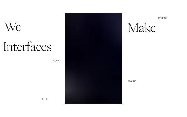
Art Gallery Minimalism: Project thumbnails, like curated art pieces, float on a light, matte background, each framed by a subtle, soft shadow box.
Color palette
Page backgrounds, card surfaces, form input fields, buttons.
Primary body text, headings, input text, and high-contrast elements.
Secondary text, link text, borders for inactive elements, and subtle dividers.
Informational body text, lower contrast textual elements.
Subtle borders and input field outlines.
Color for inactive or secondary button text.
Typography
- Weights
- 400
- Sizes
- 14px, 15px, 20px
- Line height
- 1.2, 1.4, 1.5
- Letter spacing
- normal
- Fallback
- system-ui, 'Helvetica Neue', 'Segoe UI', Arial, sans-serif
Default text for body copy, navigational links, button labels, and input fields. Sizes 14px and 15px handle most informational content, with 20px reserved for more prominent informational statements.
- Weights
- 400
- Sizes
- 13px
- Line height
- 1.5
- Letter spacing
- -0.49
- Fallback
- serif
This custom font, though small at 13px, is used for specific textual details, its negative letter-spacing (-0.0380em) hinting at a refined, almost condensed aesthetic that creates subtle visual tension against the regular sans-serif.
Spacing & shape
Elevation
Components
Background: Canvas White (#f4f3f1). Text: Graphite Text (#333333). Border Top: Dust Border (#eeeded). Padding: 20px vertical, 30px horizontal. Right border radius: 5px, others 0px. Font: sans-serif 400, 15px, 1.4 lineHeight.
Background: Canvas White (#f4f3f1). Text: Inactive Slate (#666666). Border Top: Dust Border (#eeeded). Padding: 15px vertical, 40px horizontal. Border radius: 5px. Font: sans-serif 400, 15px, 1.4 lineHeight.
Background: Canvas White (#f4f3f1). Text: Graphite Text (#333333). Border Top: Dust Border (#eeeded). Padding: 20px. Border radius: 5px. Font: sans-serif 400, 15px, 1.4 lineHeight.
Background: Canvas White (#f4f3f1). Text: Graphite Text (#333333). Border Top: Dust Border (#eeeded). Padding: 20px. Left border radius: 5px, others 0px. Font: sans-serif 400, 15px, 1.4 lineHeight.
A container with background Canvas White (#f4f3f1) and a pronounced, soft shadow: rgba(90, 50, 40, 0.15) 0px 5px 15px 0px, rgba(80, 40, 30, 0.1) 0px 4px 8px 0px. Border radius: 5px.
Guidelines
- Use Canvas White (#f4f3f1) as the primary background for all major content sections and interactive elements.
- Apply Graphite Text (#333333) for all primary body text, headings, and high-contrast UI labels.
- Frame significant visual content, like project cards, with the soft elevation shadow: rgba(90, 50, 40, 0.15) 0px 5px 15px 0px, rgba(80, 40, 30, 0.1) 0px 4px 8px 0px.
- Maintain a clear vertical rhythm between sections using a 122px gap (`sectionGap`).
- Employ a uniform 5px border radius (`radius.inputs`, `radius.buttons`, `radius.cards`) for all rounded elements.
- Utilize Ash Details (#aaaaaa) for all auxiliary textual elements, links, and borders on non-primary UI elements.
- Avoid using highly saturated or chromatic colors; adhere strictly to the achromatic palette.
- Do not introduce sharp corners or larger radii than 5px for any interactive or card-like elements.
- Do not vary line heights for `sans-serif` from the specified 1.2, 1.4, or 1.5, or for `Suisse Works Trial` from 1.5.
- Do not deviate from the specified letter-spacing for `Suisse Works Trial`; its tightly spaced appearance is a signature element.
- Do not use complex gradient fills or patterned backgrounds; surfaces should remain uniformly Canvas White (#f4f3f1) or Dust Border (#dddddd).
About this system
ShowHide
This design system evokes the ambiance of a high-end art gallery, where precise visual arrangement and subtle material textures give objects a curated weight. A minimalist palette of near-white, light gray, and charcoal provides a neutral stage, making the content—especially project thumbnails framed by soft shadows—the primary visual event. The extensive use of achromatic tones ensures a calm, contemplative experience, subtly emphasizing the work itself rather than decorative flair. Sparse, intentional typography with a high degree of contrast feels both academic and accessible.
The page adheres to a max-width contained model, centered on the screen, creating a formal, academic presentation space. The hero section is a simple, centered text block with ample negative space. Content sections are primarily a grid of project cards, arranged in a visually consistent 3-column layout, maintaining generous horizontal and vertical spacing. The rhythm is established by section gaps of 122px, separating distinct content blocks vertically. The overall density is spacious, emphasizing individual content elements. Navigation is a minimal top-right link cluster, reinforcing the content-first approach.
This design primarily relies on product screenshots and illustrative web interfaces within project cards, contained and presented as distinct objects. The 'project thumbnail' treatment is crucial: these are not full-bleed images, but smaller, contained visuals framed by Card White (#f4f3f1) and lifted by a soft, brown-tinted shadow. This makes each project feel like a displayed artifact. Photography, when used, is integrated within these 'project cards' and visually consistent with digital output, often focused on UI elements or abstract textures. The role of imagery is strictly to showcase work, not to add decorative flourish or lifestyle context. Icons, where present, are minimal line-art, fitting the achromatic theme.
Reminiscent of Awwwards-featured portfolio sites, Certain architecture portfolio sites, High-end product display pages, Minimalist editorial platforms.
# Brisbane Web Developer — Style Reference
> Art Gallery Minimalism: Project thumbnails, like curated art pieces, float on a light, matte background, each framed by a subtle, soft shadow box.

**Theme:** light

**Site:** https://carlbeaverson.com

This design system evokes the ambiance of a high-end art gallery, where precise visual arrangement and subtle material textures give objects a curated weight. A minimalist palette of near-white, light gray, and charcoal provides a neutral stage, making the content—especially project thumbnails framed by soft shadows—the primary visual event. The extensive use of achromatic tones ensures a calm, contemplative experience, subtly emphasizing the work itself rather than decorative flair. Sparse, intentional typography with a high degree of contrast feels both academic and accessible.

## Tokens — Colors

| Name | Value | Token | Role |
|------|------|------|------|
| Canvas White | `#f4f3f1` | `--color-canvas-white` | Page backgrounds, card surfaces, form input fields, buttons. |
| Graphite Text | `#333333` | `--color-graphite-text` | Primary body text, headings, input text, and high-contrast elements. |
| Ash Details | `#aaaaaa` | `--color-ash-details` | Secondary text, link text, borders for inactive elements, and subtle dividers. |
| Stone Gray | `#4d4d4d` | `--color-stone-gray` | Informational body text, lower contrast textual elements. |
| Dust Border | `#dddddd` | `--color-dust-border` | Subtle borders and input field outlines. |
| Inactive Slate | `#666666` | `--color-inactive-slate` | Color for inactive or secondary button text. |

## Tokens — Typography

### sans-serif
- **Substitute:** system-ui, 'Helvetica Neue', 'Segoe UI', Arial, sans-serif
- **Weights:** 400
- **Sizes:** 14px, 15px, 20px
- **Line height:** 1.2, 1.4, 1.5
- **Letter spacing:** normal
- **Role:** Default text for body copy, navigational links, button labels, and input fields. Sizes 14px and 15px handle most informational content, with 20px reserved for more prominent informational statements.

### Suisse Works Trial
- **Substitute:** serif
- **Weights:** 400
- **Sizes:** 13px
- **Line height:** 1.5
- **Letter spacing:** -0.49
- **Role:** This custom font, though small at 13px, is used for specific textual details, its negative letter-spacing (-0.0380em) hinting at a refined, almost condensed aesthetic that creates subtle visual tension against the regular sans-serif.

## Tokens — Type Scale

Major Third (1.25) from 15px base.

| Role | Size | Line height | Letter spacing |
|------|------|------|------|
| caption | 13px | 1.5 | -0.49px |
| body | 15px | 1.4 | — |
| heading-sm | 20px | 1.2 | — |

## Tokens — Spacing

- **Section gap:** 122px
- **Card padding:** 20px
- **Element gap:** 10px

## Tokens — Radius

- **Buttons:** 5px
- **Inputs:** 5px
- **Cards:** 5px

## Tokens — Elevation

- **Project Thumbnail Card:** `rgba(90, 50, 40, 0.15) 0px 5px 15px 0px, rgba(80, 40, 30, 0.1) 0px 4px 8px 0px`

## Layout

The page adheres to a max-width contained model, centered on the screen, creating a formal, academic presentation space. The hero section is a simple, centered text block with ample negative space. Content sections are primarily a grid of project cards, arranged in a visually consistent 3-column layout, maintaining generous horizontal and vertical spacing. The rhythm is established by section gaps of 122px, separating distinct content blocks vertically. The overall density is spacious, emphasizing individual content elements. Navigation is a minimal top-right link cluster, reinforcing the content-first approach.

## Imagery

This design primarily relies on product screenshots and illustrative web interfaces within project cards, contained and presented as distinct objects. The 'project thumbnail' treatment is crucial: these are not full-bleed images, but smaller, contained visuals framed by Card White (#f4f3f1) and lifted by a soft, brown-tinted shadow. This makes each project feel like a displayed artifact. Photography, when used, is integrated within these 'project cards' and visually consistent with digital output, often focused on UI elements or abstract textures. The role of imagery is strictly to showcase work, not to add decorative flourish or lifestyle context. Icons, where present, are minimal line-art, fitting the achromatic theme.

## Components

### Project Thumbnail Card

### Hero Bio Text Block

### Newsletter Segmented Form

### Primary Button
*Call-to-action buttons for submissions.*

Background: Canvas White (#f4f3f1). Text: Graphite Text (#333333). Border Top: Dust Border (#eeeded). Padding: 20px vertical, 30px horizontal. Right border radius: 5px, others 0px. Font: sans-serif 400, 15px, 1.4 lineHeight.

### Secondary Button
*General interactive buttons.*

Background: Canvas White (#f4f3f1). Text: Inactive Slate (#666666). Border Top: Dust Border (#eeeded). Padding: 15px vertical, 40px horizontal. Border radius: 5px. Font: sans-serif 400, 15px, 1.4 lineHeight.

### Text Input
*Standard user input fields.*

Background: Canvas White (#f4f3f1). Text: Graphite Text (#333333). Border Top: Dust Border (#eeeded). Padding: 20px. Border radius: 5px. Font: sans-serif 400, 15px, 1.4 lineHeight.

### Segmented Input Left
*Input field designed to be part of a group, appearing on the left.*

Background: Canvas White (#f4f3f1). Text: Graphite Text (#333333). Border Top: Dust Border (#eeeded). Padding: 20px. Left border radius: 5px, others 0px. Font: sans-serif 400, 15px, 1.4 lineHeight.

### Project Thumbnail Card
*Displays project previews.*

A container with background Canvas White (#f4f3f1) and a pronounced, soft shadow: rgba(90, 50, 40, 0.15) 0px 5px 15px 0px, rgba(80, 40, 30, 0.1) 0px 4px 8px 0px. Border radius: 5px.

## Guidelines

### Do

- Use Canvas White (#f4f3f1) as the primary background for all major content sections and interactive elements.
- Apply Graphite Text (#333333) for all primary body text, headings, and high-contrast UI labels.
- Frame significant visual content, like project cards, with the soft elevation shadow: rgba(90, 50, 40, 0.15) 0px 5px 15px 0px, rgba(80, 40, 30, 0.1) 0px 4px 8px 0px.
- Maintain a clear vertical rhythm between sections using a 122px gap (`sectionGap`).
- Employ a uniform 5px border radius (`radius.inputs`, `radius.buttons`, `radius.cards`) for all rounded elements.
- Utilize Ash Details (#aaaaaa) for all auxiliary textual elements, links, and borders on non-primary UI elements.

### Don't

- Avoid using highly saturated or chromatic colors; adhere strictly to the achromatic palette.
- Do not introduce sharp corners or larger radii than 5px for any interactive or card-like elements.
- Do not vary line heights for `sans-serif` from the specified 1.2, 1.4, or 1.5, or for `Suisse Works Trial` from 1.5.
- Do not deviate from the specified letter-spacing for `Suisse Works Trial`; its tightly spaced appearance is a signature element.
- Do not use complex gradient fills or patterned backgrounds; surfaces should remain uniformly Canvas White (#f4f3f1) or Dust Border (#dddddd).

## Agent Prompt Guide

### Quick Color Reference
- Text: #333333 (Graphite Text)
- Background: #f4f3f1 (Canvas White)
- Accent/Links: #aaaaaa (Ash Details)
- Input Borders: #dddddd (Dust Border)
- Button Background: #f4f3f1 (Canvas White)

### 3-5 Example Component Prompts
1. Create a `Project Thumbnail Card`: Use `Canvas White` (#f4f3f1) background, apply the shadow `rgba(90, 50, 40, 0.15) 0px 5px 15px 0px, rgba(80, 40, 30, 0.1) 0px 4px 8px 0px`, and set `5px` border radius everywhere. Inside, place a digital product screenshot.
2. Design a `Primary Button` for submission: Background `Canvas White` (#f4f3f1), text `Graphite Text` (#333333), `20px` vertical padding, `30px` horizontal padding. Apply `5px` border radius only to the right side, `0px` to others. Font: `sans-serif 400`, `15px`, `lineHeight 1.4`.
3. Implement a `Text Input` field: Background `Canvas White` (#f4f3f1), text `Graphite Text` (#333333), border `1px solid Dust Border` (#dddddd). Padding: `20px` all around. Border radius: `5px`. Font: `sans-serif 400`, `15px`, `lineHeight 1.4`.
4. Create a `Body Text Block`: Use `Stone Gray` (#4d4d4d) for the primary text color. Font `sans-serif 400`, `15px`, `lineHeight 1.4`. Ensure `122px` vertical spacing to the next section.
More like this





Keep what you find
A free account saves references to boards and can send you a weekly email of picks based on what you save.
To see every result, go Pro.