Preview image. Unlock full-res
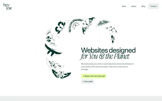
Eco-minimalist botanical blueprint: Lush green accents on a cream canvas.
Color palette
Primary text, critical headings, active navigation text, button backgrounds (inverted), icon fills — evokes nature and seriousness
Accent color for call-to-action button backgrounds, highlighted card backgrounds, interactive elements, and decorative fills — a vibrant, natural highlight
Page background, light surface borders, subtle dividers
Card backgrounds, primary button backgrounds (ghost style), elevated content surfaces
High-contrast decorative lines, specific button backgrounds for impactful statements
Secondary body text, muted helper text, subtle link text
Subtle text elements, less prominent informational text
Typography
- Weights
- 400, 600
- Sizes
- 9px, 10px, 11px, 12px, 14px, 16px, 17px, 24px, 30px, 36px, 43px, 52px, 62px
- Line height
- 0.8, 0.9, 1, 1.1, 1.13, 1.14, 1.2, 1.4, 1.5, 1.53, 1.6, 1.61
- Letter spacing
- -0.0640em at 62px, -0.0590em at 52px, -0.0510em at 43px, -0.0390em at 36px, -0.0310em at 30px, -0.0250em at 24px, -0.0200em at 17px, -0.0160em at 16px, 0.0250em at 10px, 0.0560em at 9px
- Fallback
- system-ui, sans-serif
Primary font for body text, navigation, and most headings. Its clean, slightly condensed form provides a modern, efficient feel with precise tracking for impact.
- Weights
- 400
- Sizes
- 52px, 62px, 68px
- Line height
- 0.82, 0.83
- Fallback
- serif
Display font for large, impactful headlines, adding a touch of distinct personality and organic flair. Normal letter-spacing prevents it from becoming too tight.
- Weights
- 400
- Sizes
- 20px
- Line height
- 1.5
sans-serif — detected in extracted data but not described by AI
Spacing & shape
Components
Filled button with a Green Flash background (#e6ffa3), Forest Green text (#003329), and 8px border radius. Padding is 8px vertical, 12px horizontal. Used for primary user actions.
Ghost button with a Paper White background (#ffffff), Forest Green text (#003329), and 8px border radius. Padding is 8px vertical, 12px horizontal. Used for less prominent actions.
Filled button with a Forest Green background (#003329), Green Flash text (#e6ffa3), and 8px border radius. Padding is 8px vertical, 12px horizontal. Used for impactful calls to action on light backgrounds.
Card with a Green Flash background (#e6ffa3), no box shadow, and 8px border radius. Internal padding is 24px on all sides. Used to highlight features or information blocks.
Card with a Paper White background (#ffffff), no box shadow, and 8px border radius. Used for general content presentation without specific highlighting.
Filled button with Charcoal Black background (#000000), Green Flash text (#e6ffa3), and 8px border radius. Padding is 8px vertical, 12px horizontal. For high-impact, dark hero sections.
White card (Paper White: #ffffff) with 8px radius, no shadow, and 27.78px universal padding for displaying external logos with ample breathing room.
Guidelines
- Prioritize Forest Green (#003329) for all primary text and critical UI elements to establish brand presence.
- Use Green Flash (#e6ffa3) exclusively for primary calls-to-action, active indicators, and highlighted content blocks to draw attention.
- Maintain an 8px border radius for all buttons, cards, and most images to ensure a consistent friendly yet precise feel.
- Apply 24px vertical and horizontal padding to content cards and sections for a comfortable, uncrowded layout.
- Employ UntitledSans for all body text and most headings, adjusting letter-spacing according to the scale to maintain legibility and visual rhythm.
- Use BoogyBrutPoster (weight 400, normal letter-spacing) specifically for large, expressive headlines to add a unique brand signature.
- Separate sections with a consistent 56px vertical gap for clear content distinction.
- Avoid using multiple chromatic colors; limit vibrant color usage strictly to Green Flash (#e6ffa3) as the single accent.
- Do not introduce heavy drop shadows or glows; surfaces should remain flat or use subtle elevation where absolutely necessary.
- Do not deviate from the established 8px border radius for primary interface elements; avoid sharp corners or overly rounded shapes.
- Do not use generic sans-serif fonts for headlines when a custom font is available; the BoogyBrutPoster font is critical for brand recognition.
- Avoid dense, information-packed sections without generous padding and spacing; maintain a comfortable density with ample whitespace.
- Do not apply excessive letter-spacing to body text; follow the defined negative tracking for UntitledSans at larger sizes and normal for smaller sizes.
About this system
ShowHide
Hey Low utilizes a fresh, eco-conscious aesthetic, blending a serene light theme with a strong emphasis on a single accent green. Typography is understated yet precise, with a custom sans-serif for content and a distinctive display font for headlines. Components are minimal, relying on soft radii and a prominent, specific accent green for interactive elements and highlighted content, rather than heavy borders or deep shadows. The overall feel is one of thoughtful efficiency, with visual weight primarily driven by color rather than complex styling.
The page primarily uses a max-width 1200px centered layout for content sections. The hero section is a full-width arrangement with a centered headline and supporting text, flanked by a large, circular graphic element featuring butterfly illustrations. Subsequent sections alternate between full-width neutral backgrounds and max-width contained content blocks. Content is typically arranged in left-aligned or centered stacks, with features presented in a flexible grid (e.g., 3-column card grid). There's a consistent vertical rhythm of 56px section gaps, contributing to a spacious, comfortable feel. Navigation is a minimalist top bar with right-aligned links and a 'Contact' button.
Imagery primarily features product screenshots and abstract graphic elements. Product shots are typically contained with either a subtle background or masked elements. Illustrations are flat, bold, and organic, often using brand colors (Forest Green, Green Flash) with abstract shapes. Iconography is primarily filled, often monochromatic in Forest Green, with a medium stroke weight where outlines exist. Images serve both decorative atmosphere and explanatory content roles, maintaining a relatively balanced density with text, ensuring visual breaks without overwhelming content.
Reminiscent of Stripe, Linear, Fathom Analytics, Basecamp.
# Hey Low — Style Reference
> Eco-minimalist botanical blueprint: Lush green accents on a cream canvas.

**Theme:** light

**Site:** https://heylow.world

Hey Low utilizes a fresh, eco-conscious aesthetic, blending a serene light theme with a strong emphasis on a single accent green. Typography is understated yet precise, with a custom sans-serif for content and a distinctive display font for headlines. Components are minimal, relying on soft radii and a prominent, specific accent green for interactive elements and highlighted content, rather than heavy borders or deep shadows. The overall feel is one of thoughtful efficiency, with visual weight primarily driven by color rather than complex styling.

## Tokens — Colors

| Name | Value | Token | Role |
|------|------|------|------|
| Forest Green | `#003329` | `--color-forest-green` | Primary text, critical headings, active navigation text, button backgrounds (inverted), icon fills — evokes nature and seriousness |
| Green Flash | `#e6ffa3` | `--color-green-flash` | Accent color for call-to-action button backgrounds, highlighted card backgrounds, interactive elements, and decorative fills — a vibrant, natural highlight |
| Ash Gray | `#e5e7eb` | `--color-ash-gray` | Page background, light surface borders, subtle dividers |
| Paper White | `#ffffff` | `--color-paper-white` | Card backgrounds, primary button backgrounds (ghost style), elevated content surfaces |
| Charcoal Black | `#000000` | `--color-charcoal-black` | High-contrast decorative lines, specific button backgrounds for impactful statements |
| Moss Gray | `#52756e` | `--color-moss-gray` | Secondary body text, muted helper text, subtle link text |
| Dark Olive | `#33544c` | `--color-dark-olive` | Subtle text elements, less prominent informational text |

## Tokens — Typography

### UntitledSans
- **Substitute:** system-ui, sans-serif
- **Weights:** 400, 600
- **Sizes:** 9px, 10px, 11px, 12px, 14px, 16px, 17px, 24px, 30px, 36px, 43px, 52px, 62px
- **Line height:** 0.8, 0.9, 1, 1.1, 1.13, 1.14, 1.2, 1.4, 1.5, 1.53, 1.6, 1.61
- **Letter spacing:** -0.0640em at 62px, -0.0590em at 52px, -0.0510em at 43px, -0.0390em at 36px, -0.0310em at 30px, -0.0250em at 24px, -0.0200em at 17px, -0.0160em at 16px, 0.0250em at 10px, 0.0560em at 9px
- **Role:** Primary font for body text, navigation, and most headings. Its clean, slightly condensed form provides a modern, efficient feel with precise tracking for impact.

### BoogyBrutPoster
- **Substitute:** serif
- **Weights:** 400
- **Sizes:** 52px, 62px, 68px
- **Line height:** 0.82, 0.83
- **Role:** Display font for large, impactful headlines, adding a touch of distinct personality and organic flair. Normal letter-spacing prevents it from becoming too tight.

### sans-serif
- **Weights:** 400
- **Sizes:** 20px
- **Line height:** 1.5
- **Role:** sans-serif — detected in extracted data but not described by AI

## Tokens — Type Scale

Perfect Fourth (1.333) from 17px base.

| Role | Size | Line height | Letter spacing |
|------|------|------|------|
| body | 17px | 1.53 | -0.34px |
| subheading | 24px | 1.4 | -0.6px |
| heading-sm | 30px | 1.2 | -0.93px |
| heading | 36px | 1.14 | -1.4px |
| heading-lg | 43px | 1.13 | -2.2px |
| display | 68px | 0.82 | — |

## Tokens — Spacing

- **Max width:** 1200px
- **Section gap:** 56px
- **Card padding:** 24-28px
- **Element gap:** 7px

## Tokens — Radius

- **Buttons:** 8px
- **Cards:** 8px
- **Images:** 8px
- **navigation:** 4px
- **pills:** 999999px

## Layout

The page primarily uses a max-width 1200px centered layout for content sections. The hero section is a full-width arrangement with a centered headline and supporting text, flanked by a large, circular graphic element featuring butterfly illustrations. Subsequent sections alternate between full-width neutral backgrounds and max-width contained content blocks. Content is typically arranged in left-aligned or centered stacks, with features presented in a flexible grid (e.g., 3-column card grid). There's a consistent vertical rhythm of 56px section gaps, contributing to a spacious, comfortable feel. Navigation is a minimalist top bar with right-aligned links and a 'Contact' button.

## Imagery

Imagery primarily features product screenshots and abstract graphic elements. Product shots are typically contained with either a subtle background or masked elements. Illustrations are flat, bold, and organic, often using brand colors (Forest Green, Green Flash) with abstract shapes. Iconography is primarily filled, often monochromatic in Forest Green, with a medium stroke weight where outlines exist. Images serve both decorative atmosphere and explanatory content roles, maintaining a relatively balanced density with text, ensuring visual breaks without overwhelming content.

## Components

### Primary Call-to-Action Button
*Interactive element*

Filled button with a Green Flash background (#e6ffa3), Forest Green text (#003329), and 8px border radius. Padding is 8px vertical, 12px horizontal. Used for primary user actions.

### Secondary Ghost Button
*Interactive element*

Ghost button with a Paper White background (#ffffff), Forest Green text (#003329), and 8px border radius. Padding is 8px vertical, 12px horizontal. Used for less prominent actions.

### Dark Call-to-Action Button
*Interactive element*

Filled button with a Forest Green background (#003329), Green Flash text (#e6ffa3), and 8px border radius. Padding is 8px vertical, 12px horizontal. Used for impactful calls to action on light backgrounds.

### Feature Card (Green)
*Content container*

Card with a Green Flash background (#e6ffa3), no box shadow, and 8px border radius. Internal padding is 24px on all sides. Used to highlight features or information blocks.

### Content Card (White)
*Content container*

Card with a Paper White background (#ffffff), no box shadow, and 8px border radius. Used for general content presentation without specific highlighting.

### Hero CTA Button (Dark Background)
*Interactive Element for hero section*

Filled button with Charcoal Black background (#000000), Green Flash text (#e6ffa3), and 8px border radius. Padding is 8px vertical, 12px horizontal. For high-impact, dark hero sections.

### Client Logo Card
*Brand/Partner display*

White card (Paper White: #ffffff) with 8px radius, no shadow, and 27.78px universal padding for displaying external logos with ample breathing room.

## Guidelines

### Do

- Prioritize Forest Green (#003329) for all primary text and critical UI elements to establish brand presence.
- Use Green Flash (#e6ffa3) exclusively for primary calls-to-action, active indicators, and highlighted content blocks to draw attention.
- Maintain an 8px border radius for all buttons, cards, and most images to ensure a consistent friendly yet precise feel.
- Apply 24px vertical and horizontal padding to content cards and sections for a comfortable, uncrowded layout.
- Employ UntitledSans for all body text and most headings, adjusting letter-spacing according to the scale to maintain legibility and visual rhythm.
- Use BoogyBrutPoster (weight 400, normal letter-spacing) specifically for large, expressive headlines to add a unique brand signature.
- Separate sections with a consistent 56px vertical gap for clear content distinction.

### Don't

- Avoid using multiple chromatic colors; limit vibrant color usage strictly to Green Flash (#e6ffa3) as the single accent.
- Do not introduce heavy drop shadows or glows; surfaces should remain flat or use subtle elevation where absolutely necessary.
- Do not deviate from the established 8px border radius for primary interface elements; avoid sharp corners or overly rounded shapes.
- Do not use generic sans-serif fonts for headlines when a custom font is available; the BoogyBrutPoster font is critical for brand recognition.
- Avoid dense, information-packed sections without generous padding and spacing; maintain a comfortable density with ample whitespace.
- Do not apply excessive letter-spacing to body text; follow the defined negative tracking for UntitledSans at larger sizes and normal for smaller sizes.

## Agent Prompt Guide

Quick Color Reference:
text: #003329
background: #e5e7eb
border: #e5e7eb
accent: #e6ffa3
primary action: #e6ffa3 (filled action)

Example Component Prompts:
1. Create a Primary Call-to-Action Button: background #e6ffa3, text #003329, radius 8px, 8px vertical padding, 12px horizontal padding, with text 'Book a Demo'.
2. Design a Feature Card: background #e6ffa3, radius 8px, 24px universal padding, including a headline in UntitledSans weight 600 at 24px, color #003329, letter-spacing -0.6px, and body text in UntitledSans weight 400 at 17px, color #003329, letter-spacing -0.34px.
3. Build a Hero Headline with BoogyBrutPoster: Use 'Websites for You & The Planet' at 68px, weight 400, color #003329, normal letter-spacing, and a body text in UntitledSans weight 400 at 17px, color #003329, letter-spacing -0.34px below it.
4. Create a Secondary Ghost Button: background #ffffff, text #003329, radius 8px, 8px vertical padding, 12px horizontal padding, with text 'Learn More'.
More like this









Keep what you find
A free account saves references to boards and can send you a weekly email of picks based on what you save.
To see every result, go Pro.