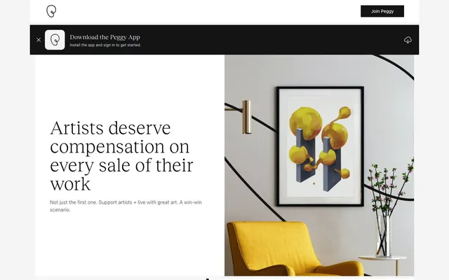
Preview image. Unlock full-res
Monochrome Gallery Wall
Color palette
Page backgrounds, subtle borders, navigation dividers, content section backgrounds
Primary text, strong headings, critical information, header elements
Card backgrounds, selected button backgrounds, prominent surfaces
Darker background accents, text on light buttons, selected interactive states
Secondary text, subtle decorative elements, helper text
Muted text, tertiary information, less emphasized links
Typography
- Weights
- 400, 500
- Sizes
- 12px, 14px, 16px
- Line height
- 1.33, 1.43, 1.5
- Fallback
- system-ui, sans-serif
Primary UI text, body copy, navigation items, button labels. Its clean, utilitarian nature supports information clarity throughout the interface.
- Weights
- 300, 400
- Sizes
- 20px, 30px, 36px, 48px, 60px
- Line height
- 1, 1.11, 1.2, 1.4
- Fallback
- Playfair Display, serif
Headlines and prominent display text. Its distinct serif form and lighter weights (especially 300) provide an artistic, contemplative voice, differentiating key messages from functional UI.
- Weights
- 400
- Sizes
- 12px
- Line height
- 1.33
- Fallback
- Chivo, sans-serif
Fine print, footer links, and minor legal text. Its compact, slightly condensed structure delivers information efficiently without demanding attention.
Spacing & shape
Components
Background: rgba(0, 0, 0, 0), Text: #666666, Border: #f4f4f4, Radius: 0px, Padding: 0px.
Background: #141414, Text: #ffffff, Border: #f4f4f4, Radius: 0px, Padding: 16px.
Background: #ffffff, Text: #141414, Border: #f4f4f4, Radius: 0px, Padding: 20px 40px.
Background: rgba(0, 0, 0, 0), Borders: none, Shadows: none, Radius: 0px, Padding: 0px 16px.
Background: #141414, Text: #ffffff, Icon-fill: #ffffff, Border: none, Height: 80px.
Guidelines
- Prioritize Inter for all body text, UI elements, and supplementary information for clear readability, using weights 400 and 500.
- Utilize Reckless for all headings, subheadings, and display text, explicitly using weights 300 and 400 to convey a distinctive artistic voice.
- Maintain a strict monochrome palette (#f4f4f4, #000000, #ffffff, #141414, #e2e8f0, #666666) for all UI elements, reserving color only for embedded imagery.
- Apply 0px border-radius to all structural components like buttons, cards, and sections, unless the element is an image with 9999px radius.
- Implement a 1px solid #f4f4f4 border for visual separation of UI elements, such as in navigation or list items.
- Use 16px for `elementGap` to ensure consistent spacing between small interactive elements and text blocks.
- Employ a base `sectionGap` of 32px to create distinct visual breaks between major content blocks.
- Avoid introducing any additional chromatic colors into the UI; strictly adhere to the defined monochrome palette.
- Do not use box shadows or elevation effects on cards or panels, maintaining a flat, two-dimensional aesthetic.
- Do not deviate from the 0px border-radius unless specifically applied to images where 9999px (a full circle/pill shape) is required.
- Never use generic sans-serif fonts for headlines; the distinct character of Reckless is essential for brand identity.
- Do not vary line heights outside of the specified values for each typeface; maintain the established vertical rhythm.
- Avoid dense placement of elements; ensure ample use of whitespace, guided by the defined spacing tokens.
- Do not use outline styles on primary action buttons; use distinct background and text colors to convey hierarchy.
About this system
ShowHide
Peggy is a design system built on a monochrome palette with sharp contrasts and minimal embellishment. It employs a modern, sans-serif primary typeface for body text and a distinctive serif for headlines, creating a duality of contemporary clarity and artistic gravitas. Components are lightweight with strong outlines and often stark backgrounds, emphasizing content through a lack of decorative elements. The overall aesthetic is one of understated authority, reflecting a serious approach to the art market.
The page primarily uses a max-width contained layout of 1280px, centered on a light (Canvas Fog) background. The hero section often features a split layout, with a large Reckless headline and Inter body text on one side, and a compelling image or artwork on the other. Sections maintain a consistent vertical rhythm, with clear visual breaks created by the sectionGap. Content organization moves between centered stacks for headings and text, and multi-column grids (like the four-column feature section) for presenting information. Navigation is a minimalist top bar, sticky only for the main logo and 'Join Peggy' button, contrasting with a dark ephemeral alert bar.
Imagery primarily consists of high-quality product photography (artwork) and atmospheric, often abstract or architectural photographs presented within the content. Photography is generally light-filled and high-key. Icons are monochrome, outlined, and minimal, serving purely functional roles. Product imagery (artworks) often has soft, rounded corners (9999px) for a subtle visual break, but UI elements typically maintain sharp edges. Imagery serves both as decorative atmosphere and explanatory content, illustrating how art interacts with the platform without heavy visual clutter. Density is moderate, balancing large hero images with text-heavy explanatory sections.
Reminiscent of Artsy, Saatchi Art, Square, MasterClass.
# Peggy — Style Reference
> Monochrome Gallery Wall

**Theme:** light

**Site:** https://peggy.com/royalties

Peggy is a design system built on a monochrome palette with sharp contrasts and minimal embellishment. It employs a modern, sans-serif primary typeface for body text and a distinctive serif for headlines, creating a duality of contemporary clarity and artistic gravitas. Components are lightweight with strong outlines and often stark backgrounds, emphasizing content through a lack of decorative elements. The overall aesthetic is one of understated authority, reflecting a serious approach to the art market.

## Tokens — Colors

| Name | Value | Token | Role |
|------|------|------|------|
| Canvas Fog | `#f4f4f4` | `--color-canvas-fog` | Page backgrounds, subtle borders, navigation dividers, content section backgrounds |
| Midnight Ink | `#000000` | `--color-midnight-ink` | Primary text, strong headings, critical information, header elements |
| White Canvas | `#ffffff` | `--color-white-canvas` | Card backgrounds, selected button backgrounds, prominent surfaces |
| Deep Graphite | `#141414` | `--color-deep-graphite` | Darker background accents, text on light buttons, selected interactive states |
| Muted Ash | `#e2e8f0` | `--color-muted-ash` | Secondary text, subtle decorative elements, helper text |
| Soft Stone | `#666666` | `--color-soft-stone` | Muted text, tertiary information, less emphasized links |

## Tokens — Typography

### Inter
- **Substitute:** system-ui, sans-serif
- **Weights:** 400, 500
- **Sizes:** 12px, 14px, 16px
- **Line height:** 1.33, 1.43, 1.5
- **Role:** Primary UI text, body copy, navigation items, button labels. Its clean, utilitarian nature supports information clarity throughout the interface.

### Reckless
- **Substitute:** Playfair Display, serif
- **Weights:** 300, 400
- **Sizes:** 20px, 30px, 36px, 48px, 60px
- **Line height:** 1, 1.11, 1.2, 1.4
- **Role:** Headlines and prominent display text. Its distinct serif form and lighter weights (especially 300) provide an artistic, contemplative voice, differentiating key messages from functional UI.

### Monument Grotesk
- **Substitute:** Chivo, sans-serif
- **Weights:** 400
- **Sizes:** 12px
- **Line height:** 1.33
- **Role:** Fine print, footer links, and minor legal text. Its compact, slightly condensed structure delivers information efficiently without demanding attention.

## Tokens — Type Scale

Major Third (1.25) from 14px base.

| Role | Size | Line height | Letter spacing |
|------|------|------|------|
| caption | 12px | 1.33 | — |
| body | 14px | 1.43 | — |
| body-lg | 16px | 1.5 | — |
| subheading | 20px | 1.4 | — |
| heading | 30px | 1.11 | — |
| heading-lg | 36px | 1.2 | — |
| display | 48px | 1 | — |
| display-lg | 60px | 1 | — |

## Tokens — Spacing

- **Max width:** 1280px
- **Section gap:** 32px
- **Card padding:** 16px
- **Element gap:** 16px

## Tokens — Radius

- **Images:** 9999px

## Layout

The page primarily uses a max-width contained layout of 1280px, centered on a light (Canvas Fog) background. The hero section often features a split layout, with a large Reckless headline and Inter body text on one side, and a compelling image or artwork on the other. Sections maintain a consistent vertical rhythm, with clear visual breaks created by the sectionGap. Content organization moves between centered stacks for headings and text, and multi-column grids (like the four-column feature section) for presenting information. Navigation is a minimalist top bar, sticky only for the main logo and 'Join Peggy' button, contrasting with a dark ephemeral alert bar.

## Imagery

Imagery primarily consists of high-quality product photography (artwork) and atmospheric, often abstract or architectural photographs presented within the content. Photography is generally light-filled and high-key. Icons are monochrome, outlined, and minimal, serving purely functional roles. Product imagery (artworks) often has soft, rounded corners (9999px) for a subtle visual break, but UI elements typically maintain sharp edges. Imagery serves both as decorative atmosphere and explanatory content, illustrating how art interacts with the platform without heavy visual clutter. Density is moderate, balancing large hero images with text-heavy explanatory sections.

## Components

### Primary Ghost Button
*Action button with a subtle outline, used for secondary actions or links where emphasis isn't on a filled background.*

Background: rgba(0, 0, 0, 0), Text: #666666, Border: #f4f4f4, Radius: 0px, Padding: 0px.

### Filled Primary Button
*High-emphasis action button with a dark background, indicating primary actions like 'Join Peggy' or 'Download'.*

Background: #141414, Text: #ffffff, Border: #f4f4f4, Radius: 0px, Padding: 16px.

### Light Filled Button
*Action button with a light background for contexts requiring less visual weight, such as within dark backgrounds or for less critical actions.*

Background: #ffffff, Text: #141414, Border: #f4f4f4, Radius: 0px, Padding: 20px 40px.

### Simple Card
*Used for informational display, feature lists, and content grouping. Emphasizes clean content presentation.*

Background: rgba(0, 0, 0, 0), Borders: none, Shadows: none, Radius: 0px, Padding: 0px 16px.

### App Download Banner
*Prominent notification bar for app download. Uses stark black and white for clear call to action.*

Background: #141414, Text: #ffffff, Icon-fill: #ffffff, Border: none, Height: 80px.

## Guidelines

### Do

- Prioritize Inter for all body text, UI elements, and supplementary information for clear readability, using weights 400 and 500.
- Utilize Reckless for all headings, subheadings, and display text, explicitly using weights 300 and 400 to convey a distinctive artistic voice.
- Maintain a strict monochrome palette (#f4f4f4, #000000, #ffffff, #141414, #e2e8f0, #666666) for all UI elements, reserving color only for embedded imagery.
- Apply 0px border-radius to all structural components like buttons, cards, and sections, unless the element is an image with 9999px radius.
- Implement a 1px solid #f4f4f4 border for visual separation of UI elements, such as in navigation or list items.
- Use 16px for `elementGap` to ensure consistent spacing between small interactive elements and text blocks.
- Employ a base `sectionGap` of 32px to create distinct visual breaks between major content blocks.

### Don't

- Avoid introducing any additional chromatic colors into the UI; strictly adhere to the defined monochrome palette.
- Do not use box shadows or elevation effects on cards or panels, maintaining a flat, two-dimensional aesthetic.
- Do not deviate from the 0px border-radius unless specifically applied to images where 9999px (a full circle/pill shape) is required.
- Never use generic sans-serif fonts for headlines; the distinct character of Reckless is essential for brand identity.
- Do not vary line heights outside of the specified values for each typeface; maintain the established vertical rhythm.
- Avoid dense placement of elements; ensure ample use of whitespace, guided by the defined spacing tokens.
- Do not use outline styles on primary action buttons; use distinct background and text colors to convey hierarchy.

## Agent Prompt Guide

**Quick Color Reference**
text: #000000
background: #f4f4f4
border: #f4f4f4
accent: no distinct accent color
primary action: no distinct CTA color

**3-5 Example Component Prompts**
1. Create a hero section: Canvas Fog background, with a prominent headline using Reckless weight 300, size 48px, color #000000. Below the headline, include body text in Inter weight 400, size 16px, color #000000. To the right, display an image with a 9999px border-radius.
2. Build a dark app download banner: Deep Graphite background, text 'Download the Peggy App' in Inter weight 400, size 16px, color #ffffff. Include a 'Download Peggy' button with White Canvas background, Deep Graphite text, 0px radius, and 20px 40px padding.
3. Design a feature card: White Canvas background, containing an icon (fill color #000000), a heading 'Secure Payments' in Inter weight 500, size 16px, color #000000, and a small description in Inter weight 400, size 14px, color #666666. No borders or shadows, 16px cardPadding.
No distinct primary action color was observed; use the extracted neutral button treatments instead of inventing a filled CTA color.
More like this
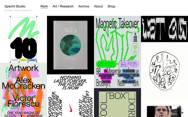









Keep what you find
A free account saves references to boards and can send you a weekly email of picks based on what you save.
To see every result, go Pro.