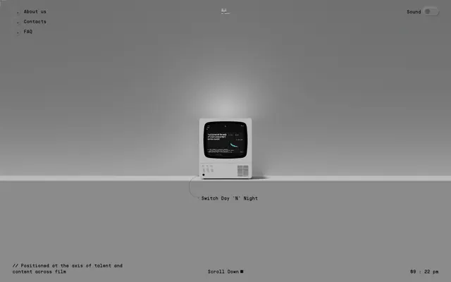
Preview image. Unlock full-res
grayscale retro-digital terminal
Color palette
On/active state for toggle switches and potential accent elements — a cool, utilitarian highlight
Primary page background, most text, inactive navigation text
Tertiary background sections, primary text for dark backgrounds, button text on dark. Also used for focus borders and outline styles
Secondary background surfaces and occasional text accents. Creates a subtle tonal shift against the primary backgrounds
Background for elevated panels or containers, offering a darker gray for layered content
Faint backgrounds or very muted text
Navigation panel background
Typography
- Weights
- 400
- Sizes
- 10px, 118px
- Line height
- 0.99, 1.2
- Letter spacing
- normal
- Fallback
- Inter
Primary sans-serif font for general UI text, headings, and larger display elements. Its sparse size data suggests highly specific usage for key visual elements.
- Weights
- 400
- Sizes
- 15px
- Line height
- 1.3
- Letter spacing
- normal
- Fallback
- IBM Plex Mono
Monospaced font for body text, navigation items, buttons, and code-like snippets. This typeface defines the site's retro-digital character, reinforcing the terminal aesthetic.
Spacing & shape
Components
text-based interaction; text color #101011 or #ffffff; transparent background; no explicit border-radius; 4px padding.
Pill-shaped toggle with a #717172 track background and a #101011 thumb when inactive; active state uses #32A4C3.
Guidelines
- Prioritize PPSupplyMonoRegular (or IBM Plex Mono) for all body text, navigation, and button labels to establish the core retro-digital aesthetic, using 15px/1.3 line height.
- Implement Ghost Canvas #ffffff as the primary text color on Midnight Base #101011 backgrounds, reserving Midnight Base #101011 for text on lighter backgrounds.
- Use a 0px border-radius as a default for all UI elements, reinforcing the sharp, hard-edged character of the design.
- All interactive elements should rely on text color changes or thin, same-color borders for interactive states, avoiding filled button backgrounds or significant elevation.
- Employ a 4px padding for minimal interactive elements like navigation items and ghost buttons, maintaining compactness.
- Section spacing should consistently use 48px vertical padding to create clear content blocks without feeling overly dense.
- When a container needs subtle differentiation, use Elevated Panel #313131 as the background color, indicating a layered context without heavy visual weight.
- Avoid using drop shadows or complex gradients; the system relies on flat colors, stark contrast, and minimal shifts between grayscale tones for visual depth.
- Do not introduce bright, saturated colors unless explicitly tied to an accent or semantic role defined in the color palette (e.g., Toggle Blue, Alert Red).
- Do not use overly large or decorative heading styles that deviate from the compact, utilitarian typography; stick to PPSupplySansRegular with minimal letter spacing.
- Do not create complex layouts with overlapping elements or varied border radii; maintain a clean, organized, and almost grid-like structure.
- Avoid decorative imagery or illustrations; imagery should be minimal and either abstract or product-focused to align with the technical, terminal-like atmosphere.
- Do not use multiple font families beyond PPSupplySansRegular and PPSupplyMonoRegular, as this dilutes the distinctive typographic identity.
About this system
ShowHide
HLE employs a grayscale retro-digital aesthetic, presenting an interface that feels like a vintage computer terminal. The design is characterized by its high contrast starkness and extremely compact, monochromatic typography with a distinct pixelated mono-space flair. Functional elements appear as subtle text-based interactions or simple toggle switches, maintaining an atmosphere of focused, understated utility rather than modern graphical richness. Surface treatments are minimal, relying on subtle background shifts and hard-edged borders for separation, eschewing shadows or complex gradients.
The page uses a full-bleed layout, with content often centered but without a fixed `pageMaxWidth` value, adapting responsively to the viewport. The hero section features a central, symbolic graphic (the retro monitor) that acts as an anchor for the primary interaction text 'Switch Day 'N' Night'. Sections are delineated by consistent vertical spacing of 48px, creating clear, distinct blocks without overt visual dividers. Content elements, such as the navigation in the top-left, tend to be anchored to screen corners. The layout is sparse and text-dominant, with a clear bottom-aligned footer containing utilitarian information. The overall rhythm is calm and deliberate, guiding the eye vertically.
The site uses minimal imagery, primarily focusing on abstract or product-focused visuals such as the retro CRT monitor. There are no expansive photographs or complex illustrations. Iconography, like the current time display, is simple, mono-color, and uses a thick stroke weight to match the overall aesthetic. Imagery serves an explanatory or atmospheric role, not a decorative one, and is always isolated rather than overlapping, integrated seamlessly into the monochromatic UI.
Reminiscent of Are.na, Terminal.com, Read.cv.
# HLE — Style Reference
> grayscale retro-digital terminal

**Theme:** dark

**Site:** https://hle.io

HLE employs a grayscale retro-digital aesthetic, presenting an interface that feels like a vintage computer terminal. The design is characterized by its high contrast starkness and extremely compact, monochromatic typography with a distinct pixelated mono-space flair. Functional elements appear as subtle text-based interactions or simple toggle switches, maintaining an atmosphere of focused, understated utility rather than modern graphical richness. Surface treatments are minimal, relying on subtle background shifts and hard-edged borders for separation, eschewing shadows or complex gradients.

## Tokens — Colors

| Name | Value | Token | Role |
|------|------|------|------|
| Toggle Blue | `#32A4C3` | `--color-toggle-blue` | On/active state for toggle switches and potential accent elements — a cool, utilitarian highlight |
| Midnight Base | `#101011` | `--color-midnight-base` | Primary page background, most text, inactive navigation text |
| Ghost Canvas | `#ffffff` | `--color-ghost-canvas` | Tertiary background sections, primary text for dark backgrounds, button text on dark. Also used for focus borders and outline styles |
| Slate Highlight | `#bbbbbb` | `--color-slate-highlight` | Secondary background surfaces and occasional text accents. Creates a subtle tonal shift against the primary backgrounds |
| Elevated Panel | `#313131` | `--color-elevated-panel` | Background for elevated panels or containers, offering a darker gray for layered content |
| Subtle Gray | `#8a8a8a` | `--color-subtle-gray` | Faint backgrounds or very muted text |
| Medium Gray | `#717172` | `--color-medium-gray` | Navigation panel background |

## Tokens — Typography

### PPSupplySansRegular
- **Substitute:** Inter
- **Weights:** 400
- **Sizes:** 10px, 118px
- **Line height:** 0.99, 1.2
- **Letter spacing:** normal
- **Role:** Primary sans-serif font for general UI text, headings, and larger display elements. Its sparse size data suggests highly specific usage for key visual elements.

### PPSupplyMonoRegular
- **Substitute:** IBM Plex Mono
- **Weights:** 400
- **Sizes:** 15px
- **Line height:** 1.3
- **Letter spacing:** normal
- **Role:** Monospaced font for body text, navigation items, buttons, and code-like snippets. This typeface defines the site's retro-digital character, reinforcing the terminal aesthetic.

## Tokens — Spacing

- **Section gap:** 48px
- **Element gap:** 8px

## Tokens — Radius

- **Default:** 0px
- **containers:** 12px

## Layout

The page uses a full-bleed layout, with content often centered but without a fixed `pageMaxWidth` value, adapting responsively to the viewport. The hero section features a central, symbolic graphic (the retro monitor) that acts as an anchor for the primary interaction text 'Switch Day 'N' Night'. Sections are delineated by consistent vertical spacing of 48px, creating clear, distinct blocks without overt visual dividers. Content elements, such as the navigation in the top-left, tend to be anchored to screen corners. The layout is sparse and text-dominant, with a clear bottom-aligned footer containing utilitarian information. The overall rhythm is calm and deliberate, guiding the eye vertically.

## Imagery

The site uses minimal imagery, primarily focusing on abstract or product-focused visuals such as the retro CRT monitor. There are no expansive photographs or complex illustrations. Iconography, like the current time display, is simple, mono-color, and uses a thick stroke weight to match the overall aesthetic. Imagery serves an explanatory or atmospheric role, not a decorative one, and is always isolated rather than overlapping, integrated seamlessly into the monochromatic UI.

## Components

### Text Link / Ghost Button
*Interactive element for navigation and actions that appears as simple text. It has a subtle 4px internal padding, drawing a thin line around itself on hover or focus using the text color to maintain its ghost-like appearance.*

text-based interaction; text color #101011 or #ffffff; transparent background; no explicit border-radius; 4px padding.

### Navigation Toggle Switch
*Binary control for activating or deactivating features, like sound. Styled as a small, pill-shaped switch with a distinct accent color for its active state.*

Pill-shaped toggle with a #717172 track background and a #101011 thumb when inactive; active state uses #32A4C3.

## Guidelines

### Do

- Prioritize PPSupplyMonoRegular (or IBM Plex Mono) for all body text, navigation, and button labels to establish the core retro-digital aesthetic, using 15px/1.3 line height.
- Implement Ghost Canvas #ffffff as the primary text color on Midnight Base #101011 backgrounds, reserving Midnight Base #101011 for text on lighter backgrounds.
- Use a 0px border-radius as a default for all UI elements, reinforcing the sharp, hard-edged character of the design.
- All interactive elements should rely on text color changes or thin, same-color borders for interactive states, avoiding filled button backgrounds or significant elevation.
- Employ a 4px padding for minimal interactive elements like navigation items and ghost buttons, maintaining compactness.
- Section spacing should consistently use 48px vertical padding to create clear content blocks without feeling overly dense.
- When a container needs subtle differentiation, use Elevated Panel #313131 as the background color, indicating a layered context without heavy visual weight.

### Don't

- Avoid using drop shadows or complex gradients; the system relies on flat colors, stark contrast, and minimal shifts between grayscale tones for visual depth.
- Do not introduce bright, saturated colors unless explicitly tied to an accent or semantic role defined in the color palette (e.g., Toggle Blue, Alert Red).
- Do not use overly large or decorative heading styles that deviate from the compact, utilitarian typography; stick to PPSupplySansRegular with minimal letter spacing.
- Do not create complex layouts with overlapping elements or varied border radii; maintain a clean, organized, and almost grid-like structure.
- Avoid decorative imagery or illustrations; imagery should be minimal and either abstract or product-focused to align with the technical, terminal-like atmosphere.
- Do not use multiple font families beyond PPSupplySansRegular and PPSupplyMonoRegular, as this dilutes the distinctive typographic identity.

## Agent Prompt Guide

Quick Color Reference:
text: #101011
background: #101011
border: #ffffff
accent: #32A4C3
primary action: no distinct CTA color

Example Component Prompts:
1. Create a primary navigation link: uses 'PPSupplyMonoRegular' at 15px, weight 400, color #101011, with 4px padding. It animates to color #ffffff on hover. When active, it displays a small dot to its left.
2. Design the 'Sound' toggle switch: track color #717172, thumb color #101011. When active, the track color changes to #32A4C3, with the thumb remaining #101011.
3. Create a footer copyright text block: uses 'PPSupplyMonoRegular' at 15px, weight 400, color #101011. This block should have 24px vertical padding and 40px horizontal padding.
More like this




Keep what you find
A free account saves references to boards and can send you a weekly email of picks based on what you save.
To see every result, go Pro.