Preview image. Unlock full-res
Analog Darkness, Condensed Impact
Color palette
Page background, primary text on light surfaces, borders in specific UI states
Hairline borders, dividers, input outlines, and card edges on light surfaces. Do not promote it to the primary CTA color
Medium-contrast borders, control outlines, and structural separators. Do not promote it to the primary CTA color
Dark elevated surface for cards, headers, and contained panels. Do not promote it to the primary CTA color
Typography
- Weights
- 500
- Sizes
- 18px, 69px
- Line height
- 0.8, 1.11
- Letter spacing
- -0.72, -2.07
- Fallback
- Space Mono
All textual content, from navigation to headings. This custom typeface defines the brand's unique, condensed, and impactful typographic voice.
Spacing & shape
Components
Text in Smoke Gray (#b3b3b3) set at 18px Antique Legacy. Encased in a pill-shaped container with `42px` border-radius. On interaction, the background is Muted Carbon (#313131) with Canvas White (#ffffff) text.
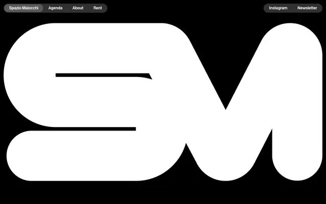
Large 'SM' brand mark in Canvas White (#ffffff) against a Pitch Black (#000000) background. This element uses the page's dominant contrast for maximal impact.
Text in Smoke Gray (#b3b3b3) at 18px Antique Legacy, underlined with Pitch Black (#000000) on hover or active states. Used for footer links or secondary actions without a strong background.
Guidelines
- Prioritize Pitch Black (#000000) as the dominant background color for most content areas to maintain a strong dark theme.
- Use Canvas White (#ffffff) sparingly for primary headings, distinct brand elements, and interactive text on dark backgrounds to maximize contrast and visual impact.
- Apply the `42px` border-radius to all interactive components like navigation pills and input fields for a consistent soft, rounded aesthetic.
- Utilize Antique Legacy font for all text elements to preserve the unique condensed typographic identity.
- Employ Smoke Gray (#b3b3b3) for secondary text and borders, balancing legibility against the dark background while retaining a muted feel.
- Maintain a compact element spacing of `8px` and primary content padding of `16px` to keep UI dense and focused.
- Avoid using saturated or bright colors beyond the core monochrome palette; vibrant accents are not part of this visual language.
- Do not introduce square or sharp corners for interactive elements; the `42px` radius is a signature visual trait.
- Refrain from using drop shadows or complex elevation schemes; surfaces are identified through color shifts (e.g., Muted Carbon #313131) instead.
- Do not deviate from the condensed aesthetic of Antique Legacy; avoid open or traditional humanist typefaces.
- Do not add additional decorative borders or embellishments; borders are either non-existent or minimal and functional.
- Avoid generic stock photography or overly illustrative graphics; the identity emphasizes raw typography and stark black-and-white forms.
About this system
ShowHide
Spazio Maiocchi evokes a raw, analog-maximalist dark aesthetic, driven by highly contrasted black and white visuals and an ultra-condensed custom typeface. The design focuses on content impact, utilizing a dark canvas to highlight bold typographic elements. UI components are minimal, often appearing as ghost outlines or pill-shaped containers, supporting a brand identity that leans into stark functionalism. Surfaces transition subtly through dark grays, offering layers without overt shadows.
The site employs a full-bleed page model where content stretches to the viewport edges. The header features minimal, pill-shaped navigation elements positioned at the top-left and top-right, creating distinct functional clusters. The hero section is characterized by a central, oversized typographic or graphical element (the 'SM' logo) against a stark black background. Subsequent content sections are not visible but are implied to flow with consistent vertical spacing. The overall density is spacious around the hero, giving way to more concentrated UI elements in the header and footer.
The site is imagery-light, primarily relying on bold typography and abstract graphic shapes for visual interest. The main impactful element is a large, custom 'SM' wordmark, presented in stark white against a pure black background. There are no photographs, illustrations, or product screenshots. If any imagery were to be introduced, it should adhere to a high-contrast, monochrome, and abstract or geometric style.
Reminiscent of A-COLD-WALL*, Burberry (early 2000s under Riccardo Tisci), The Face magazine.
# Spazio Maiocchi — Style Reference
> Analog Darkness, Condensed Impact

**Theme:** dark

**Site:** https://afterimage.spaziomaiocchi.com

Spazio Maiocchi evokes a raw, analog-maximalist dark aesthetic, driven by highly contrasted black and white visuals and an ultra-condensed custom typeface. The design focuses on content impact, utilizing a dark canvas to highlight bold typographic elements. UI components are minimal, often appearing as ghost outlines or pill-shaped containers, supporting a brand identity that leans into stark functionalism. Surfaces transition subtly through dark grays, offering layers without overt shadows.

## Tokens — Colors

| Name | Value | Token | Role |
|------|------|------|------|
| Pitch Black | `#000000` | `--color-pitch-black` | Page background, primary text on light surfaces, borders in specific UI states |
| Canvas White | `#ffffff` | `--color-canvas-white` | Hairline borders, dividers, input outlines, and card edges on light surfaces. Do not promote it to the primary CTA color |
| Smoke Gray | `#b3b3b3` | `--color-smoke-gray` | Medium-contrast borders, control outlines, and structural separators. Do not promote it to the primary CTA color |
| Muted Carbon | `#313131` | `--color-muted-carbon` | Dark elevated surface for cards, headers, and contained panels. Do not promote it to the primary CTA color |

## Tokens — Typography

### Antique Legacy
- **Substitute:** Space Mono
- **Weights:** 500
- **Sizes:** 18px, 69px
- **Line height:** 0.8, 1.11
- **Letter spacing:** -0.72, -2.07
- **Role:** All textual content, from navigation to headings. This custom typeface defines the brand's unique, condensed, and impactful typographic voice.

## Tokens — Type Scale

| Role | Size | Line height | Letter spacing |
|------|------|------|------|
| body | 18px | 1.11 | -0.72px |
| display | 69px | 0.8 | -2.07px |

## Tokens — Spacing

- **Section gap:** 64px
- **Card padding:** 16px
- **Element gap:** 8px

## Tokens — Radius

- **Buttons:** 42px
- **Cards:** 42px
- **tags:** 42px

## Layout

The site employs a full-bleed page model where content stretches to the viewport edges. The header features minimal, pill-shaped navigation elements positioned at the top-left and top-right, creating distinct functional clusters. The hero section is characterized by a central, oversized typographic or graphical element (the 'SM' logo) against a stark black background. Subsequent content sections are not visible but are implied to flow with consistent vertical spacing. The overall density is spacious around the hero, giving way to more concentrated UI elements in the header and footer.

## Imagery

The site is imagery-light, primarily relying on bold typography and abstract graphic shapes for visual interest. The main impactful element is a large, custom 'SM' wordmark, presented in stark white against a pure black background. There are no photographs, illustrations, or product screenshots. If any imagery were to be introduced, it should adhere to a high-contrast, monochrome, and abstract or geometric style.

## Components

### Pill Navigation Link
*Header and footer navigation items*

Text in Smoke Gray (#b3b3b3) set at 18px Antique Legacy. Encased in a pill-shaped container with `42px` border-radius. On interaction, the background is Muted Carbon (#313131) with Canvas White (#ffffff) text.

### Hero Brand Lockup
*Primary visual identifier*

Large 'SM' brand mark in Canvas White (#ffffff) against a Pitch Black (#000000) background. This element uses the page's dominant contrast for maximal impact.

### Metadata Link
*Informational or secondary action links*

Text in Smoke Gray (#b3b3b3) at 18px Antique Legacy, underlined with Pitch Black (#000000) on hover or active states. Used for footer links or secondary actions without a strong background.

## Guidelines

### Do

- Prioritize Pitch Black (#000000) as the dominant background color for most content areas to maintain a strong dark theme.
- Use Canvas White (#ffffff) sparingly for primary headings, distinct brand elements, and interactive text on dark backgrounds to maximize contrast and visual impact.
- Apply the `42px` border-radius to all interactive components like navigation pills and input fields for a consistent soft, rounded aesthetic.
- Utilize Antique Legacy font for all text elements to preserve the unique condensed typographic identity.
- Employ Smoke Gray (#b3b3b3) for secondary text and borders, balancing legibility against the dark background while retaining a muted feel.
- Maintain a compact element spacing of `8px` and primary content padding of `16px` to keep UI dense and focused.

### Don't

- Avoid using saturated or bright colors beyond the core monochrome palette; vibrant accents are not part of this visual language.
- Do not introduce square or sharp corners for interactive elements; the `42px` radius is a signature visual trait.
- Refrain from using drop shadows or complex elevation schemes; surfaces are identified through color shifts (e.g., Muted Carbon #313131) instead.
- Do not deviate from the condensed aesthetic of Antique Legacy; avoid open or traditional humanist typefaces.
- Do not add additional decorative borders or embellishments; borders are either non-existent or minimal and functional.
- Avoid generic stock photography or overly illustrative graphics; the identity emphasizes raw typography and stark black-and-white forms.

## Agent Prompt Guide

Quick Color Reference:
- text: #ffffff
- background: #000000
- border: #b3b3b3
- accent: no distinct accent color
- primary action: no distinct CTA color

Example Component Prompts:
- Create a header navigation link: 'Agenda' text, Antique Legacy font, 18px size, Smoke Gray (#b3b3b3) color, on a Muted Carbon (#313131) oval background with 42px radius, and 6px vertical, 21px horizontal padding.
- Design a large typographic hero title: 'A New Language' text, Antique Legacy font, 69px size, Canvas White (#ffffff) color, letter spacing -2.07px, centered on a Pitch Black (#000000) background.
- Create a footer link: 'Cookie Policy' text, Antique Legacy font, 18px size, Smoke Gray (#b3b3b3) color.
More like this





Keep what you find
A free account saves references to boards and can send you a weekly email of picks based on what you save.
To see every result, go Pro.